The Brüder Butter / Schriftguss AG type foundry in Dresden, Germany was one of the most interesting and multifaceted ones in Europe in the 1920s — yet almost no one has ever heard of them.
The Dresden site of the Butters in Großenhainer Straße, where today, some of Eckehart SchumacherGebler’s extensive type collection is stored. Next door, in the former Typoart building, is now his Monotype typesetting and print shop. Photo by Romesh Naik. (Incidentally, I am right here for a week of workshops currently.)
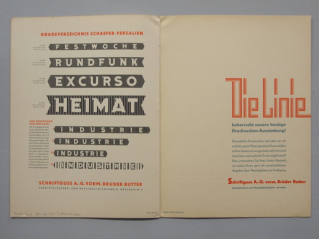
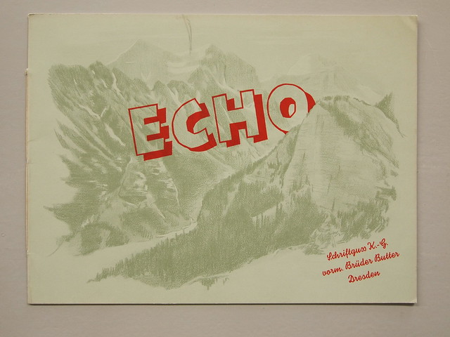
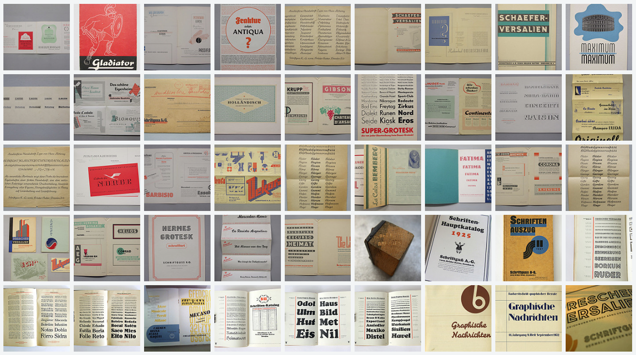
Maybe their Dresden location — away from the main centres of the German graphic industry in Frankfurt, Offenbach and Leipzig — enabled them to take a more daring and creative stance in their typeface design and marketing material. In the 1920s German type foundries were increasingly merging, expanding and exporting. Type brochures and leaflets complementing the specimen books were an important communication tool, especially in the jobbing type market. The Butters were outstandingly good at creating both advertising material and interesting type. Their folders are colourful, full of creative layouts and formats. Their typefaces are displayed in a casual and relaxed manner, often with a good amount of jest. If you ever have the chance to see some of their brochures in person (list of potential places below), do it! Until then, there are a couple of photos on Flickr to get you started.
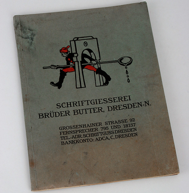
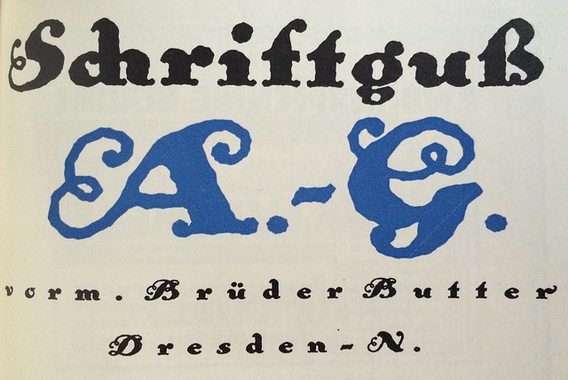
The specimens are hard to find and the history of the type foundry is even harder — it’s just not very well documented. Fortunately Maurice Göldner did extensive research for his type design studies in Leipzig, and is the foremost expert on all things Schriftguss. (This text is based largely on his research.) Check out Typography Papers 9 for an article by him about the foundry. In the trade magazine Deutscher Drucker Nr 9, 2010, Maurice asks why there is almost no company documentation. One reason may be the political change after 1945 when Schriftguss got nationalised and merged into Typoart, the communist East-German public type company who drastically reorganised their product range. Another may be the second change of system after 1989 when Typoart got liquidated and the new-old property situation was too complicated to clarify. However, Maurice compared trade registers and discovered the company was founded in 1892 under the name “Brüder Butter” by taking over the type casting firm of Otto Ludwig Bechert, which itself was founded 1889. In 1922, having grown substantially, it was incorporated as “Schriftguss A.-G. vorm. [prev.] Brüder Butter”.
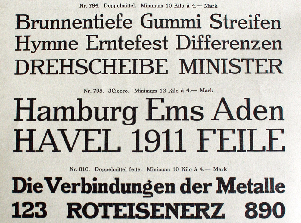
Unfortunately very few type specimens remain from the early years, so it’s hard to reconstruct what their type catalog may have looked like before the 1910s. The few surviving ephemera suggest it likely consisted of popular (and partly generic) typefaces in the style of the time: mainly billowy Jugendstil designs. Their first comprehensive specimen dates from 1913.
A mascot with a giant type metal scoop rushing through a “Sparguss-Type” (material-saving display type, ~72–96 pt), a staple of Butters’ program. Is this the first appearance of who should become known as the Buttermann (butter man)? Photo by Henning Krause.
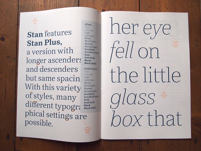
Alongside in-house type development, Schriftguss cooperated with type foundries in Germany and overseas, exchanging designs to be cast locally. They licensed Pabst Oldstyle from ATF (American Type Founders) and published it as Ohio, a typeface that got them more widely recognised. Others were Linkoln Gotisch / Wedding Text, Pfeil Antiqua / Cheltenham and Piccadilly / Tiffany Shaded, also called Typo Shaded. Cooperations with Barnhart Brothers & Spindler were Cooper / Copra, Demeter schraffiert and Fournier geperlt. And from the Inland Type Foundry in Saint Louis (merged into ATF in 1911) came Foster, which Schriftguss revised and released as Wellington around 1913. Read more about these typefaces and their contemporary revival in my article on Typographica.
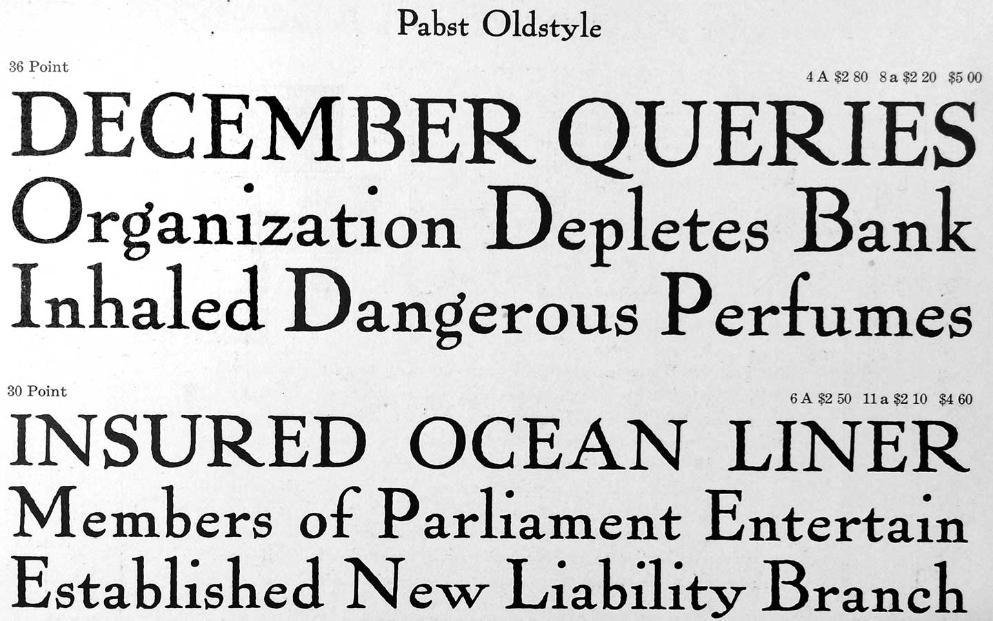
Frederic Goudy’s Papst Oldstyle from the 1912 ATF catalog. Schriftguss expanded the family by adding the expressive Ohio Kraft variant by Eduard Lauterbach in 1922 (below) — an “incredibly crude advertising face with undeniably sweeping appeal” (Klimsch Jahrbuch, 1923)
Wellington by Schriftguss Brüder Butter came from the US as Foster, now revived as Stan. Photo by Maurice Göldner.
This letterhead (featuring Wellington) from 1914 delightfully illustrates their humour and wit: a jester with ladle under his arm plays a flute, luring sorts of metal type out of Dresden’s city wall. (Nice Umlaut, too.)
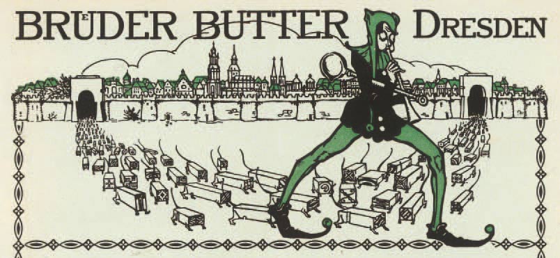
Just like the Rattenfänger von Hameln (Pied Piper of Hamelin) had power over rats, the Butters had power over the fonts in Dresden. By that time they were practically without competition. Photo by Maurice Göldner
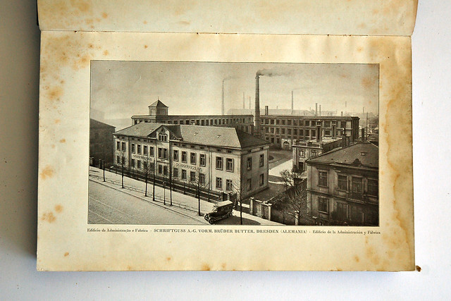
Their most productive and original phase was during the 1920s and ’30s. In 1922 the company went public and changed its name to “Schriftguß A.G. vormals Brüder Butter”. Even though the Butter brothers were no longer actively involved in management, the name was too well established to give up. The intuitive, improvised and relaxed attitude was kept alive until their very last years. The company continuously grew and moved into a free-standing factory building (see above) with its own railway access better enabling large deliveries and export to other countries. The front of the factory was painted a bright green that charmingly hinted at Dresden’s famous “Grünes Gewölbe” and symbolized the Butter-Geist — “vigour, liveliness and freshness”, as the German trade magazine Deutsche Drucker remarked in 1928.
Not much is known about their punch cutters or if they had an in-house drawing studio. The Butters mainly worked with outside “Schriftkünstler” (freelance lettering artists / type designers), more than other foundries during that time. This is understandable given the nature of their catalog — mainly display and jobbing type — but still remarkable. (For a list of their typefaces see this PDF compiled by Hans Reichardt.) A distinctive product of Schriftguss were modular systems of type “building blocks” to compose shapes and letterforms for display and jobbing applications, for instance Dekora, or most well-known Ne-Po (negative–positive) by Albert Auspurg from 1931.
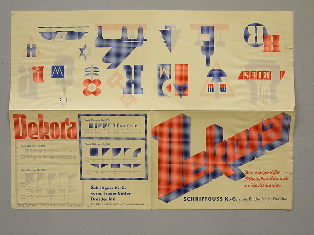
Dekora type and border system
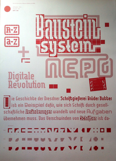
Ne-Po modular type system, digitally revived by Maurice Göldner as part of his studies at the HBG Leipzig in 2009 (alongside Marggraff and Wellington). HBKsaar students Maria Sieradzki and Daniel Weiand turned Ne-Po into woodtype in 2015.
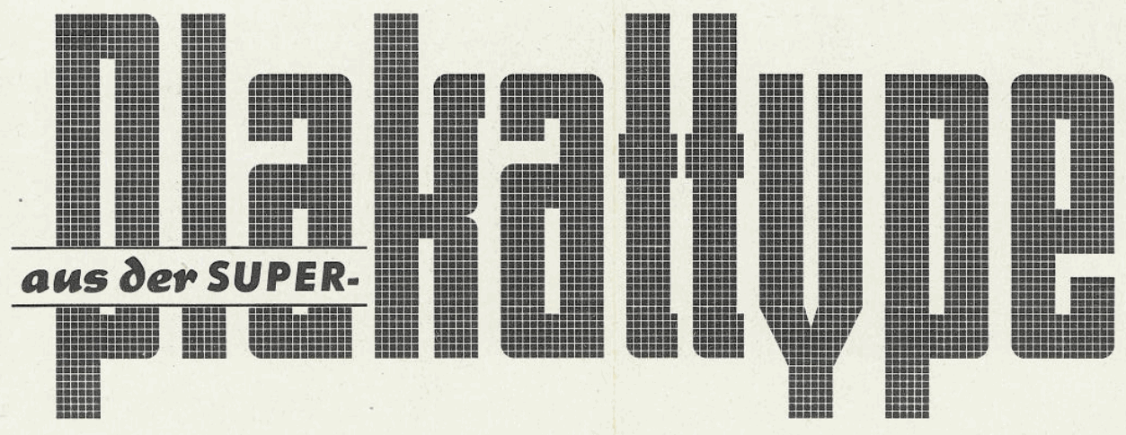
When the National-Socialist party seized power, the board of directors was reshuffled and the last Butter family member resigned. In 1937 the company name and structure was changed from an “AG” into a “KG” (limited partnership). Although the product line was ideologically influenced until the end of the war, the design of specimens remained special and interesting. In 1948 the company was expropriated and became communist public property, now under the name VEB Schriftguss Dresden. During this time of drastic change the foundry developed their last modular display type system, “Super-Plakattype”, released in 1949.
Their final name change came in 1951 after the founding of the GDR. It was now “VEB Typoart – Drucktypen, Matrizen, Messinglinien”, eliminating all reference to the capitalist Butter-history of the company. With the change in political system came a change in product range. Many of the interesting display and jobbing faces, which the type foundry was known for, disappeared from the Typoart specimen books in the following years. This supposedly allowed for more functional text typefaces under the socialist circumstances of limited production capacity and material supply. The Butter-Geist disappeared; the façade of the company buildings as well as their specimens turned more plain. But, thankfully, Schriftguss friends like Maurice and others endeavor to keep it alive.
You may find material from Schriftguss Brüder Butter in these libraries and collections: University of Amsterdam, Klingspor Museum, Gutenberg Museum, German National Library Leipzig, Letterform Archive, St. Bride Library, Columbia University NYC. (I did not check the non-German locations in person though.)