Tiny Grotesk: bridging 500 years of type design

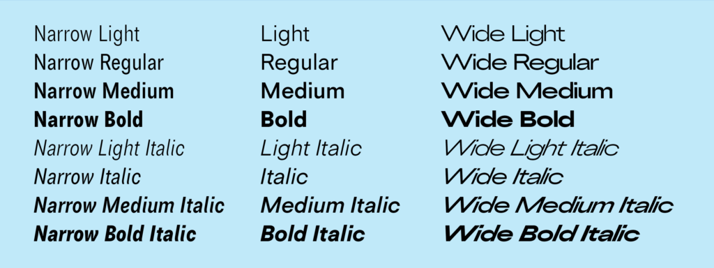
Tiny Grotesk is a tiny superfamily. In a market where sans-serif families quickly grow to contain dozens of styles, sometimes over a hundred, Tiny Grotesk is an antidote, a proposal to do more with less. It covers as much ground as possible, across only twenty-four carefully selected styles.

Tiny Grotesk is in its regular width a clean, friendly neogrotesk with relaxed capitals and a round, even-keeled lowercase. The two accompanying widths, Narrow and Wide, expand it into a complex typographic toolkit. The Narrow styles, space-saving and optimised for small use, are ideal for footnotes, asides and UI elements. The Wide styles, imposing and optimised for large use, demand space, and will take that space no matter what. This pairing makes the family versatile and broadly usable while remaining as compact as possible.

Tiny Grotesk has been in development since 2019, slowly but steadily expanding in scope but not really in size. It has been used in a few print projects, on some vinyl records, and for a complex digital catalogue before its release in 2024 and expansion in 2026.

Bridging some 500 years of typographic ideas

The initial idea for the family started in a perhaps weird place: 1500s italic calligraphy and movable typefaces based on it. In these early days, the lowercase was a cursive italic. The capitals, however, were upright forms. Since the capital letters in these texts occurred relatively rarely – an average of something like once every forty characters – their presence clearly wasn’t disruptive to readers. Not disruptive enough to feel the need to draw italic capitals, which would require a whole new set of sorts to be drawn, cut and cast. I can’t blame them for wanting to be efficient.

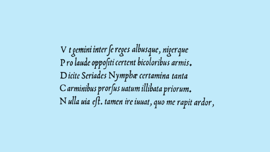
The italics by Ludovico Arrighi were the original inspiration for Tiny Grotesk, in a direct but not entirely obvious way. The proportions were taken from his second italic, and I wanted to explore them in depth. Would the typographic rhythm work in a sans-serif jacket, even with the strange width relationship between these capitals and lowercase letters?

Continue reading

Script, print, and letterforms in global contexts: the visual and the material

At the end of June, I was lucky to attend the new Centre for Printing History and Culture (CPHC) conference ‘Script, print, and letterforms in global contexts: the visual and the material’. Organised at the Birmingham City University in the UK by the talented Sahar Afshar, Vaibhav Singh, and Darryl Lim, the conference set out to explore the ‘plurality of engagements with, and interpretations of the printed and written word in various writing systems and artefacts’.

Maybe it was the anticipation of attending a conference’s first edition, or the large range of fascinating topics on the conference schedule. Or perhaps it was the idea of visiting the ‘Brummies’ in Birmingham, with its beautiful industrial terracotta buildings. Whatever the origin, I was already excited about this conference long before it even started. And I can confirm that it totally lived up to my expectations.
It’s the smallest conference I’ve ever attended, and probably the most eclectic. With a crowd of roughly 50 attendees and speakers, its ambition was no less than that of a larger conference. Bringing together scholars and practitioners from various disciplines such as book history, printing, publishing, type design, typography, and print culture, the conference aimed to start conversations from different points of view on print ‘in the diverse linguistic contexts of the world’.

Script, print, and letterforms in global contexts: the visual and the material. Vivien Chan takes the stage.

Continue reading

Remember December: Typewriter Wonderland

Things rarely happen the way you planned, that’s is why improvised trips are never disappointing. My visit to the Museu de la Tècnica de L’Empordà last summer was full of unexpected events. It all worked out at the end, but I need a second and less troublesome visit in the future.

Many of you have probably read this thread on Twitter from Marcin Wichary, who is among other things a researcher on the history of keyboards. That’s is how I got to know about one of the most important exhibitions of typewriters in the world.

I was planning to spend a few days in Girona and just before I travelled there, my friend Álvaro, who is also passionate about typewriters sent me a message. He had just moved from Rio de Janeiro to Barcelona and he wanted to visit the Museu de la Tècnica. He suggested going together. It was perfect timing! We would meet in Figueres, the town where the museum is located. Everything fit together until the day of our visit.
Continue reading

Film review: Graphic Means

A detail from the Graphic Means official poster.

If you were a part of this era, but especially if you weren’t, you must see Graphic Means.

These days, it is easier to find information regarding printing in 15th century Europe than graphic design processes in the United States during the 1970s and ’80s. The latter, the focus of Graphic Means, was a major transition for the design and printing industry as centuries old procedures and machinery made way for photographic processes and eventually digital technology. This dramatic shift has not been well-documented, perhaps due to the quick speed of the conversion or that it is still in recent memory.

Continue reading

My 2¢: The Spanish Peseta Coin

I often find myself looking at things that go unnoticed or that people just don’t care about. Coins are invisible design items for most people. We often use size and color to differentiate one from each other, but we rarely look at them closely. I have heard once that the design of a stamp was one of the most challenging and uplifting commissions a graphic designer could get. There are probably many more constraints in the design of a coin, but you would agree with me that it would be a really interesting project for a type designer.

I would like to share with you some thoughts on the design of a particular coin, the extinct Spanish peseta. It was the currency used in Spain from 1868 to 2002, when the euro was introduced. As a side note, it is one of the few examples of a coin with a female name. I was able to collect some historical models of the peseta coins which took me to dark times in our country. The coins became a symbol of political power and the images and text engraved on them were used to reinforce the establishment.

The two sides of 5 historical models of the 1 peseta coin. From right to left, peseta from 1869, 1900, 1947, 1975 and 1986

The two sides of 5 historical models of the 1 peseta coin. From right to left, peseta from 1869, 1900, 1947, 1975 and 1986

Continue reading