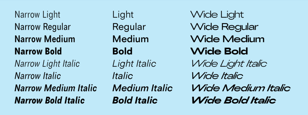
Tiny Grotesk is a tiny superfamily. In a market where sans-serif families quickly grow to contain dozens of styles, sometimes over a hundred, Tiny Grotesk is an antidote, a proposal to do more with less. It covers as much ground as possible, across only twenty-four carefully selected styles.
Tiny Grotesk is in its regular width a clean, friendly neogrotesk with relaxed capitals and a round, even-keeled lowercase. The two accompanying widths, Narrow and Wide, expand it into a complex typographic toolkit. The Narrow styles, space-saving and optimised for small use, are ideal for footnotes, asides and UI elements. The Wide styles, imposing and optimised for large use, demand space, and will take that space no matter what. This pairing makes the family versatile and broadly usable while remaining as compact as possible.
Tiny Grotesk has been in development since 2019, slowly but steadily expanding in scope but not really in size. It has been used in a few print projects, on some vinyl records, and for a complex digital catalogue before its release in 2024 and expansion in 2026.
Bridging some 500 years of typographic ideas
The initial idea for the family started in a perhaps weird place: 1500s italic calligraphy and movable typefaces based on it. In these early days, the lowercase was a cursive italic. The capitals, however, were upright forms. Since the capital letters in these texts occurred relatively rarely – an average of something like once every forty characters – their presence clearly wasn’t disruptive to readers. Not disruptive enough to feel the need to draw italic capitals, which would require a whole new set of sorts to be drawn, cut and cast. I can’t blame them for wanting to be efficient.
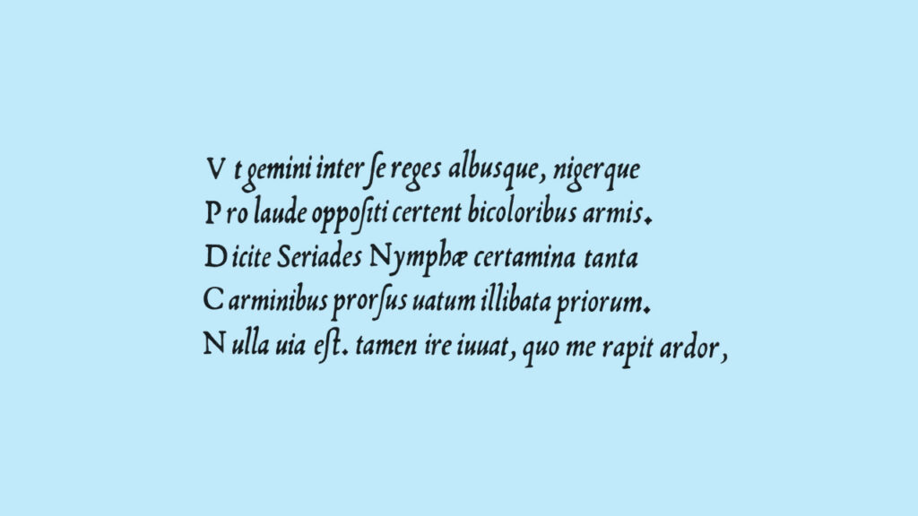
The italics by Ludovico Arrighi were the original inspiration for Tiny Grotesk, in a direct but not entirely obvious way. The proportions were taken from his second italic, and I wanted to explore them in depth. Would the typographic rhythm work in a sans-serif jacket, even with the strange width relationship between these capitals and lowercase letters?
A 20th century neogrotesk – something in the style of Helvetica, Univers or Folio, sans-serifs more rationalised than their predecessor Akzidenz-Grotesk – felt like the appropriate form. Unlike the cursiva humanistica, which is directly inspired by calligraphy, these newer grotesks are now a few steps removed from any handwriting. There are still implied rules on ductus – which parts are thick and why – but many of them are different from the rules of cursive italics from 1500. The newer grotesks also feature more graphic than calligraphic drawings, with more focus on geometric shapes, such as uninterrupted quarter-circle turns and horizontal cuts at the ends of strokes.

Finally, these neogrotesks were designed around typographic weight. Arrighi’s work was intended for book setting, at text sizes, in a single weight and style. The 19th and 20th century brought us the rotary steam press, posters, graphic design, magazines and visual identities, and with it variety. The new grotesks have thin styles, bold styles, black styles, and often matching italics for all. They even have widths, which became my next focus.
Expanding the idea into distinct styles
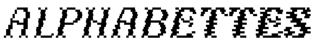
While I found the mismatched style of wide capitals and narrow lowercase charming, it was more a gimmick than a design I felt had a lot to offer. The success of the experiment was encouraging, however. The grotesk forms on the narrow lowercase width worked well, and I knew that was worth expanding.
The regular width started by stretching the narrow until the forms felt ‘normal’, or at least normal to me.2 Then, it felt logical to see what stretching it further could look like. The wide styles are an extrapolation: the same increase from narrow to regular is optically doubled. Now, the three widths started speaking for themselves. The narrow styles, rooted in book design, were already proven in small use – Arrighi’s proportions do the hard work there. The regular styles became a middle ground, a more general-purpose design with friendly proportions. The wide styles made the same conceptual step as before: if the Narrow side of the axis is for small use, Wide should be designed for big use.
With this new focus, the project began to take proper shape. It would be a superfamily in the narrowest sense of the term: multiple widths, weights and styles, but only as few of each as possible. To do a lot, with very little – which is also at the heart of the Tiny Type ethos. I believe in the versatility of my tools, and that a good designer can squeeze a lot of value out of a single style. It’s why my families tend to remain small. I’d rather pick a few clear ideas for designers to work with than to provide a range of options many of which they may never use.
Form languages and curve tensions
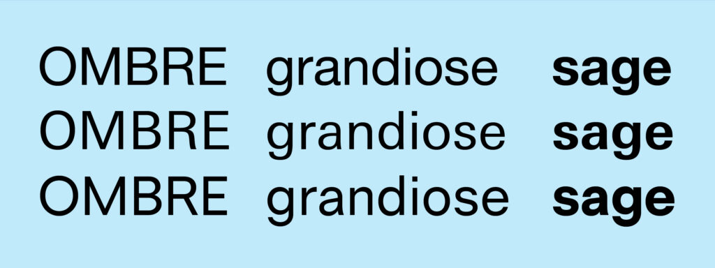
Between the six core styles, there are at least five distinct drawing styles. The curve tension of the regular widths, even-keeled with balanced curves and straight lines, is the calm heart of the family. The classical proportions, roughly based on the Aldine typefaces3, have a bit of swing to them, with more variation in the capital widths than most neogrotesks – compare M to N, E to O. These proportions bring a softness to the sans-serif curves. There can be a coldness in neogrotesks, a clinical and ‘neutral’ intent4 – but those fonts already exist. Tiny Grotesk should be friendly.
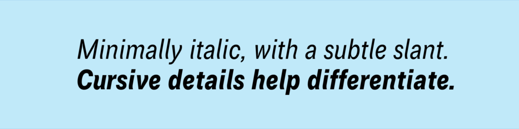
When it became clear that narrow would mean small, I had a goal for that too. A lot of small-use designs (often labeled as ‘Caption’ styles) have a wider set width than the larger-use styles, helping them look stylistically consistent – one of many optical illusions in type design. But there is no reason that smaller can’t mean narrower… if narrowness is the point. The letterforms are narrower than the regular width, but the spacing is increased, to keep forms open and uncluttered. There are subtle ink traps5 that give the styles a bit of bite when used larger, but mostly serve to lighten busy joins at smaller sizes. The italics add an occasional subtle cursive detail, to help differentiate them from the romans. This shows prominently in letters such as e n u a. The slant angle of 10° is slight, as greater slant degrees became too loud for my tastes. That allowed some of these small flourishes, for flavour and distinction.
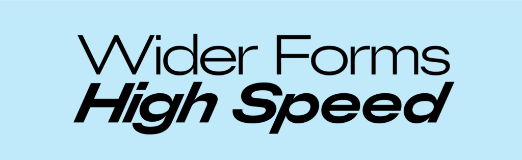
Because the wide styles are a sort of inversion of the narrow styles, a counterbalance in the family, they had to be the opposite in many conceptual ways. So, wide = big use, that’s easy. The wide spacing of the narrow styles would become tight. And the ink traps translate to very thin joins, as thin as 3% of the body size – very visible in letters like G b d p q. The oval forms of the narrow are turned 90°, and the italics are now slanted to a severe 24°, making those styles as loud and fast as possible.
A lot of range in a small package
The three widths are optimised for their different use sizes. The Narrow styles are used as footnotes, sidenotes and other typographic metatextual elements. The Regular widths are the general-purpose neogrotesk, ready for running text from 10 to 20 points. Then, for large and eye-catching use, such as headlines, logos and quotes, the Wide styles can go as big as you want. But nobody’s going to stop you if you mix things up, of course.
Tiny Grotesk is as compact a neogrotesk superfamily as it can be, and provides a genuinely useful wide range of functions with only twenty-four styles. Despite being designed as a holistic family, the subfamilies do stand on their own, and each covers the exact same typographic and linguistic features.
Tiny Grotesk is available for licensing directly from the Tiny Type Co, and there are easy trials and rentals available through Fontstand.
- For more about Arrighi’s designs and variations of his italics, see also The Fleuron, volume 3, 1924, by A.F. Johnson and Stanley Morison. ↩︎
- I spoke briefly about the word ‘normal’ in a YouTube video, which also has a text version online. ↩︎
- Relevant designs I have in mind are Nicholas Jenson‘s romans and Francesco Griffo’s romans as used in De Aetna. But I took some liberties. I split the difference between these references and the more consistent capital widths as found in 20th century neogrotesks. ↩︎
- As explored, quite literally, by Kai Bernau in his project Neutral. ↩︎
- Some people argue that the name is confusing, but it makes perfect sense. It functions like how a bass trap absorbs low-frequency sounds. An ink trap is designed to avoid visual swelling in unwanted places. ↩︎