
Self-promotion can feel somewhat gross but who doesn’t love touting the accomplishments of others? The past several months have seen a bevy of new typeface releases by many talented folks, but perhaps you haven’t heard about all of them yet? In no particular order, let the horn-tooting begin. Drumroll, please!
Pigeonette (Future Fonts)
by Ro Hernández
Pigeonette “combines the sketchiness of handwriting with the open spacing and charmingly awkward proportions of typewriters in a not-quite-monospaced design with a comfortable reading texture.” Started as Hernández’s graduation project, it’s now getting its wings on Future Fonts. Throw it some bread while support for central European languages and Cyrillic is still in the works.
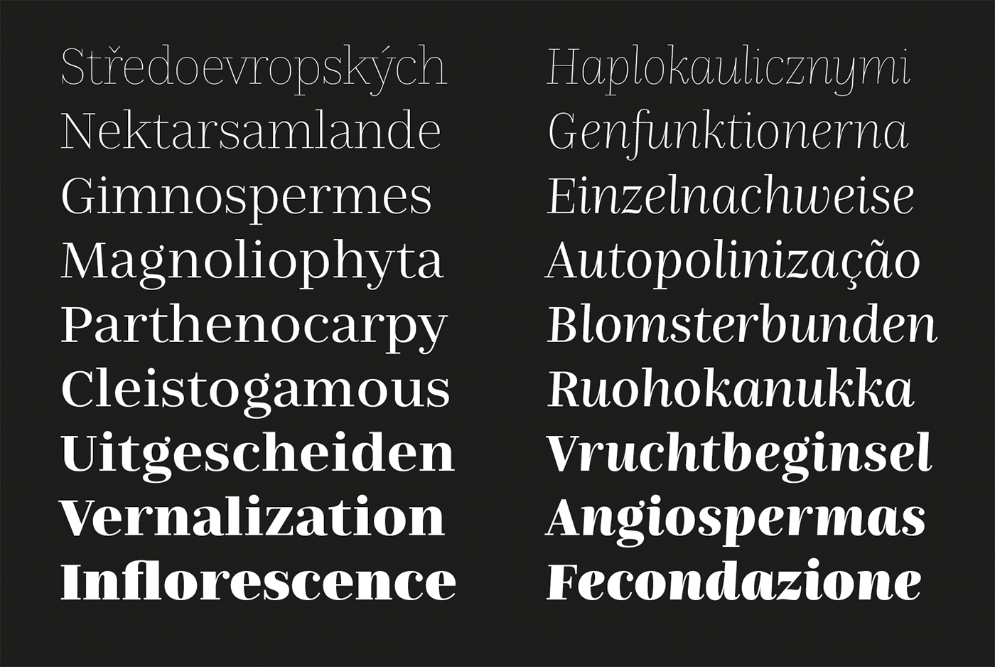
FS Kim (FontSmith)
by Krista Radoeva
If you’re not following Krista Radoeva on Instagram, then I highly recommend doing so because you will be treated to some lovely details and behind the scenes sketches of Radoeva’s process. FS Kim is a robust (no wait, exuberant) family with a range of text and display options as well as uppercase inline styles in Regular and Black. I can’t wait to see where FS Kim ends up in the world, perhaps your next branding project?
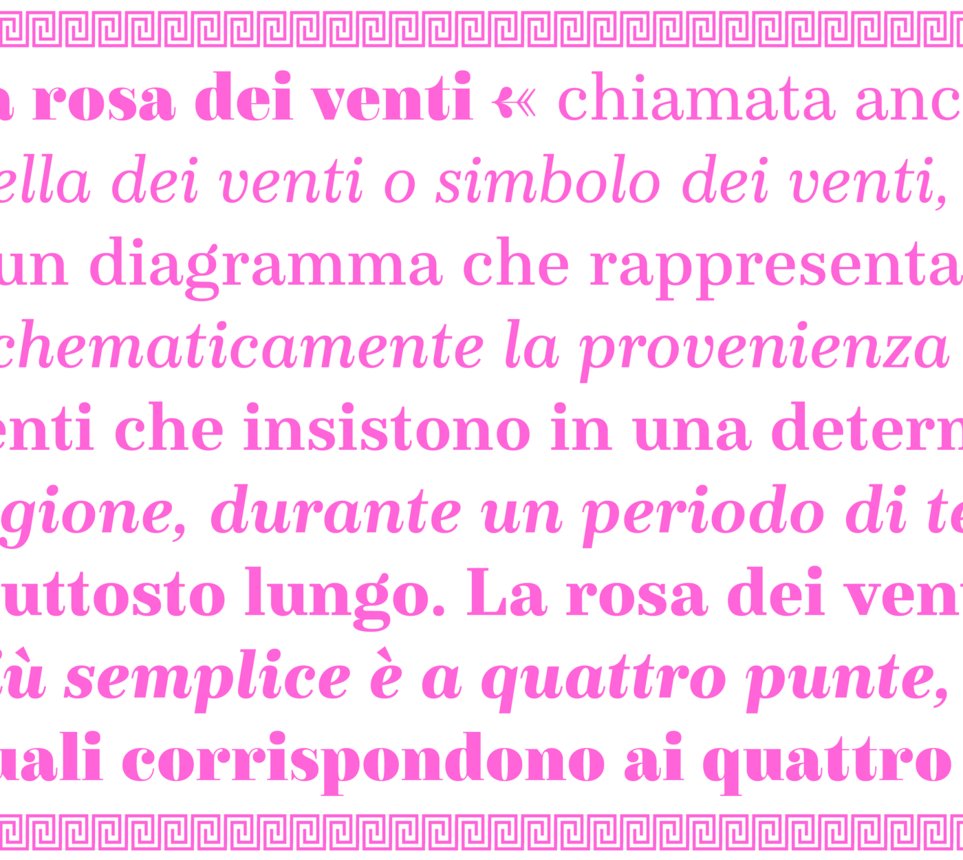
FS Ostro(FontSmith)
by Alessia Mazzarella
If you’re looking for a Bodoni alternative, check out FS Ostro. Inspired by “the 19th century British Scotch Roman designs, Italian modern style typefaces and highly contrasted display Spanish examples”, these combined influences give the family a refined feel. Also, the display styles are Italian chef-kiss dreamy.

Adelle Sans Devenagari (TypeTogether)
by Vaibhav Singh, José Scaglione, Pooja Saxena, Erin McLaughlin, and Veronika Burian
Five years in the making, Adelle Sans Devenagari is a welcome addition to the Adelle catalogue. Maintaining the spirit of the Latin, Adelle Sans Devenagari comes in seven weights “that capitalise on legibility and provide the designer a wide range of text emphasis within their layout.”
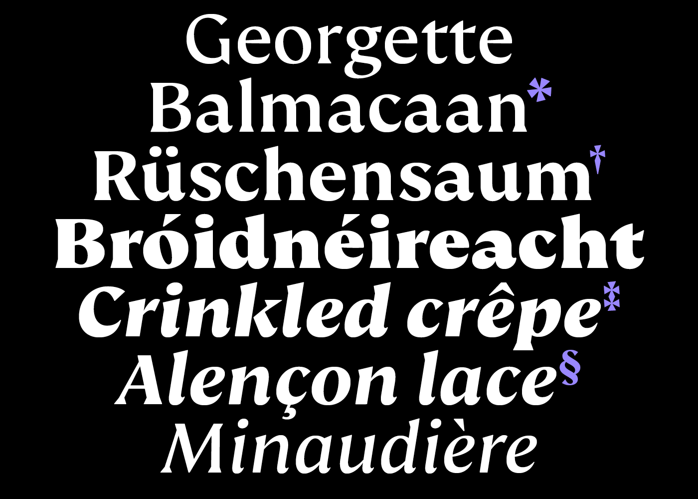
Nomada Didone (Tipografies)
by Maria Ramos and Jordi Embodas
Nomada Didone is part of the much larger Nomada family which includes Sans, Serif, Slab and Incise. This cut “exhibits a more pronounced contrast than Nomada Serif, with vertical stress and finer hairlines.” The rhythm of the italics are particularly striking.
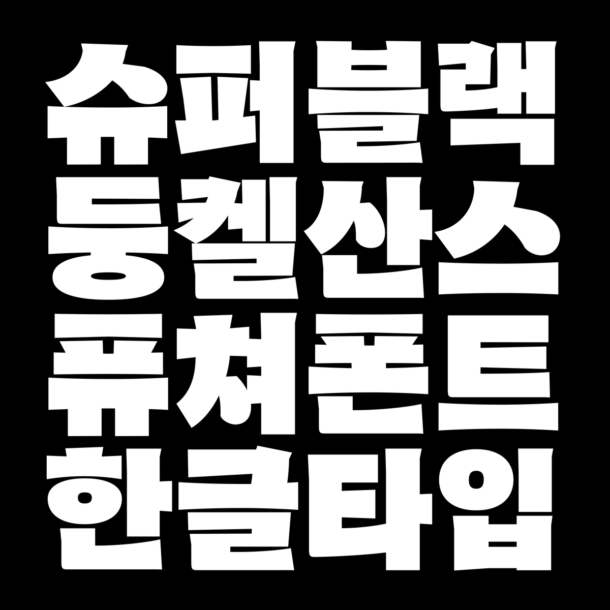
Dunkel Sans (FutureFonts)
by Minjoo Ham
Dunkel Sans explores “the limits of how black a Hangul typeface can be.” This article (in Korean only) gives a nice peek into Ham’s process and thinking (I also love that a description of Future Fonts is translated as “a US font roasting program” — thanks Google Translate!). I’m looking forward to the beefy Latin when it’s fully cooked.
Decorata (Positype)
by Martina Flor and Neil Summerour
It’s hard to believe it’s taken this long for Martina Flor’s lettering to become a typeface but some things are worth waiting for. Ornamental lettering by Martina Flor is brought to life in an eight style type family by Neil Summerour. Combining different styles offers a variety of lovely possibilities. The next time some cranky pants designer asks you why color or animated fonts are necessary, you can point them to Decorata — the family clearly shines with different color palettes, layers, and in motion.
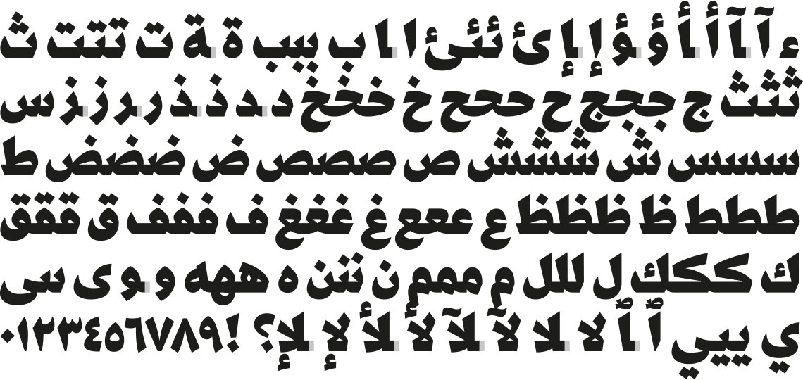
Kafa
by Nadine Chahine
While using “the resistance” to market fonts feels a bit icky to me, Kafa is a true rallying “cry against the politics of hate and xenophobia.” Released on November 6, 2018, the date of the mid-term elections in the United States, Kafa (enough in Arabic) protests the current US president’s shameful policies in the Middle East. I appreciated following Chahine’s process on Twitter and the font is now available for free on her site.
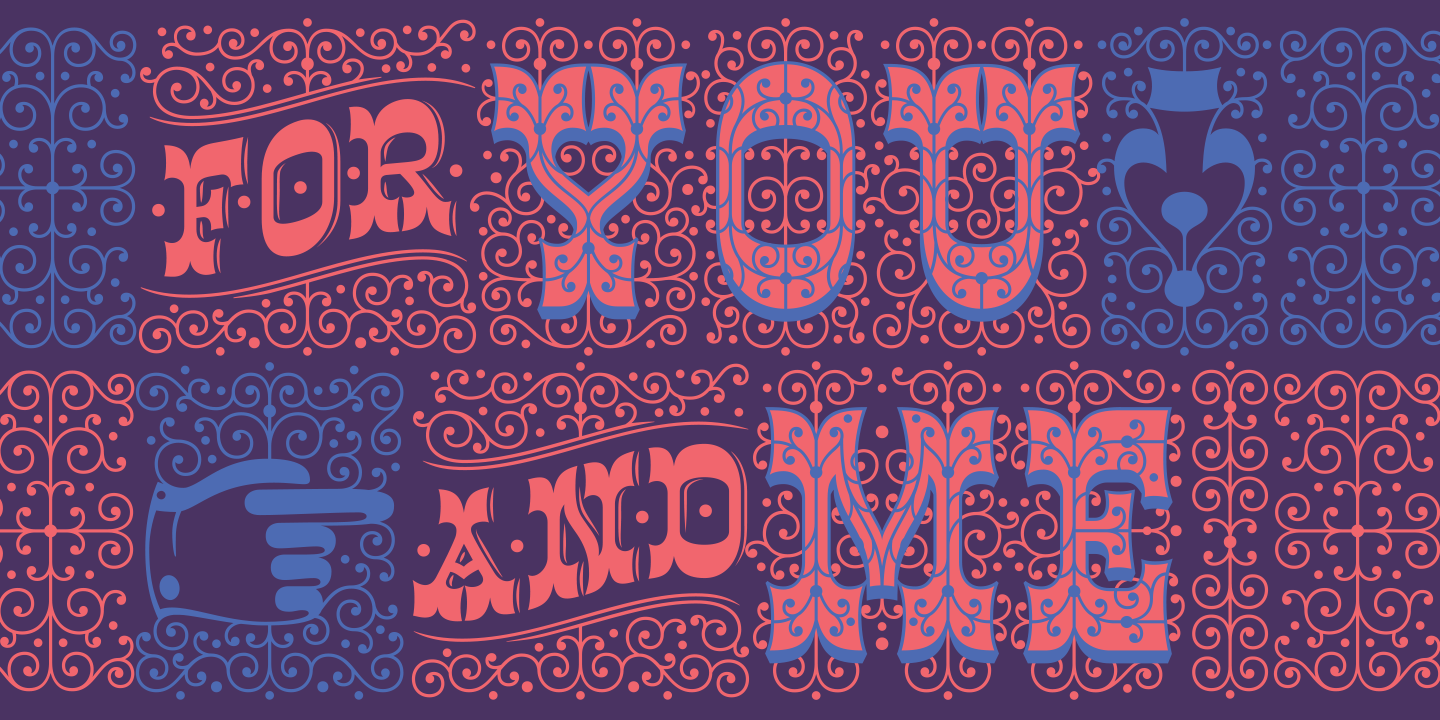
Decoupe
by María Carla Mazzitelli (Sudtipos)
Decoupe is reminiscent of jagged-edged faces like Pilot but holds its own with its nods to “gestural graphic expressions — like paper cut-outs (découpes) and spontaneous handwriting”. I’m especially drawn to the italics and thinner weights and I hope we can convince Mazzitelli to publish it as an Alphabettes.org header one of these days (no pressure!).
Know of any other recent releases that deserve a little 🎺? Comments are open!