
In a prison cell in Turkey sits an award-winning artist and visual journalist. With little sunlight and few materials, he creates astonishing art. This powerful essay by Greg Manifold, creative director at The Washington Post, tells Fevzi Yazıcı’s story.
I am breathtaken at Fevzi’s courage and persistence. His latest artwork, limited to pencils and pens, is astounding. I think of Viktor Frankl’s words: “What then matters is to bear witness to the uniquely human potential at its best, which is to transform a personal tragedy into a triumph, to turn one’s predicament into a human achievement.”

Speaking of human achievement, some days I struggle with finding meaning in my line of work. I draw letters. My husband is working on curing cancer. The disparity, for me anyway, is writ large. Very rarely does a typeface change the world—Bell Centennial, which increased legibility while saving countless trees, is the only one that springs to mind. Don’t get me wrong, the satisfaction of delivering something pleasing to a client never gets old. But I possess a deep need to do something more impactful for the world around me, a need that is mostly fulfilled by leading hikes for new parents once a week. But I digress.
One of my favorite books is Man’s Search for Meaning by Frankl. Written in 1946, its use of the word “man” when the author likely means “humanity” or “person” is dated, but this is its only blemish. It is the memoir of a psychotherapist imprisoned in concentration camps during the Holocaust. During his time there, Frankl refined his theories on what brings meaning to people’s lives: creation, experiences, and suffering.
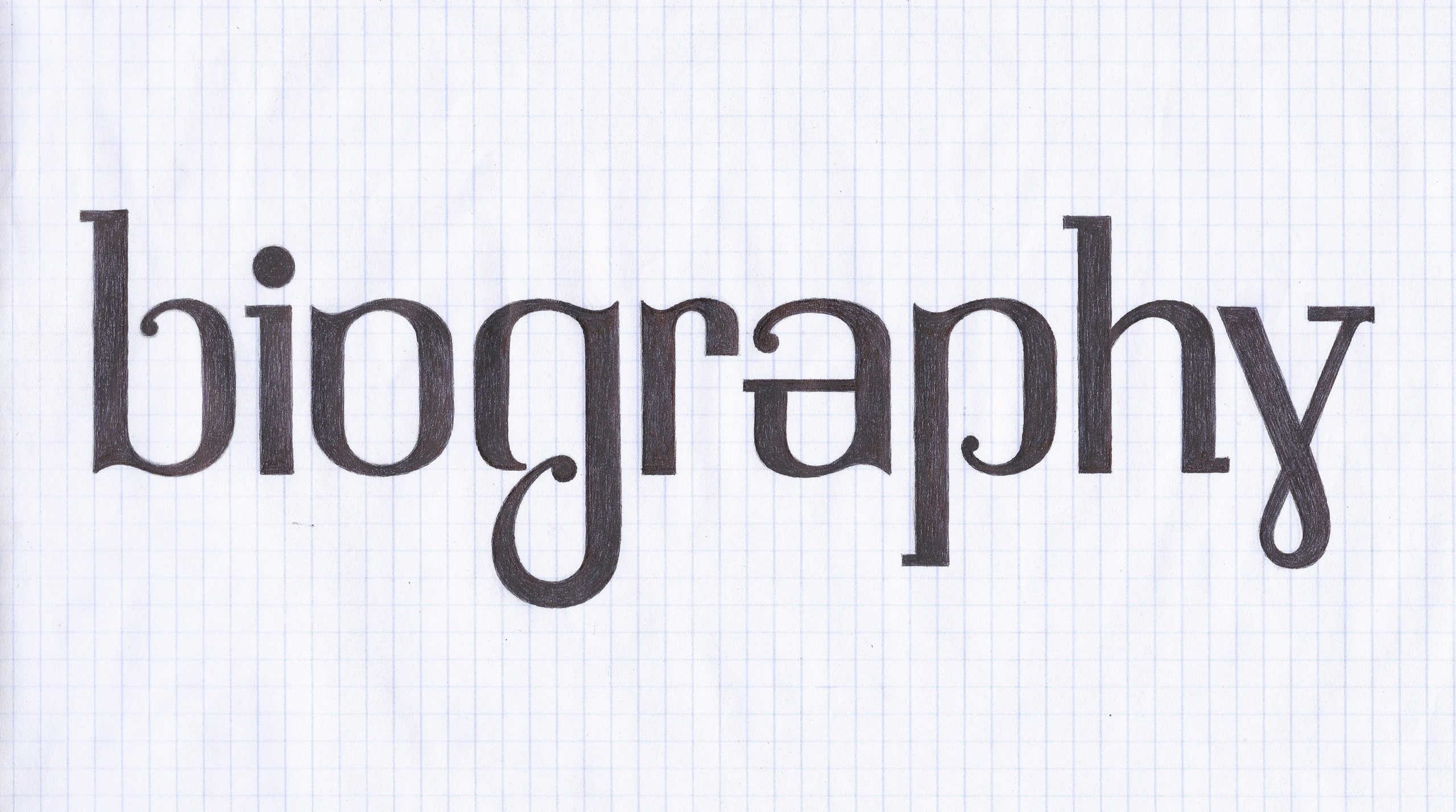
Fevzi creates. He makes beautiful, thought-provoking illustrations with no more than a ballpoint pen. His letters read like poetry. Now, he has created a typeface. “Despite the difficulties of working with a simple pencil, an ordinary paper, an eraser, and very little light, I am quite happy with the results,” he wrote. “I’ve wanted to design a font for as long as I can remember, but it was not destined to be attempted until I have been imprisoned. Even though I designed a lot of logotypes, to design a font from scratch and in whole was such another thing,” he wrote in a letter to fellow Society of News Design member Roger Black.
“My kind request,” Fevzi continued, “depending on your availability, is to examine the current state of the design and to share your expert critics with me. You can be a partner of this small journey.” Roger shared this letter with a few of us at Type Network. I wrote in my response, “I am touched by your situation and your dedication to creating art… for people like us, creation is a big part of giving meaning to our lives. With that in mind, it is my honor to assist you in creating this typeface. It is beautiful. Helping you realize your vision would bring meaning to my life.” It may sound bombastic, but it is true.
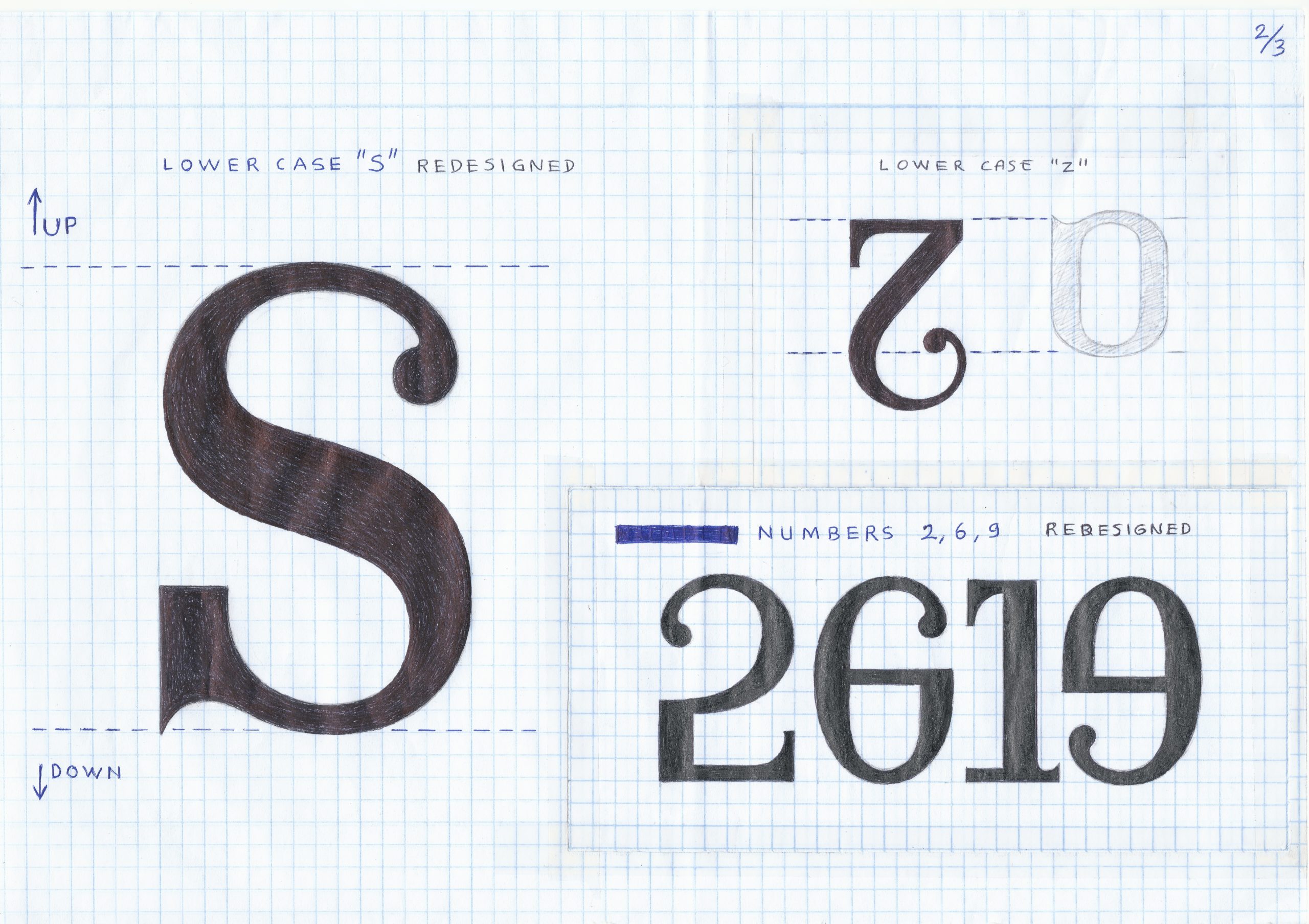
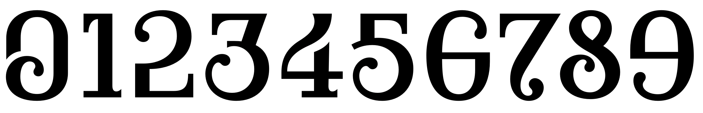
Fevzi is an enormously talented man with a keen eye. There was very little that I needed to do to make his drawings into a working typeface. I adjusted the width of some of the letters in order to create a more consistent rhythm when reading. There were other minor adjustments, such as making the measurement of the stems, thins, and serifs more consistent across all letters. The period and comma are a bit larger than the original sketches. It breaks several rules of font design, and it does so in such a way that it still comes together. Sometimes the axis is horizontal, sometimes it is diagonal. Originally, it had both teardrop and ball terminals—both looked nice, but we opted for teardrops, given the exquisite shapes in the figures.
My instinct was to make some elements more consistent, although I recognized that the quirks were part of the font’s charm, and perhaps very intentional. As a finished product, one can still read it without getting too distracted, even at smaller sizes, which is surprising for what is meant to be a display face. It is beautiful, dignified, and legible.
Fevzi creates, but he also finds meaning in a fundamental experience—love. This font, Firdevs, is named after his wife, whose name translates to “heaven.” I think again of Frankl: “For the first time in my life, I saw the truth as it is set into song by so many poets, proclaimed as the final wisdom by so many thinkers. The truth – that Love is the ultimate and highest goal to which man can aspire. Then I grasped the meaning of the greatest secret that human poetry and human thought and belief have to impart: The salvation of man is through love and in love.”
I will never find the words to fully express how I feel about Fevzi’s situation. What matters most to me is that we tell Fevzi’s story, and learn from it. “I have a dream,” Fevzi wrote. “How nice it would be if the works of all those authors and illustrators who are trapped and oppressed behind the walls could have been published with this font. As I have said, this is a dream and dreams are boundless.”

Find Firdevs here. All proceeds go to the Yazıcı family and Reporters Without Borders. His work is currently on display at The Hillstrom Museum of Art in St. Peter, Minnesota. The typeface’s first use is in the poster and catalog for this show, Fevzi Yazıcı: DARK WHITE.