The first 8 reasons to read Accessibility for Everyone by Laura Kalbag

These are eight of the many highlights and corresponding notes made by me—a typographer, mostly for print—upon reading Laura Kalbag’s book Accessibility for Everyone released last fall by A Book Apart.

1. “…everyone uses the web quite differently.”

Perhaps obvious. But we all know about what happens when we assume and assumptions are at the root of problems related to accessibility.

Continue reading

Ella Cursief

The year is 1915 and the typeface is Ella Cursief. While the name might imply that it is intended for the ladies that can’t be true because women do not even have the right to vote yet. Honestly, this is a typeface that simply cannot be pinned down by something so mundane and banal as a stereotype.

Continue reading

Tiffany Loves Graveyards

For as long as I can remember I’ve enjoyed going to graveyards. Why? Because I’m a romantic at heart. You see, in my view, headstones are the final opportunity for the living to write a love letter to the deceased. Of course, the loved one didn’t carve the actual letters but I like to think that choices were made that allowed the individuals to put their personal stamp of pride and uniqueness on the headstone.

Ferndale Historic Cemetery in Ferndale, California

Ferndale Historic Cemetery in Ferndale, California

Continue reading

The Story of Perpetua

This essay relates the origins of the typeface Perpetua and Felicity italic which were designed by Eric Gill and produced by The Monotype Corporation. Although the type and the collaborators are well known, the story has had to be pieced together from a variety of sources—Gill’s and Morison’s own writings and biographical accounts. There are accounts similar to this, but none could be found that either takes this point of view, or goes into as great detail.

PDF (1.3 MB): The Story of Perpetua

This was originally submitted by Tiffany in partial fulfillment of the requirements for the Master of Arts in Theory and History of Typography and Graphic Communication, at the University of Reading in 2000.

Magasin By Laura Meseguer

magasin1

To say that Magasin is not your average script font is stating the obvious. It is quirky and totally irreverent. It sits stock-straight upright and follows very few rules when it comes to connection between the letter­forms. You get a real sense of Mid-Century Modern and French perfume packaging, along with the echoes of Quirinus/Corvinus and Fluidum in its contrast and terminals.

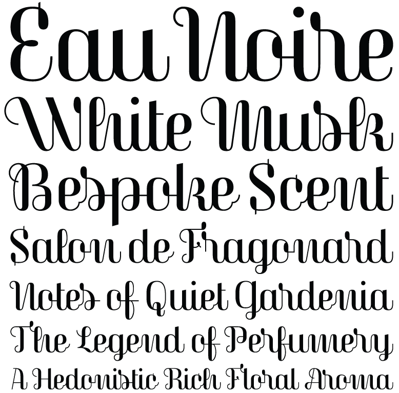
But don’t confuse Laura Meseguer’s Magasin for some dusty script revival. It is rigorous and modern, por­tray­ing a fierce independence as it easily sets itself apart from all the script fonts being released right now, dancing to its own atonal, syncopated rhythm.

Anyone daring enough to use Magasin will find a useful amount of alternates, ligatures, and swashes that create captivating and playful word shapes. (If anything is missing, I’d say Magasin could use more terminal forms.) I can imagine it deployed large in magazines and small on packaging. Don’t worry about the unorthodox letter shapes; instead, consider them an asset, because they will make people look twice. Additionally, the proud x-height assists, along with the context, in making Magasin legible enough at text sizes.

If you want a taste of what is possible, check out the specimen Meseguer created, along with the article she wrote for I Love Typography. They clearly dem­on­strate the different things that are possible with this idiosyncratic typeface design.

Specimen image made for Typographica where this review appeared previously.