Who is an industry leader?

a white coffee mug with the text, Industry Leader, set on it in the font Lobster

Who is an industry leader?

What makes one qualified to use this title? Is there a certain amount of time someone needs to be professionally active in a field to call themselves one? Is it others’ perception that matters? How are these concepts tied to gender, class, race, geography? Why do structures exist to perpetuate the use of the term and why do we think this is acceptable?

I’ll be sitting here thinking about these questions while sipping my tea.

Font licensing, webfonts and fair trade

A few weeks ago, I had to advise a design studio on licensing fonts. It is a common practice since different foundries and distributors handle licenses in many alternative ways. What may be complex for us, who work in the type industry, can become a nightmare for font users and design studios that acquire licenses for their clients. Some have made an effort in simplifying font licenses but webfonts is still a case worth discussing.

From all the types of use you can make of fonts, the web is probably the format where we find more differences, both in the licensing model and the pricing. Some articles offer information on the topic and compare the different licenses available. I was surprised to note there is little debate or discussion on this.

In terms of pricing, we can differentiate two main models for licensing webfonts, “pay as you go”—I call it a subscription to be less ambiguous— and “pay once”.

Before writing this article, I wanted to get a first impression of people’s positions so I did a quick poll. The question was simple and plain—with all the ethics implied in the word “unfair”—Do you think the annual subscription model for webfonts is unfair? I acknowledge I positioned myself when formulating the question, choosing the word “unfair” instead of “fair” and offering two affirmative options but only one for disagreement. The results of the voting are almost balanced, 41% think the subscription model for webfonts is fair—not “unfair”—and 59% agree this is an unfair model. A considerable percentage of people (32%) voted strongly on this, thinking the subscription model for webfonts is a scam. Needless to say, when I ask about “fairness”, I consider all the people involved in the trade (font distributor, font author, buyer, licensee and font user). It is impossible to think about fairness if not fair to everyone affected.

I will briefly describe the experience that made me especially reflect on this. A design studio wanted to license a webfont for a client. The budget for the project was limited, having a maximum amount for licensing fonts. They presented the proposal using trial fonts and calculated the license cost to fit the estimate. The project was approved. While buying the font licenses, they discovered the cost for the web was a recurring payment, tying the client to the distributor and exceeding the budget over time. They trusted the platform they often used for licensing fonts and they didn’t check in other places. While studying this case I could confirm the font was also available from other distributors and on the foundry site. If they were acquiring the web license in MyFonts, they had to commit to an annual payment (e.g. one font 37€). Meanwhile, the foundry site and other distributors offer the license as a one-payment purchase (e.g. one font 39$). The price is similar in both cases, which means the subscription model is never cheaper, not even in the unlikely case of using the font only for a few months. Would you consider this fair trade?

Many questions come to mind when reflecting on this. Why do licensees have to be dependent on a platform/company? What if the company goes bankrupt, is sold, or changes the subscription terms? Why make a periodic payment? Are the distributors guaranteeing and offering updates on the fonts or any extra services—besides hosting? If so, does the client need that? Also, some distributors include two options for webfonts licenses, “pay once” or “recurring payment”. In these cases, why is “one payment” so expensive compared to desktop fonts? I would be interested to know the math and reasoning behind this pricing model.

If you ask me, I would say webfont subscriptions are not fair, especially to the user. It makes them dependent on a particular company/platform and very often expend more money over time.

Protest Scribes

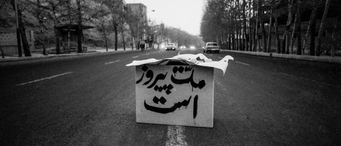
“The nation is victorious”, The revolution of Iran, approx. 1979–1980 (43 years ago)

Protest art refers to the artistic works created by activists and social movements. It is a traditional means of communication used by a cross-section of collectives and the state to inform and persuade citizens. The slogans of the revolution, movement, or demonstration are written on walls and buildings while the writer is in distress. This usually occurs at night in the cover of darkness. The scribe is not worried about letterform correction or aesthetics, they aim only to express themselves by writing their thoughts on the surface and informing the public. But their action surpasses this; they are creating art. They represent a specific cause or message from furious people that need to be heard. Protest art is an essential technique for increasing social awareness and developing networks. It has long been a powerful platform for conveying ideas to the masses, as it can promote conversation and highlight social, political, and environmental issues.

Continue reading

Thai Type Tourist

The population of Thailand is around 70 million people, 11 of them living in Bangkok alone.

Thailand is home to 71 living languages. The 2014 Ethnologue country report lists one national language (Thai), one educational language (Isan), 27 developing languages, 18 vigorous languages, 17 threatened languages, and 7 dying languages.

“Thailand has experienced the gravitational pull of Europe over the agitations to do with becoming ‘modern’. Yet, it has never been formally colonised” by Rachel V. Harrison and Peter A. Jackson.

 'Chiang Mai' in orange script lettering

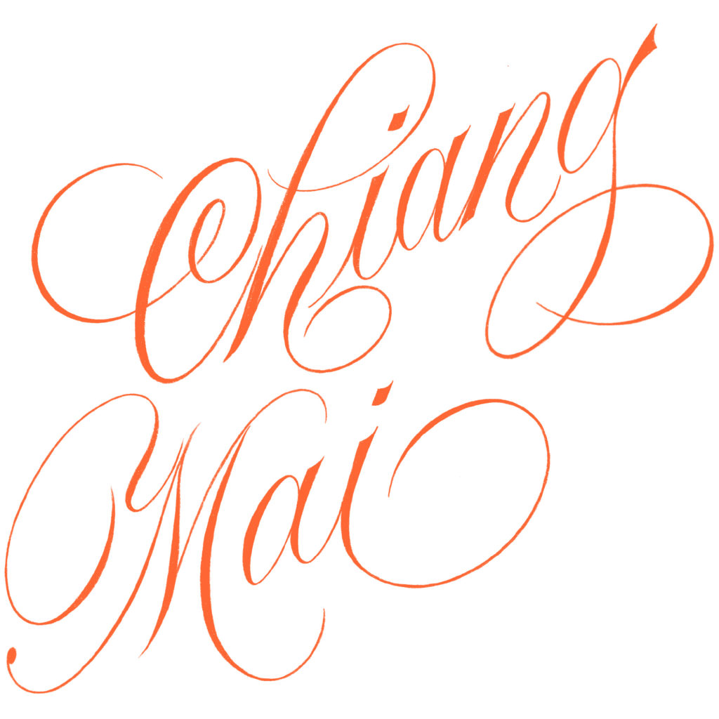
On July 19th, my partner and I moved to Thailand for one month while working remotely.
Continue reading

New borders: the working life of Elizabeth Friedlander

I first heard of Elizabeth Friedländer in an article about early female typeface designers. Using some of the typefaces mentioned in the text I decided to prepare a few images for our Instagram account. That personal exercise opened the door to extra information about the names included in the article. There was an exhibition on Elizabeth’s work at the Ditchling Museum (England), and Katharine Meynell had released the film Elizabeth in 2016. While looking for more information about her I also found the book I am writing about today. This book, letterpress printed and bound by hand, was published as a limited edition of 325 copies. A couple of months ago—coinciding with the launch of Women in type—I finally found it online and was able to read it. The University of Victoria Library scanned the pages and made the book available for all.

The book is full of reproductions of her work, not only finished and published projects but also drawings and documentation of her design process. The author tells us about her life’s path, moving from one country to another, and finding ways to nurture her career as a designer. The text includes insightful quotes from personal documents and imagery from the material she carefully preserved, allowing us to know about her work and career through primary sources.

Rough work in Indian ink for different projects

Continue reading

How to find your inner compass as a lettering artist

Recently, Dominique Falla asked me to be part of Typism’s new podcast series, and talk about the concept of inner compass. After the recording was done, I realised that the notes I prepared for our interview could be valuable for many designers in the visual communication field, and not only for the ones interested in lettering. Below are my notes for anyone who’d find that useful.

What exactly is an inner compass? 

For me, an inner compass is a set of principles to guide you through life and work, and to help you understand what things work and what things don’t work for you.

Continue reading

Reflections on THAT article

One of the things I have thought about since that article came out is why I read that article the way I do, and why others did so differently. I am someone who would both benefit and is restricted by what this article puts forward as an action in point #4. How do I deal with this contradiction? India is home to a lot of scripts and languages. I have lived in various parts of the country and in doing so have had to learn a few of the languages spoken in those parts. My fluency in those languages today is at varying levels. How do I engage with the many scripts that I am familiar with? Can I design for one of the native scripts that I grew up with, which is different from the one I am most comfortable with? Everyone’s worldview affects the way they understand things and I realise how mine has affected my own understanding. This point makes me uncomfortable too. So I push myself to sit with this discomfort. Which is what has brought me to try and view this contested point #4 in non-binary terms. When people are expressing themselves in unfamiliar ways, I assume that my work is to understand their point and that healthy boundaries are essential for everyone to flourish. Allow me to explain this further.

When I read “We need to discontinue the practice of designing for scripts we did not grow up reading and writing for custom/client projects,” I not only think about who else apart from myself will benefit from this action but also who is going to enforce this “Action”? Who is going to hold people accountable? There is no governing body that will penalise people if they do not comply. There is no one who will enforce this “call to action”. It is up to one’s own discretion. This point #4 is at best a request. Maybe it’s important to question why you might read it as an order. Why might you have gotten so defensive about being asked to respect a boundary? Did the discomfort stem from the fear of losing power, privilege, and comforts? Or maybe the fact that it came from a group of women? Would it instead be helpful to reflect on how resistance to foreign ideas can get in the way of a common goal? There is no benefit to pedantically dissecting the article and really no objective response to this call to action.

Additionally, while you have the right to feel uncomfortable, others have silently put up with the discomfort of countless microaggressions and injustices. Not every person experiencing systemic oppression has the benefit of having access to a platform that allows them to speak their mind. They might not have the vocabulary or the ability to articulate the way they feel about this. You have the benefit of reading what I write here because of my relative position of privilege in my own country. Simply growing up in a house that spoke English gave me access to opportunities that are not available to a majority of the people I have studied and worked within my country. This access is not universal even internationally. It does not escape me for one moment that there are far more intelligent and talented people who have not had the luck and opportunities I have enjoyed. I can make valid claims of hard work and effort that I have personally put in, but I also know how much my circumstances have allowed me to reach where I am. Is it correct to label someone that has relative privilege as an inspiration or role model when only a few of us make it past the hardships of a system that has been designed to exclude us? The myth that we are deserving of our successes because we have worked harder than others needs to be put to rest. It incorrectly implies that those who haven’t achieved it have only themselves to blame. Certain groups of people shouldn’t have to work harder than others to feel like they’ve earned their place in life. We shouldn’t uphold the systems that made our own journeys difficult.

And sure, all of us have worked hard to get where we are, some just happen to be born in certain countries that have given them an undeniable advantage, primarily because of their countries’ past actions. All this is of course not fair to anyone involved. But, fairness has always been relative. Maintaining the appearance of fairness that results in a gross distortion of reality. The Mercator projection is an example of this “fairness”. It distorts the size of places and makes countries in the Northern hemisphere look like the size of continents. Yet it is still an accepted way to illustrate maps. Should that continue being the norm just because changing it will make people living in some countries feel uncomfortable? Or change the status quo? Just because someone feels a certain way or there is an accepted way to get things done, doesn’t mean we must not question it. Just because someone feels a certain way, doesn’t mean it correlates with the truth and lived experiences of other people. It might be helpful to enquire the reason why positions of importance in type design are dominated by people who are not native to that script rather than people who have grown up with it? And how can you help change that? It is this discrepancy that the article was addressing. Currently, the global economics of type design do not allow someone to enter the field easily, and even if they do, sustaining themselves purely on this craft is difficult. This is true for everyone but this truth is significantly harsher for people who come from countries with weaker currencies and restricted passports. There also happens to be an overlap in people with weaker currencies and passports and those who are underrepresented in type design. It should also be acknowledged that these are not the only factors that contribute to the underrepresentation of marginalized people in type design, since this is still a problem within Western countries. My experience, however, allows me to talk about factors affecting those outside of Western countries. Scholarships and mentorships can only take someone so far.

The ability to express my ideas stems partly from the very privileged upbringing I have enjoyed but some of it is also learned by consciously unlearning and re-educating myself about political and social and economic issues that affect those who have not had the same experiences I have. Additionally, I am extremely grateful for the benefit of a support system of friends to have heard me out, especially the many women who have trusted me with their stories, some of which are similar to mine and make me feel less alone and more courageous to write mine publicly. I have tried not to generalise my views, but hope they have allowed you the benefit of insight to something beyond what you felt when you read the article. It asks an important action from you. It’s not easy but we cannot put ourselves in the centre of that decision. The article asks the type design industry to take affirmative action that will benefit those it is intended to help. I hope we can reflect on the ways we can contribute and help facilitate this change.

Reflections on “It’s Time to Act”

Alphabettes is a diverse group of women from across the globe with a variety of backgrounds, views, and life stories. The article “It’s Time to Act” is an example of a collaborative effort aiming to respond to recent events and to raise difficult questions that our industry needs to engage with. Difficult questions are by nature controversial and are often highly emotive. One such question is the one raised in point 4 which calls for designers to stop taking design commissions for scripts they did not grow up with. This article will examine this issue and focus on 3 key questions: Is a designer able to design for a script they cannot read? If yes, should they? And finally, how can we as an industry support designers who come from disadvantaged backgrounds?

There are many advantages to designers who are designing for their native script. They can read the language and are immersed in the visual culture. Does being native to a script make one a good type designer? No, there is a lot more to being a good type designer. Conversely, it is quite possible to be a great designer for a script one did not grow up with. Tim Holloway is the designer of excellent Arabic typefaces such as Markazi, Adobe Arabic, and Mitra. Adobe Arabic is one of the best contributions to contemporary Arabic type design and Tim has been at the leading edge of the field of Arabic type design. His contributions are of great importance and should be celebrated. Tim is just one of many designers who have dedicated their careers to the development of scripts they are not native to. Designing for a script one did not grow up with requires a lot of research and effort. One needs to show respect to the culture, the script and its aesthetics, and the contemporary discourse on its design. These are difficult tasks and designers who embark on this journey often invest a lot of time and effort to expand their knowledge.[1]

This leads to the next point. If a type designer has invested significant effort in learning to design in a new script, should they reject requests for such designs? In other words, are they expected to do all the learning, but not be able to make a living out of that new skill? The article states that this is to not take work away from BIPOC designers “who come from regions and cultures that have long been exploited for financial gain” and while this is a noble sentiment and made in good will, it draws borders within the type design world when we urgently need to work together to improve the development of type design worldwide. Others might disagree, but we need to accept that many of us do not want to draw borders and that we stand to benefit from a collaborative approach to type design rather than a protectionist one. Further, the circumstances of one’s birth should not limit one’s career options. A type designer who has spent significant effort to learn a script they did not grow up in, should not be turned away from the door because of the colonial past of their country of birth. If anything, we need to engage in what the late Edward Said called the dialogue of civilisations rather than the clash of civilisations. These are difficult conversations to be had particularly because of the harsh legacies of colonialism (past and present) which have decimated whole regions in ways that are difficult to recover from.

In practical terms, if a designer gets commissioned for a script that they are not native in and they would still like to design for it, one option—and others will be able to come up with other solutions—is to team up with a native designer and work together. This would be an educational experience for both parties and can help fill the gap for those scripts where there is a serious lack of native designers, or where the native designers need opportunities to further develop their skills.  Let me give one example from my own experience. When I joined Linotype in 2005 as a very inexperienced designer, I met Prof. Hermann Zapf, who suggested we revive his Al-Ahram typeface to add to the Palatino nova family. If he had simply passed on the work, I would not have had the chance to learn from him and this opportunity has changed my entire view of typeface design. We’ve made many strides in Arabic type design, but there is still such a big gap that we need many designers to step forward, whether for library or custom jobs. Similarly, many of the world’s scripts barely have any fonts available and there is much work to be done.

Finally, type designers who come from disadvantaged backgrounds face many barriers, whether they are BIPOC designers living in the Western world, or designers who are living in post-colonial countries. The structural power that has exploited both persists today. But to view them solely through the lens of racial subjugation is to deprive them of their own agency, their ability to forge a path forward, and to grow and prosper. This does not mean that the structural barriers should be ignored or forgotten, but rather that one can open new paths that form new structures of cooperation rather than structures of exploitation. There are many things one could prescribe to support designers from disadvantaged backgrounds: educational opportunities, scholarships, collaborations, mentorship, and so forth—but there is no easy answer as to how to overcome decades and centuries of injustice. Still, it all rests on one basic premise: respect for the Other, despite differences in gender, race, sexual orientation, or socio-economic background. Everything else builds on that.

The type design world is blessed with amazing individuals, a collaborative spirit, and an active and engaged community. It is this sense of togetherness that can help to expand this space to be more inclusive. The times we live in are challenging and are bringing up difficult questions that are hard to process. There will rarely be one right answer, and we will very likely disagree. However, the answer is not as interesting as the question itself. We could each come to our own conclusions, but we have all recognised that there is a bigger issue that needs addressing: the openness of our design space. Even if each of us pushes in a different direction, the result is a bigger space, richer and more diverse because of the variety of life paths and world views present.


[1] There is one important caveat here. Once we cross into the conversation about typography and graphic design, the presence of a designer on the team who is able to read the text is paramount because we are then operating in the realm of language, visual hierarchy, and how the audience will read the text laid out in a poster or a book. While this is tangential to the topic of this article, it is important to recognise the complexity of how we deal with type and that the answers that work for one scenario, the designing of typefaces, might not be the same across all instances dealing with type-related design.

It’s time to act

The Alphabettes community is, at its heart, political. We are a global network of women, connected together by our love of letters, type, and typography. Our objective is to champion anyone who identifies as a woman in type, provide a platform for them to show and share their work, and welcome them to a community that will not ignore their voice, but amplify it. Alphabettes started through the joint effort of Indra Kupferschmid and Amy Papaelias in 2015, and since then the network has grown to include over 245 members worldwide. As a community, we aim to respect and reflect on the opinions of all of our members, and we continue to learn and grow together.

During the last two weeks and following the tragic murder of George Floyd at the hands of four Minneapolis policemen, the United States of America saw a powerful uprising opposing discrimination, violence, injustice, and systemic racism against Black people, the impact of which quickly rippled through the rest of the world. In a time when much of the world has retreated into their homes and maintaining social distancing has become a necessity for health, the urgency of protesting racism and discrimination and demanding justice has eclipsed a quiet survival. Since then, crowds of protestors have taken to the streets, statues glorifying racial bigots have been pulled down, and social media platforms have seen an overwhelming sharing of educational, supportive, and encouraging discourse regarding this call of eradicating racism. Donations have been made to individuals and organisations supporting this movement. No action is too small.

For a network like Alphabettes, we truly deliberated what tangible steps we could take to address the current situation, and show a palpable collective condemnation of racism. As a global network, we feel the devastating violations of human rights worldwide on a near-daily basis, whether they affect ourselves and our loved ones, our members and friends, our contributors, or those who follow our work. Because of this, we know that it is a constant battle to fight injustice and voice our outrage surrounding racism, discrimination, and oppression. As individuals, we have strived to reflect this, each to the best of our ability and on matters closest to our hearts. As a community, we take care to always be inclusive, and part of this inclusivity is to not disregard suffering in any part of the world in favour of another, whether it is Yemen, Syria, Hong Kong, India, Chile, Egypt, Lebanon, the USA, or elsewhere. The list is upsettingly long. Because of this, rather than simply declaring that we do not tolerate racism, we have decided to use this moment of collective reflection to listen, to look inwards and at ourselves, and to then take a step back and look at our industry, and ask what changes we can make today to address the bias and appropriation that have regrettably become a normalised and acceptable part of the type and typography profession. We have reached a list of points of action we can take today. It starts with each of us, and again, no action is too small.

1.

We need to actively include more BIPOC in our events, conferences, and communities. While the value and importance of diversity at conferences is widely understood, it is very clear that there is still much work to be done to achieve true inclusivity and accessibility. It is on all of us – particularly conference and event organisers and sponsors – to seek out diversity amongst the speakers, those holding workshops, and the attendees. As the organiser: Did you reach out to a wider circle of people within the industry for speaker suggestions? Did you prioritise lifting up speakers of colour? Did you set out a clear and easy to find code of conduct on your event page to guarantee a safe and inclusive environment for all participants? Did your code of conduct clarify zero tolerance for harassment of any kind? It is a heavy responsibility to take on the task of organising an event, but if done with careful consideration, it can ensure a richer event where everyone can learn from a wider range of expertise. This however does not end with organisers. As a sponsor: Did you use your privilege to insist on a diverse lineup of speakers? If no, why not? It is well within your rights to enquire on these matters. As a speaker: Did you get invited to present at a conference and find that the lineup of speakers was particularly pale? Did this bother you? Did you get in touch with the organisers and voice this concern? Did you step away from the presentation as an act of solidarity if your input on this matter was not appreciated? Was the event made accessible to all? Were earnest steps taken to ensure that minorities and attendees from diverse backgrounds were able to attend? These are difficult questions, and it’s hard but necessary work for an industry that wants to be truly diverse.

At Alphabettes, we recognise we are not outside of this; we have always aimed for diversity among our members and community, but we will actively increase our outreach to BIPOC women, and challenge our own status quo. If you would like suggestions for speakers at your events, get in touch with us – we can make recommendations or help circulate a call for presentations. We have constantly made an effort to be part of the solution, and will continue to do so.

2.

We need to stop using the term Non-Latin. It is exclusionary, and loaded with bias. Prejudice or discrimination against a certain group is the very definition of racism, and as such there is no room for argument in favour of using what has become a shorthand that devalues and further marginalises all the scripts in the world in favour of one. Historically terms like Oriental, non-Roman, and other similar phrases were used by nineteenth-century printers and typefounders who required a marketable and easy phrase to set themselves apart from their competitors by boasting an expertise in the printing of scripts they had no in-depth knowledge of. Today, this phrase has become normalised in every sphere of the type industry: in conferences, offices, foundries, competitions, and educational institutions. There are arguments for this phrase being acceptable as it draws attention to the marginalised. Can we honestly accept that this is true? The phrase does not draw attention to Hebrew any more than Devanagari, Arabic, or Thai, but rather only re-centers the attention to what they are not: Latin. There are arguments for requiring a replacement phrase. To this we can only respond with a question: Why? Why does anyone feel the need to make this distinction at all? Is a non-Latin extension of a typeface not really just a multi-script expansion? Is it necessary to differentiate if someone is a teacher of non-Latin type design when Latin type instructors aren’t expected to do the same?

At Alphabettes, we are collectively dedicated to eradicating this offensive, Eurocentric term from our vocabulary, and all our past posts where it occurs. We also oppose any context in which various scripts are grouped together under an umbrella term. So, we will no longer be complicit in using this type of biased wording, we will rethink how we consider all scripts of the world, and hold ourselves accountable to using inclusive language. We invite you to do the same, so we can collectively make our industry welcoming to everyone.

If you would like to read more about this, we can direct you to Soulaf Khalifeh’s thoughtful piece What if Arabs Had Invented the Printing Press?

3.

We need to diversify educators, our students, and our curriculums. If you work in a university/college/design school of any sort and are in the position to do so, mention new position openings to BIPOC, or invite them as guest lecturers. Are you leaving your teaching position? If you are asked for recommendations for the vacant position, check your own bias, and think about how your position in recommending a new person can help diversify our community. Educators are big influencers on the next generation. If we have more diversity among educators, it means they will inspire more diverse students that see themselves in their teachers, and will subsequently aspire to more. As design teachers, what language are we teaching our students? Let us reflect back on the previous point; the casual use of the term non-Latin will lead to an inevitable amplification of the phrase by some students, and potentially offend others, who will often not feel they are in a position to confront us, their educators. So instead, they will sit with feelings of hurt and discrimination. It is incredibly effortless to avoid inflicting this discomfort on a young person that looks up to us. What values do we teach our design students when it comes to other cultures? Are we doing students that come from different backgrounds and want to better design typefaces for their scripts justice with our feedback? Did we try to connect such students with a specialised expert, and make sure that these experts were appropriately compensated and credited for their time and expertise? Very importantly: When did we last evaluate our teaching material? Is the traditional pathway of teaching type design through revivals of typefaces all drawn by Cisgender white men still valid? Is it time to rethink this approach and expand the scope to include the last century, or include non-book ephemera?

4.

We need to discontinue the practice of designing for scripts we did not grow up reading and writing for custom/client projects. Getting this work can be due to factors like our geographic or financial privilege or prominence within our industry. Whenever we get such opportunities, we should pass the project on to those that have the prerogative to take on the work as native users and designers of the script, and yield our position of power to those otherwise marginalised. Whether we are able to do justice to the design of this given script or not is outside the point of this post, however, we do encourage reflection on whether research on a script is the same as a lifetime of being immersed in it. This is a call to action and not a debate of this topic, so we will leave it with some food for thought from scholar Ayesha Chaudhry, who looks at this issue in the context of Islamic studies:

The study of Islam in the western academy follows the frames of these early colonialist scholars, where white scholars can presume to master and speak authoratively about Islam and Muslims. They can presume to know them better than they know themselves, to correct their knowledge about their own religion and traditions, based on “arms length,” “objective” study, treating their distance as an asset rather than as a weakness and shortcoming. In what other discipline is intimate knowledge of a subject, knowing too much about a subject, a drawback? Only in disciplines constructed around the imagined “other,” for instance in race studies. It never ceases to amaze me that whites presume themselves to be in an ideal position to study, examine, and judge racism, when they are uniquely unqualified for such study given that they have never experienced racism.

Beyond the point of whether it is possible to design for a script we are not intimately familiar with through cultural immersion, it is important to recognise that by taking on the design ourselves, we will inevitably be taking work and compensation from others, particularly BIPOC who come from regions and cultures that have long been exploited for financial gain. For a long time now, the use of native consultants in instances where the lead designer lacks nativity and thus ingrained knowledge of a script has been a band-aid over these situations: We are using a native consultant, so our design will communicate with its intended reader. At the same time, the wound underneath continues to fester; why was the consultant not given the work in the first place, if what they know is essential to the outcome of the design, if we needed hand-holding through the process? Who does this collaboration benefit? Do we even clearly acknowledge the help in the end, or do we publicly benefit from this exchange and claim our own expertise? These are uncomfortable questions, but we need to identify our own privilege, sit with our discomfort, and recognise that ignoring such questions is only possible because of our privilege.

Returning to our thread, if you work in an office and have a say in hiring new people, push for hiring designers that are native users of scripts you get a lot of work for. If you’re unsuccessful in this endeavor for reasons that are outside your power (hiring laws, applicant pool, etc) then recognise that those portions of the work need to be outsourced, rather than giving the work to others that may unintentionally impose their visual bias on another script, all the while taking valuable opportunities from those who have gained a large part of their visual language from growing up with said script. If, once you find the right person to take on the project, you recognise that they require additional support and guidance, be an ally. When you do collaborate with minorities, properly compensate and very importantly, credit them. Tell everyone about their work, because they deserve the recognition, and because it will help them to continue to get work. This is not limited to practical typeface design, and can also apply to type-related research. Reflect on your research and ask if you are the best person to take it on and how your displacement from your topic may have impacted your work. If you find the answer to be no, pivot. Find a new angle for the research that addresses your shortcomings.

 
All of this is of course not easy, and requires fundamental changes in the way many foundries operate, but these are ways in which we can take impactful action against biased structures within our own industry. Whether we have taken work that could have gone to native designers/researchers/educators in the past is not as important as whether we take this moment to reflect, to educate ourselves, and to understand how we, as a member of this industry can use any means within our power to change things.

These are the points of action that we feel can have immediate and meaningful results to change our industry for the better. We would also like to take this opportunity to acknowledge and thank others in the industry who have also recognised that our current norms tend to favor those of us that are more privileged, and have taken steps to even the field for true equality. Below is a list of opportunities made available specifically to BIPOC type designers. If we have left anything out, please let us know so we can make a truly comprehensive list:

  • Type Design A–Z from Lynne Yun: This online series aims to build a solid foundation of knowledge for what you need to know before embarking on your first typeface design, and then carrying it to the finish line. For anyone who identifies as BIPOC, they can access the content with free registration by filling out this form.
  • The Malee Scholarship from Sharp Type: The Malee Scholarship grants $6,000 USD annually to one young woman-of-colour over 16 years of age. It also includes a 4-week in-studio mentorship program, where Sharp Type will provide professional & creative guidance with the production of their typeface, as an elective. Applications for 2020 have now closed, but keep an eye on their application page for next year. 
  • TDC scholarships from the Type Directors Club: In support of design education, the TDC has awarded scholarships to promising students of typography since 1994. Three such scholarships are open for application annually, and of the three, the TDC Superscript Scholarship sponsored by Monotype (in particular) recognises students of colour studying in the type design discipline at a college or university in the United States. You can find the application form here.
  • The BIPOC fund and Type Crit Crew organised by Juan Villanueva: The Type Crit Crew is a free resource for type design students to meet 1:1 with experienced type designers for virtual critiques. To learn more and apply or offer your expertise, follow this link. The application period for Juan’s BIPOC fund to attend his Principles of Typeface Design: Display Type at Cooper Union has now ended, but through his efforts and the generosity of the type community, he was able to raise funds for five people who identified as BIPOC for this course.
  • The ATypI Diversity Fund: An initiative to enable students, educators, designers, and researchers from underrepresented communities free registration to ATypI events and funds to help offset travel.

Thank you all. We will keep having the hard conversations, continue to listen to those that think and look differently from ourselves, educate ourselves about systemic racism and how it harms our profession, and move forward so we can truly work towards achieving the type industry and community we want to see. An industry that is inclusive, diverse and equal. Letterforms build words and words are one of the strongest and most important tools we have to demand and make social change. It’s time to ask: what more can be done?

Note: This post is a collective effort by many but does not reflect the opinions of every member of the Alphabettes network.

Playing With the Glossier Play Logotype

I really like trying to reverse engineer the ways people have taken type into their own hands. Often it’s something simple, like adding an outline to make it heavier, or adding flourishes that don’t exist in the original typeface. Sometimes it’s several things. It soothes me, like taking a simple machine apart, seeing how it works, then knowing how to put it back together. I also sometimes like to redraw logotypes and typefaces to see if I can improve upon them, for similarly cathartic reasons. I mostly keep quiet with this, because being like, “HERE’S how I would’ve drawn this BETTER THAN YOU,” while knowing next to nothing about the client, their vision, or any number of constraints that inevitably exist behind the scenes, almost always makes you sound like the biggest tool.

THAT SAID. I’ve gotta talk to someone about the logotype for the new Glossier brand, and I don’t have a therapist rn.

Courtesy of Glossier

Continue reading