Dear Alphabettes: Freelancing and working from home

Dear Alphabettes,

Of the freelancers among you, what problems and anxieties are you facing? (Is a certain amount of uncertainty and anxiety maybe even necessary for the creativity of a freelancer?) Also, what are your experiences with working from home?

Jeremy

 
Dear Jeremy,

I don’t know if anxiety is necessary for creative practice, but it is certainly something I battle with in life generally! (I have OCD, anxiety and have had a bunch of panic attacks — my work is absolutely a trigger).

When I started out as a designer, I imagined a career in a studio leading a team of collaborators. When I got to that point, I was earning great money, working alongside people I admired on excellent projects — I was, in theory, achieving all my goals, but I was miserable, burnt out, and a nervous wreck. The trouble was in a corporate environment I was determining my worth by the quality of my work — so every project outcome (and compromise) became critical in my self-confidence, and I was busy striving for perfection in every project which was a fast track to the psychologist’s office.

So when I found myself looking to find a more healthy balance in my career and started to seriously consider freelance I was already incredibly anxious (seeing a psychologist twice a week) — I doubted my ability — wasn’t confident I could do good work, get the right clients or pay our mortgage. I wrote a tonne of pro’s and cons lists before getting started and also mapped out my back up career if everything turned to custard! But I was incredibly fortunate to have people around me who believed in my ability when I did not. That support structure was fundamental to me being able to turn my back on a well-paying job to freelance.

Before I wrote a business plan, I drafted a bare-bones household budget (to know exactly how much I needed to earn to cover our essential bills and living expenses). Then I wrote a business plan to ensure I could meet that minimum (x hours at y hourly rate = keep a roof over our head was my most basic formula!). Breaking it down like that gave me an achievable (less daunting) entry point and a specific number of hours to strive for each month.

Continue reading

Fonts from the Future 🚀⚡️

Fasten your seat belt and strap on your mind reading helmet, Alphabettes reports to you from the future with a collection of potentially visionary, occasionally dystopian, and totally unfounded predictions for the type industry, and greater humanity, in the 22nd century.

Table of Contents:

Propa by Elizabeth Carey Smith
Global Restructuring Organization for Alphabetical Neolatry by Jess McCarty
The Letter Lady by Meghan Arnold
CLARE by Theresa dela Cruz
The Pixel Museum by María Ramos
Emojiface Design by Liron Lavi Turkenich
XBH-17478-F9 by Luisa Baeta
Variable Fonts: The Film by Amy Papaelias

Continue reading

Cold type vs. hot typesetters

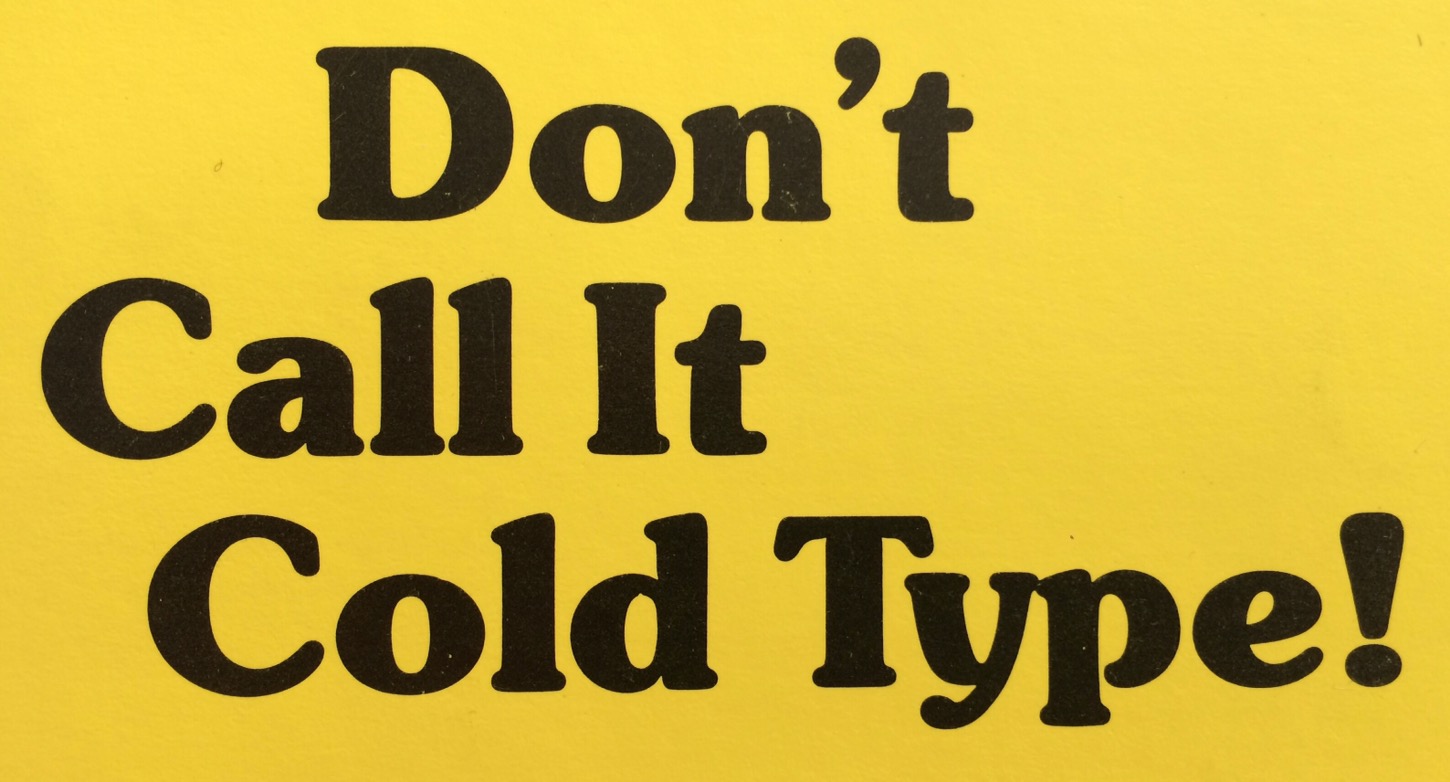
I learned about the term ‘cold type’ quite late into my fascination with phototypesetting. And when I did it was straight from its biggest critic, Frank Romano, author of a book with the title

The term had been popular in English (only) in the 1960s and ’70s amid the changes from the then prevailing mechanical ‘hot’ metal typesetting, like Linotype or Monotype, that involved live typecasting, to ‘cold’ photographic systems and computer-based typesetting. But my qualms are more about what cold refers to in relation to hot here.

In the common sense it means typesetting without the casting of metal. Now that all composition and design is done with cool digital tools, we hardly ever have to differentiate between this anymore. What I would love to make clearer though and distinguish between is the difference between foundry type and hot metal typesetting. Especially non-native English speakers tend to throw all metal type into the hot metal melting pot, but nein:
Foundry type is traditional metal type of individual sorts (letters) for hand composition, once cast by a type foundry but usually used cold, then taken apart again and reused.
Hot metal type refers to typesetting machines that involve a casting unit that compose and cast individual sorts or a line of type on the fly, e. g. Linotype, Intertype, Monotype or Ludlow systems; hot to luke warm when handled right after casting and molten down again after use.
It gets real balmy though now that most metal type used in letterpress print shops these days is actually cold ex-hot-metal Monotype for hand composition.

So maybe we should not use the thermal terms at all and be more specific in what we mean. Or at least only use hot metal for the mechanical typesetting systems. Or only when we’re referring to genuinely hot typesetters.*
Continue reading

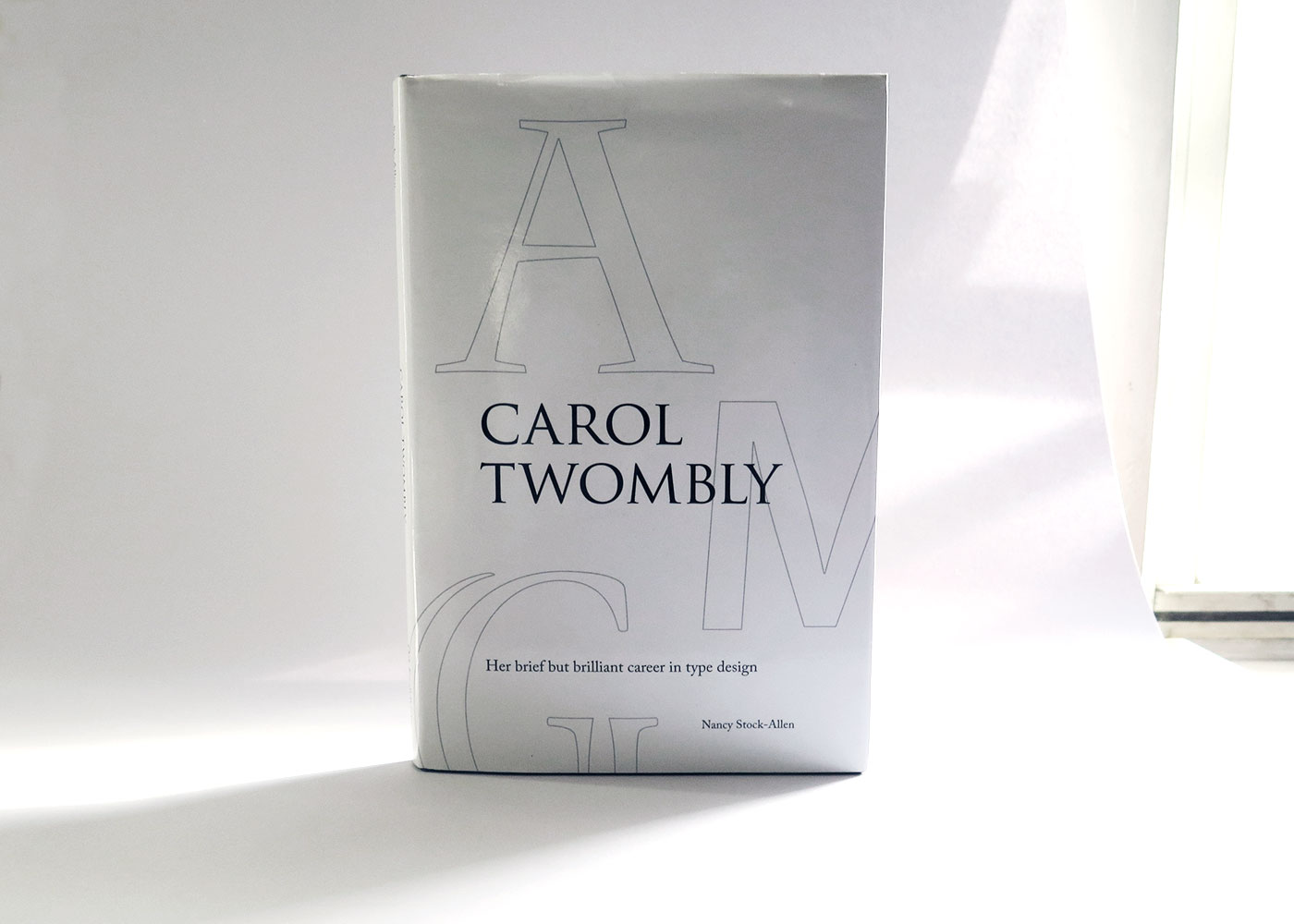
Review: ‘Carol Twombly: Her brief but brilliant career in type design’

Oak Knoll Press, 2016

Perhaps it is because we live in an age where styling and self-promotion shape how and whether we revere design, that the austerity of this book, and indeed, Carol Twombly’s life and career, feel so other-worldly. Which is not to say that Twombly is somehow weird or that this book about her life and work is lacking. In fact, the book is very well-written and — dare I say it, (this is a type nerd book after all) — quite an engaging read.
Continue reading

Hidden gems in Melbourne: Renaissance Bookbinding

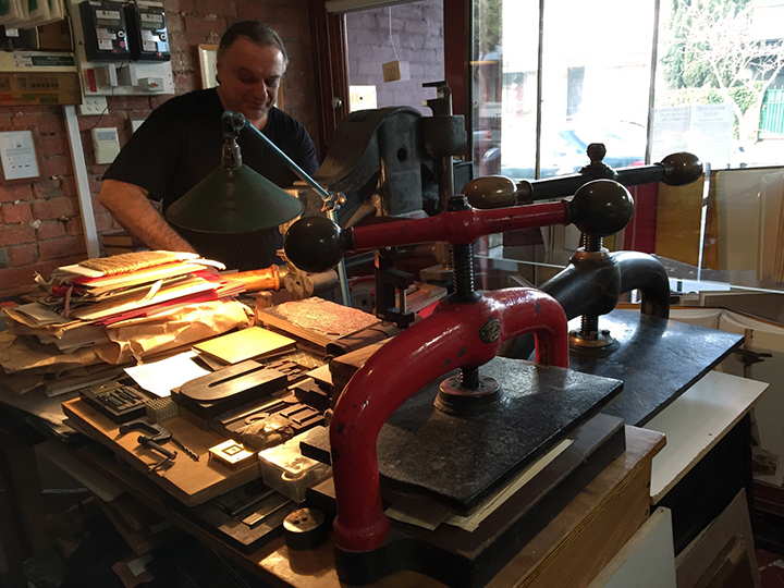
In 2012 I discovered a great hidden treasure in Fitzroy North called Renaissance Bookbinding.

I walked in the shop and I was absolutely amazed by the fantastic collection of books, printing presses, metal and wood type collections, not to mention the wide knowledge of Nick Doslov, a great professional bookbinder who has been in the business for over thirty years, and whose love and passion for the trade is worthy of everyone’s respect.

01_img_7759_720px

Continue reading

For The Love of Unicode

Say the words “character encoding standard” to most people and their brains will congeal into a pile of glazed donuts, like 🍩. See how I embedded a cute little donut directly into that last sentence? You can thank Unicode for that. What is Unicode and how did it become the universal standard for digitally representing the world’s writing systems (yes, including emoji)? Plenty has been written about its history already, but here’s an attempt at a very brief overview.

Continue reading

Please, no more Open Sans for a while

If you are also tired of seeing the ever same fonts and style on the web, and the rich typefaces getting richer, here is a running shortlist of potential body copy typefaces for alphabettes.org I once compiled. I did not test how they look in extended text yet, nor rendering across platforms/browsers. That would be the next step (and we’re also still quite happy with Elido although see that we could use more extensive language support). But maybe you are looking for a fresh, lesser seen typeface and want to check some out anyway. Trying on new clothes is luckily quite easy if you have a website up already, e. g. with tools/bookmarklets that swap out the fonts you currently use, like Webtype’s Font Swapper or FontShop’s Webfonter. Also, most of the typefaces below are available on Fontstand or as trial versions from the foundries, so you can test them locally or in mockups. Let us know if you end up using any at some point.

Continue reading

Congrats, But …

Two little tweets in an ocean of tweets. What harm can they do, especially when their message feels overwhelmingly positive?

Last week, Indian Type Foundry (ITF) sent out the following tweet in reaction to this showcase of type designers who also happen to be women:

Continue reading