Dear Alphabettes: what defines a ‘Book’ weight?

Dear Alphabettes,
Is ‘Book’ supposed to be lighter or bolder than ‘Regular’?

Lisa

Hey Lisa,

Thanks for asking! And no thanks for making me answer this. We put out a poll asking our peers what they think it’s supposed to be, and you’re not going to like the results. 58% of the votes claim it should be lighter, while 42% claim it should be darker. There are historic, conceptual and technical considerations for why it might be so uneven.

The reasoning for ‘Book’ to be lighter than ‘Regular’ is as good as the one for it to be bolder. A lighter weight ‘Book’ style may have been made to counteract the print gain of paperback printing, and a darker ‘Book’ style may have been made to look better when smaller (just as optical sizes tend to gain weight towards the smaller end). I find both of these lines of reasoning persuasive and logical. (And then there are also the instances where it’s neither reason, but something else entirely, or just legacy.) And then we’re back to why you asked the question in the first place.

There is also a technical problem with some software interpreting ‘Book’ to be the same weight as ‘Regular’. That means that the styles will be sorted differently – or even ignored – depending on the application you’re using. Software doesn’t care about the logical conundrum, or which side of the Twitter poll gets slightly more votes. If software got to decide, we’d just name all our weights with numbers instead.

If it is reasonable for a weight to be two different things, perhaps the best solution is to avoid the name ‘Book’, at least in combination with ‘Regular’. Type designers should then skip the term, and instead either commit to a more thorough system for optical sizes, or adopt more distinct names. Some favourites include ‘Blond’ (as Fred Smeijers likes to call his slightly-lighter-than-regular weights) and the rather literal ‘Blanca’, ‘Gris’ and ‘Negra’ pairing that PampaType do in their fonts. I guess I’m partial to poetic names.

Lisa, I’m sorry, but I’m gonna have to give you the most common [citation needed] answer in type design: It depends!

Love,
Robin
Dear Alphabettes: What is a good font editor for Windows 10?

Dear Alphabettes,
I worked in Typographer a long long time ago. I made a few of my fonts back then. What I would love to ask you, what is the modern version of that programme? which one can I use for the Windows 10. Thank you very much for your answer.

Dear Windows,

Thanks for your question. We are going to assume you are referring to Fontographer, which you can actually still buy (for Windows or Mac) from its vintage but functional website. What if you wanted to spread your wings a little and fly a bit closer to the sun. What would be your options then, Dear Windows?

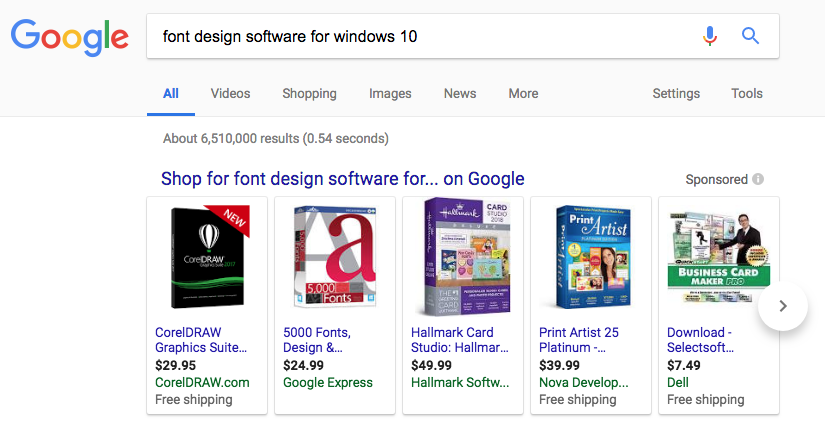
At first, we thought this might be a quick LMGTFY situation. However, we treat each Dear Alphabettes question with the utmost respect it deserves. Also, we did that and got this hot mess:

a google search for "font design software for windows 10" turns up a bunch of unrelated things like CorelDRAW and Hallmark card design software.

Thanks but no thanks, Google.

Continue reading

Dear Alphabettes: Freelancing and working from home

Dear Alphabettes,

Of the freelancers among you, what problems and anxieties are you facing? (Is a certain amount of uncertainty and anxiety maybe even necessary for the creativity of a freelancer?) Also, what are your experiences with working from home?

Jeremy

 
Dear Jeremy,

I don’t know if anxiety is necessary for creative practice, but it is certainly something I battle with in life generally! (I have OCD, anxiety and have had a bunch of panic attacks — my work is absolutely a trigger).

When I started out as a designer, I imagined a career in a studio leading a team of collaborators. When I got to that point, I was earning great money, working alongside people I admired on excellent projects — I was, in theory, achieving all my goals, but I was miserable, burnt out, and a nervous wreck. The trouble was in a corporate environment I was determining my worth by the quality of my work — so every project outcome (and compromise) became critical in my self-confidence, and I was busy striving for perfection in every project which was a fast track to the psychologist’s office.

So when I found myself looking to find a more healthy balance in my career and started to seriously consider freelance I was already incredibly anxious (seeing a psychologist twice a week) — I doubted my ability — wasn’t confident I could do good work, get the right clients or pay our mortgage. I wrote a tonne of pro’s and cons lists before getting started and also mapped out my back up career if everything turned to custard! But I was incredibly fortunate to have people around me who believed in my ability when I did not. That support structure was fundamental to me being able to turn my back on a well-paying job to freelance.

Before I wrote a business plan, I drafted a bare-bones household budget (to know exactly how much I needed to earn to cover our essential bills and living expenses). Then I wrote a business plan to ensure I could meet that minimum (x hours at y hourly rate = keep a roof over our head was my most basic formula!). Breaking it down like that gave me an achievable (less daunting) entry point and a specific number of hours to strive for each month.

Continue reading

Dear Alphabettes, when an author says they’ve written a book, don’t they mean they wrote a text?

We’re being a little cheeky here. This question wasn’t really addressed to Dear Alphabettes, but since we’re on the subject of answering things without being asked, we thought we’d leave our contribution anyway.

One of the temptations is to start this text (in this case, a blog post, not a book!) by asking the broader question: what are books? It reminds me of an episode of Look Around You. Talk about derailing… A book is a book is a book.

When an author says they have written a book, what they mean, and what the vast majority of people understand that they mean, is that they have written the content of the book.

Now you may insist: isn’t the content of a book the same as a text? Usually it would be in text form, yes, although I suppose if an author’s process was to narrate the contents of their book into, say, a recording device, rather than writing it down, we would still say they wrote a book, even if they hadn’t, strictly speaking, written anything down.
Similarly, if you listen to an audiobook, the content would be experienced through sounds, and it would still be a book.

When we hear the word “book”, we tend to picture it in codex form. Printed and bound, a physical object, a set of printed sheets of paper held together inside a cover. The platonic ideal of books. That rules out literature and text written in scrolls, clay or stone tablets, etc. The saying goes we shouldn’t judge a book by its cover, and yet here we are, defining a book by its shape rather than its contents. Today, however, many books are not even published in printed form, and are available only on e-readers. They are still books.

So let’s not purposely obfuscate things here. When someone says they wrote a book, we all know what it means. Dante wrote The Divine Comedy, Mary Shelley wrote Frankenstein, J.K. Rowling wrote Harry Potter. We understand that they wrote those books, and we are not talking about the physical act of writing (with a pen or a computer), or the physical shape of any specific edition of the book.

As a group of women involved in lettering, typography and type design, we tend to enjoy the physical form of books and, more broadly, the physical form of letters that give shape to written content. There are many hands, eyes and brains that bring the book that the author wrote into the finished form that the reader will hold in their hands, or read through their screens, or listen to through their headphones, etc. Many of us work full-time contributing to this process. We appreciate and celebrate it and we imagine most of our readers do too.

Let’s continue to celebrate all the people that bring books into existence, starting with the people who write them.

 
Do you also have a question about questions nobody asked, the universe, or everything else? Tweet at us @alphabettes_org and if the answer doesn’t fit into a tweet, we may reply here.

Dear Alphabettes: What was the best discovery or mind blown experience you’ve had in an archive?

Dear A,

I guess one of your first visits to an archive, or a library, or museum of things related to your interesest will always be one of the most memorable. Even if the things and facts that blew your mind then seem funny (to say the least) today.

I remember my first visit at the Anna Amalia library in Weimar in 1997. I had just come back from an internship in the Netherlands that a.o. brought me to the Plantijn Moretus museum, guided by Fred Smeijers. For a young type enthusiast bursting of curiosity (more than knowledge) there is already barely a more mind-blowing experience imaginable than holding punches by Hendrik van den Keere et al. and learning about how they made them. There, I had Fred to answer all my questions and put things in context.

Fast forward a few weeks later, by myself back in Weimar, I was looking at these marvelous books printed by the private Cranach Presse of count Harry Kessler which by themselves are totally mind-blowing! In case you ever have a chance to see their edition of Hamlet printed on vellum, it’s INSANE! I wanted to know all about these books, who made them, what these typefaces are, and who had made those, who the illustrations, the binding … I had so many questions I couldn’t quite put into order or connect, or even know what keywords to search for in the library’s physical card-based catalog, pre-Google. How for instance is it possible they say this type in the Vergil is Jenson when other books say that guy is long dead and from the 1400s, oh ok, a guy called Edward Price then, and who is Emery Walker? And the whole can of worms of private presses and revivals opened in front of me.

It was there where I finally “got” type history – painstakingly, embarrassing and on my own, even though I had read Counterpunch and saw Fred work for months. I guess the things you painfully figure out yourself are always the stuff that really sticks, and boy was I proud of myself and my “amazing research” (that everyone else but me already knew).

When I came to Fred with my findings and excitement about all these fancy private press books and typefaces he just shrugged and said (something like) “Private Press books are shit. Making cheap books beautiful is the real challenge and art”. I was disappointed right that moment, but sleeping on it, I knew he was right. Cured my interest in fancy press books forever.

Best, Indra

(Comments are open! I’m curious about your archive and library stories.)

 
Do you also have a question about mind-blowing experiences, the universe, or everything else? Tweet at us @alphabettes_org and if the answer doesn’t fit into a tweet, we may reply here.

Dear Alphabettes: How do you translate your header for various languages?

Dear Alphabettes,
How do you translate the Alphabettes header for various languages and writing systems?


When I was doing an Arabic header for the blog, I decided to use a Persian transliteration. This was fairly straightforward, except for two letters, the ‘S’ and the ‘T’. In Persian phonology, the /s/ phoneme can be represented with three letters (س – ص – ث) and the /t/ phoneme can be represented through two letters (ت – ط). I made the choice to stick to the most widely used form of each of these letters in different languages that use the Arabic script, namely the Sīn (س) and the Tā (ت). So for instance I could have used the Thā (ث) for /s/, but this letter often corresponds to /th/ in the Arabic language, so I avoided it. Also, Persian does not have grammatical gender and does not maintain a distinction that would make it necessary for me to add anything to the transliteration to make clear I was referring to a group of women—🙌—but I know that this is something Liron had to consider for her header…

xx
Sahar

Here is another case of great similarities between the Arabic and the Hebrew scripts! Apart from making the same decision about which letters wouldn’t look odd, just like Sahar did, I had another challenge. Unlike Persian or English, Hebrew uses grammatical genders. The word Alphabettes has to be female, so it would be ending on either ‘h’ (ה) in singular or ‘t’ (ת) in plural. So if Alphabettes were a group of women, they would be “Alphabetot“. Since there is no Hebrew word as such, but the ending is very Hebrewish, it looked odd. Luisa solved the problem when suggesting to decide if I should transliterate by thinking how I am describing Alphabettes to my friends in Israel. I am saying Alphabettes just as it sounds! So now the ending is “ס”, combining Hebrew letters and a Latin word.

xx
Liron

Do you also have a question about transliteration, the universe, or everything else? Tweet at us @alphabettes_org and if the answer doesn’t fit into a tweet, we may reply here.

Dear Alphabettes: How to deal with clients who think they know better?

Dear Alphabettes,
how should I best deal with a client who asks me to change the design of some letterforms and spacing against my advice?


This is a very good, important, and tricky question.

Sometimes clients think they know better than us, that they hired us not for our competence, skills and professionalism, but just to mechanically execute what they have in mind. There are three ways this can go:

In the best case scenario, we don’t really need this job, we can run away from these people and never spend another minute thinking of them and their silly ideas.

In most cases though, we can’t afford to do that. So we go into ‘it’s just a job, it pays rent and bills’ mode, and in a way, it also pays for our silence.

But we are designers, and all that we have is our reputation. Releasing something that we know is below our standards, will harm it. We may have no way to control clients and how they will promote the substandard work we did, or which absolutely pointless and meaningless detail will be proudly present as the cornerstone of the entire project, or keep them from using unfinished and unpolished versions of our files. We have no way to control how our designer colleagues and friends will react to it, or — on a larger scale — the opinion of the general public.

In the bearable version of this scenario, we may be able to remain anonymous, keep our work a secret and our reputation intact and move on to the next project.

In the worst case though, our name is credited everywhere and we will have to own our choices: no one forced us to take that job. So we’re trying to ride out this not so great situation, (because at some point people will forget, right?), and move on to the next project, hopefully it will be better than this one.

We’re not aware of a total-disaster end-of-the-world case where a brilliant designer’s career ended abruptly because of a single terrible project. (If it exists, let us know in the comments.) So maybe the hidden question here is: how to deal with ourselves when we have to work on such projects and with such clients? It is an extremely delicate and personal balance. How much can we point out before losing our clients, or our jobs? How much can we insist in trying to make them see what we see before giving up and smile and nod? Where is the line between us not doing our jobs and keeping our jobs? How much are we willing to compromise or sacrifice? How many of these projects are OK to accept before they become all we are working on? How much can we tolerate to be ashamed and embarrassed of our own work?

(Luckily not all jobs or clients are like this. Some are open to new ideas, some come with perspectives and points of view that enrich and improve our work, and make us proud of collaborating with or working for them.)


Do you also have a question about work ethics, the universe, or everything else? Tweet at us @alphabettes_org and if the answer doesn’t fit into a tweet, we may reply here.

Dear Alphabettes:
Who is a type master?

Dear Alphabettes,

Currently I am a graphic design student, and recently I was working on a group project highlighting a “type master” in history. Much to my surprise, there were no women on the list of “masters” to choose from. Our teacher said we could do our project on a woman type designer if we could find one who made substantial contributions to the world of type. After research, we chose Carol Twombly. When I asked my teacher if she would be added to the list for future classes, he said he doesn’t feel her contributions warrant the title “type master”. Is he right? If not, can you provide me with a poignant argument in favor of Twombly?

Thanks!
Alicia

 
Hi, Alicia!

The first time I read your email, I had to close the tab and take some deep breaths. I don’t know why it struck a particular nerve – I’m newish here but I’m already pretty used to the work of highly accomplished women being underestimated, undervalued and dismissed. C’est la vie, am I right?

At Alphabettes, we made a quick list of women designers we think deserve to be called “type masters.” But you know what, Alicia? I hate that we felt the knee-jerk reaction do that. The issue, as I’m sure you know, is not that only white men do good work, it’s that people in positions of power consistently fail to see the problem in excluding the work of women and people of color from what they deem worthy. Hitting your teacher with a bunch of women designers (lists of whom are already out there tenfold) and good reasons to include them (same) isn’t going to change his mind. It is absolutely on him to reflect on why his list of who counts as a “master” skews so male and so white, and feel a duty to do better by those of his students who are not white men.

Adobe Caslon drawings by Carol Twombly, via Adobe

Your teacher has already seen your group’s presentation on Carol Twombly’s work. I could recall her accomplishments, but if he wasn’t asleep while you were talking (and for the entirety of his career as a designer or educator, tbh) he already knows she was more prolific and influential in only eleven years than most type designers hope to be.

By all means, discuss the structural inequalities that resulted in an all-male “type masters” list with your fellow students. Rally any other professors and professionals in your circles who see this as the belittlement of Twombly’s contributions that it is. But if that isn’t enough, who am I to convince your teacher? I’m a type designer with three years’ experience at a respected foundry. Important people in the industry admire my work and believe in my potential. Some of them are on his list of “type masters.” I bet you if I called them up, they would all vouch for Twombly’s mastery. I’m sorry I can’t give you something more inspiring or helpful or poignant to tell him, but if your teacher doesn’t already believe Carol Twombly is a type master, it won’t ever be enough to hear it from me. Wait, that’s actually kinda poignant.

All my best,
Victoria

 
Do you also have a question about outstanding designers, the universe, or everything else? Tweet at us @alphabettes_org and if the answer doesn’t fit into a tweet, we may reply here.

Dear Alphabettes:
Air Quote Gestures

Dear Alphabettes,
I always wondered why people go up and down twice when there is just one quote mark.
Indra

 
Dear Indra,

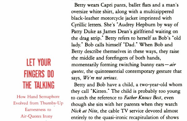
Air quotes are the visual equivalent of scare quotes, used to show doubt, question the validity of, or demonstrate irony in a written text. This 1989 Spy magazine article, “The Ironic Epidemic,” discusses the history of air quotes and their significance as a reflection of jaded, contemporary culture.

When Bob and Betty describe themselves in these ways, they raise the middle and forefinger of both hands, momentarily forming twitching bunny ears–air quotes, the quintessential contemporary gesture that says, We're not serious.

Read the full article. (Thanks for the tip, Quora.)

Beyond pop culture and casual conversation, air quotes are not beneath politicians, elected officials, or repulsive human beings who managed to become elected officials. The current White House press secretary-weasel utilized the double motion air quotes as a way to somehow justify the abhorrent use of scare quotes by a certain fearless leader.

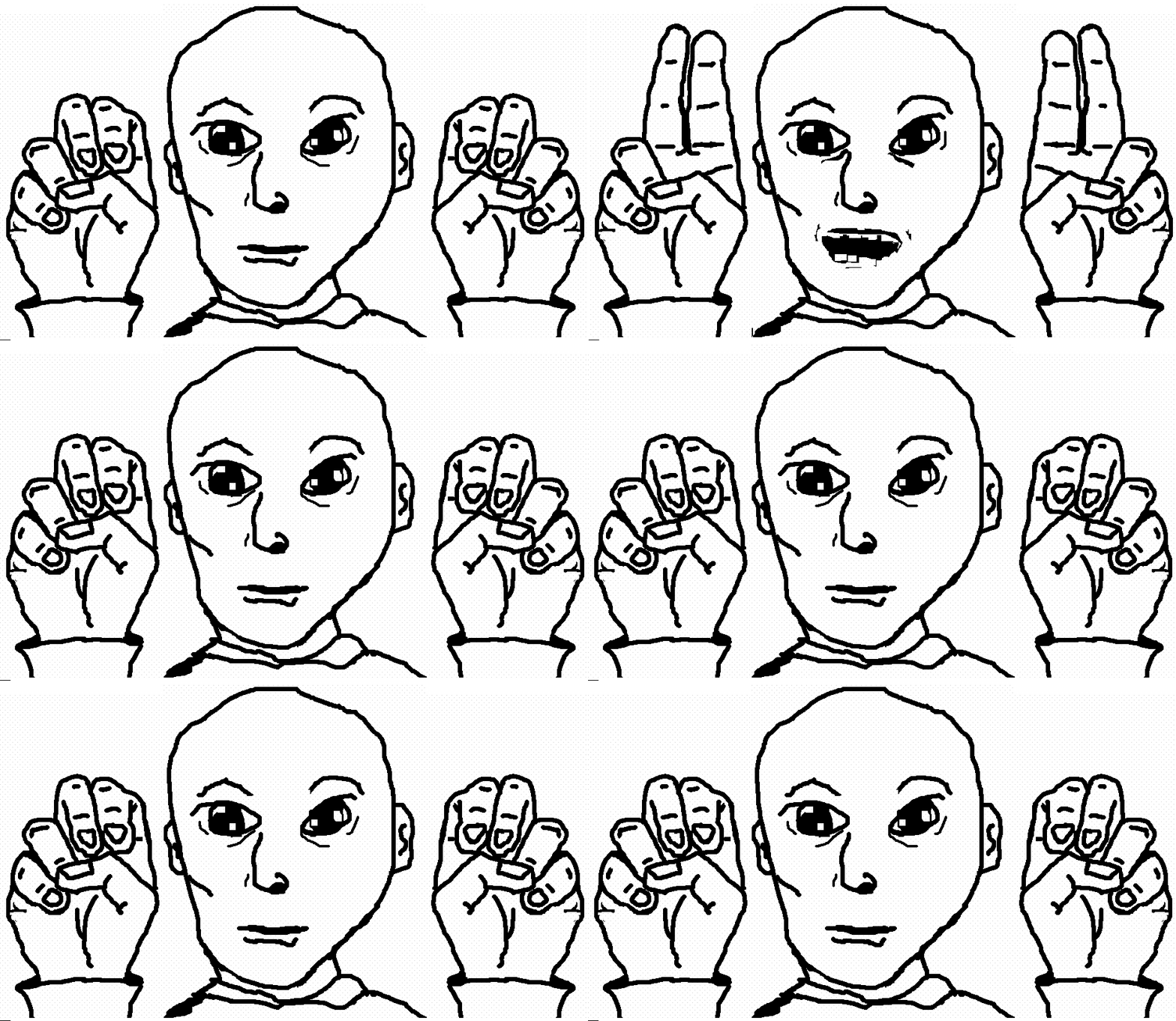
A bevy of internet gifs guarantees that air quotes will weather the future of post-language communication, but this one is quite possibly my favorite:

I’ll see you in my “nightmares.”

I will answer your question by suggesting that although right and left quotations are singular characters, the gestural convention for moving one’s fingers up and down multiple times occurs because verbal language, unlike a written text (at least for the previous couple thousand years or so), exists in time. If a gesture, like air quotes, does not coincide with the duration of the word or phrase found within said air quotes, it does not conform as easily to speech patterns. So, here’s my guess, as originally hypothesized on Twitter: maybe the double motion visually signifies more than one word or a multisyllabic word within the quotation?

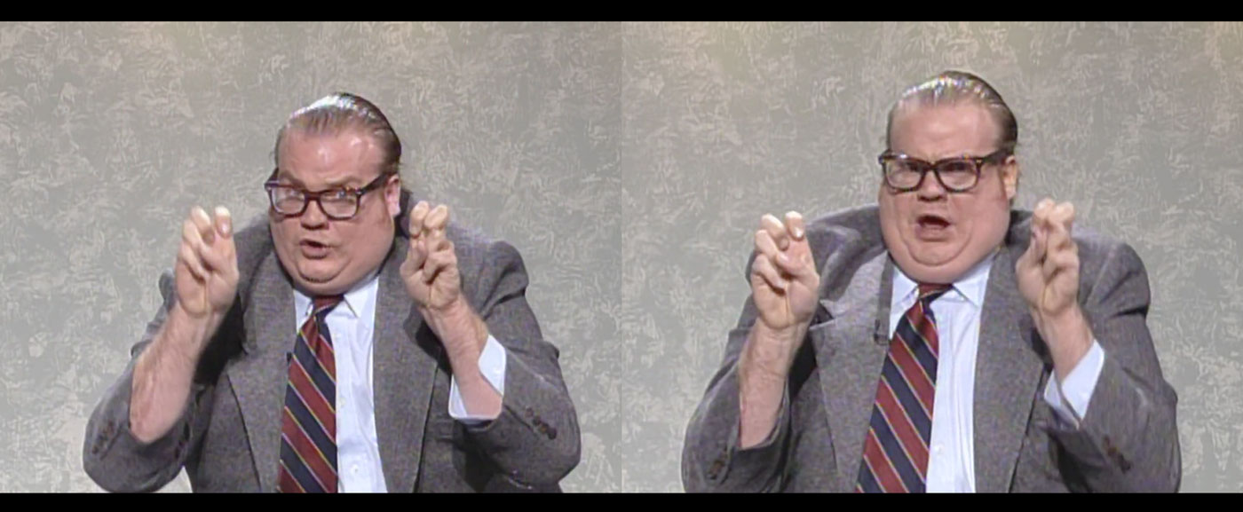
Let’s take the Saturday Night Live character, Bennett Brauer played by Chris Farley, as an example.

Chris Farley as Bennett Brauer, the pathetically lovable news commentator.

In this skit, Bennet Brauer uses the double “up + down” method of air quotes you refer to in your question. It’s hilarious because he’s aligned the movement of his air quotes with his over-emphasized speech pattern. The air quotes make his tragically desperate intonation sound even more tragically desperate.

Then there’s Dr. Evil’s generous use of air quotes.

At first, Dr. Evil employs single gesture air quotes for the word “laser.” But as the plan gets more absurd, he uses the double motion air quotes for “ozone layer.” It’s the slow lead up that makes the joke stick.

As you can see, Indra, the multi-gesture air quotes may have more to do with the need for hand gestures to synchronize with speech, rather than the actual typographic mark. Still, it’s so fun when written and spoken language meet like this. How might the air quote gesture change with local quotation mark conventions? And what about the victory/air quote emoji (✌️), which effectively turns a gesture back into a typographic symbol? Those are questions for another day.

“✌️Amy✌️”

 
Do you also have a question about quotation marks, the universe, or everything else? Tweet at us @alphabettes_org and if the answer doesn’t fit into a tweet, we may reply here.

Dear Alphabettes:
webfont versus web font

Dear Caren,

Is it webfont or web font?

Thanks, Bianca


Dear Bianca,

As you pointed out to me recently, there’s a certain logic to web font:

Logically it should probably be web font, just like it is web developer. Besides, desktopfont would be unacceptable, so why isn’t webfont?

Fair, but maybe things like syllable count and simplicity come into play here. After all, common usage has closed up words like email, website, and ebook.

Chicago recommends minimal hyphenation, except in cases where confusion seems likely. Webfont presents no confusion. For A Book Apart, I’m currently editing a brief on, uh, webfonts; ABA’s house style guide recommends “web fonts,” but I’m lobbying hard for a change! The arc of usage bends toward simplicity. And anecdotally, people seem to prefer webfont. So anyway, yeah. I vote for webfonts. Besides, “I don’t think it will be long before people start calling what we call ‘webfonts’ fonts.1

¯\_( 🔠 )_/¯

Kind regards,
Caren

1. Nick Sherman, Typekit Roundtable at the White Rabbit Bar, NYC, April 20, 2011 (00:23:40)

 
Do you also have a question about webfonts, the universe, or everything else? Tweet at us @alphabettes_org and if the answer doesn’t fit into a tweet, we may reply here.