This article is based on the presentation, “Web typography is just typography, sort of,” part of the Type@Cooper West Lecture Series at the San Francisco Public Library, on July 18, 2017. Watch a video of the talk or keep reading.
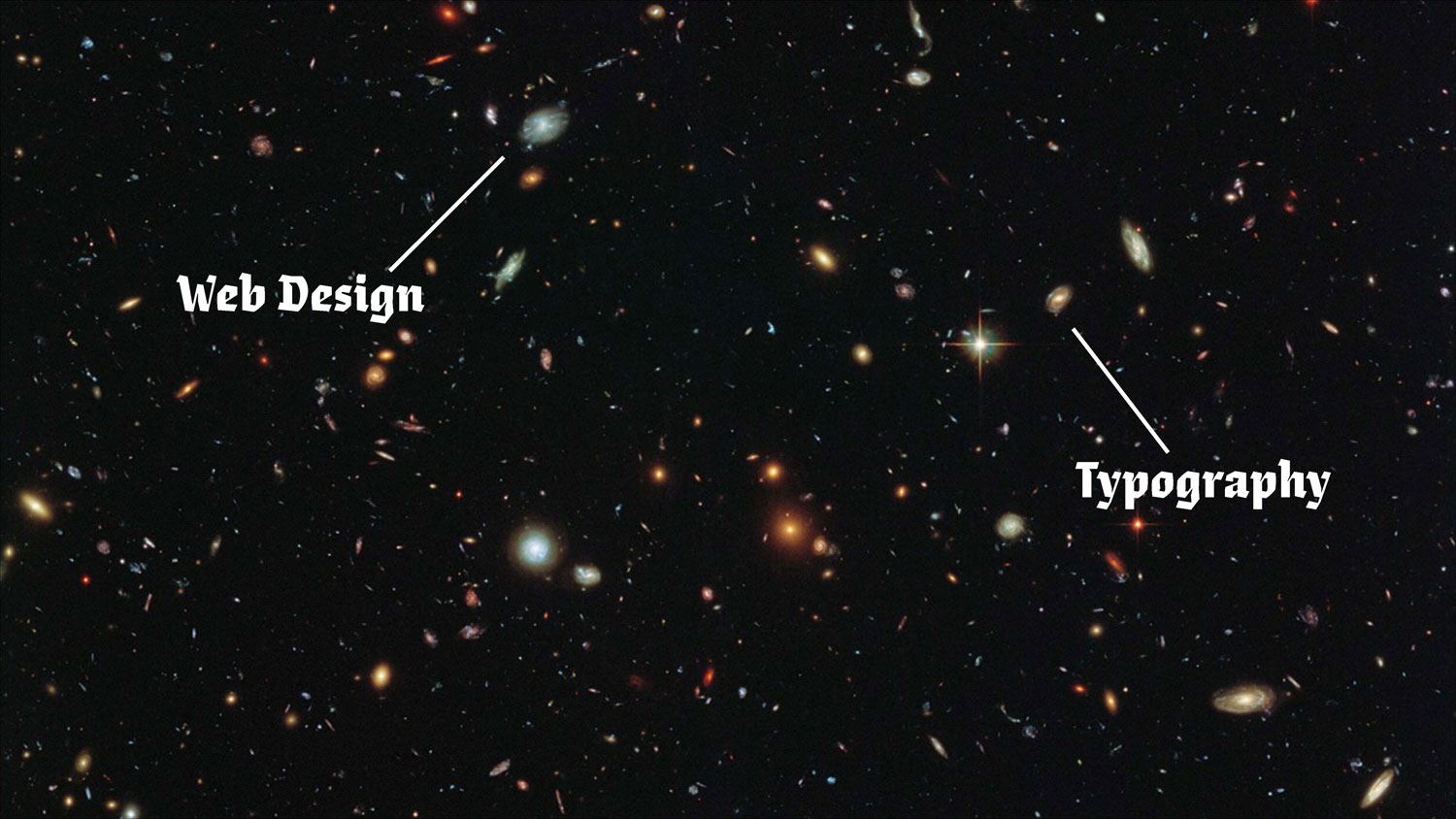
In many design programs, web design and typography courses exist in parallel universes. If 95% of the web is typography, then why aren’t we teaching this?
TL;DR, The main takeaways:
- Teaching design is a different skill from doing design. You can be good at one, the other, or even both.
- The primary focus here is to understand why typography and web design education exist in parallel universes and to find ways to improve the connections.
- There are several important reasons for this separation. Here are a few:
– WYSIWYG vs Hello, World! Web technologies and desktop publishing technologies developed and evolved alongside each other, but did not frequently intersect.
– Fear of code. Computational thinking and visual practices are isolated from each other early on, and that separation continues in university settings as well; this creates an ingrained fear for both students and teachers.
– The web is not truly part of design history and scholarship—yet. Most “academic” typography research and writing is not about the web, code, technology; let’s change that. - Tacit knowledges of typography (on the web): How do we describe what we know? What should typographers know about web development? What should web developers know about typography?
- The best way to start integrating typography on the web into your courses is to start small and put it on your syllabus. It’s perfectly fine to learn with your students.
Warning!
This is not a technical article about the “rules” of good typesetting on the web, or webfont loading issues, or where to find and test great typefaces for the web. There are so many existing, wonderful, rad, resources out there already. What I do want to think about is pedagogy, and what it means to teach typography on the web today. And I promise we will slay some dragons along the way.
Educators love to talk about teaching—amongst ourselves. It’s rare to discuss teaching with a more general audience of professionals and enthusiasts. This past April, I participated in a panel presentation at the Type Directors Club in New York in April, Teaching Type: A Panel Conversation, organized by Design Incubation. The event recording is online and also I wrote a recap of the event here on Alphabettes. In writing that summary, I realized there was a lot to expand upon, especially when it came to teaching typography for the web and screen-based environments.
Why do I teach? There’s a preconceived (and false!) notion that being a teacher means you couldn’t make it in industry. If you walk away with anything, I hope it’s an appreciation that teaching is a very different set of skills from professional practice. Sometimes they overlap and sometimes they diverge. I didn’t expect to become a full-time educator but I had the opportunity to do so while I was a grad student and fell in love with it. For me, teaching is this perfect balance between stand-up comedy and dog training. How do you deliver instruction and impart knowledge in a way that truly engages people? How do you facilitate mutual respect, individual growth, and make whatever eye-rollingly boring subject you’re teaching seem fun to those who may have yet to drink the Kool-Aid? As a design educator, there are several important challenges I try to keep in the back of my mind:
The Curse of Knowledge
The curse of knowledge describes the cognitive bias that once you know something, it’s hard to remember what it’s like not to know that thing. Teachers are expected to be both an expert and empathetic to a student’s awareness of a subject. Do you remember what it’s like to not understand basic typographic hierarchy? Or to look at a wall of HTML and feel totally bewildered? I need to remind myself: even though I find a concept or task very straightforward, it may not be so obvious to my students.
Skills to Pay the Bills
Am I helping my students foster critical thinking alongside their formal and technical development? I feel a responsibility; many of my students are the first in their family to go to college, or are taking out jaw-dropping student loans. In my own undergraduate education, I picked one of the least practical majors: English. It has ended up helping me in many ways, but here I am teaching in a program where students have specific career goals in mind. I want whatever we are doing in the classroom to benefit their lives beyond a list of software (which will likely be obsolete / outdated in a few years) and an expensive piece of paper.
The False Dichotomy
This is nothing new.
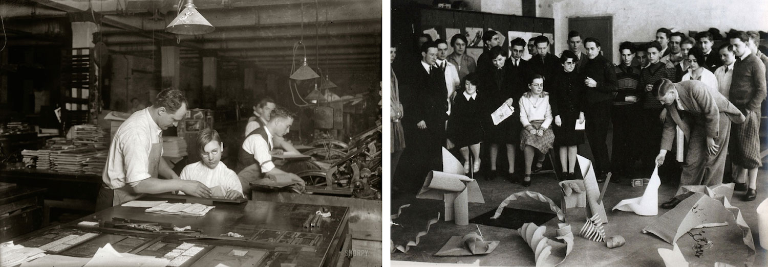
Left: “Horace Lindfors, 14-year-old printer’s helper, sizing up leads for the Riverside Press, First Avenue” (1917) Photograph and caption by Lewis Wickes Hine. Library of Congress
Right: Assessment of work from Albers’s Preliminary Course, 1928–9. Photo by Umbo (Otto Umbehr) © The Joseph and Anni Albers Foundation / VG Bild-Kunst, Bonn and DACS, London 2007
For the past hundred years or longer, design education has wrestled between two identities: is it professional training or a creative / humanistic practice? The Bauhaus foundation year, which much of American art and design education is based upon, was originally conceived of and taught as vocational training for the crafts and applied arts. As its faculty and former students moved to the US, the Bauhaus began to signify the reductionist, modernist studio art foundation course that we might think of today.
We still see this dichotomy evident in the contemporary marketing of design education programs.
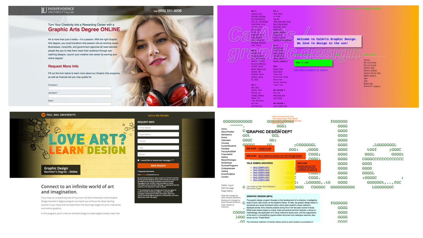
On the left, some for-profit, online design programs; on the right, CalArts and Yale.
There’s a visual difference in the way these design institutions position themselves (and arguably, these programs cater to different students): slick/professional vs low-fi criticality. These are of course the extremes but what kind of experience are we offering and how can we balance visual literacy and formal mastery alongside industry expectations and economic realities?
The Parallel Universes of Typography and the Web
In most traditional undergraduate graphic design programs, web design and typography courses exist in parallel universes that don’t always (or ever?) intersect. It’s likely not the same professor teaching both (although hey, maybe you’re lucky). They might be taken simultaneously or in sequential semesters or out of any order. In many cases, innovation in course content, especially as it relates to introducing new methods and technologies into the curriculum, is restricted by faculty willing to learn, then teach it.
Such is the case when it comes to integrating web design into the undergraduate design curriculum. By the time web design was added to most design programs (more on that later), digital typography teaching methods were well-established and separated from web design courses, where the focus is on learning the basics of HTML/CSS. Unfortunately this separation lags behind the current state of typography, where the lines between screen typography and print typography are blurring quickly.
Tracing the evolution
How does the parallel development of web technologies and desktop publishing impact design education? If we look at the early web, we notice a self-defined sense of technological utopianism. Book titles such as The Virtual Community: Homesteading on the Electronic Frontier (1993) by Howard Rheingold offer metaphors of the wild west and exploration of new worlds. The autonomous spirit and open accessibility of the world wide web is evident in the Declaration of the Independence of Cyberspace, written in response to the Telecommunications Art of 1996 (which is, shockingly, still relevant as we debate the merits of net neutrality). The irony that the entire internet is now owned by approximately five corporations is not lost on me.
I wanted to understand the chronology of technological innovations in desktop publishing and the web over the past forty years. What could be learned from a timeline of these milestones?
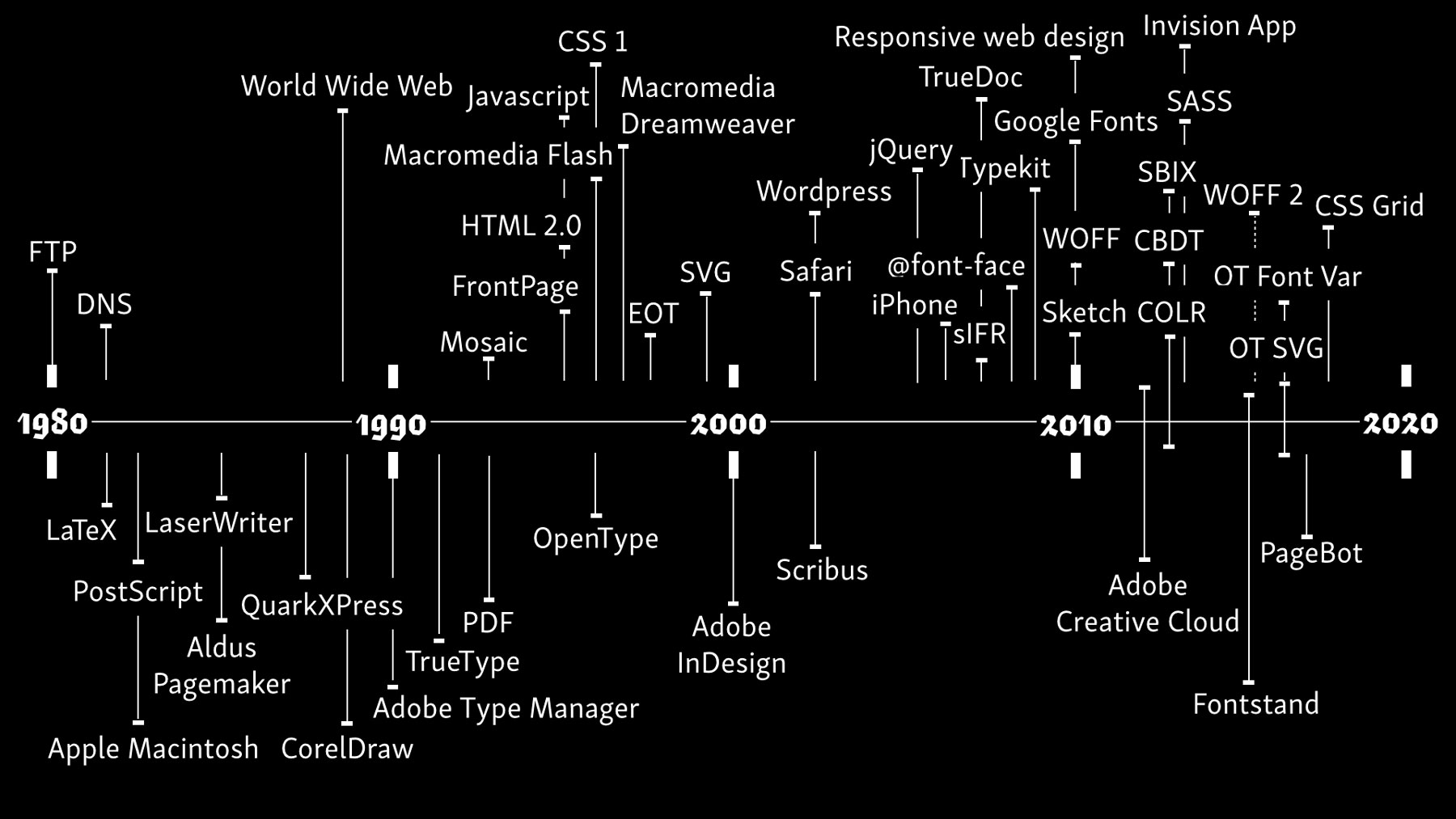
Milestones in the web and desktop publishing: an admittedly incomplete, quasi-accurate-ish,
partial timeline of tools and technologies related to digital typography
On the top half of the timeline are web-based technologies, on the bottom half are desktop publishing technologies. In addition to mapping the specific timeline of technological milestones, I wanted to understand their relationship to one another. How much impact did the technical innovations happening in the evolution of web affect desktop publishing and vice versa?
I’m not sure what to make of all this yet. Arguably, there’s a lot left out. In both the web and desktop publishing realms, there are these flurries of activity within a couple of years. And what also struck me was how these technologies and worlds really did develop in parallel to one another. Only more recently do we see how the technological affordances of one side impacts the other. Ok, ok, PostScript was important for everyone.
How have milestones in design education in the United States aligned or intersected with these innovations in desktop publishing and the web? In order to make this manageable, I focused on some significant moments and educators at design schools and universities in the United States, although a broader study would certainly be interesting.
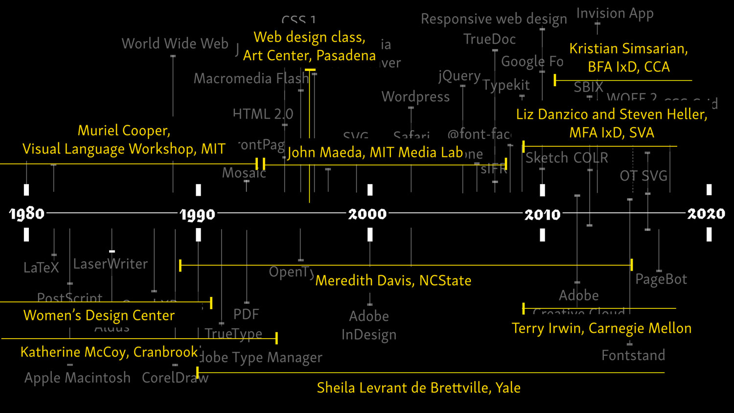
Milestones in U.S. design education, 1980–2020
The vertical line around 1997 delineates the first web design course at Art Center, as mentioned in the 2007 Artifact article, “Design History of the www.: Website Development from the Perspective of Genre and Style Theory”, by Ida Engholm. “[A]round 1996-1998 the first design and art colleges began to train actual web designers, which further consolidated the status of web design as a distinct discipline and profession.” Traditional modernist aesthetics (large images, ample white space, asymmetrical composition) permeated web design during this time as well, in contrast to text-based, “usability-oriented” sites.
Perhaps these parallel evolutions of the web and desktop publishing explain, in part, why integrating the web into design and typography education has been a challenge. Most design instructors cut their teeth in the 1980s–1990s on Pagemaker, Quark, and, later, InDesign. Because web design was this other thing that didn’t give you a whole lot of typographic control and required you to write code, it was frustrating and underwhelming for the traditionally print-based and educated designer.
Learning to love the web
My entry into the web, and teaching web design, came at a fortuitous time. I made my first website in 2005 in graduate school where I had the luxury to focus and play, not to mention a community of peers and professors I bothered endlessly for help when I broke something. During the interview for my first teaching position, I was asked if I could teach web design (including Flash, of course). I said “sure!,” without being totally sure.
While I taught web design, my then teaching colleague and type designer, Gary Munch, was teaching calligraphy. A student once pointed out to me the similarities of measuring pixels in the CSS Box Model to counting units for the column widths in calligraphy class. Mind. Blown. Gary introduced me to Jeffrey Zeldman’s Designing with Web Standards. It changed my understanding of the relationship between typography and web design, structure and content, and how the semantic web was more accessible and sustainable.
CSS Zen Garden was (is, it’s still around) another important tool for developing those early web typography skills. The site is a series of demos to show how web content can be completely separated from the style itself. This was one of my favorite teaching tools and a great way to learn about CSS, typographic hierarchy, and visual communication.
The past meets the present
The early to mid-2000s saw initiatives that attempted to apply the principles of traditional typographic design in print to the web and screen environment. The Elements of Typographic Style Applied to the Web by Richard Rutter, used the framework of Bringhurst’s The Eltements of Typographic Style to illustrate how those rules can be followed on the web using CSS3 (as Rutter says on the About page, “to allay some of the myths surrounding typography on the web,”). These efforts held the olive branch out for the print designers fearful of the lack of typographic control in a web environment.
In the 2015 Print article, “The Essentials of Web Typography”, typography professor (and one of my Alphabettes-partners-in-crime) Indra Kupferschmid makes this great point: “Of course, not everything we see and read on screens is fine typography, but that’s how it was in the early days of DTP, too—people using a medium and software who aren’t yet experts in the field—and still is for the majority of ‘offscreen’ typography.” In this comparison to the early days of desktop publishing, typography on the web is still considered utilitarian above all. And, what this lack of control by the experts has taught us about typography is this, according to Kupferschmid: “Design is no longer about tailoring invariable content to one specific embodiment; the web forces us to think about typography in terms of parameters, and get clear about content versus form.”
Searching for examples of desktop publishing’s early influence on web design, I found an interesting story relayed in the Design Issues article, “Typography and the Screen: A Technical Chronology of Digital Typography, 1984–1997,” by Loretta Staples (2000). @Home Network, touted as an industry-changing tech venture that would bring web access through cable TV providers, is now known as one of the biggest tech flops of the late 20th century (its merger with Excite was described in this WIRED article, “The $7 Billion Delusion”). In order to maintain the graphic identity, Staples describes @Home signature feature of its “@Home’s proprietary browser automatically displayed HTML text in @Home’s signature fonts (a default setting users could change, however).” The @Home identity was designed by @Home’s creative director Roger Black, known then and now for his magazine and editorial designs.

@Home Network homepage in 2000, via the Way Back Machine
Because designers had far less typographic control over a web page (limited to system fonts, user preferences, etc.), “[g]raphic designers and clients alike considered the subversion of graphic identity by Web browsers a distinct problem.” Black’s experience as a print designer might have “limited his ability to recognize that the ‘magazine’ served simply as a metaphor, and perhaps not the appropriate one for such an innovative medium. Black might have chosen television, film, or even architecture as the organizing metaphor for @Home’s browser, breaking new ground in subverting the ‘pageness’ of the Web. Other graphic designers would follow suit, bringing the limitations of page-oriented conceptual models to Web design.” Certainly, the magazine metaphor can’t be blamed for @Home Network’s demise, but the criticism points to the ways in which designers were thinking, in narrow terms, about this new format.
Web design history is typographic history
We should also remember that typography has traditions that are thousands of years old as compared to the web and screen. If you own a few copies of Phillip Meggs’ History of Graphic Design, you notice there’s only a few pages or so devoted to the web, which, given the textbook’s timespan, makes sense. We’re just on the cusp of thinking about web design as a part of typographic history.
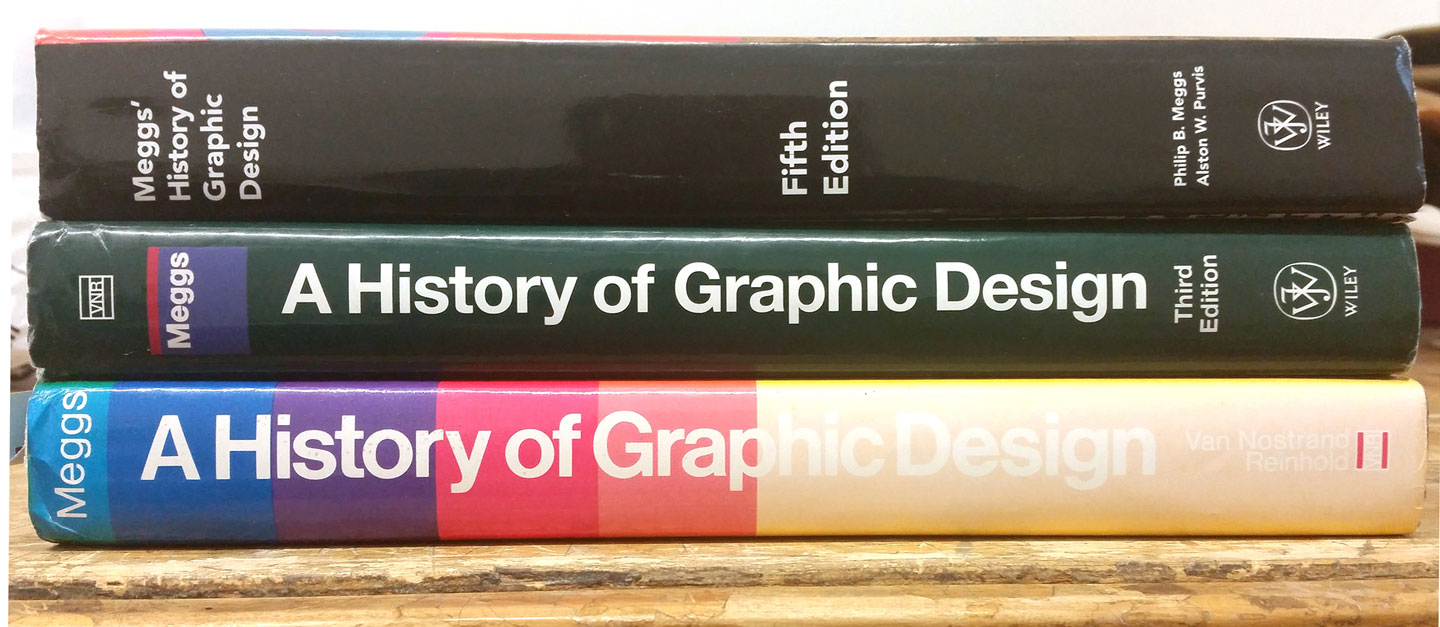
The history books don’t get shorter and yet our course times stay the same. If web typography is added to a typography class curriculum, what gets left out?
Jen Simmons recently described the web as being in the silent era of filmmaking. We are still experimenting with the medium, trying to understand its limitations and possibilities. Despite a never-ending stream of technical resources, online demonstrations, and tutorials, there is limited research on web design published in scholarly design journals and periodicals. This is an opportunity, especially for emerging scholars and graduate students, to embrace web histories, web technologies, and yes, even web typography, as part of their research agendas and academic discourse.
Tacit knowledges
I asked developers, designers, and educators who are actively engaged in typography on the web: how did you become interested in this area of web typography? Did you start out as a coder who found typography? Were you a graphic designer who fell into web design?
Not surprisingly, people’s paths varied greatly (although Designing with Web Standards was mentioned by many people as a game-changing text). However, almost everyone stated that the secondary knowledge was learned outside of a formal educational setting. They learned it on their own time by reading books and articles on the internet, finding tutorials, or picking something up at work. And this reminded me that as design educators, we can only do so much.
Tacit knowledge describes knowledge that is hard to articulate or teach in a straightforward way. It’s something that we can know, but describing how we know it can be difficult. For example, if asked about the grammatical rules of your first language, it might be challenging to explain them, but you know what sounds right. For both typography and web design, there’s a lot of tacit knowledge to unpack.
What does a web designer need to know about typography? What does a typographer need to know about web design? In typography, we might consider tacit knowledges to include: hierarchy of information, readability of paragraphs, and type selection and combinations. Many of these topics have specific rules that could be followed, but sometimes, what feels good works too. Bethany Heck gave a talk recently with some excellent suggestions for how to combine different typefaces and families. As she argued, it’s far less about the rules, and more about thoughtful trial and error.
In web design, we might consider tacit knowledges to include: the fluidity of the page / screen based on browser, window, device, or physical environment (Frank Chimero’s “edgelessness of the web” comes to mind), stylesheets as suggestions, not rules (Jeremy Keith), and the wide world of webfont loading. There is nuance to all of these topics and understanding them comes with practice and exploration.
What’s not exciting about typography and web design?
In my experience, typography and web design are not necessarily the subjects many students begin college knowing a whole lot about. It’s not all that surprising. If they’ve searched typography on Pinterest or Instagram, then they assume they’re going to learn how to make cool script-ish lettering of sappy inspirational quotes. Imagine their disappointment when they realize they’re going to learn about letter spacing and paragraph widths! With web design, they’ve heard it’s hard. It’s code. It’s SCARY. They tried doing something in HTML once and “it didn’t work” and they gave up. It’s important to remember that not everybody’s a natural at this. How can we help them get over that hurdle?
This leads us back to that age old question of whether designers should learn how to code. I know this is a contentious topic that leads to bar fights so my only comment is this: designers should learn enough to feel confident when communicating with web professionals. And if they want to know enough to make something cool themselves, that’s great. There is something empowering about knowing how things work (remember dissecting that worm in 7th grade? Ok, nevermind.). How do we make it accessible and exciting? And why are they (and we?) so scared?
Materiality of code
I spoke about this with art education professor Dr. Aaron Knochel, whose research focuses on the ways in which technology interfaces with art education. He suggested to me that at the primary and secondary school level in the U.S., introducing any technology, let alone coding, within the context of the art classroom, is challenging for a variety of reasons. First, there’s a resistance to thinking about code as a kind of material, and material is fundamental to learning art (ie: paper maché, clay, wood, paint, ink, etc.). If we don’t think of code as material, it’s hard to grasp how it could be incorporated into art education.
Second, in visual art education, technical ways of learning are perceived of as logical and therefore, not creative. Computational thinking (solving problems in systematic or effective ways) is a big buzz concept in education right now, but in terms of art education, it’s still a new approach that is received with skepticism.
Third, we’re taught that an artist stands at an easel with their palette, brush, and smock, painting a waterfall and some happy clouds. And like, that’s cool and all. But as an educators in art and design, it can be an uphill battle to help our students understand that design is also about people, communication, context, and um, function.
WYSIWYG makes Jack a dull boy (I still love u Adobe)
There is no question that WYSIWYG software revolutionized the publishing and production process. It’s relationship to web design has been a bit (ok, a lot?) more complex. From PageMill and GoLive to Dreamweaver, Flash, and Muse, there exists a long history of WYSIWYG software to make web design appealing and accessible to graphic designers. Some of these have been more successful than others (who doesn’t wax a little nostalgic for the good days of Flash?). If you have become acclimated to the holy trinity of desktop publishing software (Illustrator, Photoshop, and InDesign), as either a professional or a student, it’s hard to suddenly transition to markup languages like HTML. The typographic control we become used to in InDesign is nearly impossible to replicate in a web environment (of course, once you begin to understand how the web works—see tacit knowledges above—you might ask yourself, why bother anyway?)
FWIW, I still love u Adobe and Typekit. There are also many tools like TypeShift and Typecast, and resources like Explorations in Typography, that help make learning and teaching typography on the web a bit less terrifying.
What are we teaching?
In a recent Twitter poll, I asked educators where web typesetting was being taught in their curriculum.
Design educators: where is typesetting on the web taught in your program’s curriculum?
— Amy Papaelias (@fontnerd) June 21, 2017
Let’s be clear: Twitter polls are not really research. But they’re still fun. The question itself is somewhat ambiguous, too, since I did not define what “typesetting on the web” means: Writing HTML and CSS? Mocking it up in InDesign or InVision? While this Twitter poll paints a pretty optimistic picture (75% said it was being covered somewhere in their curriculum), what might come from the results of an actual survey to a broader audience of design educators? This requires further investigation.
Fighting the good fight
The good news is that there are many educators integrating typography on the web into their teaching and research. Here are a few:
Gary Rozanc, a professor at the University of Maryland, Baltimore County, runs the excellent podcast Design Edu Today. Interviews with designers, developers and educators, every episode also includes the transcript, making it easier to cite in articles or just more generally accessible. In his two-year anniversary episode, he reflects back on what he’s learned from the project (spoiler alert: HTML and CSS are still important!).
Mindy Seu’s teaching portfolio is an inspiration for thoughtfully integrating typography in screen-based experiences. In her interaction design course, she has students build a typeface in CSS, a playful way of learning about letterform shapes and relationships while drawing in code (hi there, computational thinking).
Petr van Blokland, a professor of graphic and type design in the Netherlands, has been very vocal about encouraging designers to bring programming into their education and practice. His presentation “The End of CSS” at TypoBerlin 2014 is a great talk on the subject. Most recently, van Blokland has also been busy developing PageBot, an open source, Python-based application for creating “high quality typographic documents” (*cough* what’s up InDesign *cough*).
More folks definitely worth knowing about and checking out:
Laura Franz, professor at UMass Dartmouth
Jon Caserta, professor at RISD
David Ramos, faculty at American University
Slay some evil dragons: Make something
How can we get over our own fears and embrace the web? Like Jessica Hische and Russ Maschmayer’s 2011 Don’t Fear The Internet tutorial project, the best approach for me has been to make something. Make something really low stakes. Work with someone who knows a little more or a little less than you. A few years ago, I made youarewhatyoukern.com because I wanted to show students that they could easily make a resume on the web, show off their type chops, and impress potential employers with their wizardry. The site continues to serve me well: it’s a great personal sandbox to try out new things like CSS Grid for the next web design course (starting next week!).
Conjure your mystical powers: Teach something
Put it on your syllabus in your class schedule. Add it towards the end of the semester so you have time to learn it first. You don’t need to know everything before the semester starts, you just have to know about a week ahead of them. Yes, even teachers procrastinate!
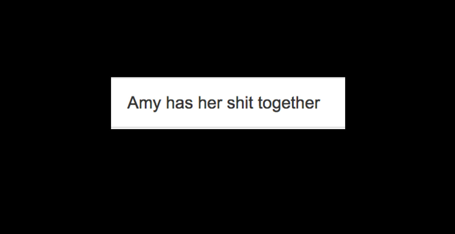
Academia happens at glacial speeds. Still, we can make small changes that won’t disrupt the entire ecosystem. If you’re assigning a type specimen project in typography class, why not a little HTML version for that? If you don’t know how to do that, you and they will figure it out. I think we have to be okay with being upfront with our students about the fact that we might not have all the answers. And I know this works because one of the best comments I received on my student evaluations was this:
Wrapping up
Teaching typography on the web means straddling two distinct practices that have developed in parallel. By exploring the historical impact of technological innovations on design practice and pedagogical approaches, we can start to challenge these unnecessary barriers. By confronting our fears of coding markup languages, stepping outside of the WYSIWYG security blanket, and embracing the materiality of code, we can empower ourselves to welcome type on the web (heck, let’s go beyond that, too!) in both our teaching and research. There are plenty of resources out there and nerds willing to help. We’ve all earned our wizard badges. Time to go slay!
References
Books
Web Typography, by Richard Rutter, 2017.
Responsive Typography: Using Type Well on the Web, by Jason Pamatel, 2014.
On Web Typography by Jason Santa Maria, 2014.
Designing the Editorial Experience by Sue Apfelbaum and Juliette Cezzar. 2014.
Webfont Handbook by Bram Stein, 2017.
The Virtual Community: Homesteading on the Electronic Frontier, by Howard Rheingold, 1993.
Designing with Web Standards, 3rd edition, by Jeffrey Zeldman, 2009.
Meggs’ History of Graphic Design, 6th edition, by Philip Meggs, 2016.
Explorations in Typography, by Carolina di Bartolo, 2016.
Articles
“Variable Fonts for Responsive Design”, by Nick Sherman, A List Apart, 2015.
“The New Web Typography”, by Robin Rendle, 2016.
“Please, no more Open Sans for a while,” by Indra Kupferschmid, Alphabettes.org, 2016.
“Takeaways on Teaching Type,” by Amy Papaelias, Alphabettes.org, 2016.
“Josef Albers, Eva Hesse, and the Imperative of Teaching,” by Jeffery Saletnik, Tate Papers no. 07, 2007,
“A Declaration of the Independence of Cyberspace,” by John Perry Barlow, Electronic Frontier Foundation, 1996.
“Design History of the Www: Website Development From the Perspective of Genre and Style Theory,” Ida Engholm, Artifact Vol 1. No 4, 2007.
“The Essentials of Web Typography,” by Indra Kupferschmid, Print, 2015.
“The $7 Billion Delusion”, by Frank Rose, Wired, 2002.
“The Web’s Grain”, by Frank Chimero, 2015.
“Your WYSIWYG Editor sucks”, by Rachel Andrew, 2011.
“A Nostalgic Rummage Through the History of Flash,” by Yassine Bouhlel, tutsplus, 2010.
Resources
Typekit Practice
Axis Praxis
Professional Web Typography
Color Fonts WTF
CSS Zen Garden
The Elements of Typographic Style Applied to the Web
Font Face Observer
Typeshift
Typecast
Design Edu Today
Design for the
Don’t Fear the Internet
Grid by Example
Presentations
“Teaching Type” panel discussion, Design Incubation and the Type Directors Club, 2016.
“Designing with Grid,” by Jen Simmons, Creative Bloq, 2017.
“The Value of Multi-Typeface Design,” by Bethany Heck, Type@Cooper West 2017.
“The End of CSS,” by Petr Van Blokland, TypoBerlin, 2014.
Thank yous: Bianca Berning, Tim Brown, Cara di Edwardo, Aaron Knochel, Indra Kupferschmid, Maurice Meilleur, Tânia Raposo, and Type@Cooper West.
Wow. Great. Work.