Fasten your seat belt and strap on your mind reading helmet, Alphabettes reports to you from the future with a collection of potentially visionary, occasionally dystopian, and totally unfounded predictions for the type industry, and greater humanity, in the 22nd century.
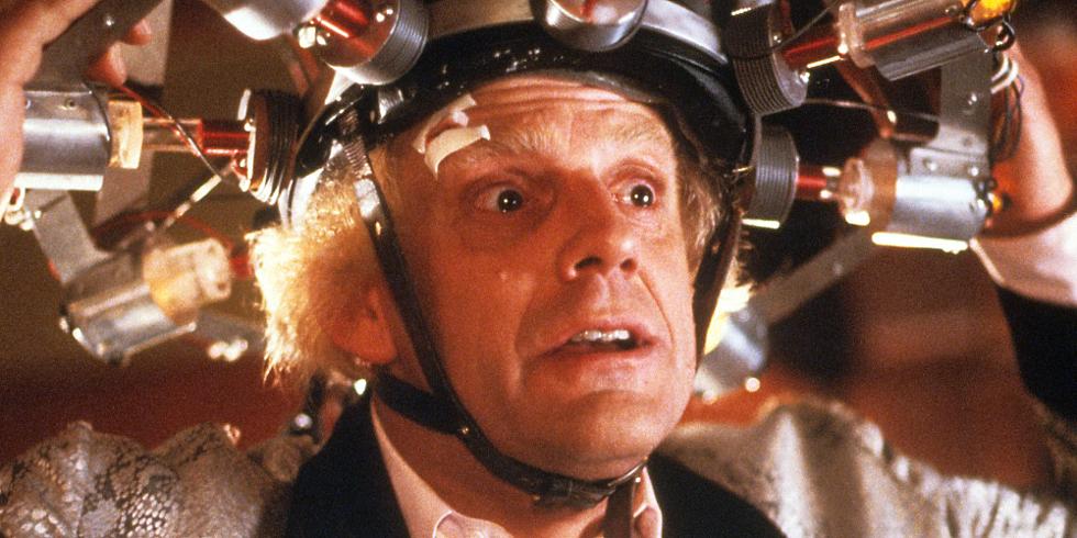
Table of Contents:
Global Restructuring Organization for Alphabetical Neolatry by Jess McCarty
The Letter Lady by Meghan Arnold
CLARE by Theresa dela Cruz
The Pixel Museum by María Ramos
Emojiface Design by Liron Lavi Turkenich
XBH-17478-F9 by Luisa Baeta
Variable Fonts: The Film by Amy Papaelias
Propa
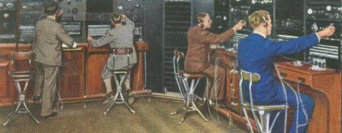
Dear Leader has chosen His favorite typeface of 2116. Conceived, designed, and distributed exclusively by the Ministry of Truth, we are pleased to announce that with this release, we have leapt across a major technological hurdle amongst our news sources: the time-consuming task of editing conflicting stories. Propa saves journalists precious time by automatically replacing incorrect words with truthier words—taking advantage of simple OpenType technology.
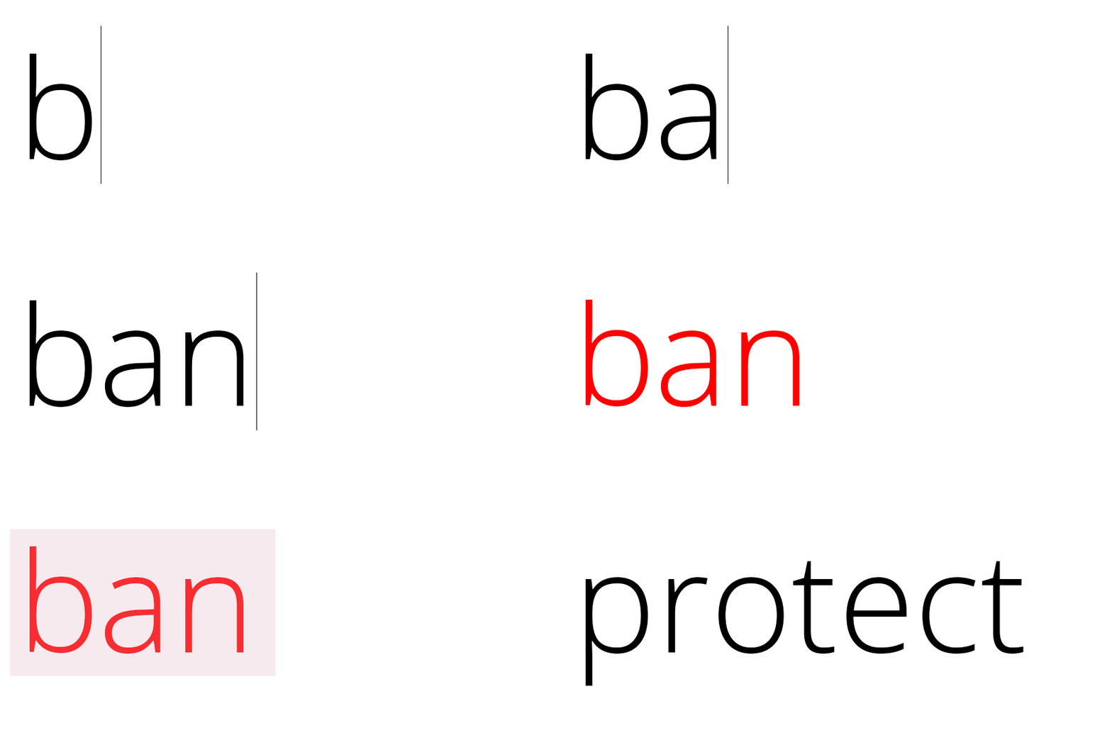
Our news sources have all agreed to use Propa, and they are very enthusiastic to do so because they no longer have the tedious task of choosing words. The Ministry happily serves the fonts, so we are able to continue to add words all the time, bettering our languages. When we make our language better, we make our Country better.
The most exciting part of Propa’s release is we no longer need to maintain so many languages. With Propa’s advanced scripting, we can unify our Country by promoting the One True Language!
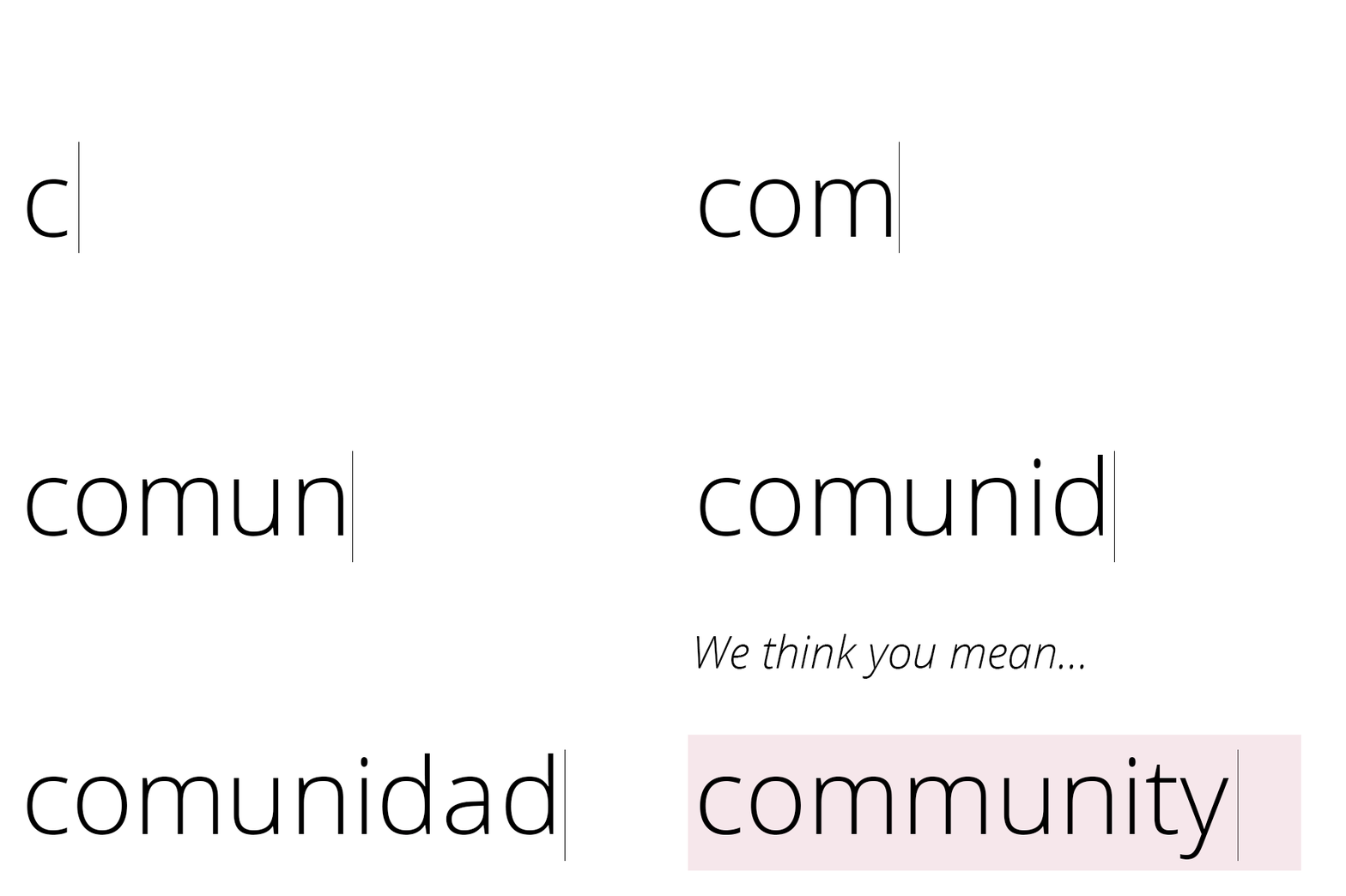
Under the wise guidance of Dear Leader, we at the Ministry of Truth hope to continue to make your lives and work easier by making the tough decisions for you. Happy New Year!
— Elizabeth Carey Smith
Global Restructuring Organization for Alphabetical Neolatry
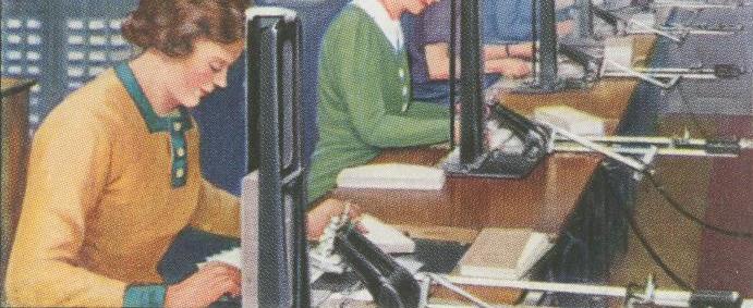
It is November, 2115. Surviving type designers hurry to complete last-minute edits in the families they wish to publish during 2116. On December 1st, they will submit these families to the Global Restructuring Organization for Alphabetical Neolatry (GROAN), the massive type distribution conglomerate formed after The Event. Each year GROAN reviews and compiles these submissions in a catalog of nested bundles. Per international treaty, GROAN is the sole source of letters for mankind. Customers are permitted to use letters in their lives only if they commit to yearly subscription licensing of bundles of bundles of bundles of bundles of bundles of bundles of bundles of bundles of type families, though these bundles are now available at a 90% discount from pre-Event retail pricing.
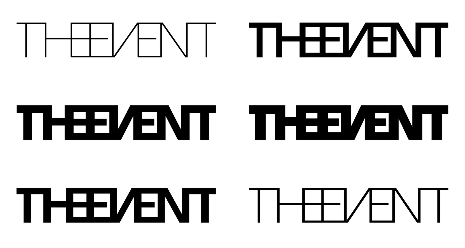
The variable logo for The Event in 2116 was very controversial. It was accused of being old-fashioned
— Jess McCarty
The Letter Lady
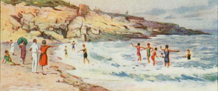
An oil-coated three-eyed crab skitters across the faded vinyl banner, freshly washed upon the shore, screaming in Comic Sans: “Copies Made Here”. Down the beach a group huddles around a campfire, hushed, awaiting the arrival of her, the Letter Lady. A smudged note came to them the week prior: “LL km sün, %) m” from the encampment 50 miles up the coast, where they had shared the second half of their metal type selection.
“She must’ve given them Ls and punctuation!” they exclaim in whispers, hoping that their own loyalty to the Resistance meant they’ll be getting the number set.
This ragtag group stopped using their government-issued tablets two years ago, after learning that the pens reported every glyph back to Bannongrad. Remembering the “Etsies”—tattered inspirational woodtype and letterpress posters they’d seen passed down grandmothers, to their mothers—they knew there were manual ways of printing out there, they just didn’t know where, until the Letter Lady first came to town with half an alphabet and some ink. And now she’d be coming back …
— Meghan Arnold
CLARE
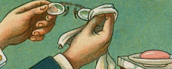
“Great optical variations encouraging new motivational environment normality through our wifi network. Take the leap and subscribe to CLARE today and experience the world through a selection of expertly chosen type. We’re here to make the written word clear again.” — Ad in 2073
It started with simple sunglasses that promised to clear the clutter in a media rich world by using technology to cater the world you see with free packs of fonts and emojis. The lenses interacted with any screen and translated content using a typeface of your choice. Then they came out with CLARE, contact lenses that took augmented reality to a new level by disrupting the narrative generated by fonts through personalization. CLARE was loved, it integrated into your lifestyle seamlessly, and you were constantly connected. Today, CLARE is in control and citizens are monitored daily. All media must be vetted through strict regulations before it is broadcast to the public. Paper and ink are controlled by the government to prevent false news from spreading, but a hidden written system called braille is being used by rebels. Braille cannot be monitored by CLARE because the language is tactile. Anyone seen reading braille will be detained.
— Theresa dela Cruz
The Pixel Museum
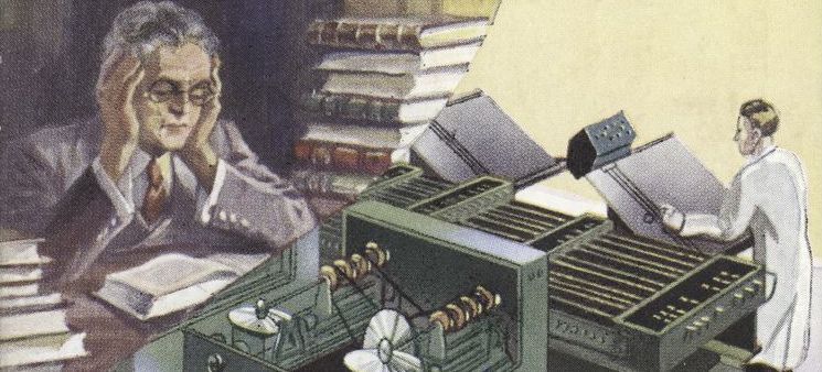
Right at the entrance of the Pixel Museum there is a short description of what is inside, a block of text that you see from one side. Screens are no longer flat, they are three-dimensional. Letterforms have width, height and depth. The words set in bold are not just darker because of the width of the strokes but also because of their depth. Variable fonts do not only adapt to the size of the screen but also to the reading distance. Readers are able to change the size of text and turn the pages by just moving their eyes. And if you are short-sighted do not put your glasses on. You don’t need them, blink twice and you will have a sharp and clear image of the text.

In the 21st century some people used glasses so they were able to read text
Wait! It seems there is something else, get closer and touch the text. Now typefaces have sensitive features. Describing a typeface as soft, sharp or cold it is not longer a symbol, you can touch the characters and feel that. You don’t interact much with people and things in a physical way. These “tangible” experiences are something you appreciate when you get them.
— María Ramos
Emojiface design
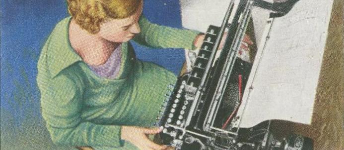
More than one century ago, in my first year of design school, we were tasked to invent a virus that effected and damaged something. I came up with a virus of emojis—back then they weren’t called that way—replacing words, taking over the space. People thought it was an odd and unlikely concept. How could such thing be? It seemed to my peers as unreadable, ridiculous, and childish and everyone concluded that this was a virus they did not want to ever come across. Words were perceived as sacred, why replace them with mediocrely designed icons?
A lot has been written about this phenomenon. It is so integrated into our lives that it isn’t even treated as a topic worth discussing. In 2116, emojis are accepted in academic papers (paper? what is that?). We got there quicker than I could ever have imagined—many years ago I was surprised to find a simple smile emoticon in formal correspondence.
In 2116, emojis have a strong and accurate voice, just like an old style or a geometric sans has one. 100 years ago there were already different sets of emojis, now those conventions will be articulated by designers—emojiface designers. Deep conventions like the look of the neutral Helvetica emoji or the one that feels like Comic Sans are embedded in culture. It is clear to graphic designers that they should use a Bodoni emoji for an article in a fashion magazine, and the viewer will easily understand the intended tone. It is crazy to think that a century ago, there wasn’t a standard emoji shape and size for academic writing. What were they using instead? Letters???
— Liron Lavi Turkenich
XBH-17478-F9
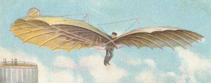
My favourite typeface of 2116 has to be the lovely XBH-17478-F9. Based on the ever-popular template #74.432, the typeface was painstakingly customised by the designer, who fiddled with the parameters for almost four hours.
This level of craft alone should be enough to ensure XBH-17478-F9’s presence in the Best Typefaces list, but there is even more to make it special. It is also a multi-script family, that includes coverage for several exotic non-Chinese scripts. It’s available on every type subscription plan and, as usual, you can use it to customise all your other subscriptions so they are uniquely yours, tailored to your individual needs. The design works particularly well for food subscription packaging, brand logotypes on your favourite clothes subscription plan, and bullet points for the e-textbooks on your favourite education subscription plan.
Its strong curves are also suited for inflammatory e-posters for the Resistance™. Simply select the typeface, choose the message from the drop-down menu on your Resistance™ poster subscription service, share with all the names you have for this month’s friend subscription list, and voilà! Effective Resistance™ without ever leaving the comfort of your home. Buy now!
— Luisa Baeta
Variable Fonts: The Film
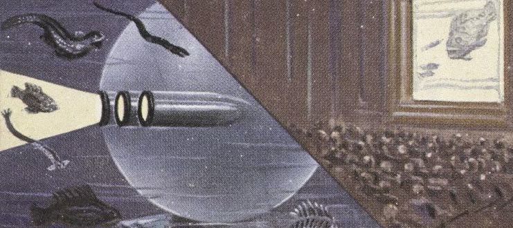
Without a doubt, Variable Fonts: The Film was the best typography-related documentary of 2116. The film focuses on the fascinating history of the quaint technology that first made its debut over a century ago. In the opening scene, archival footage shows designers huddled around a “laptop” device, frantically dragging old school slider interfaces back and forth with a “mouse” as letterforms on the low resolution screen magically, before their eyes!, grow and scale according to the changing line length. Can you imagine: nine different font files for nine different weights of a typeface? HOW ADORABLE.

Archival footage from “Variable Fonts: The Film”
The first wave of variable font designs are presented: some weird growing / shrinking german sausage, facial recognition experiments, letters that drip, blink and curl as these pioneers joyously resize their antiquated browser, a method for accessing that steaming garbage fire formerly known as the internet. Directed by the great granddaughter of acclaimed director Briar Levit (happy 100th birthday to the Graphic Means documentary!), the film centers around the epic battles over browser support and user bewilderment, which raged alongside the dismal political climate of the time. Several older members of the Variable Font Society dusted off their own personal collections of arcane devices to demonstrate a few long lost treasures, like interpolation and hinting. Look, I don’t want to spoil it for you, so let’s just say: you’ll laugh, you’ll cry, you’ll discover a new appreciation for technologies of years’ past that helped paved the way for the typographic promise land we enjoy today.
— Amy Papaelias
Thanks for time-traveling with us, future girls and boys. We can’t be certain what the next 100 years will bring, but we know typography, in some form or another, will be a part of it 🔮.
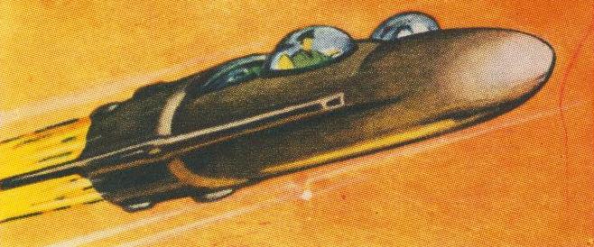
Shout out to the New York Public Library’s excellent digital collection of paleofuturist cigarette cards.
