There are designers and creatives who are capable of delving into many analog mediums at once (this maybe calligraphy, or origami, or whatever.) Their projects seem to have exciting new approaches, often narrated by nuances of the medium used. However, I have almost always been more of a digital designer. This post is a small window into my process of designing the signage for Royal Academy of Art’s (KABK) Library in The Hague.
Towards the end of last year as I was applying and looking for work, I tried keep myself busy by engaging in stone carving lessons at KABK. Sanne Bereen (the letterpress instructor at KABK) who was also taking these lessons, brought up that the school’s library could use a signage system. And without thinking much of it, I offered to help out and we began to discuss further. I thought this project would keep me busy until something more concrete turned up. At least I would be drawing letters. If it turned out well, it could certainly add to my portfolio since I had never explored material and letters this way. At the same time, Sanne had a lot of experience in the field and it would be an opportunity to learn.
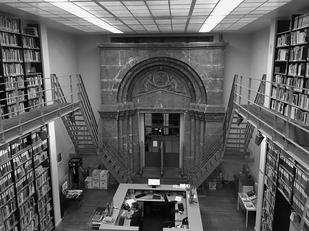
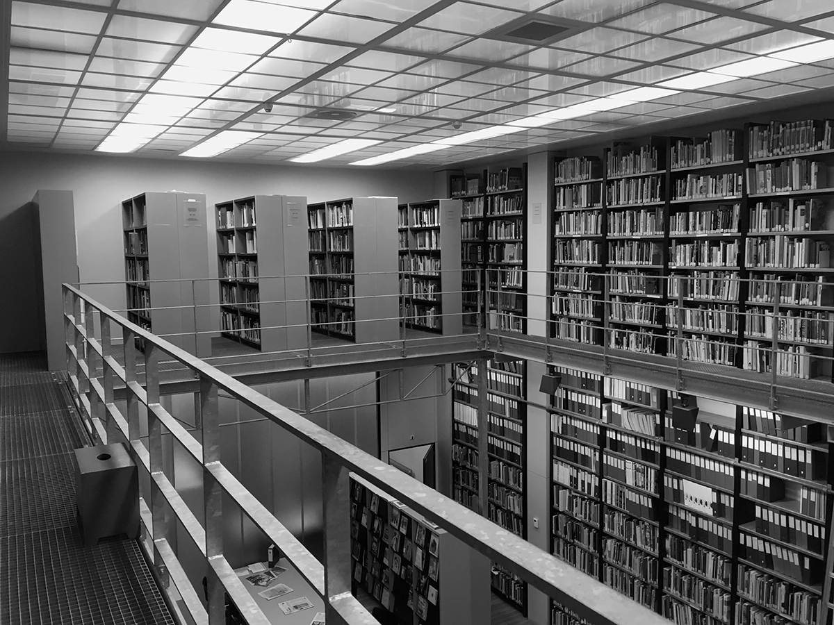
Prior to this, I had had very minimal interaction with the librarians and while I was studying, used the library only a few times. It was under renovation at the time and I remember being terrified while I was exploring the upstairs type section, with scaffolding all around. I’d like to blame the scaffolding for never visiting again. Up until December 2018 – when I saw a small, well lit, and a neat space that was very loved by the people who used it regularly.
KABK Bibliotheek, February ’19
After the first meeting with the librarians I began sketching. In order to understand what they had in mind, I proposed a few different design directions. I appreciated their perspective and feedback, even if it was to process my own thoughts.
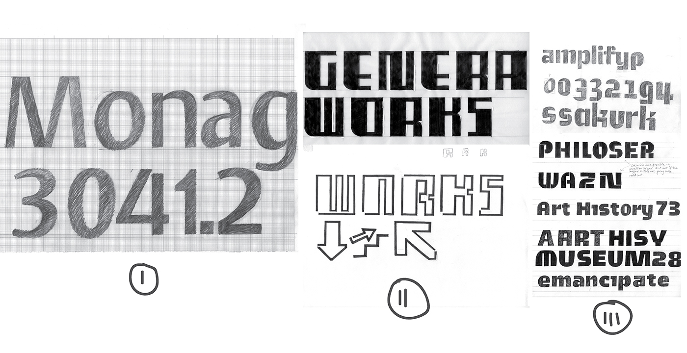
Early design directions for the signage.
The librarians chose the third and final direction, for which I took my inspiration from the space. It has recurring square and rectangular shapes, a lot of steel – which gives it a modern appeal. But the historic arch above the doorway, the people, the books and the nature of the space, soften that first impression. I wanted to bring the contrast of these elements and their significance into the design.
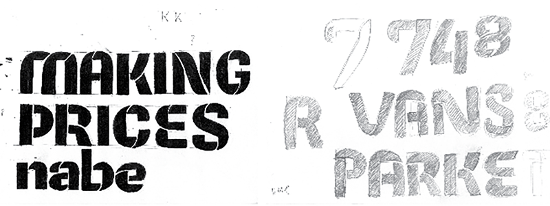
Initially, I imagined the design to be quite – for the lack of a better word – constructed. As per my limited research on signage in indoor spaces, stencils seemed to be the latest of trends. Here was my take:
Signage letters, stencil explorations
Feeling unsure when I saw the result, I spoke to some colleagues and type people around The Hague. One suggestion was to maybe try different kinds of cuts for the stencils, some suggested adding humanist elements; this lead me to question whether stencils were even necessary, as stencils or sign plates would involve more material in comparison to just cutting the letters out. I made some simulations on Photoshop with the letters in different materials and styles, to help the librarians see what I was imagining. Vinyl or other 2D material could also be used for the signs, but I was just generally at the stage in the project where things get quite existential and start to fall apart and nothing is “good enough” (but who decides what good enough is anyway?).
Signage letters, more stencil explorations

Photoshop simulations of the new signage
While getting critique and feedback, my attention was brought to one of the early bits in my sketches. I went back to it, scanned and tested the shapes in different sizes and they seemed to work. In the process, I also learned that any cutting device would need room to turn. So if I was to use any other material than paper, there had to be some provision in the letters’ joins and crotches for that. I buried my head in my thoughts again and went back to drawing with the new considerations.
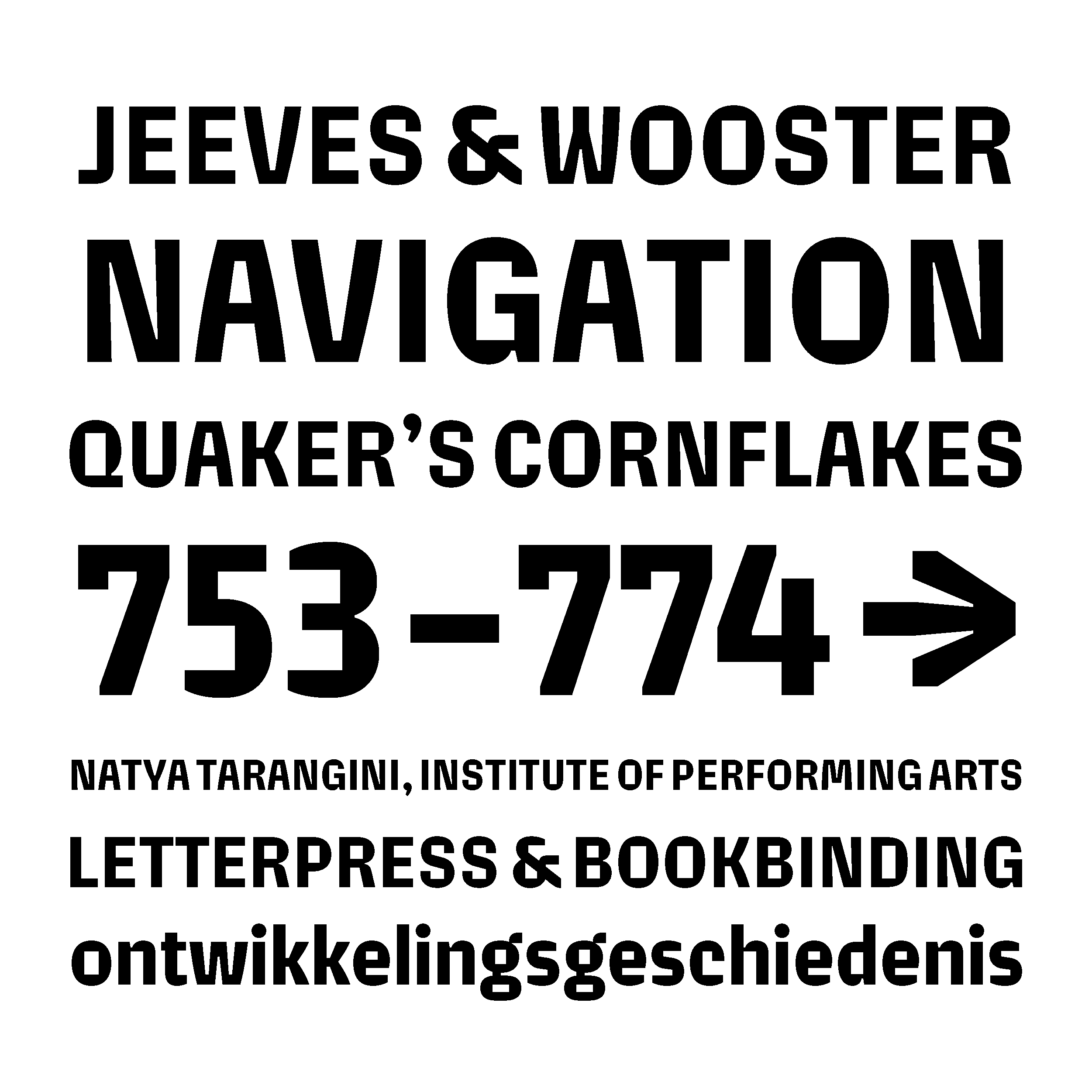
Non-stenciled letters and early drawings of ‘Biblio’
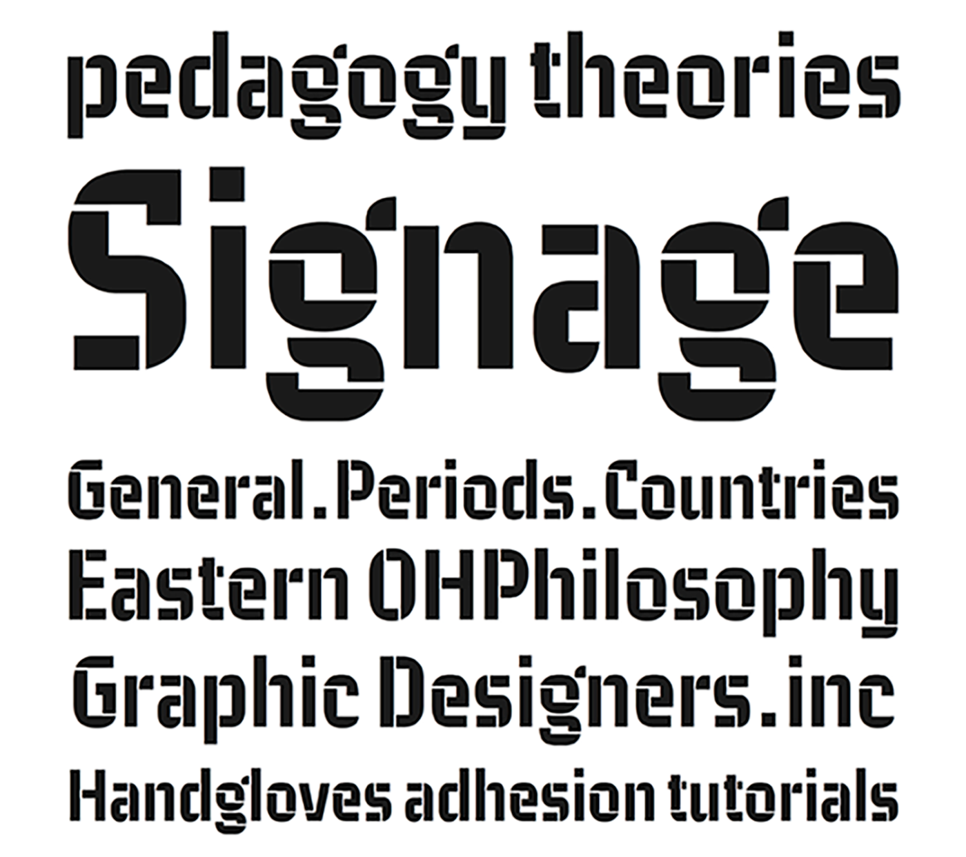
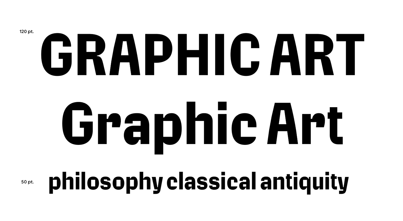
The new forms were sturdy regardless of the material they would be produced in. The type is space efficient in its horizontal and vertical metrics with shorter ascenders/descenders and slightly condensed proportions. To avoid kerning ‘gaps’ and save up on that space, the A, M, V, W, were designed with curved diagonals instead of straight ones.
Type design details
Production
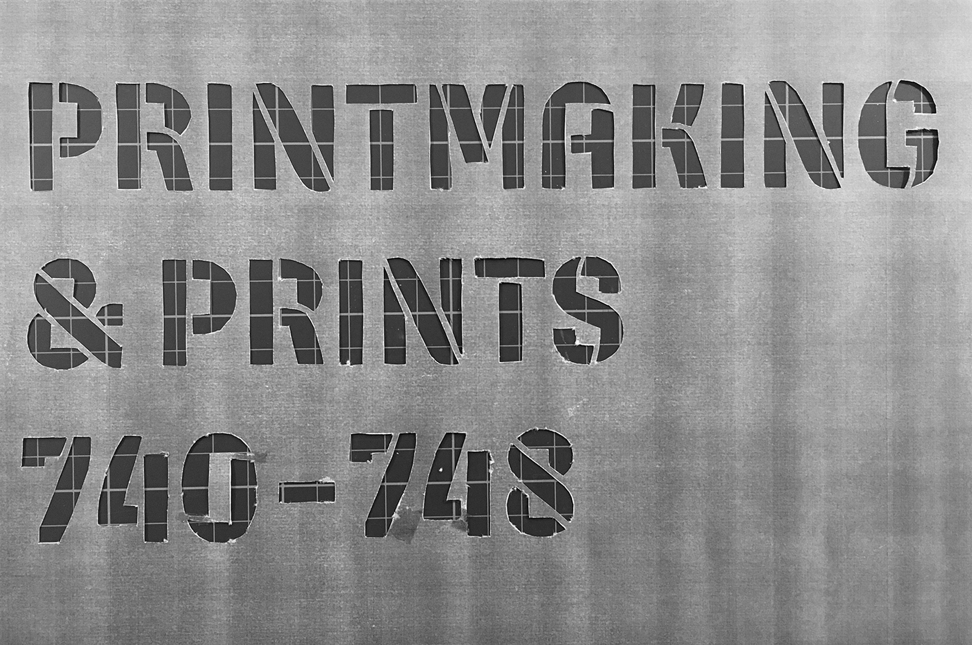
Other than a few simulations done earlier on Photoshop and despite knowing that the final design could be determined only upon knowing the material – I pushed that phase of testing to the last minute. We (by ‘we’, I refer to the librarians and I) began with going to the laser cutter in KABK’s metal workshop to book a slot to make samples and prototypes. As it turned out, the machine was free for the hour and we could make the samples right then and there or wait a week. As someone who thrives (and complains endlessly) under pressure, this was probably the push I needed. I could’ve gone only a certain length without testing and the first round of prototypes proved that. What I had in my mind, seemed to make no sense when I actually saw it materialised.
First material test for the signs; used superglue and my hands for typesetting.
The system had to work in my absence since I certainly could not sit there and manually type-set every single word and sign by hand. It had to be more efficient. Secondly, the acrylic allowed in the lasercutter wasn’t thick enough, and would get heated up and melt! Metal was expensive, so we decided to go with 4mm plywood.
Material exploration
The new samples were made with a horizontal bar in the background, which meant that the letters and the bar would be cut as one piece. I based this on the principle of linotype – instead of typesetting everything by hand, the line was pre-set. But plywood also burns! And the next solution seemed to be to spray paint the wooden signs. We had only made a sample, when we were suggested by one of the workshop instructors to use masking tape over the ply boards before putting them into the laser machine (could’ve never guessed this one on my own) to save them from the burn marks. Thirdly, to make the type stand out more, I used the ‘engrave’ setting on the laser cutter, over the bar and avoiding the letters. And about six trials later – after trying the different engraving and cutting settings, making the inktraps wider, M’s crotch higher, figuring out the right combination of Adobe Illustrator commands to achieve exactly what I wanted and multiple cuts and splinters later — I had my signs. All we had to do now was install them.
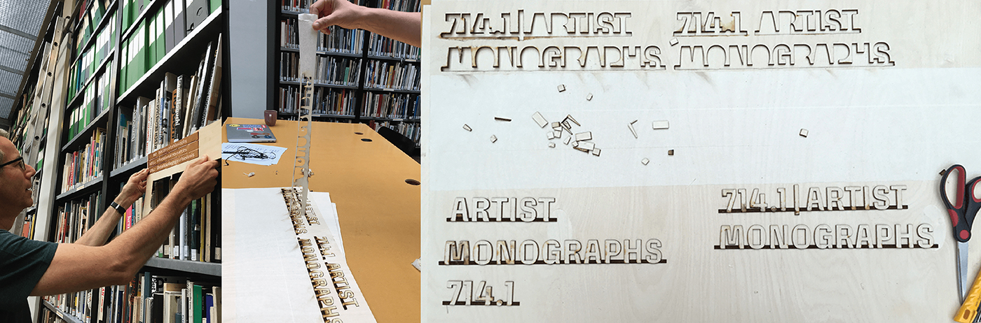
Different stages of production
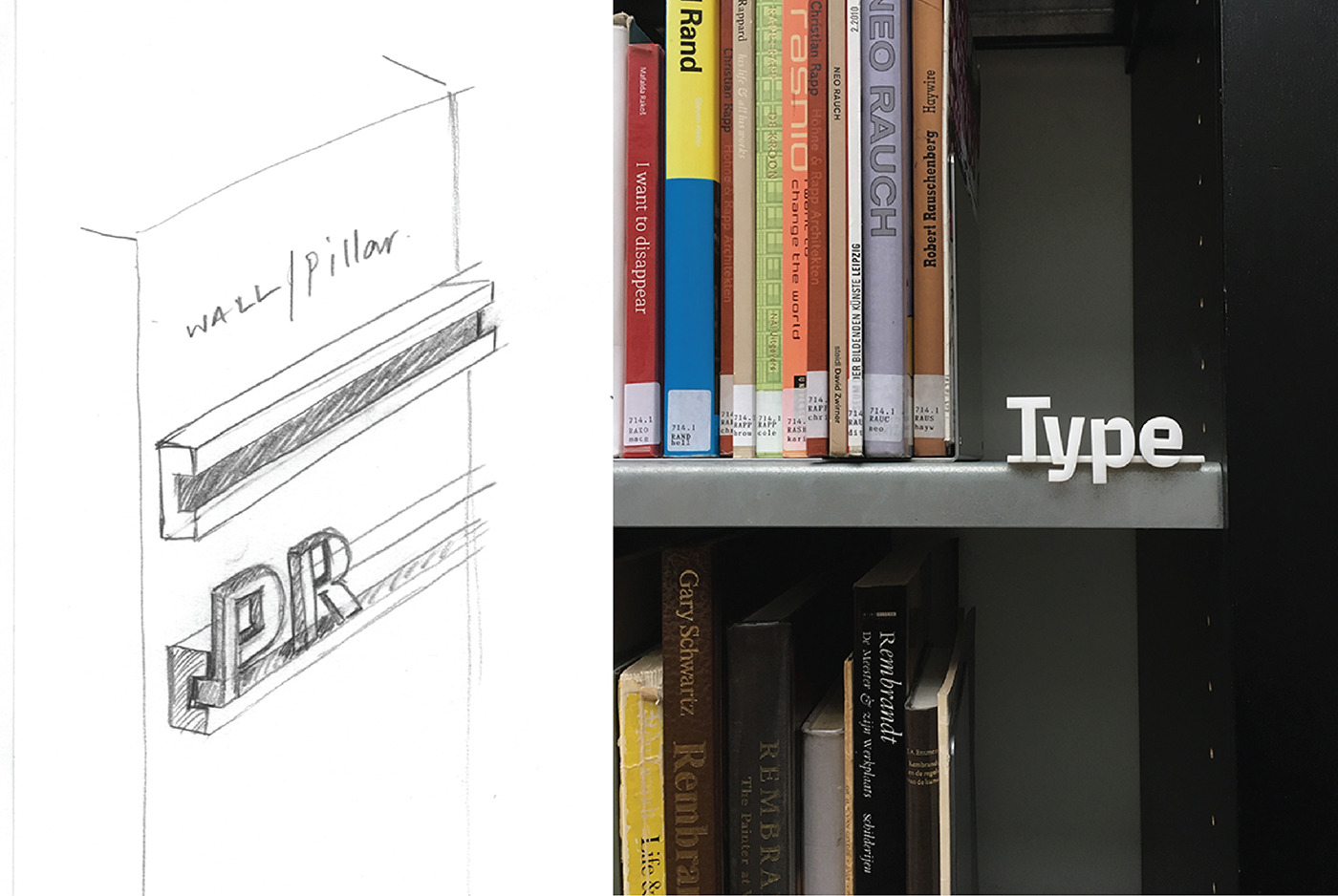
The shelf signs were relatively easier to figure out. These were smaller sub-sections’ signs to be placed on the book shelves. Mostly to be engraved, cut in plywood and installed on the shelves using magnets. These however took longer to produce because of the sheer number of them and the process of engraving.
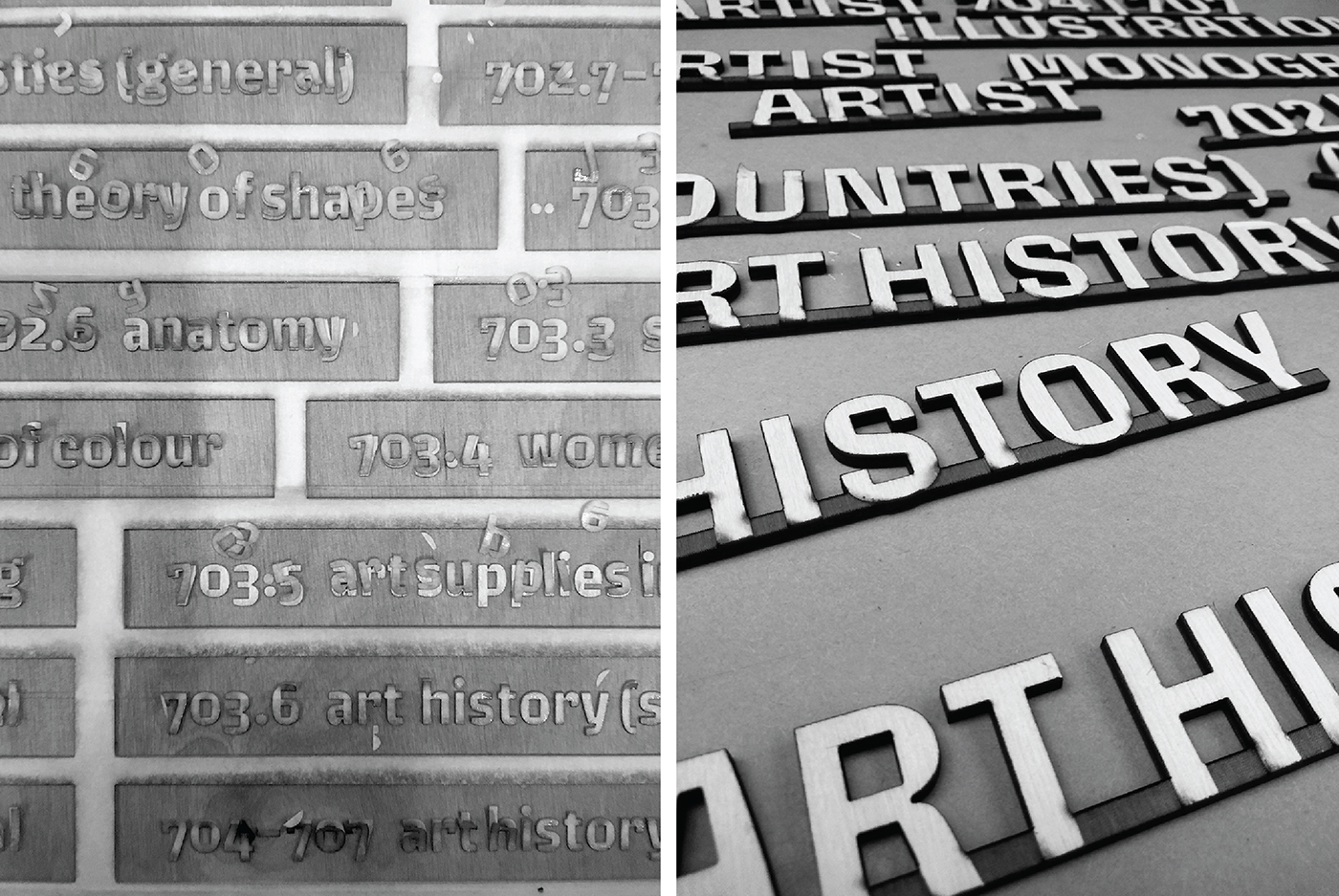
Left – bits of masking tape scatter as the laser cuts through the ply board. Letters on the shelf signs are engraved, but the fan and laser from the machine remove most of the masking tape covering these.
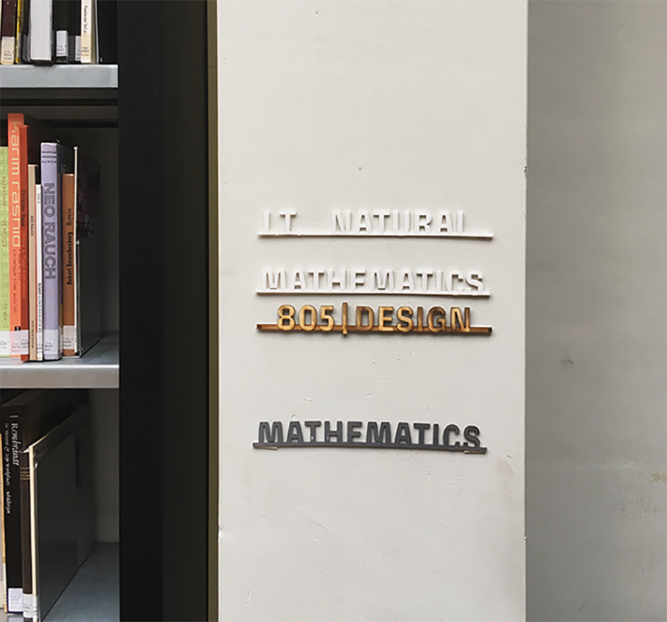
Right – Pillar signs laid out on the table.
This is a summary of the process and despite making the whole thing sound so dramatic – these are just some letters in a small library of a small country, fulfilling the basic needs of some very lovely people and making them happy as they look at it everyday. No big deal.
–x–
As any new graduate, the year after TypeMedia began with unrealistic expectations of employment. I was worried about not having enough work, though that changed a few weeks into this project. I was engaged in exploration, and enjoyed myself a lot more than I had imagined. But it was daunting in the beginning as I set out, since I was only thinking about how my work would be judged by colleagues and teachers visiting the library. So much, that the pressure kept me from being productive. Sharing my thoughts with those around helped me understand that this was my project and I got to decide its result.
One reason for me to stay back in The Hague another year, was to step out of my comfort zone and explore. This project made me make use of the resources available around me at any given time, even if they were new to me. Despite having graduated, I was given a chance to interact and get to know the people of the school workshops, to learn from their expertise and their patience. Considering the pace I was going at and the many times that the car broke down on the way, it was not possible to get everything done without constant feedback and interaction with the people around the academy and the librarians. We literally went from fixing one problem to the next on a daily basis. Most of what we ended up with was because the things (materials, design) we had initially planned did not work out and getting this kind of liberty in a commissioned project is mostly un-heard of. And I am a braver designer now than I was because of it.
The encouragement I received in this process and on completion makes me grateful for the type community in The Hague every day. And for the guidance of Sanne, Marcel, and Annemarie who brought the best out of me to be able to do this.
The final pictures of the library are yet to come in since all the signs are not up yet. When they do, I will share them on my social media (and maybe even here?). The custom typeface is now available on FutureFonts as ‘Biblio’ and everyone should definitely get a license before the new update makes the price go higher!
Lastly, a big thanks to Indra, for inviting me to write about my experience!