
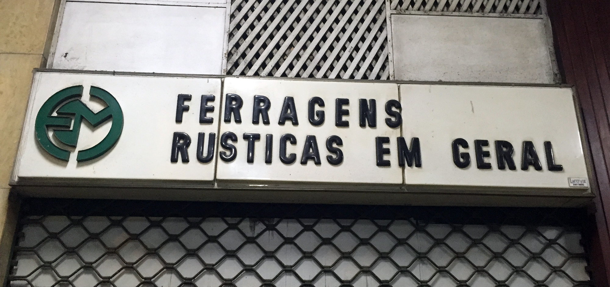
A hardware store in Copacabana.
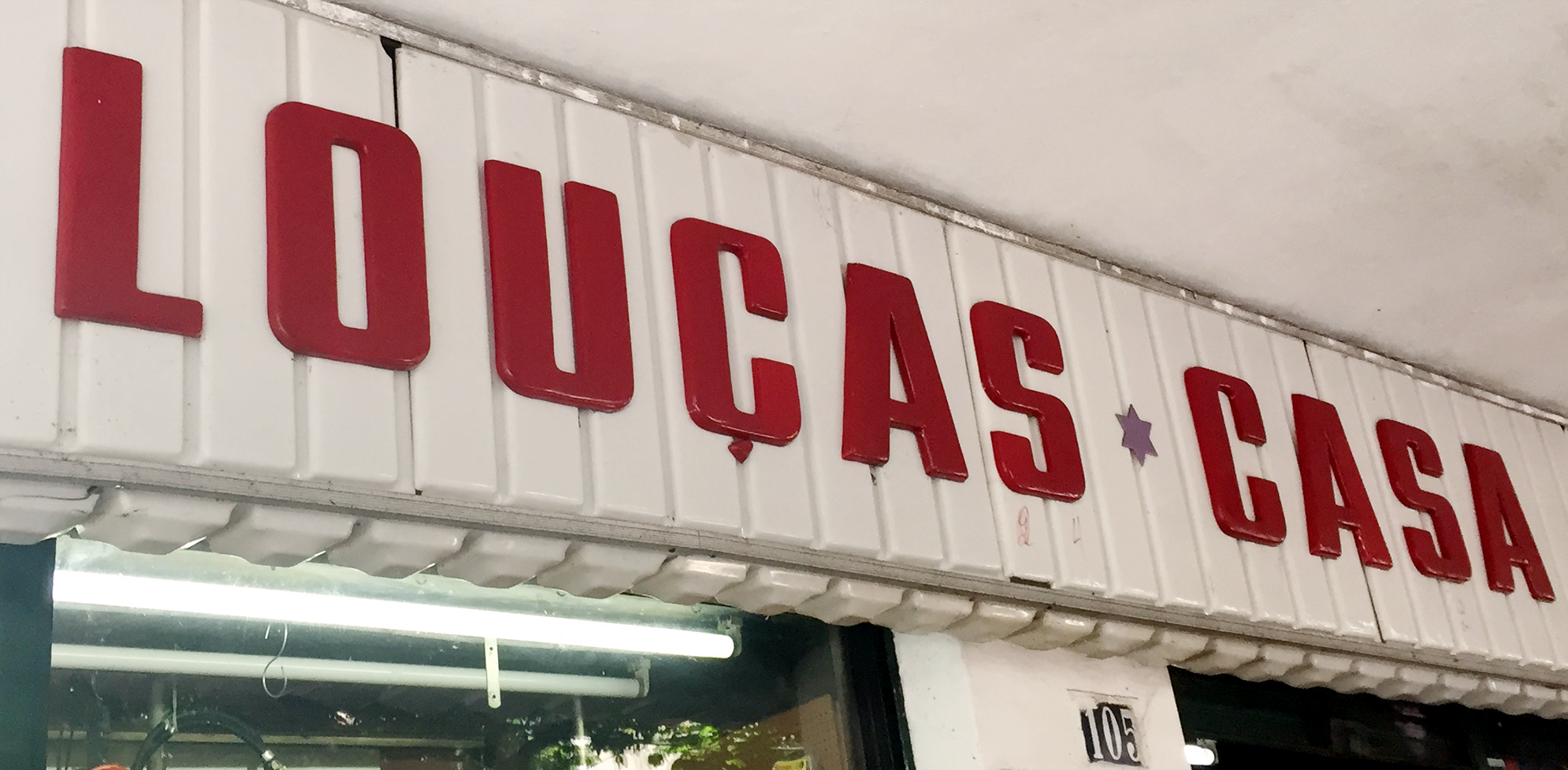
Love is a strong word, but I’ll admit I have a fondness for them. In truth, I grew up in Rio and I can’t say I ever paid much attention to this kind of acrylic signs. Now, having lived in London for almost a decade, whenever I visit I stay with family in an upper-class neighbourhood where they hardly exist. A few days ago I went to the grittier neighbourhood of Copacabana and had an almost Proustian experience as I found myself surrounded by these old signs; with their cheap plastic appearance and soft edges, they formed the typographic landscape of my childhood. Although I can’t say they are exactly beautiful, I suddenly found them oddly charming. They were the letterforms of local popular commerce in 1980s Rio, the letterforms of hardware stores, florists, barbers and fishmongers, cheap-looking and anonymous, often considered ugly and vulgar. Today they are slowly disappearing, and the city doesn’t mourn the loss.
I decided to write my love letter to them, in spite of all the mixed feelings about their aesthetic value, and tried to find out more. I daydreamed about finding an old factory with stacks of old acrylic letters in different styles, dusty and forgotten…
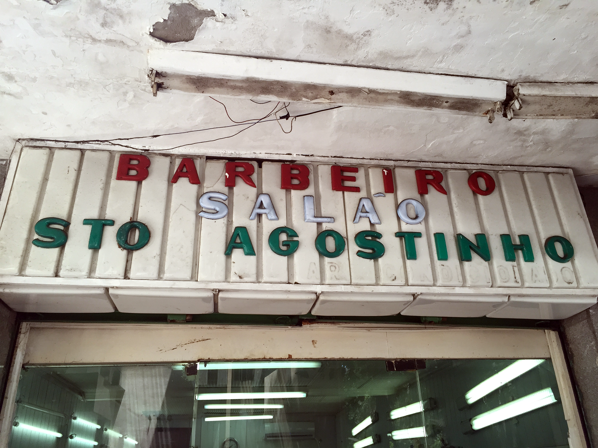
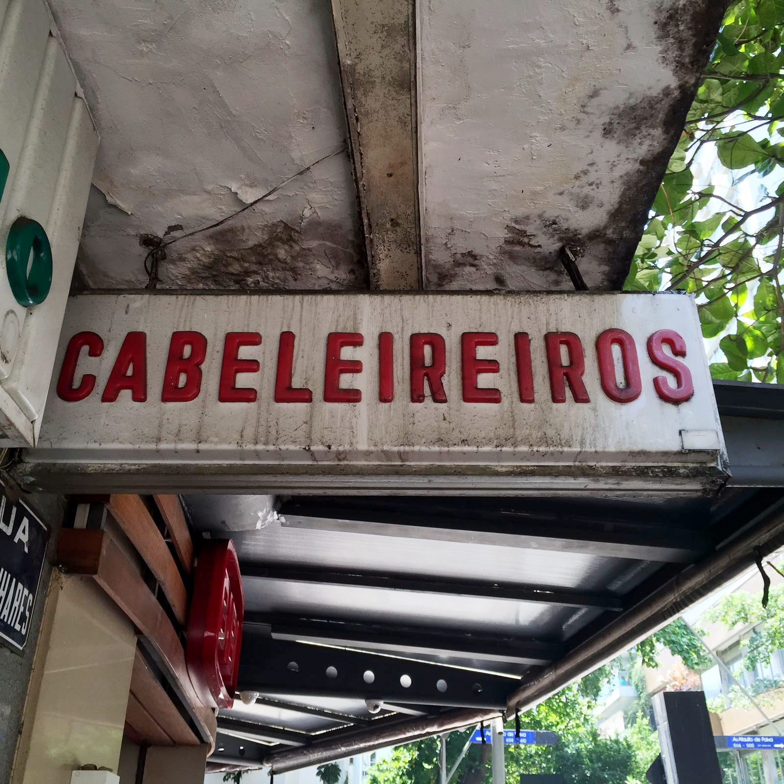
A barber in Leblon, with its runaway tilde.
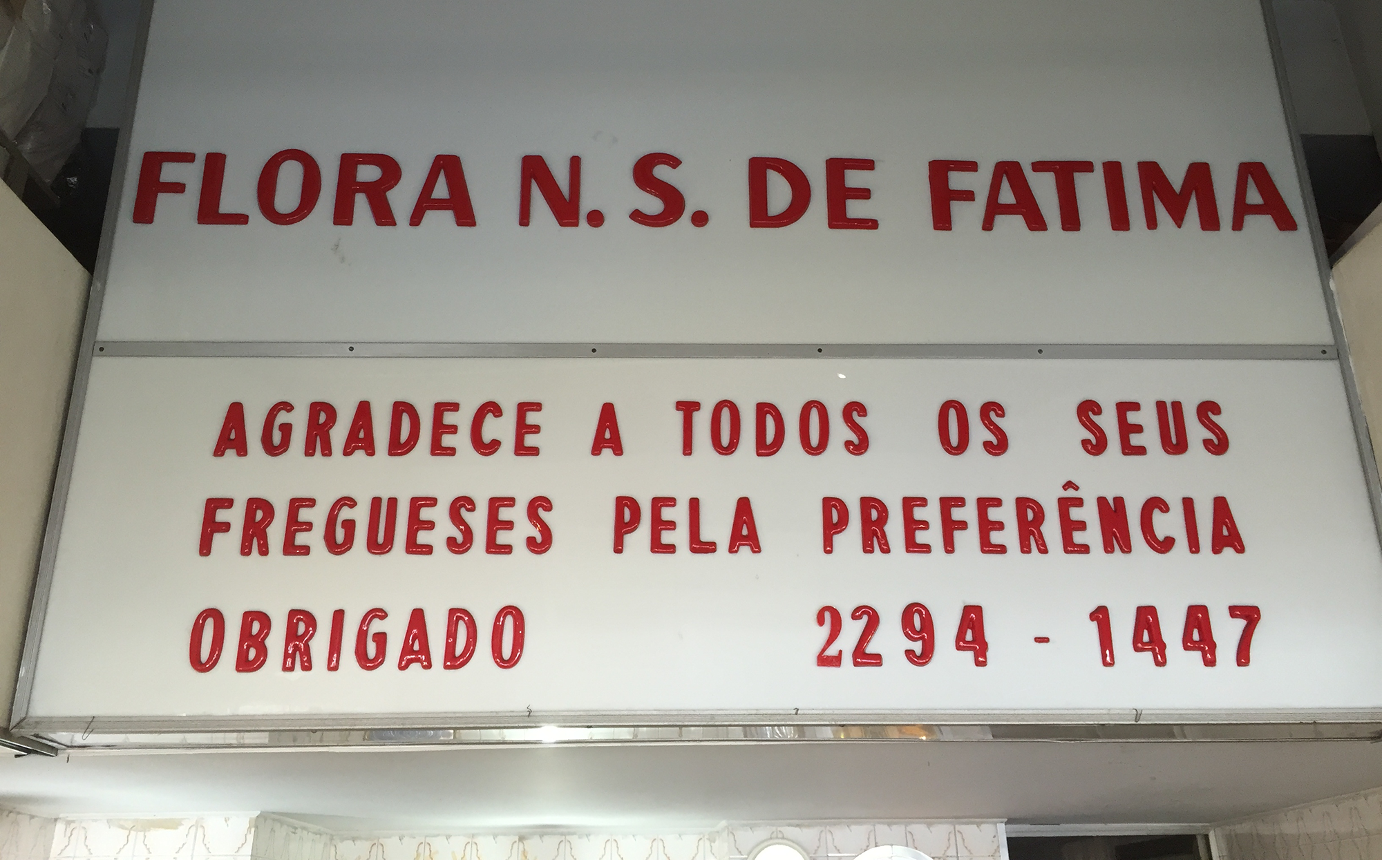
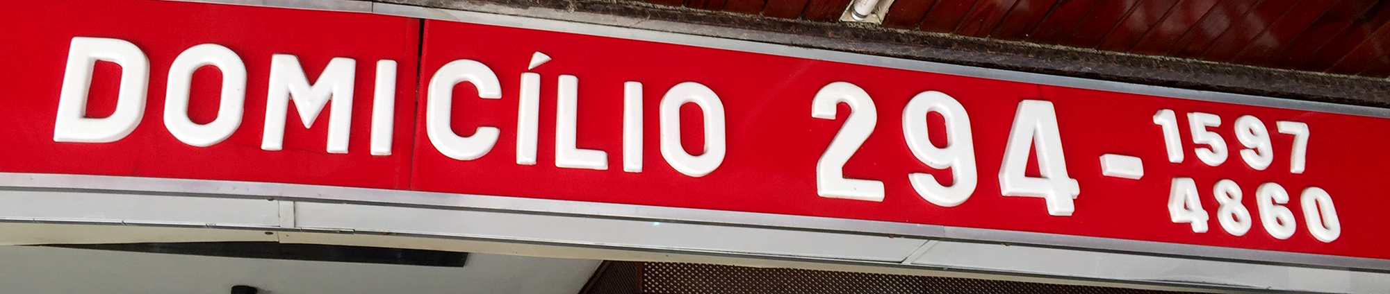
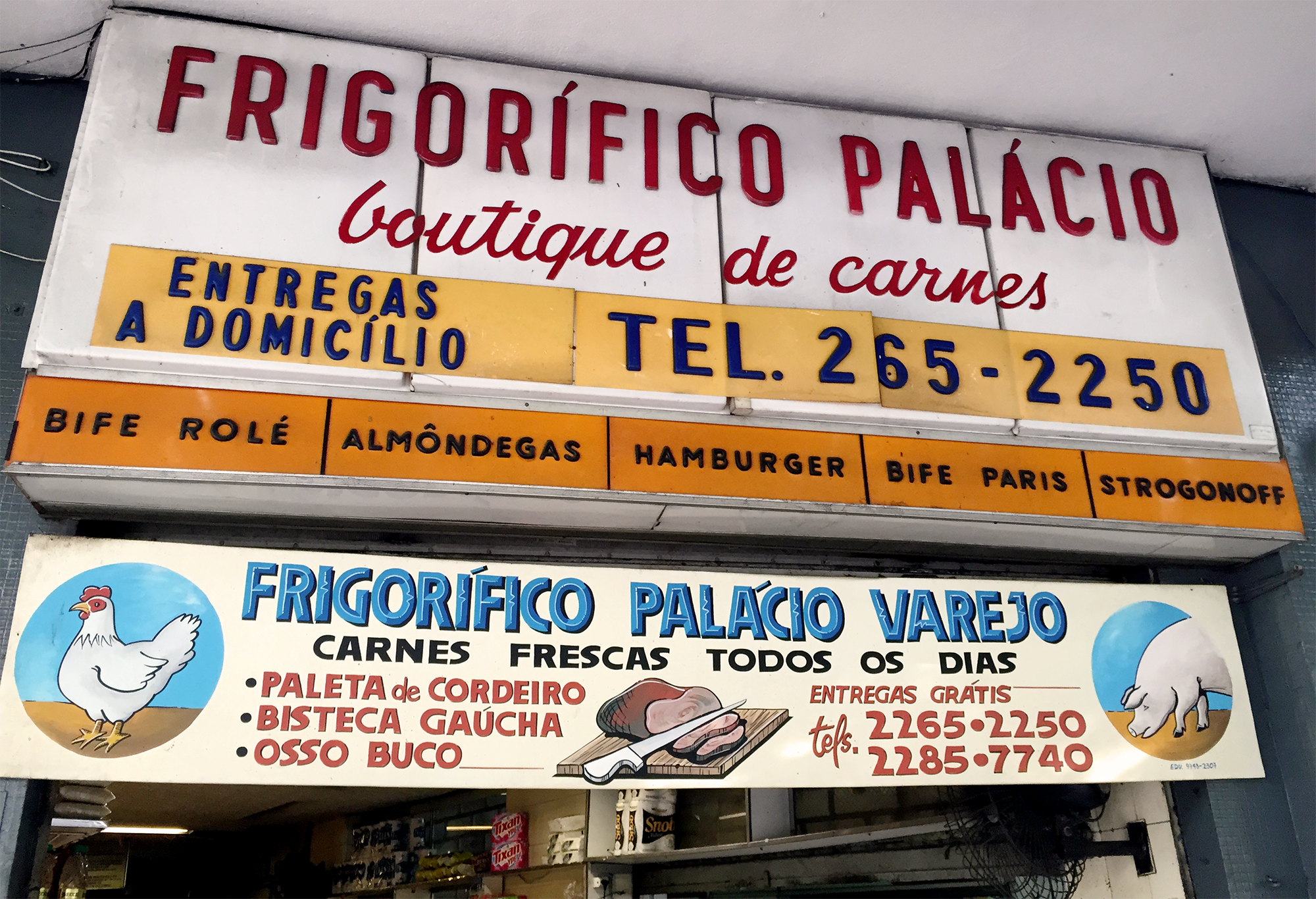
I started by visiting some commercial establishments that still have them. Increasingly, popular commerce uses plotting for their signs, or even newer kinds of acrylic letters, laser cut, glossy and hard edged with a less limited typographic palette, including custom logos, etc. But even in my family’s gentrified neighbourhood, some old signs survive, squeezed between sushi restaurants and surfwear shops that sell craft beer. Tellingly, all the phone numbers displayed on the signs still show 7 digits (landlines have had 8 digits in Rio since 2001). I walked into each of these stores and asked for the contact of the company who did the signs outside… Also tellingly, in each of these stores I managed to find an old owner or manager who has been working there for several decades, and they all told me the signs have been there for over 25 years (one went as far as saying almost 50). In a bakery that has become quite a trendy spot in the neighbourhood, the manager proudly announced that they are about to change and renew the sign within the next couple of months, with a new sign sponsored by Kibon, the country’s biggest ice cream brand.
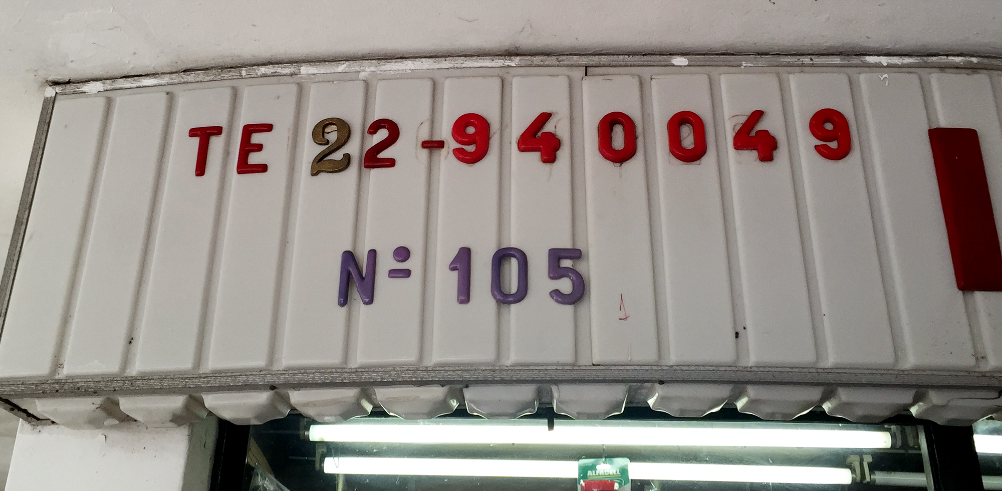
When new digits were added to landlines, some shops improvised to add the extra digit, such as this 2 taken from a door number.
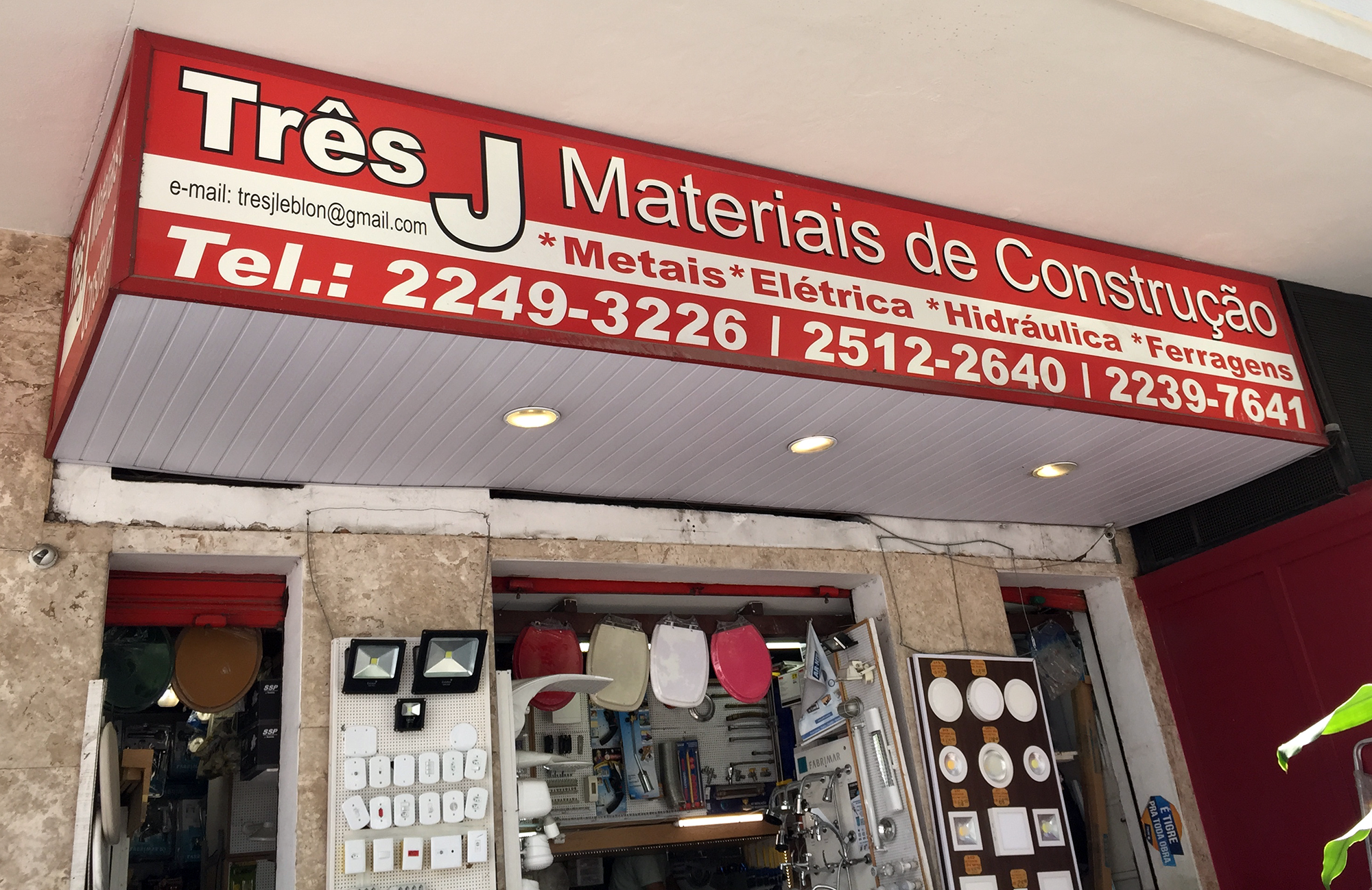
An example of the new printed signs that are replacing old acrylic ones.
Asking on a Brazilian typography group on Facebook, I was told that although it would be hard to find, there may still be a factory that makes them, or a store on the street in the city centre that specialises in acrylics. Arriving on that street and entering the first store (with its puzzling display of a completely transparent acrylic toilet seat cover for R$ 350, about US$ 90), I was told that the only person on the street that still works with lettering was Paulinho, at number 41A. Surely enough, Mr. Paulinho had been working there for decades, and when I showed him a picture of what I was looking for, he told me he doesn’t do those anymore. Nobody has requested them for years. Of course, he still sells acrylic letters and signs, but they are laser cut now, while the old ones were molded through heat using wooden matrices. This is what gives the old ones their rounded edges. The new ones can be cut from vectorial files in any shape, while the old ones had a variety of matrices in different styles and sizes. Unfortunately, there was no catalog displaying the styles: sample letters would simply hang from the wall of his shop for the client to choose from. Even more unfortunately, the wooden matrices have rotted or been infested with termites at some point, and Mr. Paulinho threw them all away, as well as any old remaining letters of that kind. (Not all is lost, though: he said that if I had a project where enough letters were needed, he would be willing to make new matrices. I do hope some Brazilian designer takes on this challenge, I only wish I could).
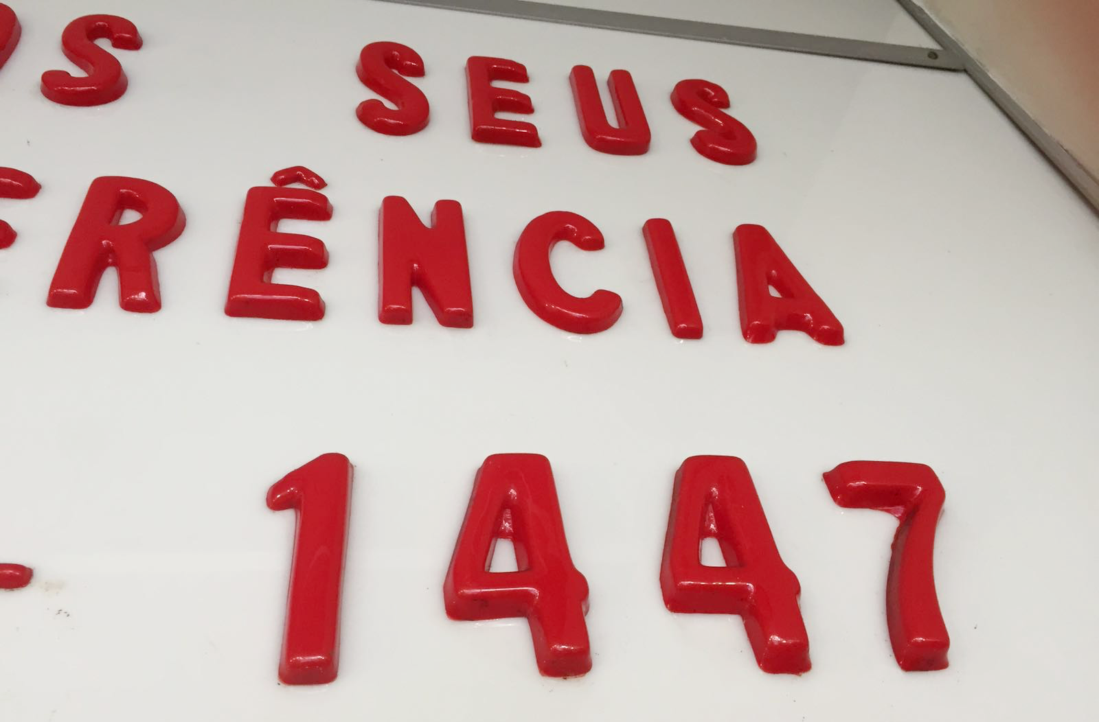
The soft, rounded edges of heat-molded acrylic.
To be frank, I realise that the appeal these signs have for me is almost entirely nostalgic. I wondered how and when they started populating the storefronts of my city, what letterforms they had substituted, how they were perceived. I looked for old newspapers for clues. In the 60s, a few adverts already mentioned acrylic signs, sometimes looking for draughtsmen with experience in acrylics or listing the material as the obvious choice for shop signs due to its light diffusion abilities. From the 1970s onwards, the presence of these signs seem to start making a real impact in Rio’s urban landscape. The first factory that produced acrylic in Brazil was set up in the state of Bahia in 1971, and an article applauded the many benefits of this petroleum-based material in comparison to “its rival”, the heavier and more fragile glass. However, for the rest of the decade, acrylic signs seem to lead an odd double life: they are either the epitome of modernity, cited on real estate adverts for new commercial buildings (alongside other flashy amenities, such as automatic lifts and air conditioning), or a symbol for decadence and bad taste spreading over once-beautiful locations around the city. One article complains that a row of acrylic shop signs in every colour makes Copacabana look like the “poor suburbs of Las Vegas”*. Another article, about plans to revitalise a traditional street in downtown Rio, notes that a revitalisation program must take the ugly shop signs into account: a well-respected scenographer and fine arts professor** argues that acrylic signs were being placed on historic façades without any taste or criteria. He points out that in Switzerland there are entire cities where you would not find any acrylic or neon lettering.
I can understand these complaints and the urge to defend the city you know from changing into something ugly and unrecognisable, although I am not quite sure what the city they defended looked like. It is hard for me to picture how Rio’s streets may have been before acrylics took over. In a book with early 20th century photographs, a picture from the city centre in the late 1930s shows lots of neon signs, which today are gone, but the articles that attack acrylic signs don’t seem to defend neon at all. I am not ready to go into this parallel research, but I’d hazard a guess that neon may not have been particularly well-received in the 30s by a city that was proud of its tropical Parisian aesthetics during the Belle Époque. But Rio has never been good at preserving its heritage.
So, there you have it. These rounded, unfussy letters were part of Rio de Janeiro for a few decades, and are now disappearing. I will vaguely miss them. I suppose I do love them, after all.

My favourite, this butcher’s sign in Largo do Machado includes a script (presumably done with a different technique), and a hand-painted banner with the updated phone number underneath.
* Rio de Janeiro Bonus Points: the same page shows a picture of Brigitte Bardot, about to visit Brazil in that year of 1973.
** More Rio de Janeiro Bonus Points: this professor, Fernando Pamplona, also worked for several years as a “carnavalesco”, a sort of carnival parade director, for the Salgueiro samba school.