
For a brief spell in the 90s, I fancied myself as a coin collector. The interest didn’t last too long, but I did end up with a few old Indian coins that I still like, including a 1945 pice that has a hole punched in the middle. Maybe it had something to do with the fact that I was in primary school, but I was very fond of coins with interesting shapes, like the 1p, 10p and 20p coins. There is little wonder then that my all-time favourite coin was the ₹2 one—it was a hendecagonal (or an 11-sided polygon), and I saw it and used it everyday.
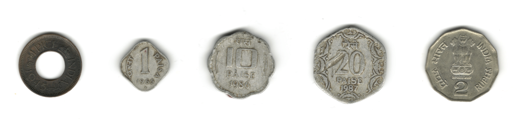
Coins of denomination 1 pice (1945), 1p (1965), 10p (1986), 20p (1987) and ₹2 (2000)
It was only later, when I became interested in design, that I noticed the squarish, monolinear Devanagari letters around several of the commemorative ₹2 coins I had collected as a child (Indian Type Foundry’s Akhand Devanagari is an interpretation of a similar style).
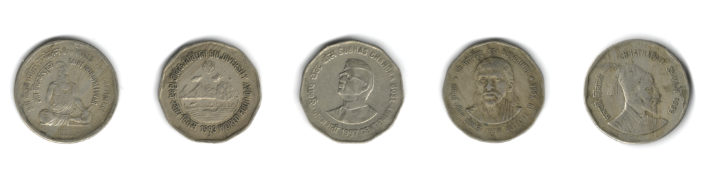
Commemorative ₹2 coins: Saint Thiruvalluvar (1995), World Food Day (1993), Subhash Chandra Bose (1997), Sri Aurbindo (1998), Chhatrapati Shivaji (1999) in the top row
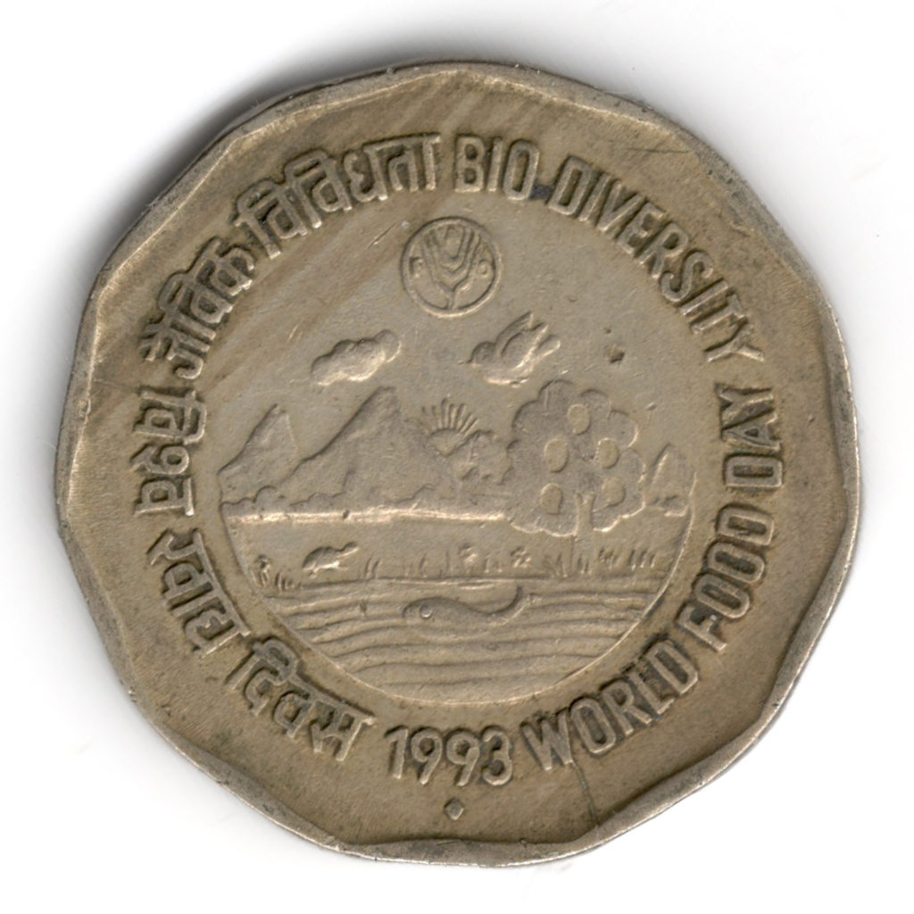
Close-up of World Food Day (1993) coin
But coming back to my love affair with the hendecagonal-shaped ₹2 coin: in 2006 and 2007, the Reserve Bank of India (RBI) circulated two new versions of the ₹1 and ₹2 coins. My beloved hendecagon was gone. The coins were now round. Needless to say, I was very disappointed. The first series was a new interpretation of the national integration theme that the ₹2 coins had carried for some time, and the second was the Hasta Mudra Series that Shelley adores. These coins show hasta mudras, or hand gestures from classical dance that also represent the coin’s denomination. A clever idea, no doubt! The size and shape of the ₹1 and ₹2 coins became identical. While earlier you could tell which was which without looking and simply running your hand against the edge; now you had to look and check if you were handing out the right change. This was bad enough for those who could read, worse for those who couldn’t, and truly a problem for the visually-impaired.

₹1 and ₹2 coins from the Hasta Mudra series
Unfortunately, things have only become worse since, especially for the visually-impaired. In 2011, the RBI issued new designs for the 50p, ₹1, ₹2, ₹5 and ₹10 coins to include the new rupee symbol. The shape and design of the first four is the same, except the text that describes their denomination. They are impossible to distinguish at a quick glance. A case of bad design, if there was ever one.
This post is part of My 2¢, a short series on money-related type and lettering examples, stories and thoughts. You can read the rest of the series here.