
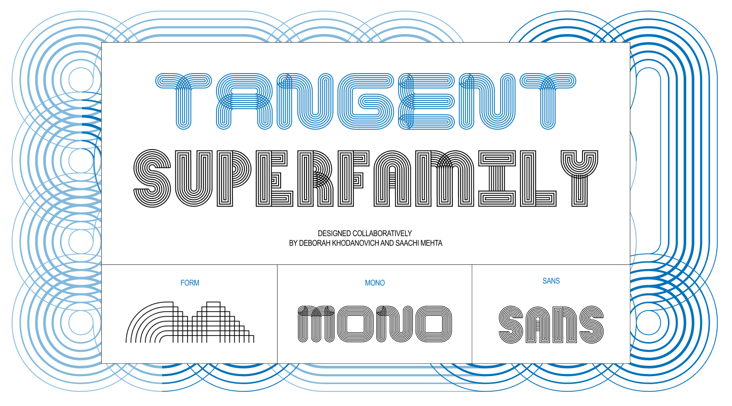
How we collaborated on an on-going generative type system.
Deb: So, we want to write this article for Alphabettes, right?
Saachi: Yeah, to talk about our process. How we actually built Tangent.
Deb: How did we even start? It feels like we got to it so fast. Like one day we had nothing, and the next we had… a superfamily?
Saachi: Okay, let’s back up. All the way to the beginning.
Pit Stop 1: (Crossed) Pathways
It began in Kelsey Elder’s class called Variable; with the assignment Kit-Car. The brief was simple:
In the spirit of Sister Corita Kent, observe the world around you, and find a source. Look to find form in things that are, too, made up of shapes or parts. Consider toys, patterns on family heirlooms, fundamental shapes of objects, optical illusions, and so on. Create components from this source of inspiration and use them to make a set of static glyphs.
Corita Kent’s line: “learn to see the world by looking at the world one piece at a time” was basically the north star for the whole thing. Start small, start with parts.
Deb: We knew from the start that we wanted to collaborate on this, which meant we needed to start somewhere modular, something that could actually be passed back and forth between us.
Saachi: And we were both already circling the same obsession for our theses, from different directions: Stories. Dialogue. Gossip. The way ideas converse, connect, and evolve from one to another.
Deb: So the question became: what would a typeface look like if every glyph was connected to its neighbors? We started with the simplest modules we could draw.
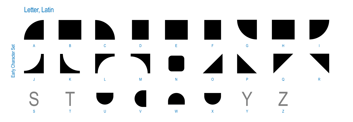
Saachi: I was thinking about ribbons at the time, that continuous over-under twisted quality.
Deb: And I was deep in custom path-drawing in Animal Crossing, of all things.
Saachi: Different rabbit holes, same destination. We were both circling textiles: knitting, weaving, embroidery. And pretty quickly we went from solid connected forms to layered strings of lines, hoping they could actually weave in and out of each other like thread, that became the beginning of multiple strokes in parallel.
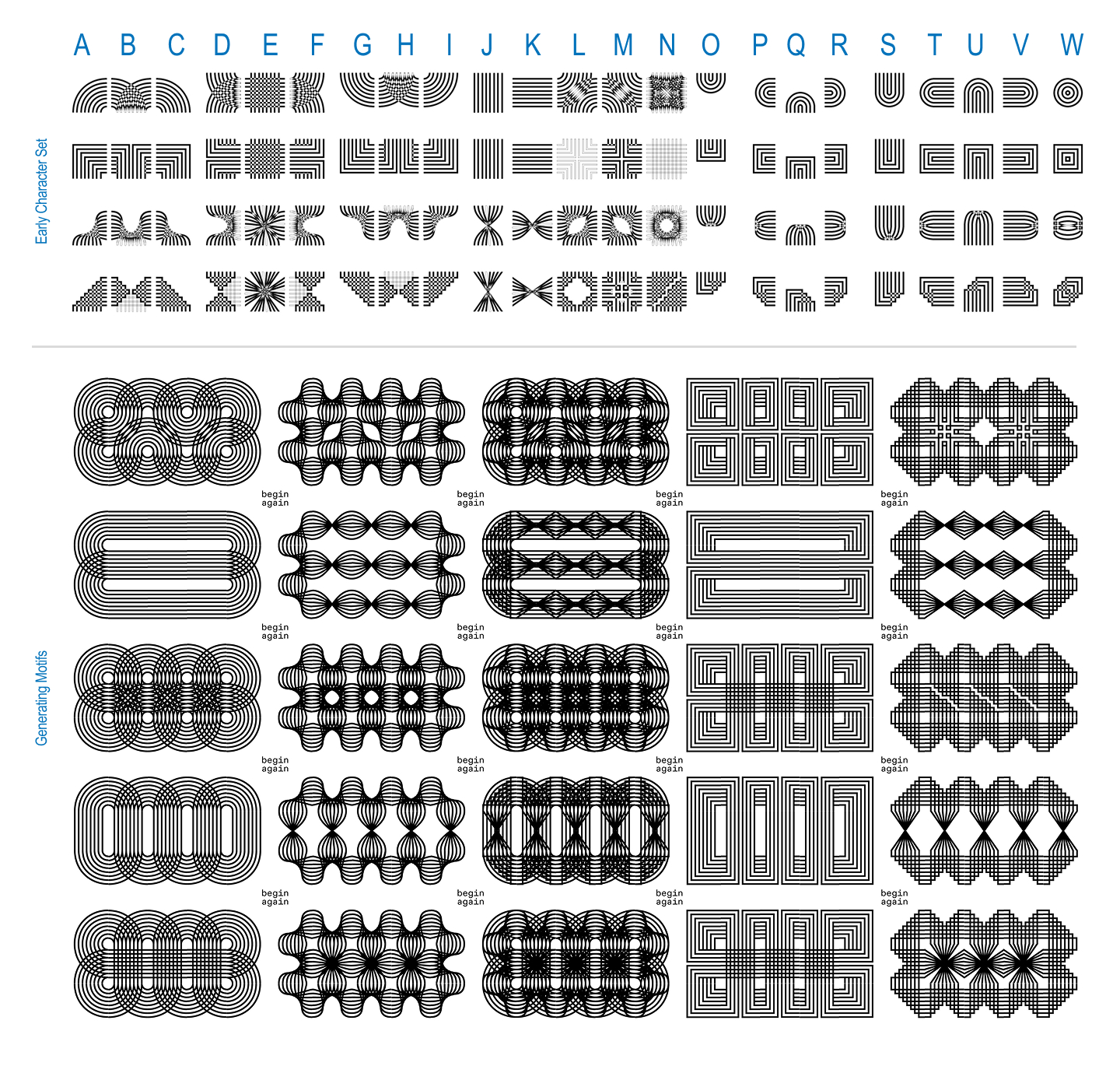
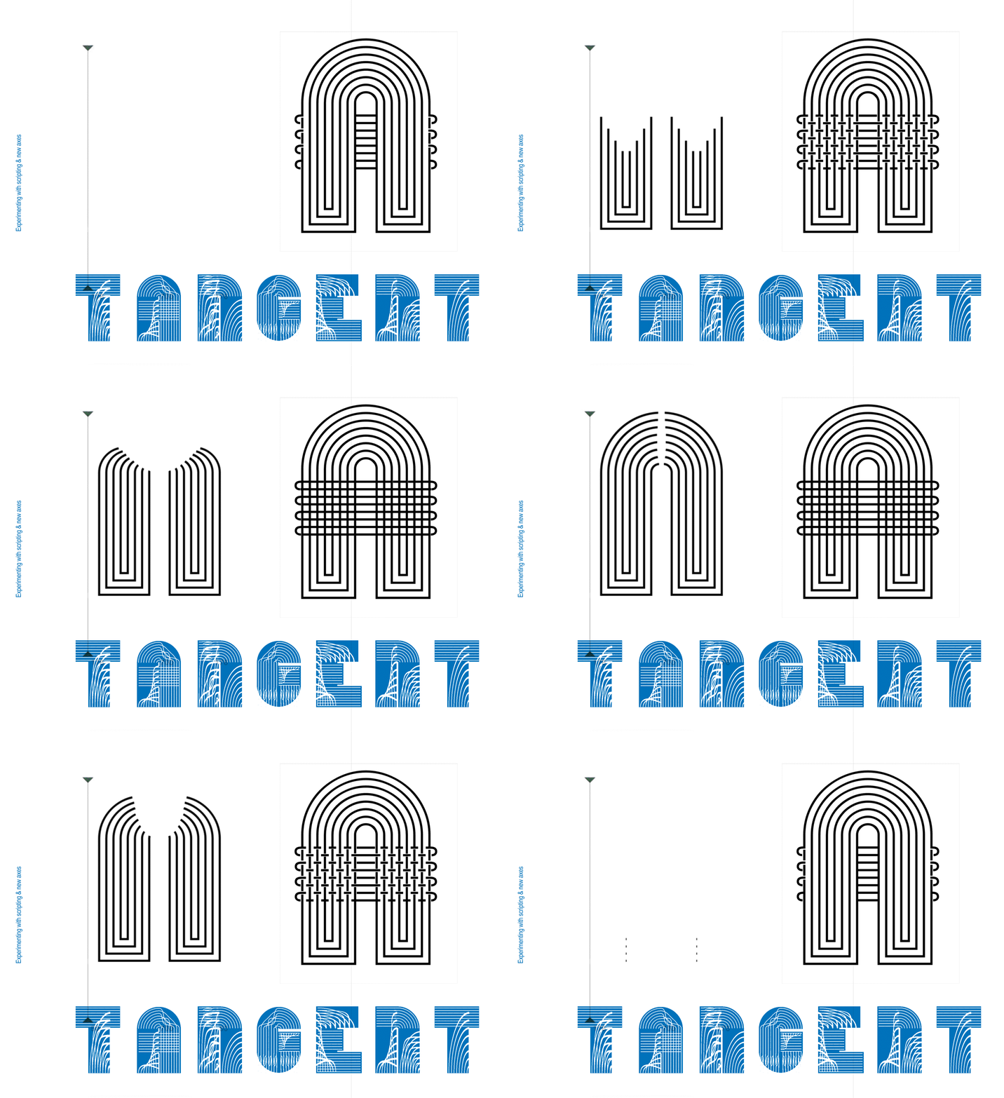
Deb: That weaving idea became the first real version: one weight, one axis. A completely modular system that always connects to itself, and twists; a pattern-making font. This was the core mechanic, honestly; round or square, twisted or untwisted. Everything that came after started with this. The concept was simple.
How does gossip and oral story-telling transform and shape shift? How do stories get twisted over time, as they are passed through dialogue from person to person? What paths and lineage do these conversations evolve through?
Saachi: With that idea, we started on the same screen, scribbling on the same sheet of paper. Trying to get the initial grid of parts to work and connect to one another.
Deb: Once they connected, we took off, each trying to make the twist work.
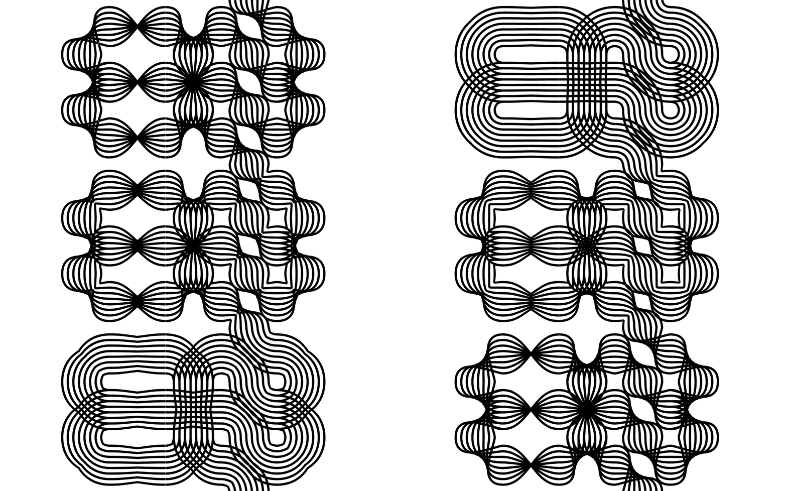
Saachi: This was a truly collaborative typeface- we shared files, worked on the same screen and–
Deb: somehow had the exact set of skills that when put together, created the perfect harmony.
Pit Stop 2. (Finding Our) Axes
Saachi: Once we had a system that worked, Kelsey hit us with a real question: how does a person actually type with this? A modular, twisting, connecting system is a fun idea until someone has to sit down and use it. We could use it intuitively at this point, but others… less so.
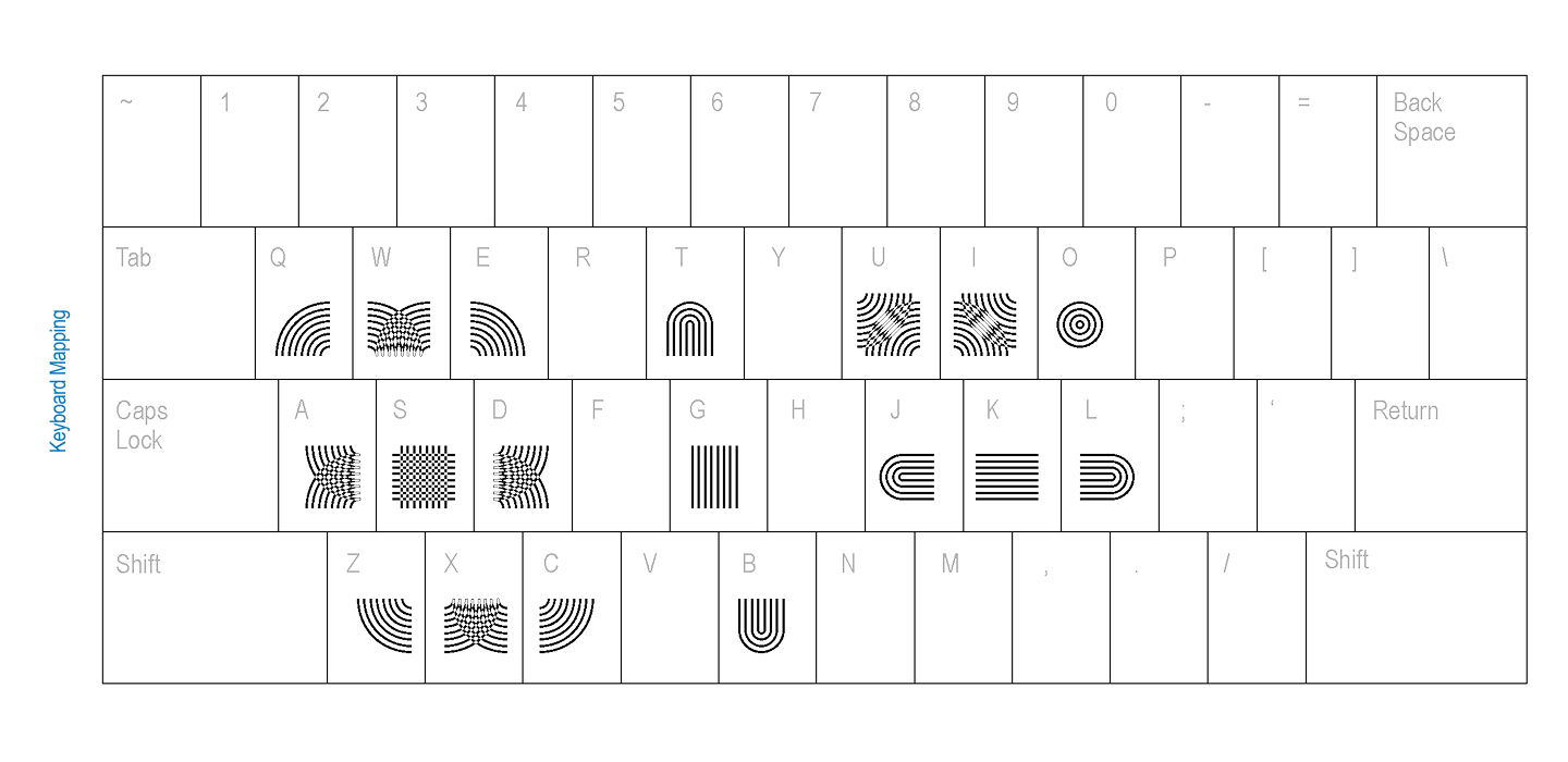
Kelsey suggested: Why don’t you run some keyboard mapping tests with your peers, to figure out the most intuitive way to assign these connecting parts to keys, looking at digital games and the like?
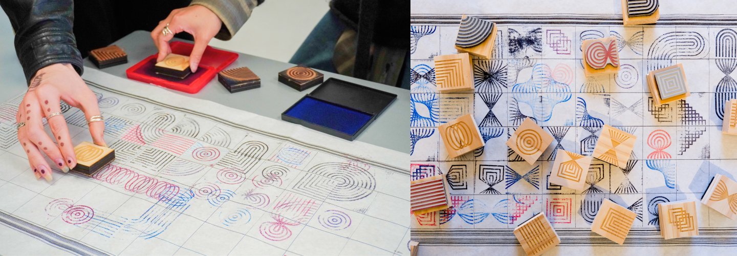
Deb: We also went physical. We made rubber stamps, asking people to stamp our glyphs on a really long grid, just to feel the modularity in our hands instead of on a screen.
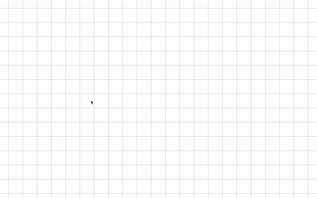
Saachi: And we tried a completely different kind of input: drawing with it. There was a Processing sketch where you could draw your way into the system instead of typing.
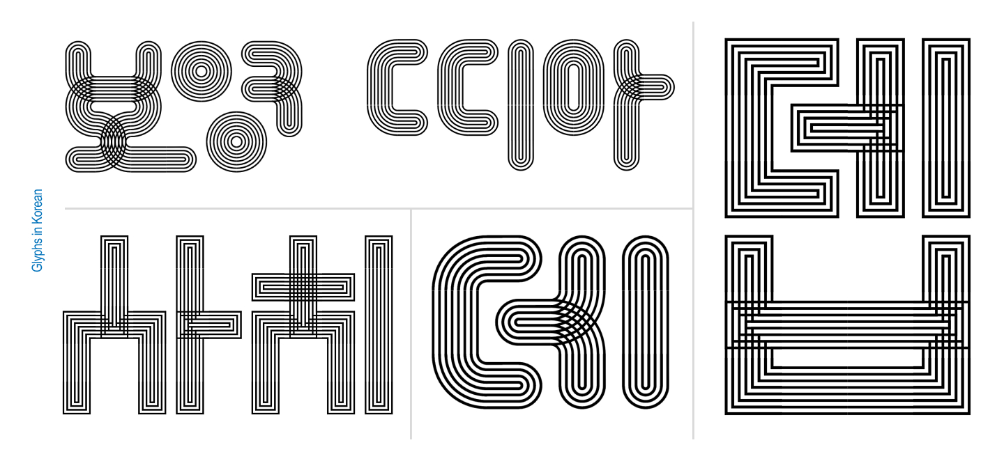
Deb: And because we were surrounded by graphic designers people started making letters out of it. Instinctively. Nobody asked them to. We watched people default to Korean and English letterforms the second we handed them the modules.
Pit Stop 3. (Going off on a) Tangent
Saachi: That was kind of the turning point. If everyone who touched this system reached for letters, so we did too.
Deb: Well that, and we were in a variable type class at the time, emphasis on the type.
Saachi: Right… so we expanded the size of the grid and started building out full alphabets, with contextual alternates. We ran colour experiments. We tried making a Sans. This is where Tangent stopped being just a modular system and started actually becoming a typeface.
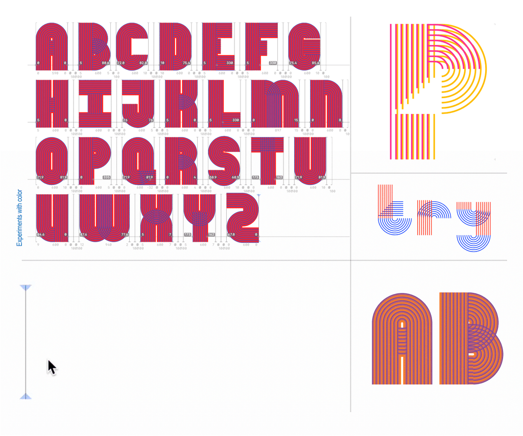
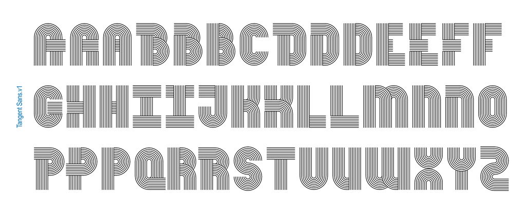
Deb: Completely generative, right? At some point Kelsey looked at what we were doing and asked: since this whole system is generative, what if you asked a computer to make every possible permutation?
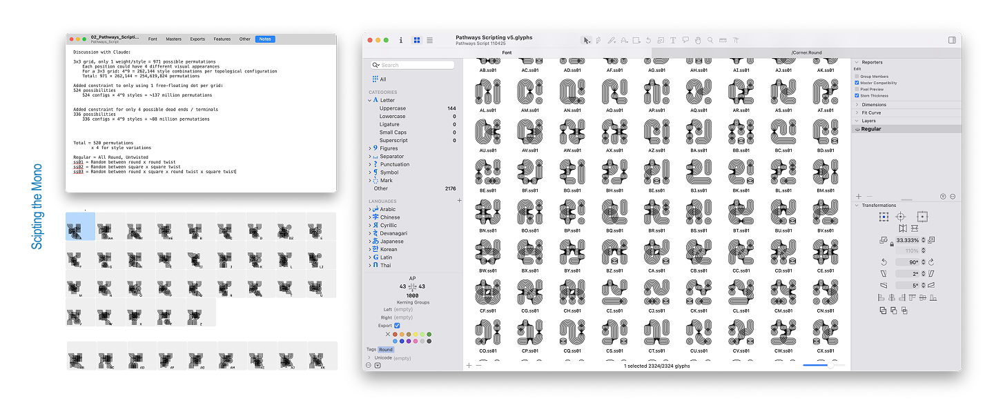
Saachi: We gave it rules. A 3×3 grid. Every spot has to be used. Everything has to connect. A cap on how many empty slots were allowed. No rotating pieces to cheat the system.
Deb: I spent so much time with Claude at that point. Trying to get the script to work properly. Finally it did, making 971 glyphs. And, of course, as type designers, we immediately started seeing letters in the noise. We couldn’t help it. That exploration led to the Mono.
Pit Stop 4. (It takes a) Superfamily!
Saachi: Then Kelsey hit us again: what happens if it moves?
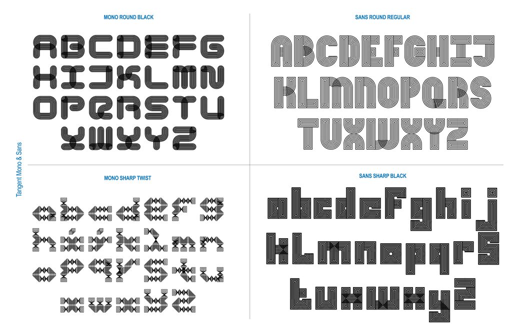
Deb: And just like that we were back in variable territory. We built out a complete 5-axis system, with twist, weight, amplitude, stretch and radius, across a Sans and Mono version.
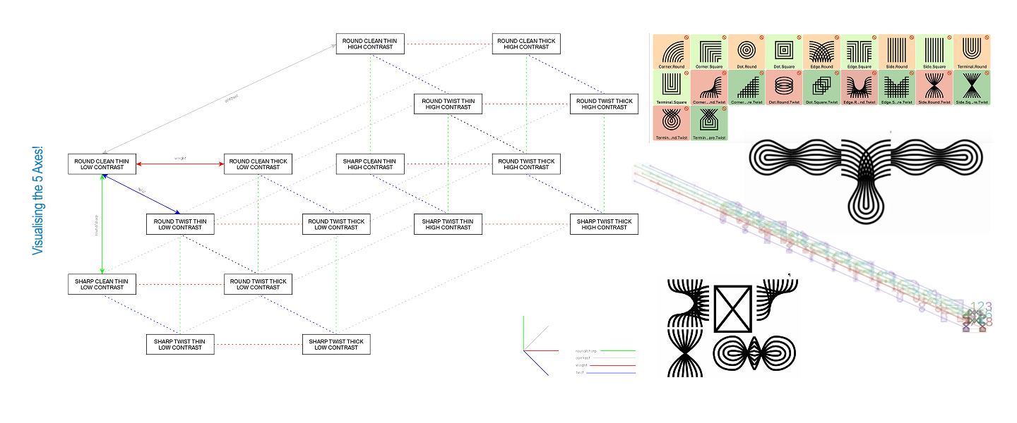
Saachi: This was a task in itself, and we often got extremely frustrated when Glyphs rebelled against our complicated workflow or just wouldn’t export our typeface.
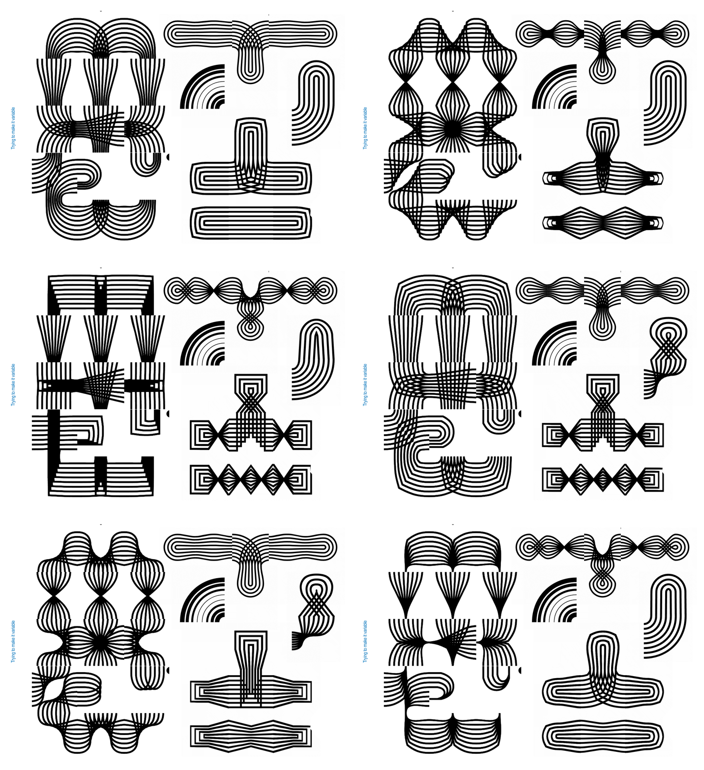
Deb: It was so nice to have a collaborator, we would just send the file to the other person when we were completely defeated by Glyphs.
Saachi: We’d get so frustrated, and then be like “Deb!! This doesn’t make sense to me!”
Deb: And somehow the other person, with a fresh pair of eyes, always knew how to solve it.
Saachi: Honestly, this whole project has been so generative that we have a running list of new axes and spinoff versions this superfamily could still grow into. Every time we think we are done with it, we come up with new things to add to it.
Deb: So: this is an open call. If you want to play with Tangent, we’d genuinely love that. Making a poster, an experiment, anything fun? Reach out and we’ll send you our font files.
Saachi: And if you’re reading this thinking “this is exactly the kind of weird, connective, story-driven identity my brand needs” hire us. We mean it.
DEBORAH KHODANOVICH
Deborah Khodanovich (she/her) is a Toronto-born designer and educator based in Providence, RI, having recently completed her MFA in Graphic Design at RISD. Her practice explores gossip as a method of producing and sharing knowledge, examining information networks and intimacy as design methodology. Working across typography, textiles, and books, she questions who gets to create knowledge, how it circulates, what gets valued or dismissed, and how we attribute ideas along the way. Get in touch at dvorit.ca
SAACHI MEHTA
Saachi Mehta (she/her) works at the intersection of visual design, motion graphics, and systems, translating concepts into visual experiences across identity, environmental, and editorial contexts. She’s drawn to building systems that hold together at any scale and of late, she has also enjoyed teaching; she taught Motion Design at Rhode Island School of Design, where she also received her MFA in Graphic Design. She has worked as a Graphic and Motion designer for the RISD Museum, Netflix, HP, and more. You can find her at saachimehta.work