Alphacrit: January 18, 2019

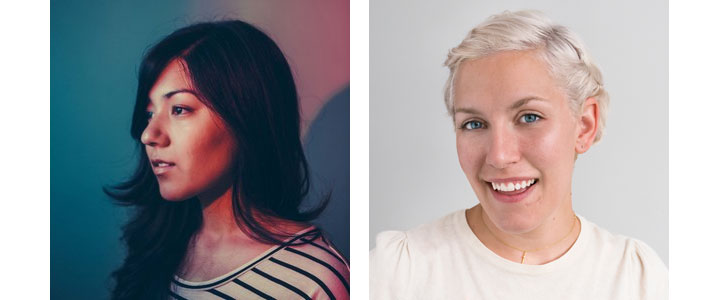
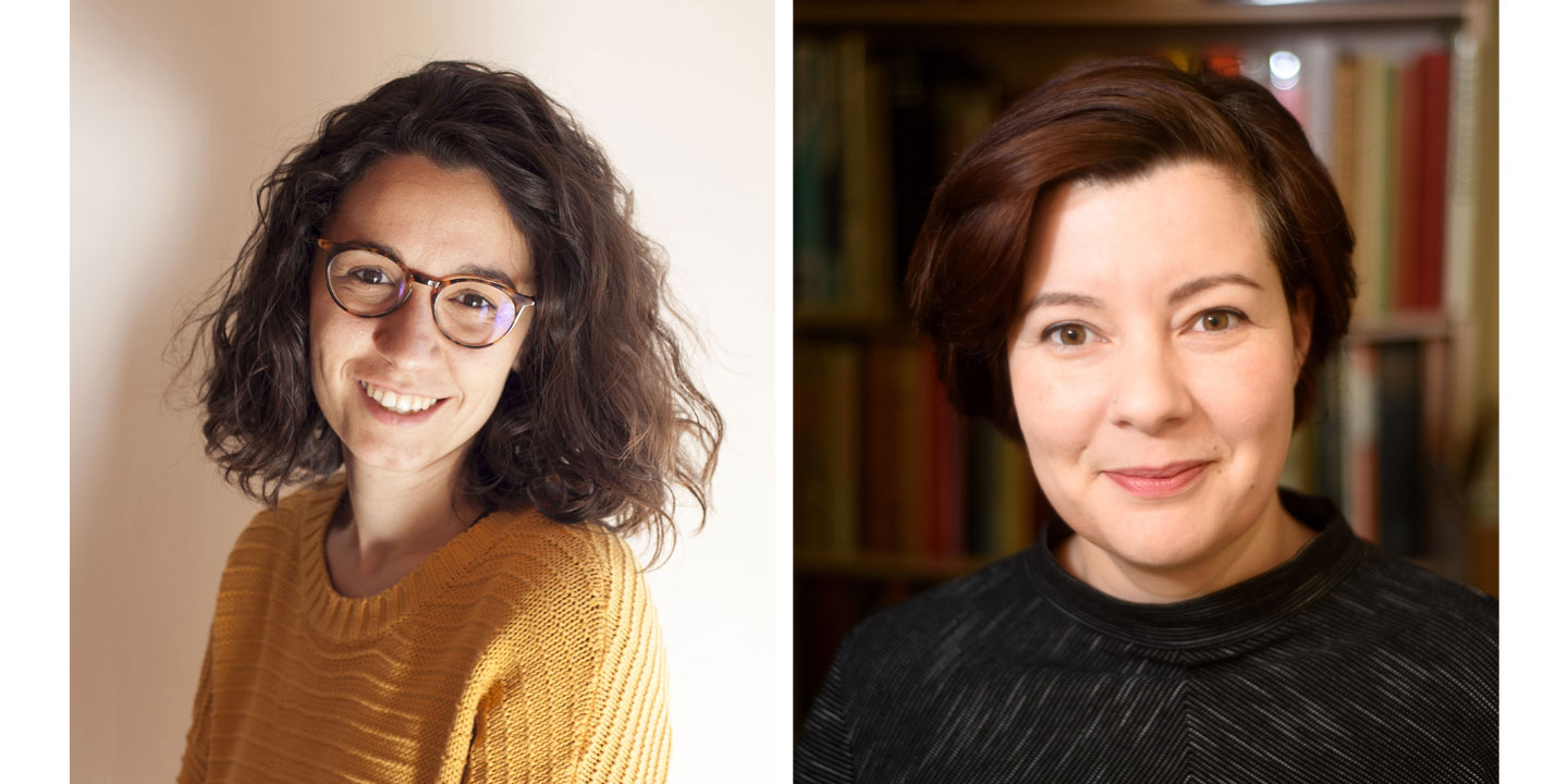
This special session of Alphacrit will focus on Indic scripts, specifically Devanagari and Odia. Kimya Gandhi and Alessia Mazzarella will review in-progress typefaces of four lucky participants seeking feedback on their work. Sol Matas will moderate to ensure a smooth crit. Read on to learn more.

Kimya Gandhi is a type designer from Mumbai with a passionate interest in Indic scripts, specialising in creating new and innovative Devanagari typefaces. Kimya is a partner at the type foundry, Mota Italic, with her husband Rob Keller. She divides her time between designing and teaching typography and type design at various design institutes in Mumbai. After graduation, Kimya gave herself two years to decide if she wanted pursue type design professionally, it’s been 7 years since and she is very happy that she did.

Alessia Mazzarella is a senior type designer at Fontsmith. After receiving a BA in Graphic Design from Central Saint Martins and a BA in Graphic and Multimedia Design from Sapienza (University of Rome), her interest in type design led her to the Typeface Design MA program at the University of Reading. She graduated with distinction in 2013. Alessia is interested in the technical and multi-script aspects of typeface design.

What to expect: Four people will present their in-progress typeface, each receiving approximately 10 minutes of feedback. The entire session will last about an hour. Participants will have the benefit of sitting in on the other critiques as well. To keep it focused, we suggest presenting either a single weight of a typeface or come prepared with a specific question about a multi-weight typeface. Specimens need to be ready a couple of days before the session so plan ahead!

When & where: Friday, January 18 at 6:30 pm GMT (UTC +00:00) via video conferencing.

Who can participate: This session is open to everyone, of any skill level, and the four spots will be drawn lottery style. Preference will be given to underrepresented groups and people who haven’t participated before. Underrepresented groups include, but are not limited to: women, people of color, people with disabilities, and LGBTQ+ individuals.

How to apply: Fill out this form https://goo.gl/forms/dvHmo8QYt7NYSJuj2

It asks for some very basic information, like your name and email address. Nothing you can’t handle.

Applications due by: January 10, 2019

Questions: Still have questions? Drop us a line at crit@alphabettes.org.
Dear Alphabettes: what defines a ‘Book’ weight?

Dear Alphabettes,
Is ‘Book’ supposed to be lighter or bolder than ‘Regular’?

Lisa

Hey Lisa,

Thanks for asking! And no thanks for making me answer this. We put out a poll asking our peers what they think it’s supposed to be, and you’re not going to like the results. 58% of the votes claim it should be lighter, while 42% claim it should be darker. There are historic, conceptual and technical considerations for why it might be so uneven.

The reasoning for ‘Book’ to be lighter than ‘Regular’ is as good as the one for it to be bolder. A lighter weight ‘Book’ style may have been made to counteract the print gain of paperback printing, and a darker ‘Book’ style may have been made to look better when smaller (just as optical sizes tend to gain weight towards the smaller end). I find both of these lines of reasoning persuasive and logical. (And then there are also the instances where it’s neither reason, but something else entirely, or just legacy.) And then we’re back to why you asked the question in the first place.

There is also a technical problem with some software interpreting ‘Book’ to be the same weight as ‘Regular’. That means that the styles will be sorted differently – or even ignored – depending on the application you’re using. Software doesn’t care about the logical conundrum, or which side of the Twitter poll gets slightly more votes. If software got to decide, we’d just name all our weights with numbers instead.

If it is reasonable for a weight to be two different things, perhaps the best solution is to avoid the name ‘Book’, at least in combination with ‘Regular’. Type designers should then skip the term, and instead either commit to a more thorough system for optical sizes, or adopt more distinct names. Some favourites include ‘Blond’ (as Fred Smeijers likes to call his slightly-lighter-than-regular weights) and the rather literal ‘Blanca’, ‘Gris’ and ‘Negra’ pairing that PampaType do in their fonts. I guess I’m partial to poetic names.

Lisa, I’m sorry, but I’m gonna have to give you the most common [citation needed] answer in type design: It depends!

Love,
Robin

Alphacrit: June 22, 2018

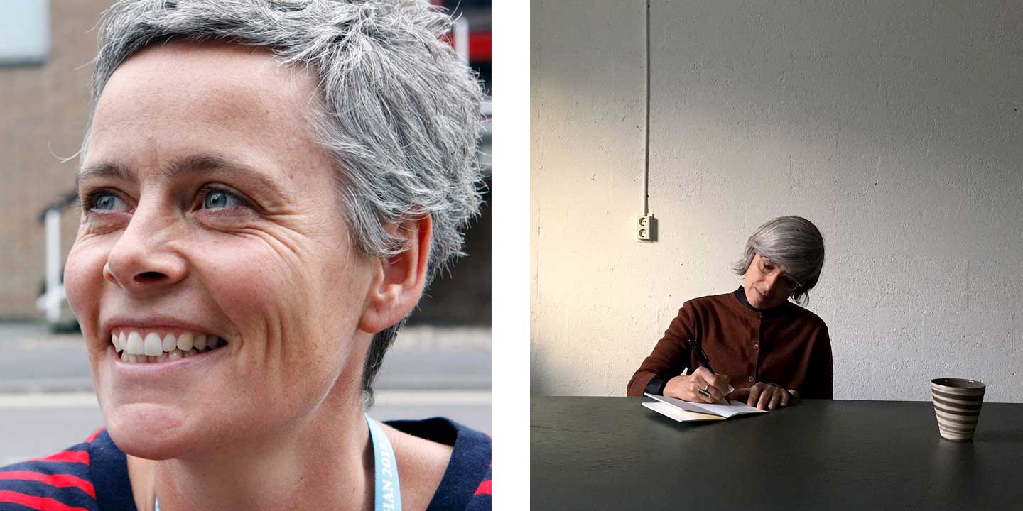
Welcome to the tech edition of Alphacrit. Instead of reviewing in-progress work, Noe Blanco and Irene Vlachou will answer your questions about font production and technology. Designing a typeface is one thing, making a font technically sound is entirely another.

What kind of questions can they answer? Noe and Irene have wide a range of experience designing and producing fonts. Together, they can cover topics such as font engineering, hinting, getting a font ready for release, variable fonts, specificities of production related to the Greek script, foundry workflows and many of the details in between (coding OT features, bezier point placement, class-based kerning, their experience with various font editors, etc.). Read their bios below to learn more about their backgrounds.

Noe Blanco and Irene Vlachou

Noe Blanco is a typeface designer and font engineer based in Barcelona. She enjoys drawing and producing fonts with a special focus on the process where drawing and design meet technology. After graduating at BAU with a BA in Graphic Design and an MA in Advanced Typography at Eina (Barcelona), Noe went on to complete an MA in Type and Media at the Royal Academy of Arts (KABK) in The Hague. Noe has worked for Underware and since 2013 has collaborated independently with numerous foundries such as Tobias Frere-Jones, Blackletra and FosterType. Currently she works at Klim Type Foundry and occasionally collaborates with other independent foundries.

Irene Vlachou is a typeface designer working somewhere between Bristol and Athens. After trying life as an artist and a violinist, Irene found her vocation. Her terrible handwriting and horror of olives turned out to be no obstacles for her becoming a type designer specializing in Greek. In 2004 she gained her Masters in type design at the University of Reading and since then she has been collaborating with many international type foundries as a typeface designer and as a Greek type advisor. She designs original custom typefaces as well as extending typefaces to add the Greek character set and she is a senior designer and the variable font obsessive at TypeTogether.


What to expect: There are six slots for this session. Each participant will come up with three questions (at the time of application) about font production or technology. During the session, Noe and Irene will answer the questions, starting with each participant’s first and getting to the rest if there is time. Participants will sit in on the entire session and have the opportunity to ask questions and follow up on anything they don’t understand. The session will last about an hour.

When & where: Friday, June 22 at 9am Central (2pm UTC) via video conferencing.

Who can participate: This session is open to everyone, of any skill level, and the eight spots will be drawn lottery style. Preference may be given to underrepresented groups and people who haven’t participated before. Underrepresented groups include, but are not limited to: women, people of color, people with disabilities, and LGBTQ+ individuals.

How to apply:
Fill out this form: https://goo.gl/forms/wgE2pqCsH0VFT0i02

It asks for some very basic information, like your name and email address. Nothing you can’t handle.

Applications due by: June 13, 2018

Questions: Still have questions? Drop us a line at crit@alphabettes.org.
Alphacrit: May 18, 2018

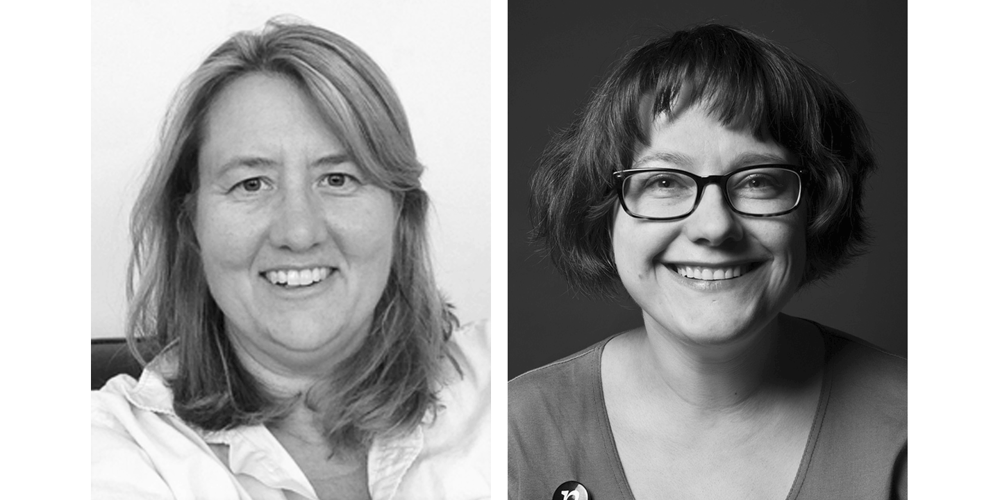
Take your typeface to the next level by getting constructive feedback from two seasoned professionals. This Alphacrit, focused on typeface design, features Jill Pichotta and Nina Stössinger (Jill Pichotta!! and Nina Stössinger!!). Four lucky participants will submit their work for Jill and Nina’s review. Nicole Dotin will moderate to ensure a smooth crit. Read on to learn more.

Jill Pichotta began working for Font Bureau as an apprentice with David Berlow in 1991, honing her skills on projects for Rolling Stone, Esquire, Condé Nast Traveller, The New York Times, Apple Computer, and other notable brands. She has managed the production of retail releases for independent designers since 1993, and has contributed several of her own typefaces to Font Bureau’s diverse library. Over the years, she has divided her time between various retail, custom, and OEM projects. In conjunction with its mid-2016 launch, Jill Pichotta took on the role of Principal Product Manager for Type Network, overseeing type development and quality for the company’s global alliance of foundry partners.

Nina Stössinger is a Senior Typeface Designer at Frere-Jones Type. Originally from Basel in Switzerland, she graduated in multi-media design from Burg Giebichenstein University of Art Halle/Germany, where she discovered her love for type. She went on to receive a CAS in Type Design from Zurich University of the Arts, and an MA in Type and Media from the Royal Academy of Art in The Hague. Nina teaches type design at Yale University School of Art, serves on the Board of Directors of the Type Directors Club, and has spoken at numerous international conferences and events (this year she’ll be a keynote speaker at Typecon!). Her published type designs include Conductor (with Tobias Frere-Jones), Nordvest, and FF Ernestine.

What to expect: Four people will present their in-progress typeface, each receiving approximately 10 minutes of feedback. The entire session will last about an hour. Participants will have the benefit of sitting in on the other critiques as well. To keep it focused, we suggest presenting either a single weight of a typeface or come prepared with a specific question about a multi-weight typeface. Specimens need to be ready about a week before the session so plan ahead!

When & where: Friday, May 18 at 2 pm Eastern (UTC -4) via video conferencing.

Who can participate: This session is open to everyone, of any skill level, and the four spots will be drawn lottery style. Preference will be given to underrepresented groups and people who haven’t participated before. Underrepresented groups include, but are not limited to: women, people of color, people with disabilities, and LGBTQ+ individuals.

How to apply: Fill out this form https://goo.gl/forms/kvUTTfX3wG6fGkix1

It asks for some very basic information, like your name and email address. Nothing you can’t handle.

Applications due by: May 6, 2018

Questions: Still have questions? Drop us a line at crit@alphabettes.org.
Dear Alphabettes: What is a good font editor for Windows 10?

Dear Alphabettes,
I worked in Typographer a long long time ago. I made a few of my fonts back then. What I would love to ask you, what is the modern version of that programme? which one can I use for the Windows 10. Thank you very much for your answer.

Dear Windows,

Thanks for your question. We are going to assume you are referring to Fontographer, which you can actually still buy (for Windows or Mac) from its vintage but functional website. What if you wanted to spread your wings a little and fly a bit closer to the sun. What would be your options then, Dear Windows?

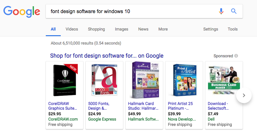
At first, we thought this might be a quick LMGTFY situation. However, we treat each Dear Alphabettes question with the utmost respect it deserves. Also, we did that and got this hot mess:

a google search for "font design software for windows 10" turns up a bunch of unrelated things like CorelDRAW and Hallmark card design software.

Thanks but no thanks, Google.

Continue reading

Alphacrit: April 27, 2018

Ever wonder what Dana Tanamachi and Kelly Thorn think of your work? You can find out! The focus of this Alphacrit session is lettering, where Dana and Kelly will provide constructive feedback on your own works of lettering. Nicole Dotin will moderate to ensure a smooth crit. Read on to learn more.

Dana Tanamachi and Kelly Thorn

Dana Tanamachi began her career as a graphic designer, but serendipitously discovered she had a knack for creating large-scale chalk lettering murals — a trend which she pioneered beginning in 2009. Post-chalk, she now runs her Seattle-based company Tanamachi Studio where she blends her talents in lettering, design, and illustration for clients such as Nike, Target, West Elm, Instagram HQ, and the USPS. In 2017 she spent the entire year spearheading the ESV Illuminated Bible project, with over 500+ gold ink illustrations.

Kelly Thorn is a lettering artist and illustrator who runs the design studio Charles&Thorn with her husband Spencer Charles, whom she met while they were both working at Louise Fili, Ltd. Together, Kelly and Spencer specialize in lettering, type design, illustration, branding, packaging, book covers, and all of the intersections in between — including, but not limited to hand-poked tattoos!

What to expect: Four people will present their work or works-in-progress, each receiving approximately 10 minutes of feedback from Dana and Kelly. The entire session will last about an hour. Participants will have the benefit of sitting in on the other critiques as well. Work submitted for review can be anything from single lettered words, to logos, to lettered book covers. You may want to submit only one complicated piece or 5-10 smaller pieces to talk about your overall trajectory. Work samples need to be ready about a week before the session so plan ahead!

When & where: Friday, April 27 at 11 am Central (UTC -5) via video conferencing.

Who can participate: This session is open to everyone. Depending on demand, we will give preference to underrepresented groups and people who haven’t participated before. Underrepresented groups include, but are not limited to: women, people of color, people with disabilities, and LGBTQ+ individuals. The four spots will be drawn lottery style.

How to apply: Fill out this form: https://goo.gl/forms/43f7f2l8zuJBJqIp2

The form asks for some very basic information, like your name and email address. Nothing you can’t handle.

Apply by: April 13, 2018

Questions: Still have questions? Send us an email.

Alphacrit: March 16, 2018

Get out of your head and into a feedback session where two accomplished designers review your in-progress work. This month’s session, focusing on typeface design, will feature Veronika Burian and Laura Meseguer.

Veronika and Laura

Veronika is co-founder of the independent type foundry TypeTogether. Not only has Veronika released some amazing typefaces (hello Maiola!), she’s built a collaborative platform in TypeTogether, supporting not only the work of up-and-coming designers but some of our most accomplished and beloved, too. Learn more about Veronika.

Laura is a freelance graphic and type designer, and runs her own foundry Type-Ø-Tones. As if that weren’t enough, she has dedicated herself to helping others learn typography and type design through teaching and workshops. As such, she is the co-author of a very rare thing in type design — a book about type design — called “Cómo crear tipografías. Del boceto a la pantalla,” or “How to create typefaces: from sketch to screen.” Learn more about Laura.

What to expect: Four people will present in-progress work, each receiving approximately 10 minutes of feedback, with the entire session lasting about an hour. Participants will have the benefit of sitting in on the other critiques as well. To keep it focused, we suggest presenting either a single weight of a typeface or come prepared with a specific question about a multi-weight typeface. Specimens need to be ready about a week before the session so plan ahead!

When & where: Friday, March 16 at 3:00 pm UTC/GMT via video conferencing.

Who can participate: These sessions are open to everyone. Depending on demand, we may give preference to underrepresented groups. Those include, but are not limited to: women, people of color, people with disabilities, and LGBTQ+ people. The four spots will be drawn lottery style.

How to apply: Fill out this form: Alphacrit application for March 16, 2018 It asks for some basic information, like your name, email address, and a description of your work. Nothing you can’t handle.

Application deadline: March 1, 2018

Questions: Still have questions? Send us an email.

Remember December:
Oh, the Places I’ve Gone!
Oh, the Places I’ll Go!

I am a fan of Oh, the Places You’ll Go! by Dr. Seuss. It is a children’s book laden with metaphors for adults and one that comes to my mind every time I finish something. Or start something, since when we finish, we also begin. This year, I started working at Morisawa’s first U.S.-based design office, which Cyrus Highsmith aptly named the Providence Drawing Office. (We are in Providence, Rhode Island, and we draw.) And again, I thought of Dr. Seuss.

You have brains in your head.
You have feet in your shoes.
You can steer yourself
any direction you choose.
You’re on your own. And you know what you know.
And YOU are the [girl] who’ll decide where to go.

I decided to go to Typeland with my brains and feet. And type has definitely taken me places this year. Lots of places.

NEW CITIES

In June, I returned to my favorite city, NYC, for Typographics again. But this year, type has flown me abroad, too—a short flight to Montréal for ATypI, and a long one across our biggest ocean to Japan and Taiwan, for work.

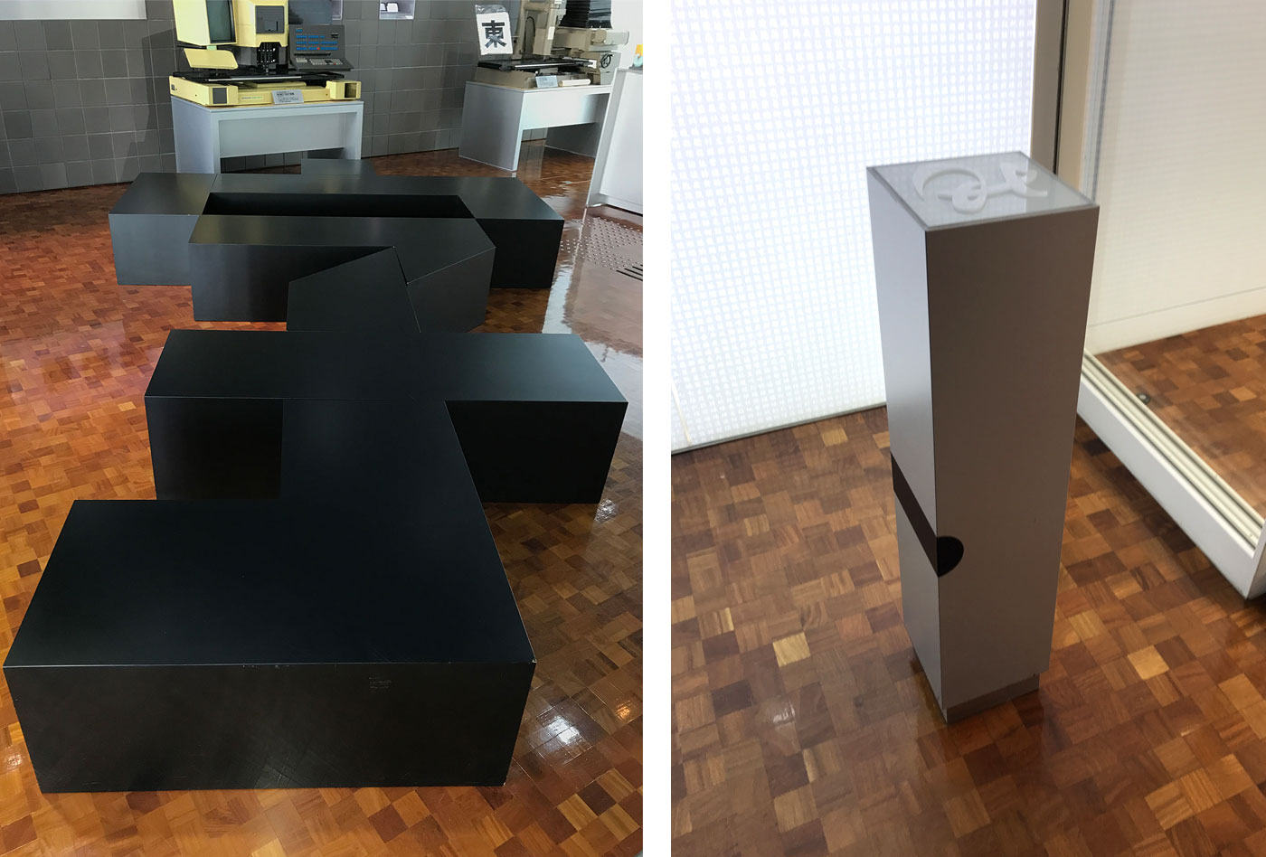
A bench in the shape of the Chinese character “zi,” which means “character/letter” (left), and the employee ID card scanner in the shape of a piece of metal type (right). Morisawa’s Osaka Headquarters.

A bench in the shape of the Chinese character “zi,” which means “character/letter” (left), and the employee ID card scanner in the shape of a piece of metal type (right). Morisawa’s Osaka Headquarters.


Continue reading

Remember December: Reflections on Arabic literature, calligraphy and type

I have always had a fascination for Arabic literature; I say this not as a native speaker but as a Lebanese francophone who studied in an American university. The multilingual education system in Lebanon gave us the privilege of reading literature classics in three different languages. But Arabic has always had its unique aura, enchanting me with its subtle grammar and with how the interplay of short and long vowels, along with other rhetorical elements, can overhaul its semantics and enrich its rhythm.

This literary enchantment has indirectly played a significant role in my life by drawing me into calligraphy when I was a design student. I used to keep a notebook in which I collected quotes that piqued my interest. The words I had once noted down started taking different shapes in my calligraphy copybook. The desire to bring these eloquent words to life, through beautifully entangled strokes, fueled my discipline and commitment towards doing–and sometimes overdoing—my homework. Only then was the euphoria of reading matched, if not surpassed, by that of writing.

Continue reading

Remember December: Greetings from the old continent

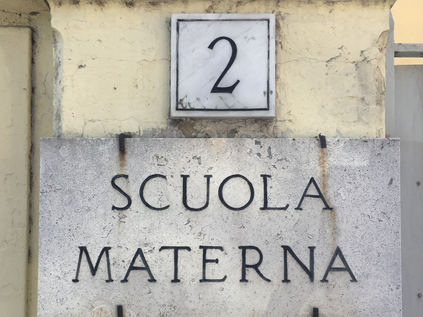
This spring I got to travel for 5 weeks to Europe. It was my first time visiting Italy and the first time visiting more than a few cities in Spain over the same trip.

I grew up in Venezuela, and a lot of the people back home came from these countries, so it meant a lot to visit. There’s plenty of familiarity, culturally and language-wise, but of course, there’s so much history engrained in these two countries, that it was a real pleasure to discover all its wonders.

Below, what I could capture in between aperitivos, fresh made pasta, tapas and cañitas.


Continue reading