Tiny Grotesk: bridging 500 years of type design

Tiny Grotesk is a tiny superfamily. In a market where sans-serif families quickly grow to contain dozens of styles, sometimes over a hundred, Tiny Grotesk is an antidote, a proposal to do more with less. It covers as much ground as possible, across only twenty-four carefully selected styles.

Tiny Grotesk is in its regular width a clean, friendly neogrotesk with relaxed capitals and a round, even-keeled lowercase. The two accompanying widths, Narrow and Wide, expand it into a complex typographic toolkit. The Narrow styles, space-saving and optimised for small use, are ideal for footnotes, asides and UI elements. The Wide styles, imposing and optimised for large use, demand space, and will take that space no matter what. This pairing makes the family versatile and broadly usable while remaining as compact as possible.

Tiny Grotesk has been in development since 2019, slowly but steadily expanding in scope but not really in size. It has been used in a few print projects, on some vinyl records, and for a complex digital catalogue before its release in 2024 and expansion in 2026.

Bridging some 500 years of typographic ideas

The initial idea for the family started in a perhaps weird place: 1500s italic calligraphy and movable typefaces based on it. In these early days, the lowercase was a cursive italic. The capitals, however, were upright forms. Since the capital letters in these texts occurred relatively rarely – an average of something like once every forty characters – their presence clearly wasn’t disruptive to readers. Not disruptive enough to feel the need to draw italic capitals, which would require a whole new set of sorts to be drawn, cut and cast. I can’t blame them for wanting to be efficient.

The italics by Ludovico Arrighi were the original inspiration for Tiny Grotesk, in a direct but not entirely obvious way. The proportions were taken from his second italic, and I wanted to explore them in depth. Would the typographic rhythm work in a sans-serif jacket, even with the strange width relationship between these capitals and lowercase letters?

Continue reading

Disrupting Type Canons: Representing Fat Bodies

Overlay of colorful, illustrated fat letterforms on top of an image reading "Anatomy of a Typeface" that is meant to demonstrate how the fat letterforms could reimagine how we teach typographic anatomy.

Above: Brooke Hull. “Overlay of Fat Letterform Illustrations on Type Anatomy Guide.” 2023. Type Anatomy guide image via Material Design. “Understanding typography.” nd. https://m2.material.io/design/typography/understanding-typography.html#type-properties 

How can we disrupt design canons & fight fatphobia intersectionally through embodied typography? 

This research began as I discovered and accepted my own fat, nonbinary body for the first time at the age of 23-24. I was in graduate school having to not only expand my knowledge about the systems within the world around me but having to understand how those systems impacted my own body. As a person who has been fat my whole life, I never accepted this reality until I learned about the system of oppression known as fatphobia. 

Fatphobia, as defined by Dina Amlund, is “the name of the structure and the social hierarchy that place people of size, or fat people, beneath slender people” (2017).

Fat people face proven discrimination at work, in relationships, in healthcare, and in the media (Cooper Stoll 2019). Fatphobia, like all other systems of oppression, is intersectional (Crenshaw 1989), further harming folks who embody multiple systems of oppression, like race, gender, sexuality, and disability. While learning about these intersecting systems of oppression, I wanted to use design to relate these systems to my own body and bodies like mine. This is where the idea of fat typography began. 

Continue reading

Font releases and reviews from 2024

Reflecting on the past year, we can say the number of new typeface releases was remarkable. The type market has become more diverse and competitive than ever, with new fonts hitting the scene every day. Both amateur and professional designs are eager to be in the spotlight so they can really be seen. In this hectic landscape, we find it valuable to offer insights that help identify excellence and merit within the crowd. This includes evaluating proficiency in crafting letters, the overall quality of the font, and the contributions that a new typeface brings to the table.

Continue reading

Designing a Georgian Header

There are approximately four million Georgian speakers worldwide, so I am quite happy to represent my community by designing the first Georgian Alphabettes header.

Despite the relatively small size of the Georgian-speaking population, the script has a rich calligraphic history with significant developments over the centuries. The evolution of the Georgian alphabet has produced three scripts: Asomtavruli (5th century), Nuskhuri (9th century), and Mkhedruli (10th century). Over time, letterforms have transformed and shifted between scripts, allowing all three to be preserved and used in some capacity today. However, Mkhedruli is the primary script in modern use, which is why I chose to design the header with it.

Continue reading

Exhibition: Same Bold Stories? Type Design by Women and Queers in the 20th and 21st Centuries

photo by Simon Malz

Same Bold Stories? Type Design by Women and Queers in the 20th and 21st Centuries
Exhibition at the Klingspor Museum, Offenbach am Main, Germany
July 19—November 24, 2024

A Quick Intro

In July, I had the chance to attend the opening of Same Bold Stories?, an exhibition that explores the question: Where are women’s voices in type design that complement the existing history?

While conversations about women in type design are becoming more common, exhibitions on this topic are still pretty rare. That’s why it’s so important to acknowledge and appreciate this effort. The exhibition was developed in collaboration with the Klingspor Museum (Dr. Dorothee Ader, Valerij Ledenev, Tatjana Prenzel), design studio Turbo Type (Laura Brunner, Leonie Martin), and the feminist collective +FEM (Kristina Mukhacheva, Naomi Rado). The opening took place on July 19, and I was lucky to be there. The feedback has been very positive, with media describing it in fitting words like “Fat, brave, and cheeky!” (hr2-Kultur Review) and “Arial, Bold, Times New Roman – Queer and Feminine Font Design” (Deutschlandfunk Kultur Interview). The exhibition runs until November, with various events planned. You can check the details here.

Continue reading

Shippo: Weaving traditional Japanese pattern into type

I have been fascinated by the ways design layout is governed by a structured grid or set of rules. My curiosity extends to the exploration of typographic designs guided by specific grids. Navigating the delicate balance between creativity and legibility presents a challenge I wanted to tackle. 

With my heritage in Japan, I realized that Japanese patterns on textiles consist of different ranges of shapes, which I decided to take inspiration from. One of the patterns is called “shippo” meaning “seven treasures” in Japanese. The Shippo pattern consists of endless circles overlapping each other. 

image credit: 京屋 七宝(しっぽう)柄の意味と由来
Continue reading

A Letterpress Calendar for 2024

Leah Rosen is a fourth year Industrial Design and Psychology student at the Rochester Institute of Technology, in Rochester, New York, USA. Since 2020, she has been a Student Assistant in the RIT Cary Graphic Arts Collection. Her roles vary from setting up the new Cary Pressroom, shelving rare books and handling archival items in the collection. This year Leah was also the Teaching Assistant in RIT’s Letterpress Printmaking course. She initiated a personal letterpress project. Despite her busy schedule, she was not discouraged to dedicate a significant amount of time and effort to typesetting and printing a calendar for 2024. She shares her process, challenges, and some valuables lessons. The outstanding outcome speaks for itself.

The 2024 letterpress Calendar by Leah Rosen.

Continue reading

Very Cool Thing: Words on Type

The last time Lisa Huang shared a Very Cool Thing on Alphabettes, she published her research on Noto Sans Nüshu script, and the community of women behind it. Two and a half years later, Lisa is back to answer some questions on her newest Very Cool Thing, Words of Type.

Tell us about your new project and Kickstarter campaign!
Words of Type is an encyclopedia of typography, with each term illustrated, described and explained into multiple languages. Each term is explained in concise and straight forward terms to be easily understood, and illustrated by multiple artists to bring visual variety and fun. To bring the various typographic cultures closer together, there will be not only terms from Latin typography, but also those of other writing systems. To give a (literally) better access to typographic knowledge, it’s going to be a website that gives free access to everyone, everywhere. And it will grow and evolve over time, with more languages and words.

Continue reading

Type Revival for Film & TV

Screenshot of subway scene in the Marvelous Mrs. Maisel looking down stairs at crowd of people coming off train.

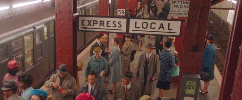
“The Marvelous Mrs. Maisel,” Season 5, Episode 2.

The Job

As a Graphic Designer for Film & TV, I work in the art department and create anything that is seen on screen with text and or imagery, such as storefront signs, food packaging, patterned wallpaper, stacks of bills, newspapers, lost cat flyers, or even children’s drawings. The range of items we create is incredibly broad, and the cool thing about that is it reframes graphic design from an exclusive, professional pursuit into a universal human activity. If everything is design, everyone is a designer. So instead of creating as “Leah Spencer, graphic designer,” I have to create as a shopkeeper, as a sign painter, as a college student, as an accountant, and so on.

Array of graphic designed items: newspaper, contract, kid's drawing, map, burlap bag, mail, plumber sign, hotel key, phone map app, binder

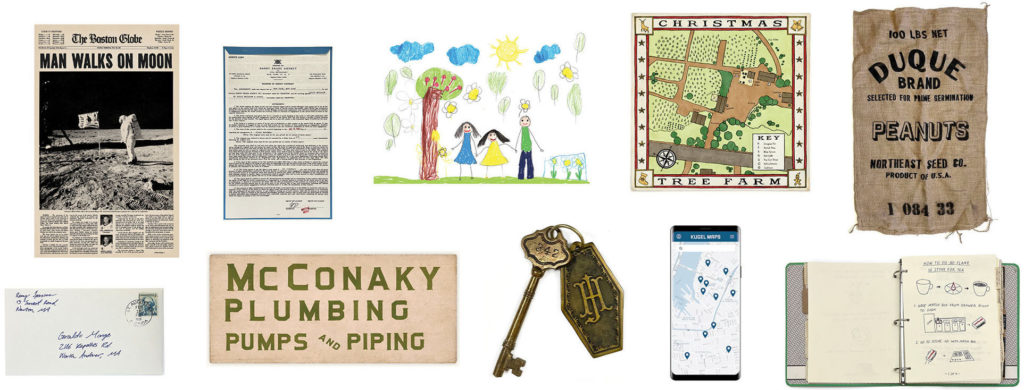
Some of the many items considered graphic design in the context of film and TV. In addition to designing these items, the graphics team is also responsible for physically making them in-house or sending them out to a vendor for fabrication.

Considerations for Typography

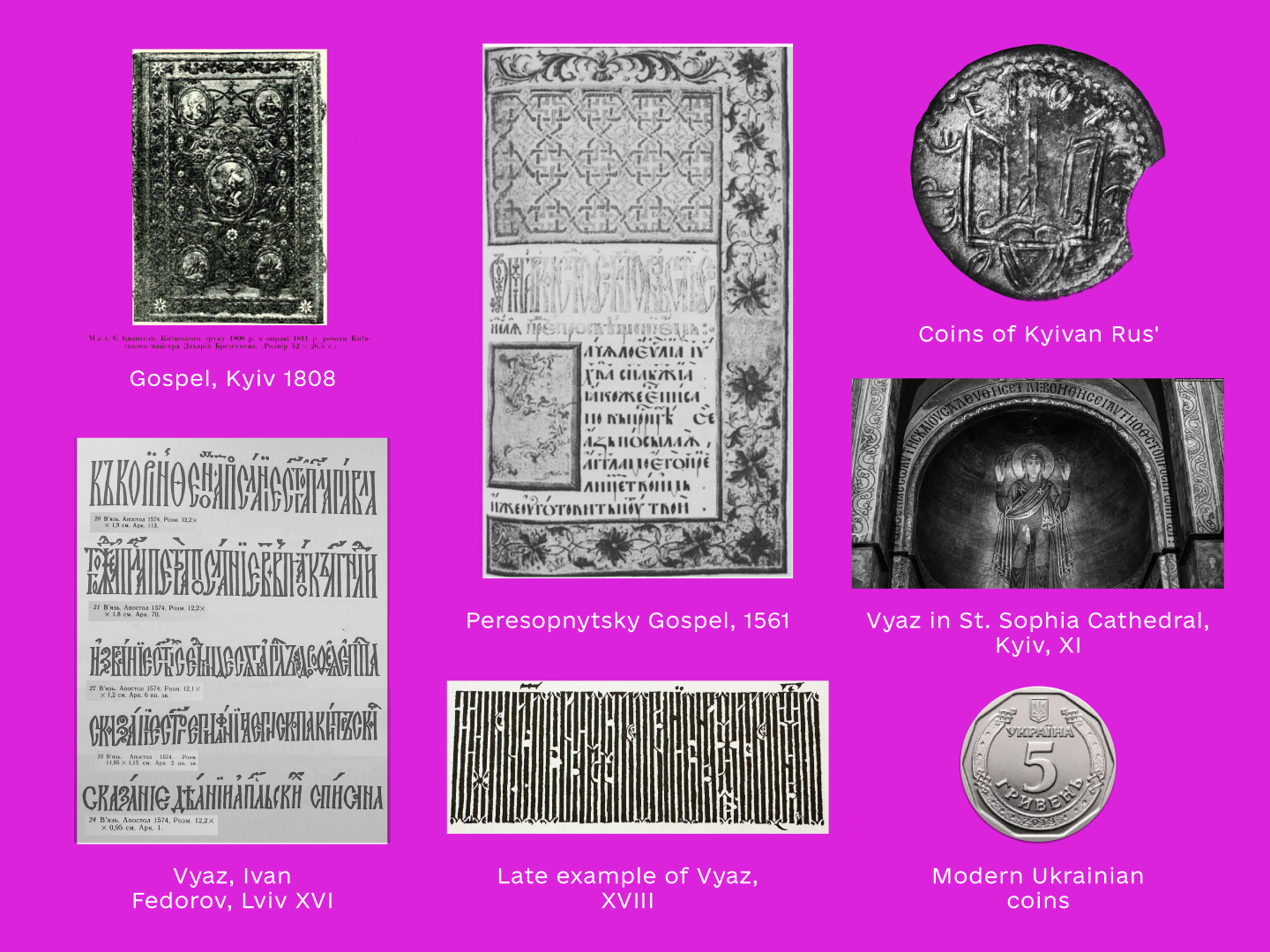
In addition to the challenges of forgery, I specialize in graphic design for period productions, and when you approach period typography, you wind up with several restrictions. Firstly, many typefaces that were used for letterpress or used in typewriters were never digitized and only survive today in their original forms or in their printed materials. Secondly, there are lots of existing digital period typefaces like Futura or Garamond, but they too have issues. We lack (or are logistically unable to use) historical production methods, such as mimeograph, Letraset, offset printing, Linotype, etc., so the kind of roughness you expect of period graphics is lost. We also have legal restrictions on font foundry use, so each production’s clearance team will tell you, for example, “you can only use Adobe fonts on this movie.” This can be restrictive, particularly for period or highly stylized productions where only a small portion of the available fonts are appropriate. And thirdly, there are lots of instances of lettering that were never a typeface in any sense, such as sign painting or handwriting.

Continue reading

Leaving a Mark: Ezhishin Interviews

Next month, the Type Directors Club will present Ezhishin, a conference focused on Native North American typography. From Friday November 11 – Sunday November 13, the virtual conference will feature the voices and work of Native North American type designers, lettering artists, design educators, printers, researchers, and more. This Q&A with four the Ezhishin presenters, Violet Duncan, Jessica Harjo, Monique Ortman, Sadie Red Wing, and Kathleen Sleboda, highlights some of their ways of working, recommended readings, and what leaving a mark means to them.

Violet Duncan

Violet Duncan is Plains Cree and Taino from Kehewin Cree Nation. Touring nationally and internationally since 1991, she has performed for audiences across the United States, Canada, and Europe through work as a Native American dancer, hoop dancer, choreographer, storyteller, and author. Violet is a former “Miss Indian World”, representing all Indigenous people of North America. After becoming a mother of 4 and seeing the need for Native representation in literature, she took it upon herself to author three award-winning children’s books: I am Native, When We Dance, and Lets Hoop Dance! She has recently joined the family of Penguin Random House with two new children’s books and a middle school novel coming out 2023/24. Violet is the Creative Director of Young Warriors, where she aims to create space for programming of Indigenous performance and practice.

Continue reading