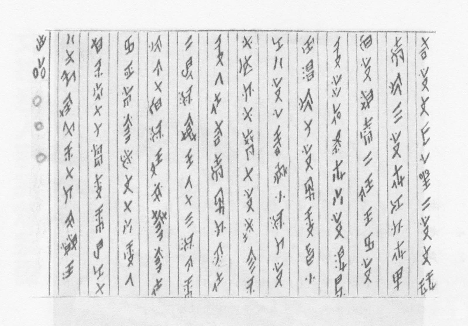
Clumsy lettering with personality

My initial motivation in learning lettering was to be able to create perfect, elaborate, admiration-inducing letters. In 2011 I completed a type design masters at EINA school in Barcelona, which also opened up the world of calligraphy and lettering in all sorts of styles for me. I ended up loving the brush. I wasn’t too good at first but after additional workshops, reference books —Brush Lettering: An Instructional Manual of Western Brush Lettering by Marilyn Reaves was particularly helpful— and hours of after-work practice, I finally tamed it. I even gave a brush lettering class. I felt pretty good about it. Then… I felt stuck. Most of what I was achieving was by the book but somehow felt bland and impersonal.

Brush lettering class example

Reference alphabet I prepared for the brush lettering class I gave at the Spotify offices in Montreal in 2015.

Continue reading

Multiscriptual Typesetting

image of globe showing north and south america


Last month I had the honor of creating the graphics for Designing without Borders, a three-part lecture series hosted by AIGA NY and the TDC. The design process was a collaboration between myself and the event organizers; Caspar Lam, Juan Villanueva, and Lynne Yun, which led to an ambitious undertaking of designing with a dozen languages. This experience was equally rewarding as it was challenging. It inspired me to continue pushing my understanding of typography by going beyond what is linguistically familiar. 

Continue reading

Letters for a Library

There are designers and creatives who are capable of delving into many analog mediums at once (this maybe calligraphy, or origami, or whatever.) Their projects seem to have exciting new approaches, often narrated by nuances of the medium used. However, I have almost always been more of a digital designer. This post is a small window into my process of designing the signage for Royal Academy of Art’s (KABK) Library in The Hague.

Towards the end of last year as I was applying and looking for work, I tried keep myself busy by engaging in stone carving lessons at KABK. Sanne Bereen (the letterpress instructor at KABK) who was also taking these lessons, brought up that the school’s library could use a signage system. And without thinking much of it, I offered to help out and we began to discuss further. I thought this project would keep me busy until something more concrete turned up. At least I would be drawing letters. If it turned out well, it could certainly add to my portfolio since I had never explored material and letters this way. At the same time, Sanne had a lot of experience in the field and it would be an opportunity to learn.

Prior to this, I had had very minimal interaction with the librarians and while I was studying, used the library only a few times. It was under renovation at the time and I remember being terrified while I was exploring the upstairs type section, with scaffolding all around. I’d like to blame the scaffolding for never visiting again. Up until December 2018 – when I saw a small, well lit, and a neat space that was very loved by the people who used it regularly.


Continue reading

Playing With the Glossier Play Logotype

I really like trying to reverse engineer the ways people have taken type into their own hands. Often it’s something simple, like adding an outline to make it heavier, or adding flourishes that don’t exist in the original typeface. Sometimes it’s several things. It soothes me, like taking a simple machine apart, seeing how it works, then knowing how to put it back together. I also sometimes like to redraw logotypes and typefaces to see if I can improve upon them, for similarly cathartic reasons. I mostly keep quiet with this, because being like, “HERE’S how I would’ve drawn this BETTER THAN YOU,” while knowing next to nothing about the client, their vision, or any number of constraints that inevitably exist behind the scenes, almost always makes you sound like the biggest tool.

THAT SAID. I’ve gotta talk to someone about the logotype for the new Glossier brand, and I don’t have a therapist rn.

Courtesy of Glossier

Continue reading

A few thoughts on our first Greek header

This week’s header started with a conundrum: to transliterate, or not to transliterate? In this case there were two main reasons not to. First of all, the word Alphabet is Greek, literally a portmanteau of άλφα and βήτα (alpha and beta) – like saying the ABCs. Given this, it felt wrong to use Greek letters but spell it according to how it sounds in English. Secondly, the Greek writing system does not have a letter to represent the Latin b sound. In fact, the word βήτα (beta) is actually pronounced VEE-ta in Greek. The b sound is not native to the Greek language and is most commonly found in words of foreign origin. In those cases the sound is created by putting two letters together – μ (m) and π (p). Alphabettes transliterated would therefore become Άλφαμπετς. Instead, and read aloud with me – our Greek header is pronounced Alpha-VEE-tess.

When I finally decided how to spell the word (half the battle!), I was ready to work on the design. This was my first attempt at digitizing Greek letters. Though I have an advantage as a native speaker, there was a challenge once I had to make basic decisions about proportions and spacing. The letters were digitized in Robofont but I first worked on paper, and the resulting design is based on brush pen strokes.

My first exploration of the forms through casual handwriting

Final sketches with the brush pen before digitizing

Since most typefaces out there that support Greek are large “workhorse” families, it is rare to see modern experimental Greek typefaces or lettering. A project like this gave me the freedom to try something that may never be used and experiment beyond function. Some of the movement in the forms mimics the way I would write these letters, but it is mostly just a weird design – and I enjoyed the exploration!

Faces of Funtoosh

“The whole of man is in the alphabet.”
— Victor Hugo

“Letters have a mysterious and cabalistic quality that has been recognised at least since Roman times. As the building blocks of words, and thus of languages, their magic has inspired artists throughout the ages. The illuminated initials of medieval manuscripts, ranging from Romanesque exuberance to Gothic excess, paved the way. Here were not only biblical scenes but mythical beasts and human figures that were the direct precursors of the zoomorphic and anthropomorphic alphabets of the Renaissance and later. Ornamented letters presented historical and mythological events, romantic landscapes, trees, flowers, buildings, clowns, devils, naked figures, street cries, children and every kind of animal.”

The Animated Alphabet, Hugues Demeude, 1996, New York

Continue reading