Playing With the Glossier Play Logotype

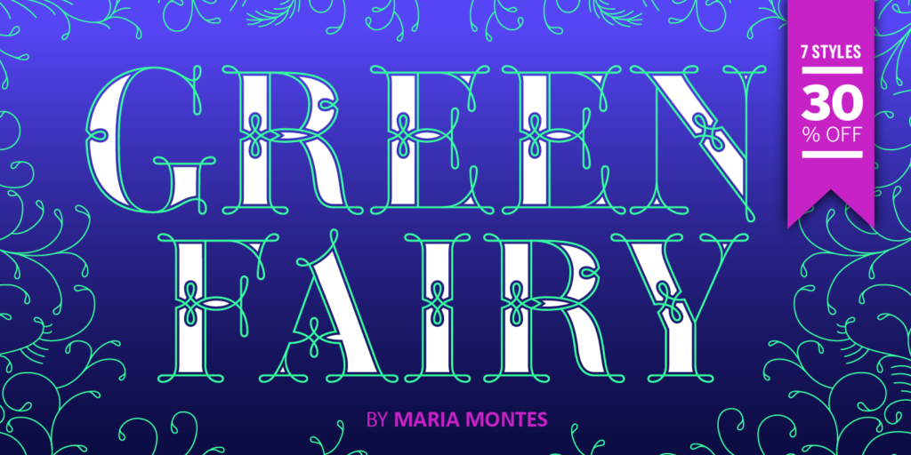
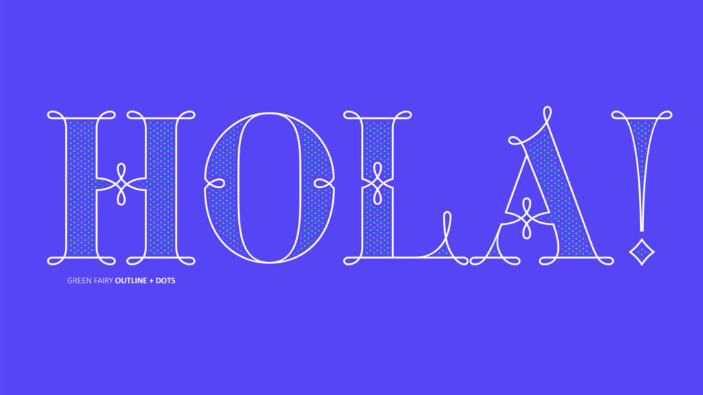
I really like trying to reverse engineer the ways people have taken type into their own hands. Often it’s something simple, like adding an outline to make it heavier, or adding flourishes that don’t exist in the original typeface. Sometimes it’s several things. It soothes me, like taking a simple machine apart, seeing how it works, then knowing how to put it back together. I also sometimes like to redraw logotypes and typefaces to see if I can improve upon them, for similarly cathartic reasons. I mostly keep quiet with this, because being like, “HERE’S how I would’ve drawn this BETTER THAN YOU,” while knowing next to nothing about the client, their vision, or any number of constraints that inevitably exist behind the scenes, almost always makes you sound like the biggest tool.

THAT SAID. I’ve gotta talk to someone about the logotype for the new Glossier brand, and I don’t have a therapist rn.
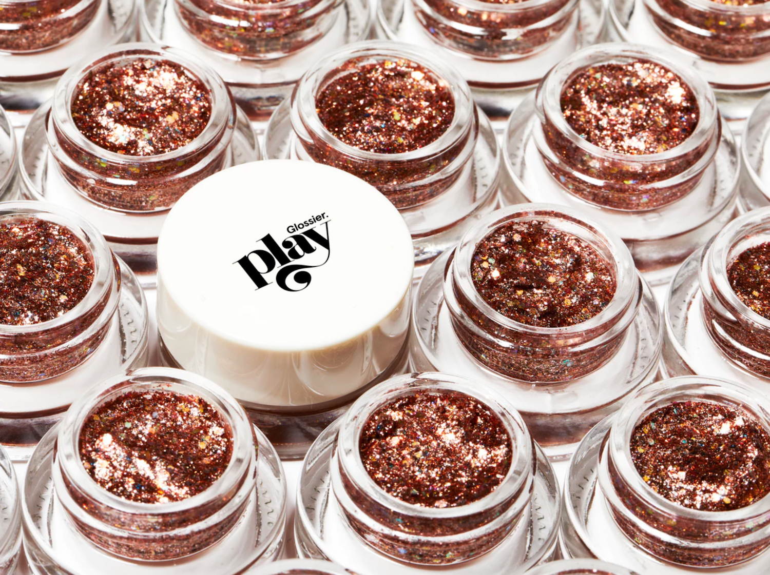
Courtesy of Glossier
Continue reading

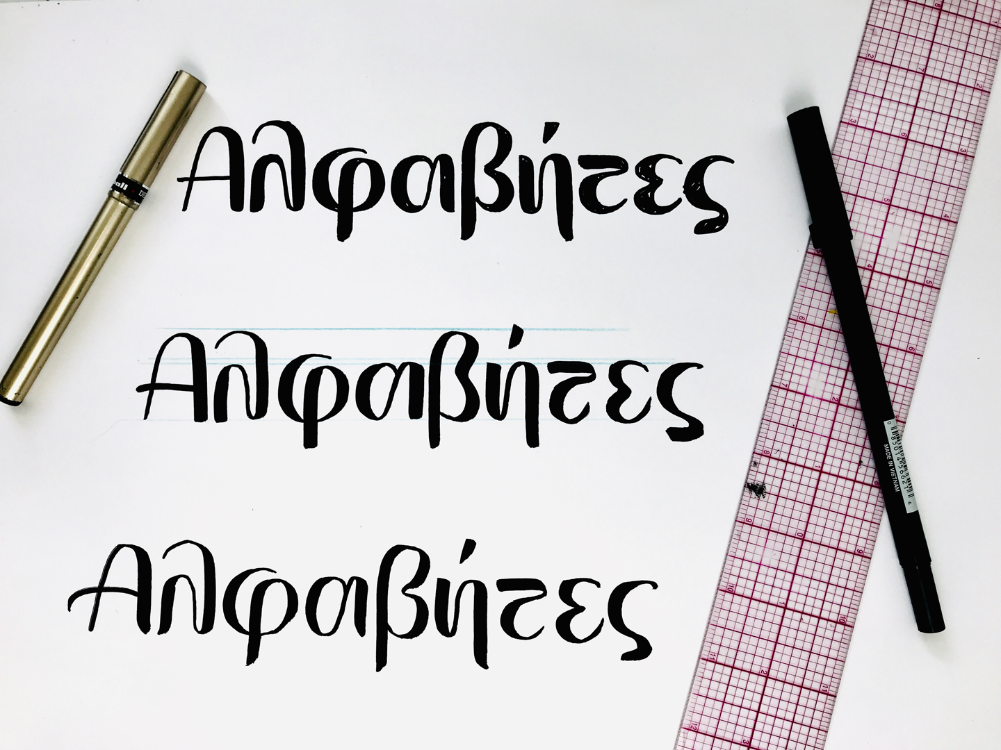
A few thoughts on our first Greek header

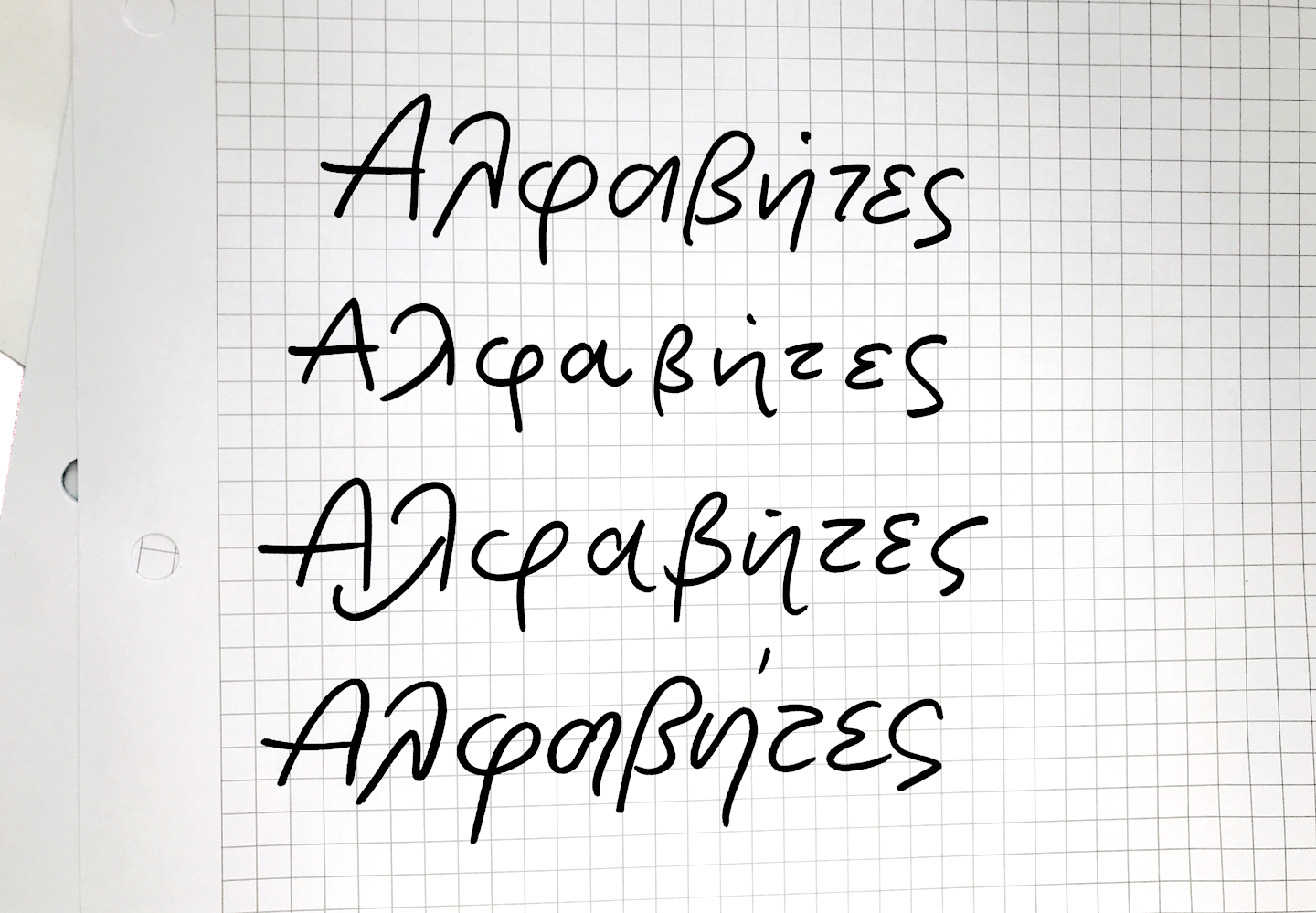
This week’s header started with a conundrum: to transliterate, or not to transliterate? In this case there were two main reasons not to. First of all, the word Alphabet is Greek, literally a portmanteau of άλφα and βήτα (alpha and beta) – like saying the ABCs. Given this, it felt wrong to use Greek letters but spell it according to how it sounds in English. Secondly, the Greek writing system does not have a letter to represent the Latin b sound. In fact, the word βήτα (beta) is actually pronounced VEE-ta in Greek. The b sound is not native to the Greek language and is most commonly found in words of foreign origin. In those cases the sound is created by putting two letters together – μ (m) and π (p). Alphabettes transliterated would therefore become Άλφαμπετς. Instead, and read aloud with me – our Greek header is pronounced Alpha-VEE-tess.

When I finally decided how to spell the word (half the battle!), I was ready to work on the design. This was my first attempt at digitizing Greek letters. Though I have an advantage as a native speaker, there was a challenge once I had to make basic decisions about proportions and spacing. The letters were digitized in Robofont but I first worked on paper, and the resulting design is based on brush pen strokes.

My first exploration of the forms through casual handwriting

Final sketches with the brush pen before digitizing

Since most typefaces out there that support Greek are large “workhorse” families, it is rare to see modern experimental Greek typefaces or lettering. A project like this gave me the freedom to try something that may never be used and experiment beyond function. Some of the movement in the forms mimics the way I would write these letters, but it is mostly just a weird design – and I enjoyed the exploration!

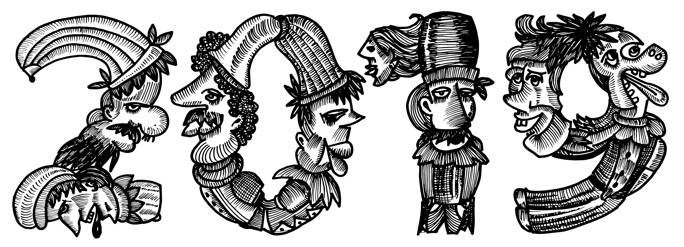
Faces of Funtoosh

“The whole of man is in the alphabet.”
— Victor Hugo

“Letters have a mysterious and cabalistic quality that has been recognised at least since Roman times. As the building blocks of words, and thus of languages, their magic has inspired artists throughout the ages. The illuminated initials of medieval manuscripts, ranging from Romanesque exuberance to Gothic excess, paved the way. Here were not only biblical scenes but mythical beasts and human figures that were the direct precursors of the zoomorphic and anthropomorphic alphabets of the Renaissance and later. Ornamented letters presented historical and mythological events, romantic landscapes, trees, flowers, buildings, clowns, devils, naked figures, street cries, children and every kind of animal.”

The Animated Alphabet, Hugues Demeude, 1996, New York

Continue reading

Branding and the Psychology of Handwriting: The new NIVEA Care Type

At Juliasys Studio we’ve been working for some time now on a digital handwriting style for the “NIVEA” brand of Beiersdorf AG. “NIVEA Care Type”, as we are calling the new OpenType font, is understood to be the imaginary handwriting of the NIVEA brand persona, the “NIVEA Woman”. Care Type on product packaging and in marketing material has the function to subtly present the NIVEA Woman personality in the look and feel of the brand. Care Type is to be used prominently but at the same time sparingly, “with caution”.

Figure 1: A century of typographical metamorphosis on the legendary NIVEA tin

Continue reading

Corsair and Conductor: a co-showcase

Yesterday was a good day for type releases designed or co-designed by women, so here’s a quick double showcase to commemorate the event.

Project: Corsair
Designer: Ksenya Samarskaya
Foundry: Rosetta Type
Team Members: Azamat Kodzoev, Micha Strukov, James Todd (Drawing); Mathieu Réguer (Post-production)
Published: 2018
Link: Corsair

Project: Conductor
Designers: Tobias Frere-Jones and Nina Stössinger
Foundry: Frere-Jones Type
Team Members: Fred Shallcrass
Published: 2018
Link: Conductor
Continue reading

Showcase: Guru Gomke

Project: Guru Gomke
Designer: Pooja Saxena
Company: Matra Type
Team Members: Subhashish Panigrahi
Client: Centre for Internet and Society’s Access to Knowledge (CIS-A2K)
Published: 2016
Link: Guru Gomke on Github

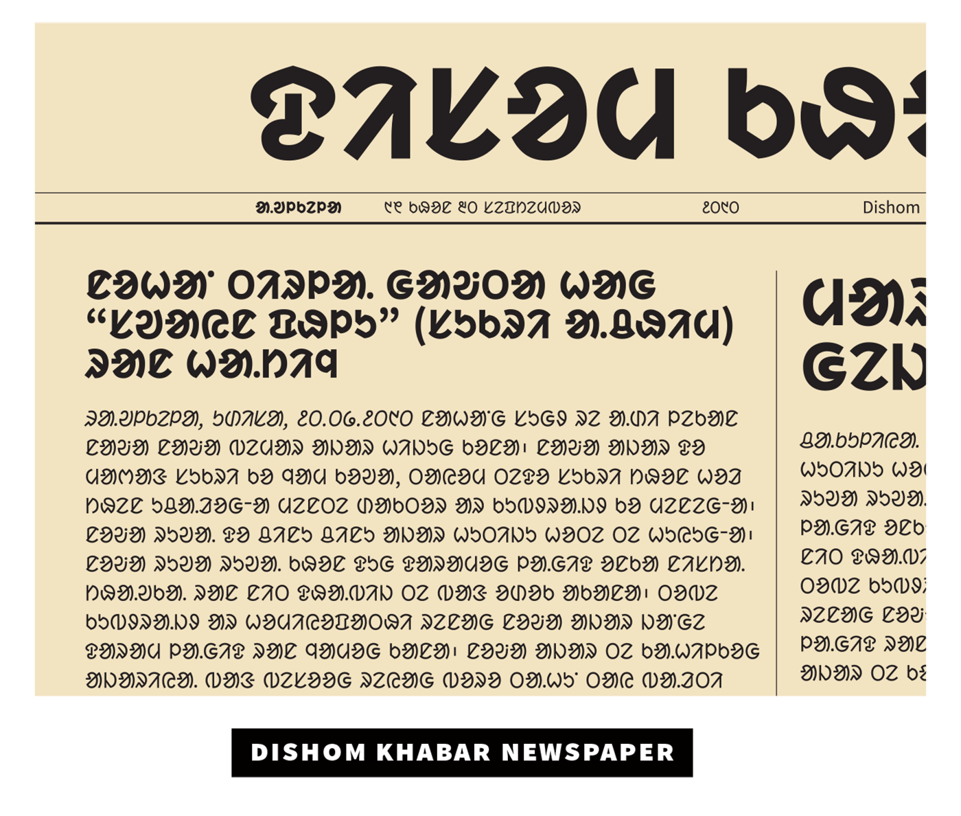
Gure Gomke newspaper

Pooja Saxena has designed some really nice Indic script typeface families (Farsan Gujarati and Cambay Devanagari for example), but I want to take a moment to shine a light on one particular project of hers.

Continue reading

Granada: The Spanish language as type design criteria

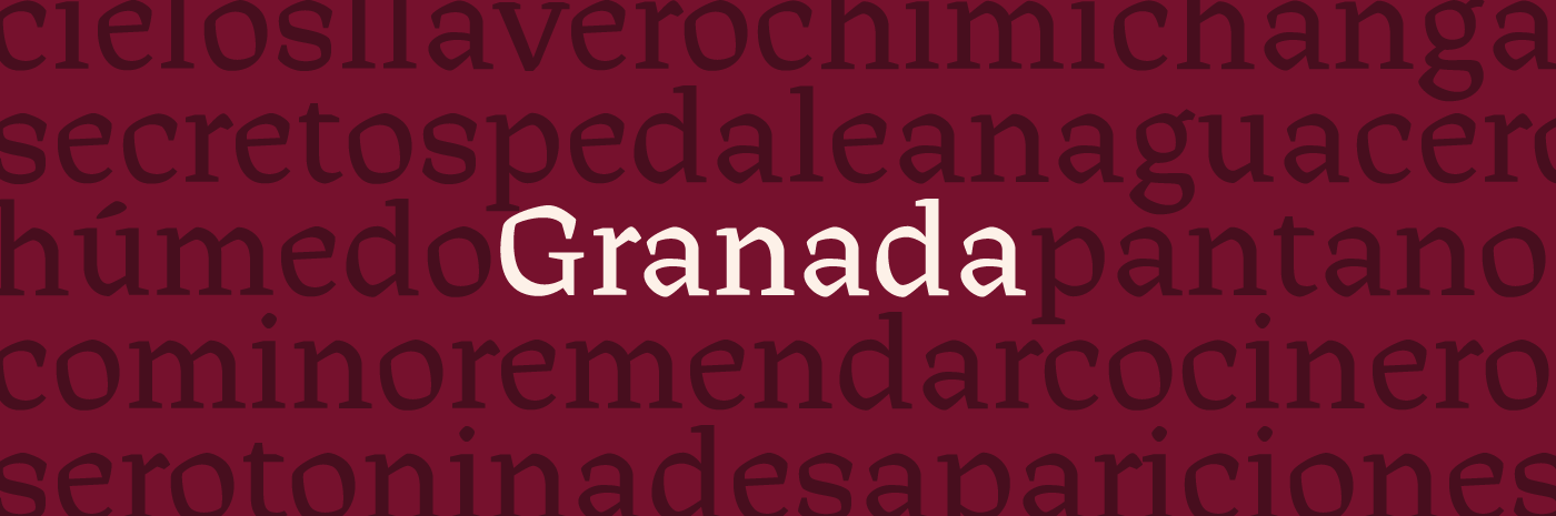
Halfway through 2016, as I was finishing my undergrad Graphic Design studies, I became very interested in the idea of researching the relationship between language and type. Fortunately, I stumbled upon Bianca’s dissertation, which helped me greatly as I could build upon her thoughts, draw my own conclusions and hopefully design a typeface based on language as criteria.

Continue reading