Scared Shitless: Facing fear and getting out of your comfort zone

This is the transcript of my talk at TYPISM Conference on September 30, about facing fear and getting out of your comfort zone. You can watch me losing my shit here, but I wanted to make the written version available for anyone who’d find that useful. Enjoy!

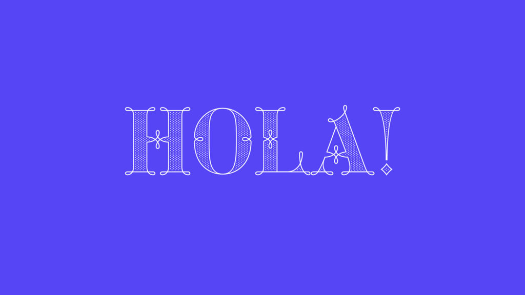
Hola! My name is Maria Montes and I am incredibly honoured to be here and share my journey with all of you.

First of all, thanks to Dominique, George and the entire TYPISM community for your ongoing support, it means the world to me.

Continue reading

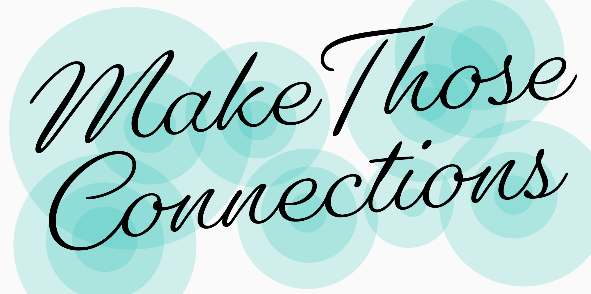
Make Those Connections

This is the transcript of my talk at Typographics last June about the making of my (now-released) typeface, Gautreaux, edited for clarity in this medium. You can watch me in all my nervous glory here, but I wanted to make the written version available for anyone who’d find that useful. Enjoy!

Hi! I’m Victoria and I’m a type designer. I have a learning story for you about a script typeface. I happen to really like hearing people tell their learning-to-do-things stories, which is convenient for me because mainly the only stories I have so far are learning-to-do-things stories, so I guess I’m just interesting like that. I came to fonts via script lettering, and so I’m really into coming up with projects that help me to understand their distinctions and overlap. This one is about exploring what it takes to make some lettering into a font, the things that work and the things that break, and whether you want to make a font that obscures the clues that it is in fact a font, or as I ended up doing, tackle hug those issues into a chokehold. I’m going to talk to you about this one script font, right here, I’m sure you guessed. I’m going to tell you how I started, what I set out to do, and then about all the details I’ve screwed up and then fixed. Okay, here we go. Continue reading

Emoji Ambivalence

In December 2015 I spotted an unconventional SKULL AND CROSSBONES ☠ [U+2620] on a passing truck transporting explosive goods in Gujarat, India. Needless to say I immediately demanded a whole set of emoji based on it, and needless to add nobody volunteered.

So here I am, a year later, trying myself as an emoji designer and simultaneously exploring possibilities of bringing this font to life. And that, I discovered, is a bottomless pit if I’ve ever seen one.
Continue reading

Book of the Week

featured

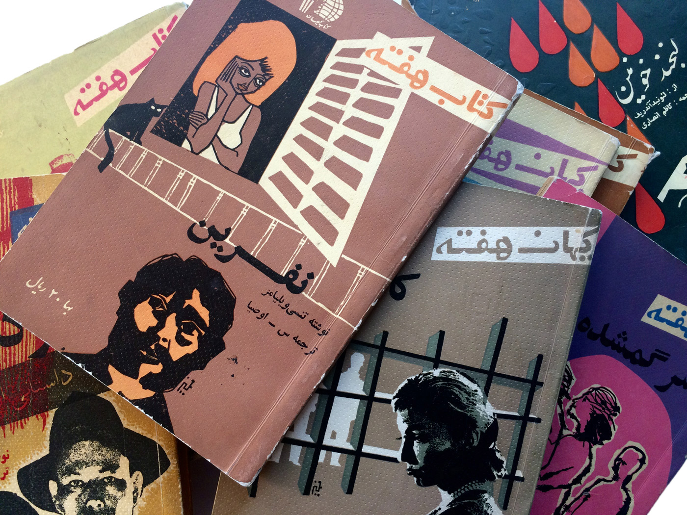
As the name suggests, ‘Book of the Week’ was a series of paperbacks that were distributed every week in Iran between the years of 1961 and 1963. A product of the Tehran-based publishing institute Kayhan, the books gained a great amount of popularity among the general public by featuring literature from established writers, as well as publishing essays on a diverse range of topics such as science, culture, society, poetry and the arts.

Continue reading

Elido by Sibylle Hagmann

… and a bit about type on the web in general.

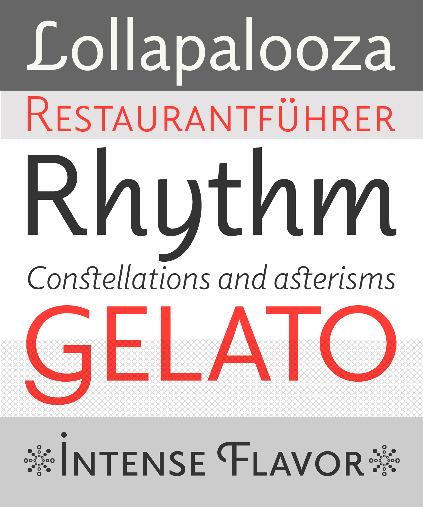
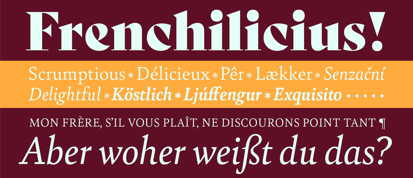
It’s long overdue that we introduce you to Elido more. I won’t even need that many specimen images because it’s the typeface you are reading right now. When we were discussing the fonts for the Alphabettes blog, we were after something that looks appropriate for very diverse content that we didn’t have yet — potentially long or maybe short, serious, delightful, angry or funny — and that is comfortable to read and rendering well on the web. All demands that many editorial sites share.

elido_specimen

Elido specimen images by Sibylle Hagmann

Continue reading

Another Lettering Video

Some very sped-up drawing, for your vector-scrutinizing pleasure. My favorite parts, if you can catch them, are when I realize halfway through that the ascender tops are leaning the wrong way, and when my boyfriend’s iMessage pops up with some solicited feedback that the “a” and “l” are too close together.

Music is Jenny by the bird and the bee.

Magasin By Laura Meseguer

magasin1

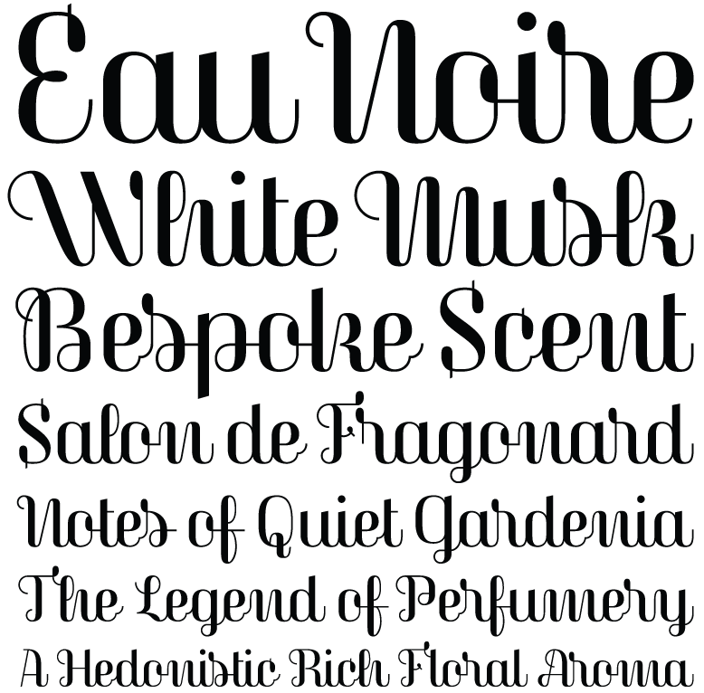
To say that Magasin is not your average script font is stating the obvious. It is quirky and totally irreverent. It sits stock-straight upright and follows very few rules when it comes to connection between the letter­forms. You get a real sense of Mid-Century Modern and French perfume packaging, along with the echoes of Quirinus/Corvinus and Fluidum in its contrast and terminals.

But don’t confuse Laura Meseguer’s Magasin for some dusty script revival. It is rigorous and modern, por­tray­ing a fierce independence as it easily sets itself apart from all the script fonts being released right now, dancing to its own atonal, syncopated rhythm.

Anyone daring enough to use Magasin will find a useful amount of alternates, ligatures, and swashes that create captivating and playful word shapes. (If anything is missing, I’d say Magasin could use more terminal forms.) I can imagine it deployed large in magazines and small on packaging. Don’t worry about the unorthodox letter shapes; instead, consider them an asset, because they will make people look twice. Additionally, the proud x-height assists, along with the context, in making Magasin legible enough at text sizes.

If you want a taste of what is possible, check out the specimen Meseguer created, along with the article she wrote for I Love Typography. They clearly dem­on­strate the different things that are possible with this idiosyncratic typeface design.

Specimen image made for Typographica where this review appeared previously.