… and a bit about type on the web in general.
It’s long overdue that we introduce you to Elido more. I won’t even need that many specimen images because it’s the typeface you are reading right now. When we were discussing the fonts for the Alphabettes blog, we were after something that looks appropriate for very diverse content that we didn’t have yet — potentially long or maybe short, serious, delightful, angry or funny — and that is comfortable to read and rendering well on the web. All demands that many editorial sites share.
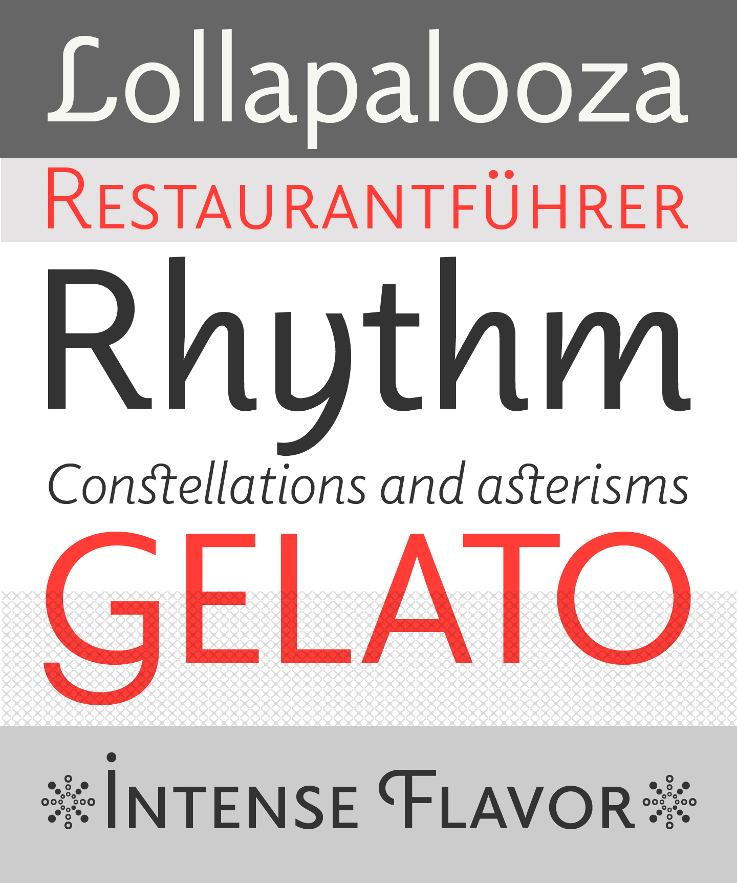
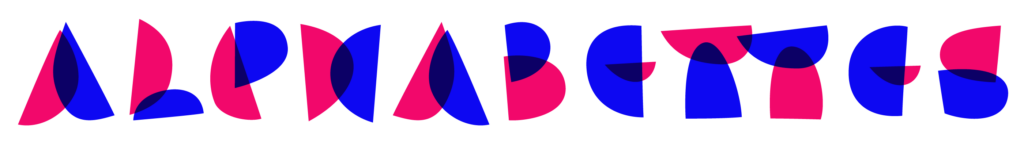
Elido specimen images by Sibylle Hagmann
Elido was designed by Sibylle Hagmann in 2010 as the sans-serif companion to her earlier typeface Odile, which enjoyed wide acknowledgement with awards and press coverage. You really need to check out Odile in detail but in short, some of the key features are the upright “cursive” alongside a more conventional italic (and roman of course) as well as the charming Initial and swashy Deco Initial styles. The letterforms and the concept of an upright italic are inspired by an experimental serif face by W. A. Dwiggins called Charter. (Some more on Odile in this article in Eye.) All this was also carried over into the new serif-less, linear design.
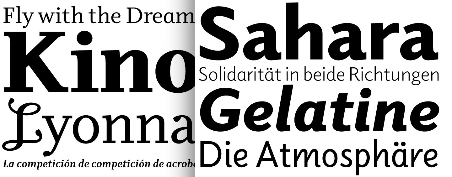
Odile and Elido
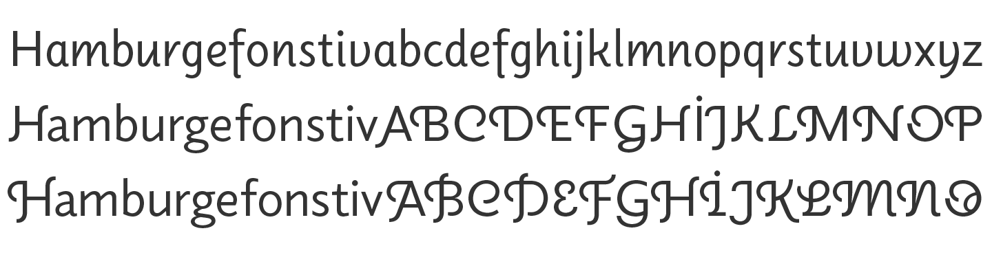
The result is an open and approachable humanist sans-serif in its own right with a “slight geometric hint”, as Hagmann puts it, but which doesn’t rule the overall tone too much. Especially when used together with the upright italic or the swash initials, Elido feels affable and informal, though you can just as well use it for serious reporting and entirely unbiased typesetting as we do here. The family has a workable scale, comprising 16 styles in five weights with italics, plus the upright italic and the two Initials styles in the regular weight. Oh, and ornaments. (Packaging or poster designers would perhaps enjoy the upright italics and swash styles in bolder weights, too, though.)
Elido on the Web
Typefaces designed for general multi-purpose use, and not specifically for the screen, don’t necessarily work perfectly right out of the box on the web. They often have a smaller letter image on the “body” (now the bounding box they sit in) than old standard screen fonts like Verdana, thus you have to use them in a larger nominal size. This isn’t a problem per se but it gets tricky when the fallback ends up mingling with the webfont*. We’re using Elido at 1 em (16 px) in the desktop layout which seems a good, comfortable size. But it felt a tiny bit tight on screen, especially with subpixel-antialiased rendering which tends to slightly fatten up the letterforms, reducing the space between them (but which makes type render much better compared to using only full-pixel grayscale antialiasing). We adjusted some small things in the CSS, like increasing the letter spacing (+0.012 em) and word spacing a bit (0.03 em), which may be kept a tad larger on screen than in print. Perhaps you don’t even notice it (then we got it right) or you don’t even see it because your browser doesn’t support subpixel-positioning. (It should always work OK without adjustment, too.) Besides, you can only divert so much from the standard measures to not end up with a very different text image and feel, especially when the type designer is watching closely. 😳
Now, after putting it through its paces for over six months, I still very much like reading Elido here. Prospectively, we also want to experiment with more typefaces that are not seen around much, just in case you come back one day and the headlines or texts aren’t set in Elido anymore. That wouldn’t mean I changed my opinion, on the contrary. I think Elido should be seen and used much more — in print, on the web, in apps, and all around.
* Please remind me to tell you about the hack that Amy and I concocted for “missing-character-fallback” cases or well I’ll just tell you right now: Check my article about Moscow. There are some words in Cyrillic but our Elido webfonts don’t have Cyrillic language support, so it fell back to Verdana for these words which, in 16 px, looked enormous and disturbing between the rest of the text. To mitigate this, we wrapped the Russian words in spans, calling a “.fallbacksizer” class with just 85% of the font-size**. (A class and not just span style so we can reuse it in future cases, like we did in the Hobo review.)
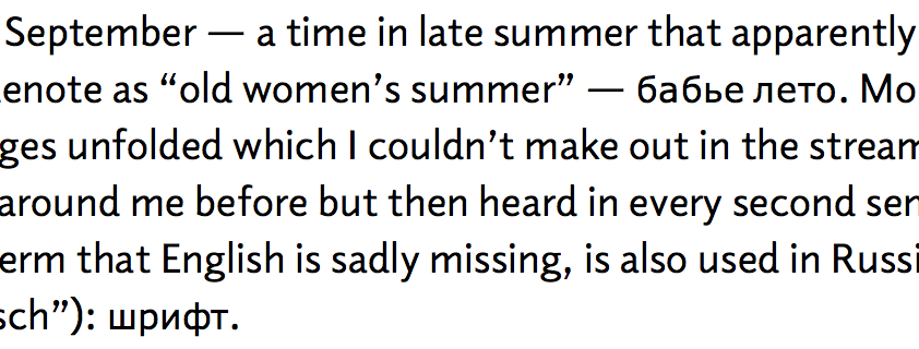
Scaled-down Verdana in a paragraph of Elido
** One can do that with the Google Webfont loader script more elegantly but we didn’t look into that up to now as it seemed overkill for this rare case. But it would make things easier to change down the line.