It all began two or three years after I moved to the UK when I realised that I was living here in contradiction to my host country and not in harmony with it: (my) life was a cultural fight. It was frustrating. At some point, I decided to change the paradigm, embrace Britishness, stop fighting it and learn the culture of the country where I happily live. That journey of learning and embracing the Britishness included, unavoidably, British biscuits.
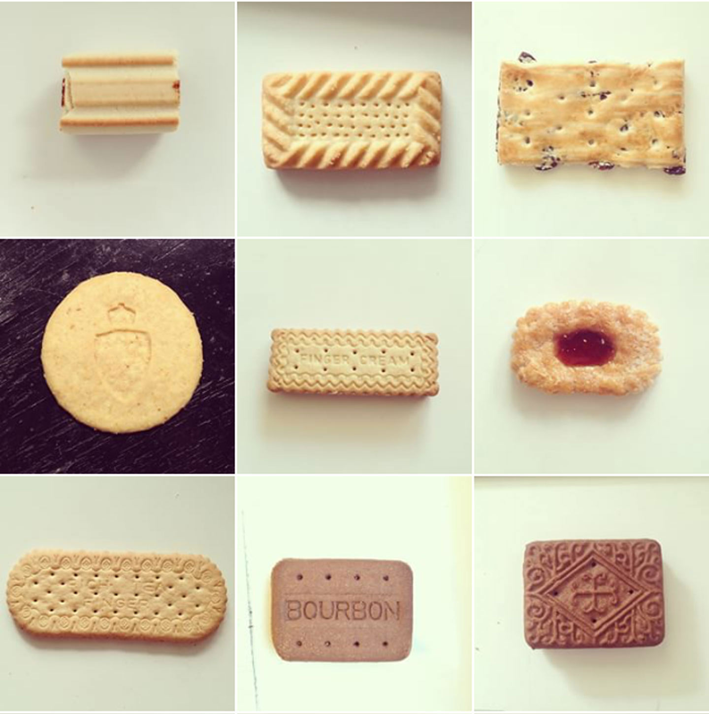
My first biscuits study, in the form of an Instagram hashtag: the Fig Roll, the Shortcake, the Garibaldi, the Duchy?, the Finger Cream, the Redcurrant Puffs, the Rich Tea Finger, the ‘fake’ Bourbon — Bourbons are never square!
![]()
![]()
![]()
Biscuits are the British culture. The Oxford dictionary offers 4 definitions for the word biscuit:
1 — (British) A small baked unleavened cake, typically crisp, flat, and sweet.
1.1 — (North American) A small, soft round cake like a scone.
2 — Porcelain or other pottery which has been fired but not glazed.
3 — A light brown colour.
4 — A small flat piece of wood used to join two larger pieces of wood together, fitting into slots in each.
We only care about the first one, because a biscuit, no matter what the North Americans say, is not a cake.
The disambiguation page on Wikipedia offers a wider meaning for the word biscuit. What seems simple in appearance, just a baked cake biscuit, begins to unfold as a complex character, and as an essential element in the British-being. It is not part of the culture, it is the culture. Biscuits and British, I’ve discovered, are one to each other. And of course, nothing can be British enough if it doesn’t have a good piece of lettering stamped on it. Two disciplines become one: the lettering-biscuits.
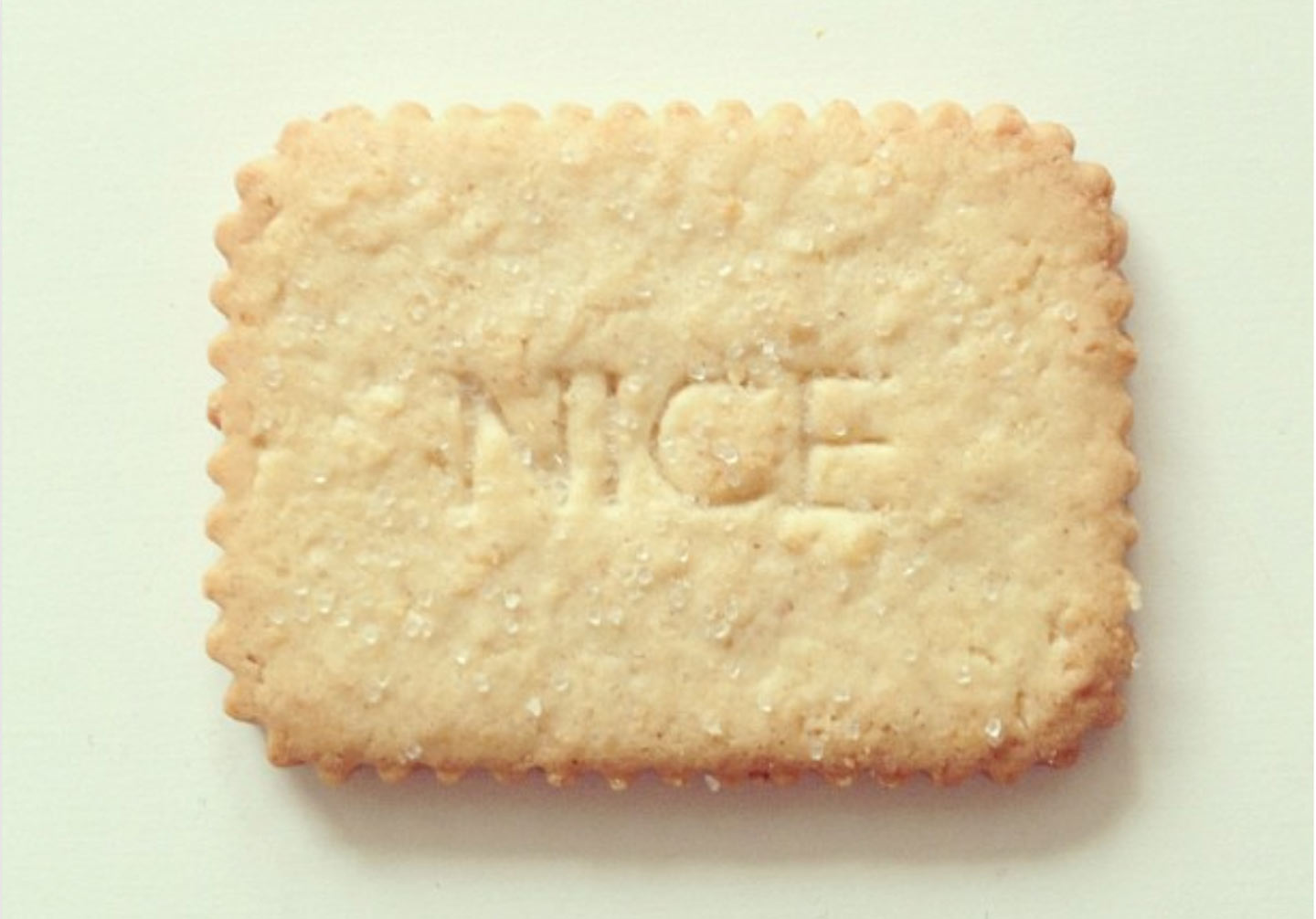
Nice. The tropical biscuit with a coconut hint.
Biscuits can create a national debate. The debate around Jaffa Cake has the country divided. Is it a cake or a biscuit? The Oxford Dictionary makes it very clear: “A sponge biscuit with an orange-flavoured jelly and chocolate topping.” But is it that simple? Well, the problem is taxes: biscuits covered with a chocolate layer pay an extra tax. So, rephrasing the question, should the Jaffa Cake pay taxes? The answer is no, it is a cake, not a biscuit. [More on this: 1, 2, 3, 4].
And of course, the eternal debate, to dunk or not to dunk.
Biscuits can cause a national crisis. In the last few years England has suffered all kinds of food shortage: the rationing of broccoli and lettuce in 2017, the recent beer and fizzy drinks shortage due the lack of CO2 during the heat wave and the football world cup, an almost crumpet crisis for the same reason, but nothing has been as devastating as the biscuits shortage of 2017. After a huge flood in Carlisle, one of the largest biscuit producers could not continue making ginger biscuits, Bourbons and other biscuits fundamental for British life. For three months it was national devastation. The crisis was only slightly alleviated when two Boeing 777 filled with biscuits were flown from the Emirates to Doncaster Sheffield Airport also known as the Robin Hood Doncaster Airport (free pun!).

Several online newspapers echoed the biscuits shortage, the tone varied but the content was the same: a national crisis.
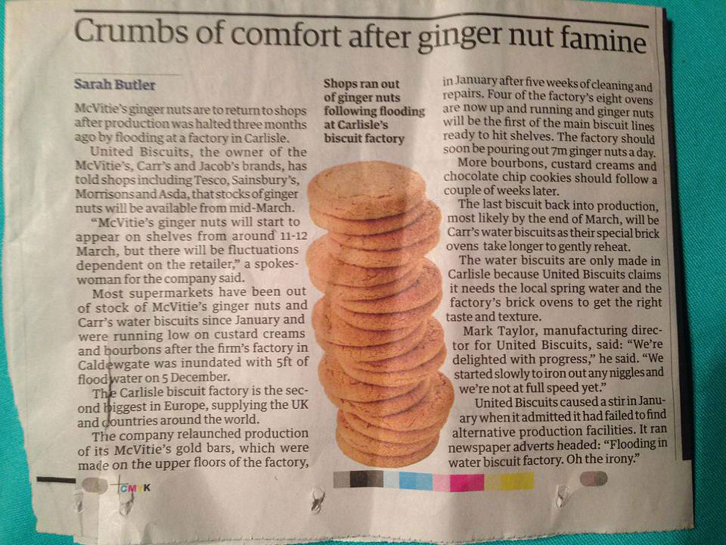
This article was included in The Guardian, on a Saturday on page 3. Compared to other pages 3 this is a sweet one. It is accessible online with a different headline and a slightly changed text
Biscuits are on the BBC. The TV program Inside the factory devoted one episode (series 3, episode 3) to the world of biscuits. The documentary shows the embossing of biscuits with a moulding roller made of bronze that weighs 400 kg and costs around up to £5000. The process of engraving each biscuit on the roller is absolutely mesmerising. Once the roller is working on the biscuit machine it will cut the biscuit and stamp the lettering at the same time. But why add ornaments and lettering to the biscuits in the first place? And when did it start? And who was behind the designs? Nicola Twilley answered some of these questions in her article ‘The Unsung Heroes of Biscuit Embossing’. The reasons for the decoration seemed to be ‘both pragmatic and decorative. The practice of punching holes in biscuits is known as “docking,” and has been done by bakers for centuries in order to prevent uneven puffiness and promote flat crispness.’ In addition to those two reasons, we could probably add branding, intentional or not. Automated production lines appeared by the turn of the 19th century in parallel to the development of advertising, packaging and early corporate identity. The birth of the industrial biscuit, I am still quoting Nicola Twilley, allowed ‘the marriage of these two morphologies — docking and decorating’. Initially, that decoration and the lettering might have been a form to recognise the biscuits and the maker but over time they have become iconic to brands like Digestive or Oreo. Regarding the last question, who designed the biscuits, it seems that no one cared much about authorship. But both the NY Times article and the BBC program mention a similar profile: a design engineer.
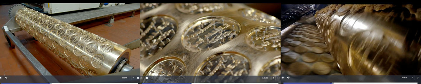
Screenshots of the BBC documentary Inside the Factory (series 03, episode 03) showing a biscuits roller.
https://dailymotion.com/video/x6p9i2d
Jump to the minute 26:52 for the beginning of the roller explanation and to the minute 29:35 for a mini interview with Alang Long from All Rollers and check out how the rollers are engraved.
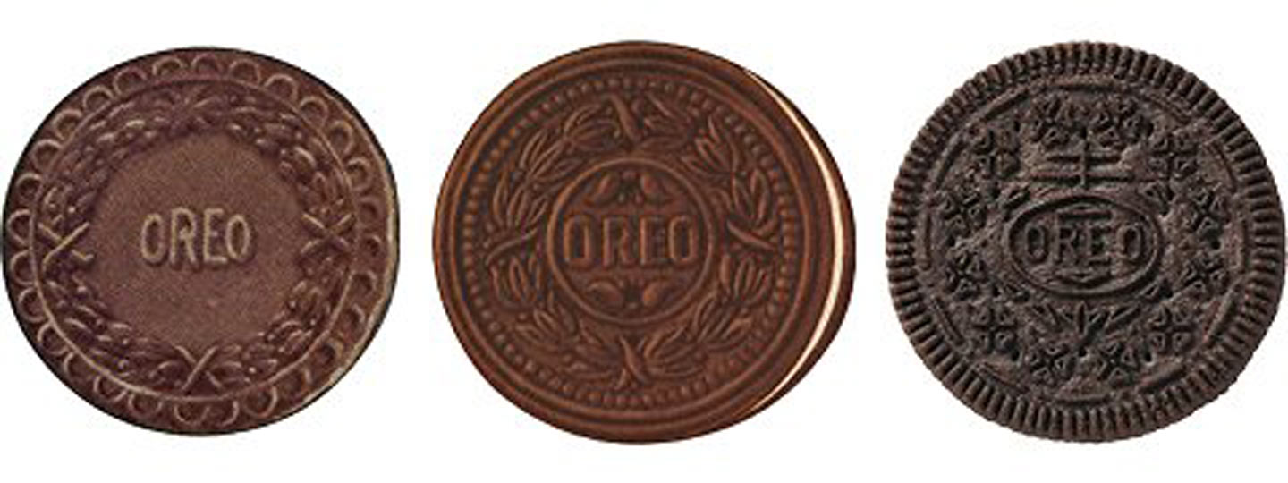
The evolution of the Nabisco Oreo emboss, 1912, 1924 and 2011, via The New York Times.
Foreign biscuits also have lettering. And not only the Marie biscuit which is available in many countries (also a British invention by the way). The Spanish lettering biscuit scene is a wasteland compared to the French one, as I could verify during the conference ‘Everyday Reading Type for phonebooks, dictionaries, ebooks’ in Amiens. But here we are talking British, not alien!
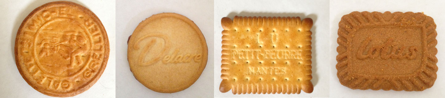
A collection of French biscuits widely available during the conference ‘Lire au quotidien. La typographie des annuaires, dictionnaires, et ebooks. ’
Biscuits can be classified. As we all know, a proper study is never complete without the pertinent taxonomy. Not surprisingly, there is such a thing as a biscuits classification regarding their biscuit properties: Do they have a chocolate layer? Are they almost a cake? Or are they more similar to bread? Are they individually cellophane wrapped? No question is too small when it comes to biscuits. Without a doubt, the best biscuit classification is Nicey & Wifey’s Venn diagram of biscuits from the blog Nice Cup of Tea and a Sit Down, which has also been published in a book about biscuits (Nice Cup of Tea and a Sit Down, 2005) — the book that triggered this post. However complete, it does not contemplate the biscuit’s shape, form, or lettering. And without the lettering a Nice would not be a Nice, a Bourbon would not be a Bourbon, a Digestive would not be a Digestive.
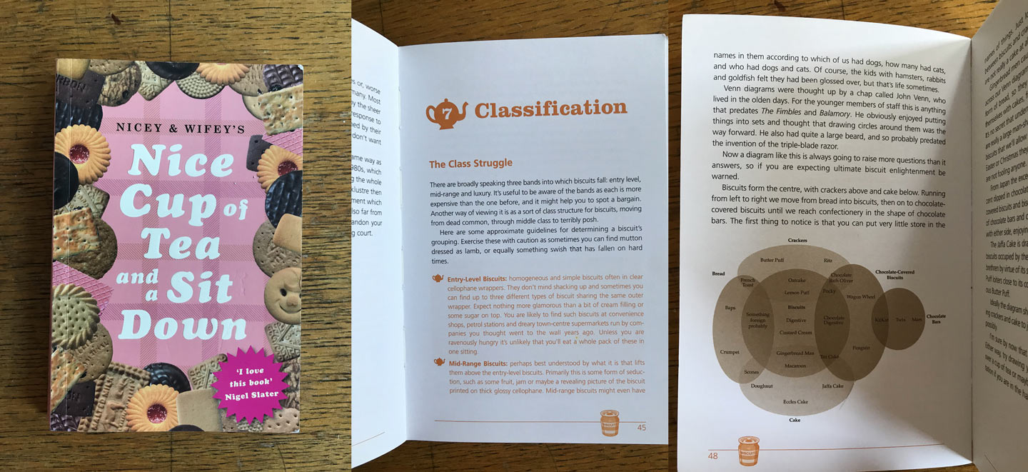
Cover and internal pages about the biscuit classification. Absolute genius.
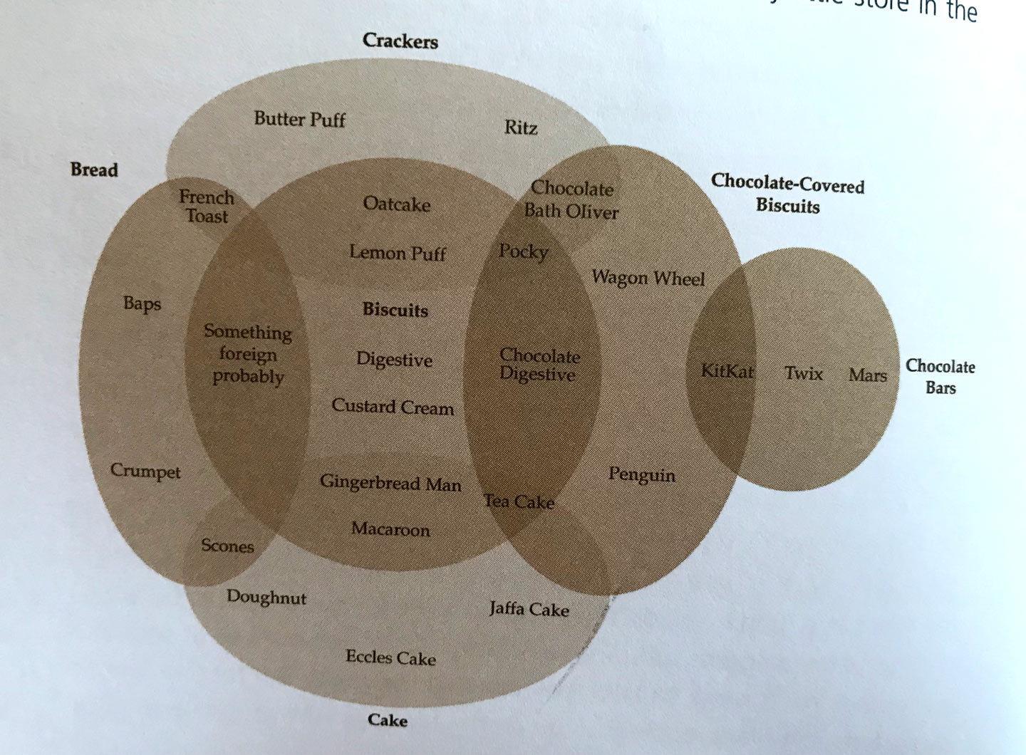
Nicey & Wifey’s Venn diagram of biscuits In my short experience with biscuit diagrams and classifications I can say with no hesitation that this is the best I have encountered. However, it is not satisfactory for a biscuit lettering study. The form, shape and lettering are not part of the diagram. Fair enough.
British biscuits have lettering. But not all of them. Because this can’t be a study of all things biscuits, our first step is to determine the universe of biscuits that will be part of the study. Many biscuits don’t have any decoration or lettering at all: ginger nuts, oats, chocolate covered, wafers, fruity biscuits, etc. This shortens the list of candidates to basically five categories: plain dunkers, shortcakes, digestives, sandwiched biscuits, and the jam.
Using the book Nice Cup of Tea and a Sit Down as a reference for the framework, we find that thirteen biscuits out of a total of 34 biscuits included in the book feature lettering. The number is not breathtaking, and after filtering out all the kinds mentioned above (ginger nuts, oats, etc), the result is thirteen out of sixteen qualifying biscuits show lettering. Thus it’s probably safe to say that if there is an opportunity to mark a biscuit with a name or a pattern manufacturers will take it. However, I wanted to widen the biscuit universe and also analyse biscuits not featured in the book.
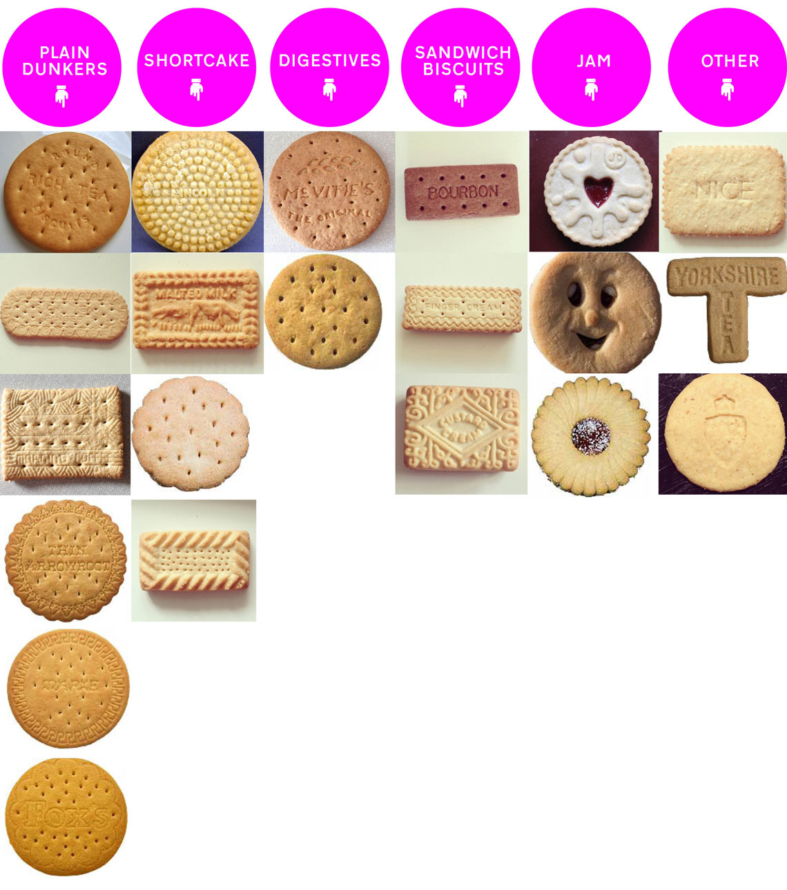
This image shows all the ornamented biscuits that I have been able to find, both in real life and online. Although some categories are debatable and some biscuits I have not a clue in which category they should be, it is, to the date, the more thorough taxonomy on ornamented lettering.
What makes this study complicated is the lack of original material. We could compare the biscuits in a timeline but are the current designs the same as the initial ones? Hence it is hard to determine whether sans-serif letters were being used more often in the early years of biscuit mass production (the Bourbon biscuit, for instance, was created in 1910), or if the more informal hand-written form of the Digestive (early-mid 19th century) was the prevalent style of the time? We can only assess what we see today, probably a mix of legacy and production-driven design.
Referencing the common letterform classifications (Sans, Serif, etc) we find that the vast majority of the biscuit lettering is basically a skeleton sans. This is very likely due to the process of making the biscuit, in which serifs and details may get lost. There are two exceptions though: the Thin Arrowroot (which I have never tried) and the (wonderfully designed but a bit boring) Art-Deco-ish Morning Coffee. Our biscuit taxonomy shows them arranged from the bold Lincoln and Custard Cream to the thinnest of the thins, the coco-ish Nice biscuit that stands out for its spindly almost-Roman-proportions lettering. Should maybe biscuit lettering have its own branch in the Vox and British Standard type classifications? I foresee a large debate over some even larger Belgium beers.
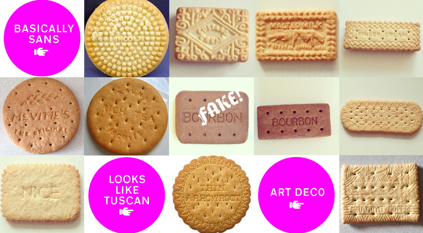
Left to right, from sans-ish to art deco-ish and from bold to thin a taxonomy of lettered biscuits.
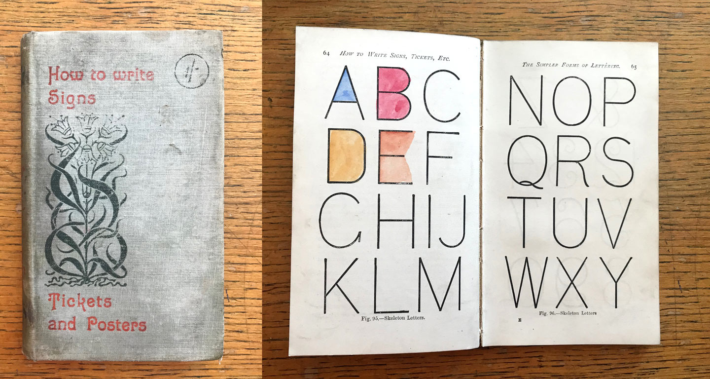
‘The simpler forms of lettering. Skeleton Letters’ as featured in Hasluck’s (1895) ‘How to write Signs, Tickets, and Posters’. An example of what was understood as the most basic letterforms by the end of the 19th century. (This is my copy, a very unique one, because someone at some point of its 123 years of life had water coloured some letters.)
We could also contemplate how the letters sit on the baseline, does the lettering follow the shape of the biscuit or is it just sitting there in a straight line? The majority fall in the second category.
Now, what does all the biscuit analysis tell us? I’m speculating but it looks like manufacturers are playing it safe: using mostly lettering without details, biscuit shapes are quite simple (with the exception of the Yorkshire Tea) and the text just sits there, centred in the biscuit form. But can we blame them? Who would want to risk their biscuits?
![]()
![]()
![]()
Final note. I want to end by discouraging you from continuing any kind of biscuit-lettering research until all companies mass-producing biscuits stop using palm oil or at least use sustainable sources — although I wonder if that is even possible. However, palm-oil-free biscuits do exist and here is a list compiled by ethicalconsumer.org. Some things are more important than research, even than lettering research.
Thanks to Amy and Indra for revising the biscuits ‘manuscript’ without eating it, to Ulrike Rausch (LiebeFonts) for her typeface LiebeChristmas, and special thanks to my British friends, Catherine and Becky, who are my guiding lights in my Britishness and who have tirelessly explained all I ever wanted to know about their culture. If you don’t have British friends, or yours are meh, I recommend George Mikes’s classic How to be an Alien.
These are not Biscuits. They are Cookies! Biscuits are flaky round buns eaten with breakfast or dinner (don’t get me started on Dinner vs. Supper).
https://en.wikipedia.org/wiki/Biscuit_(bread)
And while we’re at it, let’s put this one to bed:
Is it Math or Maths? – Numberphile – YouTube
Pingback: Elena Veguillas Explores British Culture and Design with Biscuits « Adafruit Industries – Makers, hackers, artists, designers and engineers!
What a great article!
Pingback: MUJERES EN TIPOGRAFÍA: ELENA VEGUILLAS | Rayitas Azules | Diseño Editorial y Tipografía