
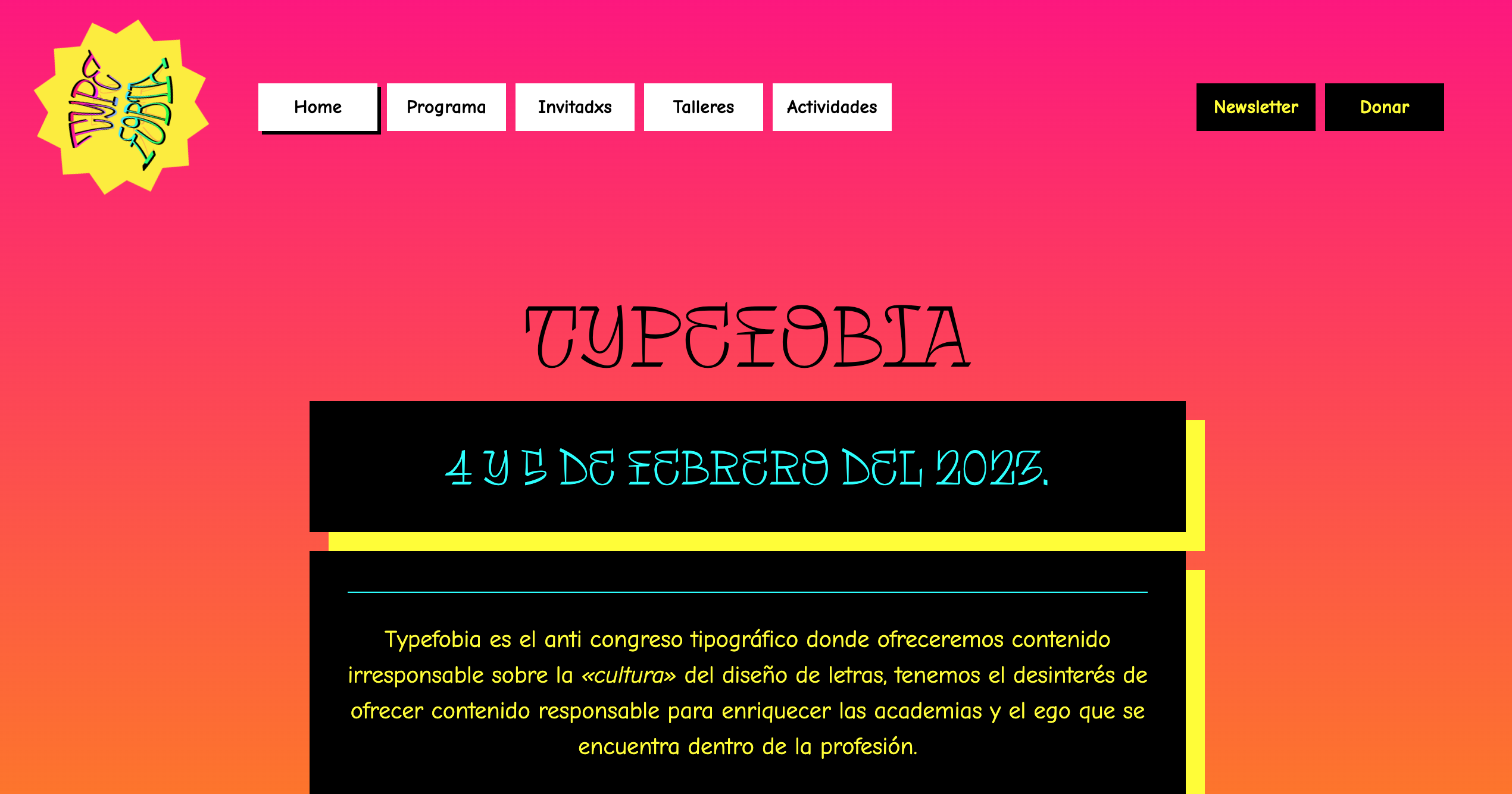
A few weeks ago, I found the most wonderful surprise in my in-box: a 15-page PDF outlining what appeared to be a kind of alternative typographic universe: an “anti-conference about the ‘culture’ of letter design”. It’s Typefobia, happening this weekend, February 4 and 5, online and in Puebla, México.
This is not your average type conference and Typefobia organizers, Romina and Karly, answered some questions about how this weekend intends to challenge industry / academic expectations and reimagine what a design conference can be.
What is Typefobia?
Typefobia is a half in person, half online anti-conference on February 4 and 5, 2023, where we believe the people behind type and design are more important than the work itself.
Where is Typefobia happening?
In a small art/cafe space in central Puebla, México, along with an online call, we’ll have local and international guests speak about their experience working in the design and type related fields and try to bust the doors wide open for anyone that wants to join the community of letter workers looking for a better tomorrow.
How did the idea of Typefobia come about?
The original idea came from a chat with some friends about how important and necessary it is for us designers to speak about real issues. Sometimes you just need to badmouth your own work, or be frustrated about a string of failures or speak honestly about how mental health and privilege seem to sabotage your job opportunities at the worst possible moments.
And sometimes in the design community, and specially in design conferences, it can feel like you always have to wear the mask of your superhero designer ultra cool and super successful persona or be doomed to feel a bit ignored or out of place.
So afterwards, the idea stayed in Karly’s head and she started to make stuff happen; assembling a great team, all the way from students and recent grads and also some that have been into type for years. That all added up to an event with a shared rebel spirit, but with many different perspectives. All showed great care and enthusiasm for bringing people together.
What are some of the main activities?
There’s talks, featuring people you probably haven’t heard from, but totally should, because they’ve probably had similar struggles as you, and like all of us.
In the spirit of Mean Girls, we have a burn book, where all attendees who want to, can share their bad formative experiences in design, education and the workplace, and start to move forward together.
We have an anti-exhibit, showcasing the best projects you tend not to show: the one where you took the longest, the one that went all wrong but taught you so so much, the one where you totally ripped off that guy, but it made you understand it all…
There’s two workshops: One online, with Fer Cozzi, where you’ll learn to make letters lose all legibility, good form and good manners; another one in person where LetterEngine’s Miguel and Eduardo will teach attendees how to destroy a font entirely with code. Both are as priced as low as possible and invite us to lose that, often paralyzing fear of coding/drawing/doing it “wrong”.
Finally, we have two roundtables, exploring how mental health and privilege tangle up in a design career. From the local perspective and also in the international type scene.
Most of the online events are at least, partly in English so it’s somewhat accessible for non-Spanish speakers who want to join.
What do you hope participants take away from the weekend?
That a community is shaped by those who are in it, and that there exists a place for you in the creative fields if you want it to be. There’s fewer barriers every day and we want to encourage the people that have been on the fence to just come in and learn and be themselves and make design theirs too.
This is not the design conference to come hear how some already famous people have already made it. This is one where you hear all about the mistakes other young people have made, maybe get some tips on how to start looking for better work, find a mentor or learn about scholarships or other opportunities. And where we do have more “successful” guests (what does that “successful” mean anyway?), we’ve asked them to talk about the less shiny parts of their experience.
We hope attendees are left feeling that their colleagues and designer friends matter more than the work and the deadlines, and that even when the world seems hopeless, at least in this design community, you can find friendly faces to support you and in the future hopefully start new, better projects.
Why Comic Neue?
The whole idea of the graphics was to make it look anti-design. So what says “graphic design is my passion” more than rainbow Comic Sans? But since it’s the web, and considering Google Fonts’ freeness and our budget, that turned into us using a lot of Comic Neue, which is somehow maybe even less type proper.
It was funny that, when making social media posts and such, it turned out to be quite challenging to make the comics plus Fer Cozzi’s Tomasa NOT look kind of great instead.

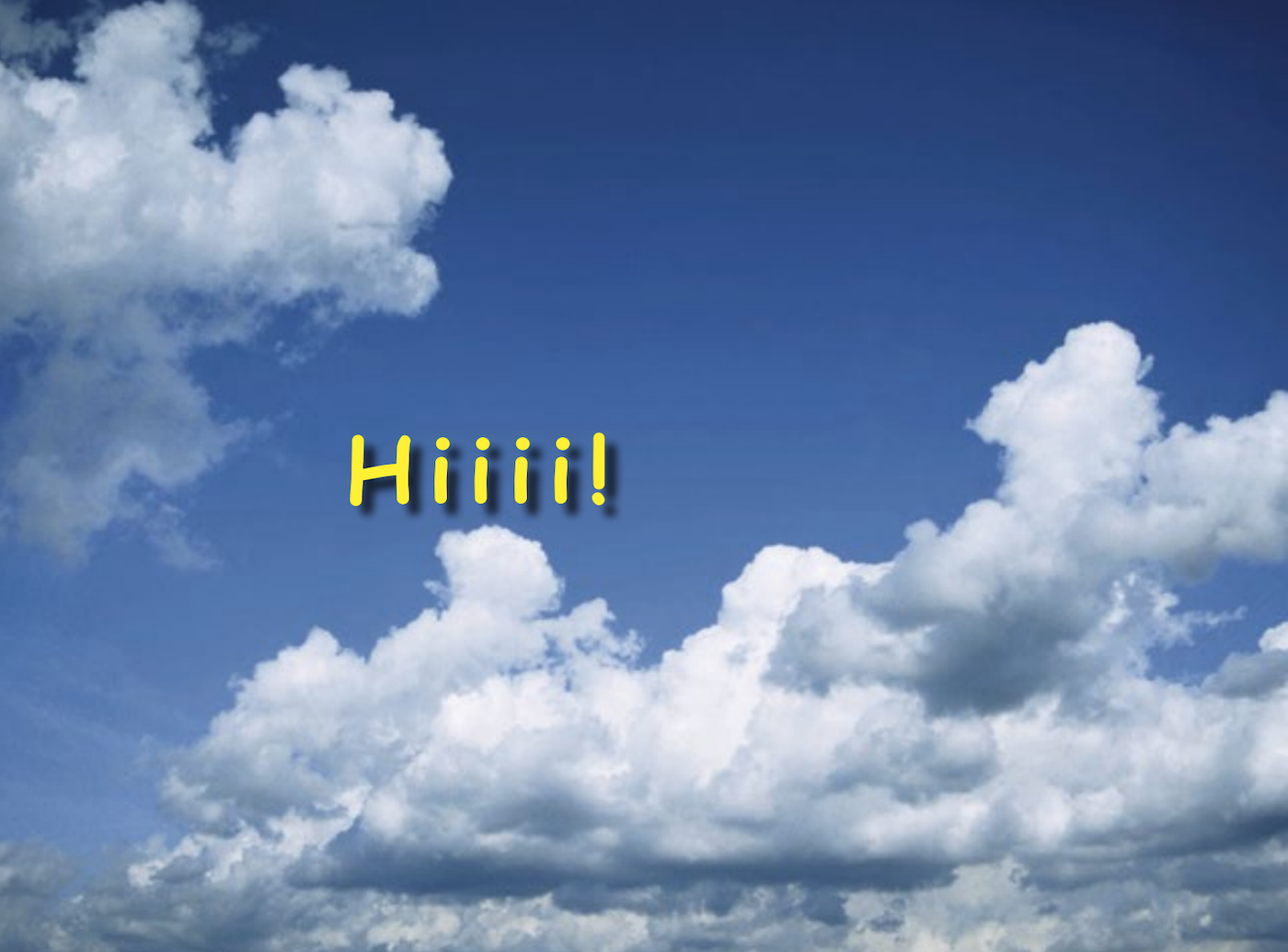
Also some of the fundraising materials we put together, we used OG Comic Sans MS and actual historical low quality jpegs from preserved clip-art CDs from the 90s. It was quite a privilege to be able to open those bits, undisturbed since the dot-com bubble burst and bring those pictures of clouds at dusk to their former glory.
How can people get in touch or get tickets?
All the details are at typefobia.com, and this is a link to get tickets for the online events: https://www.eventbrite.com.mx/e/typefobia-tickets-524878775547 and we’re open for any questions, mostly on instagram @typefobia.