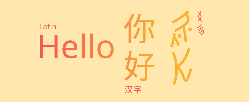
with Noto Sans Regular in Latin, Chinese and Nüshu
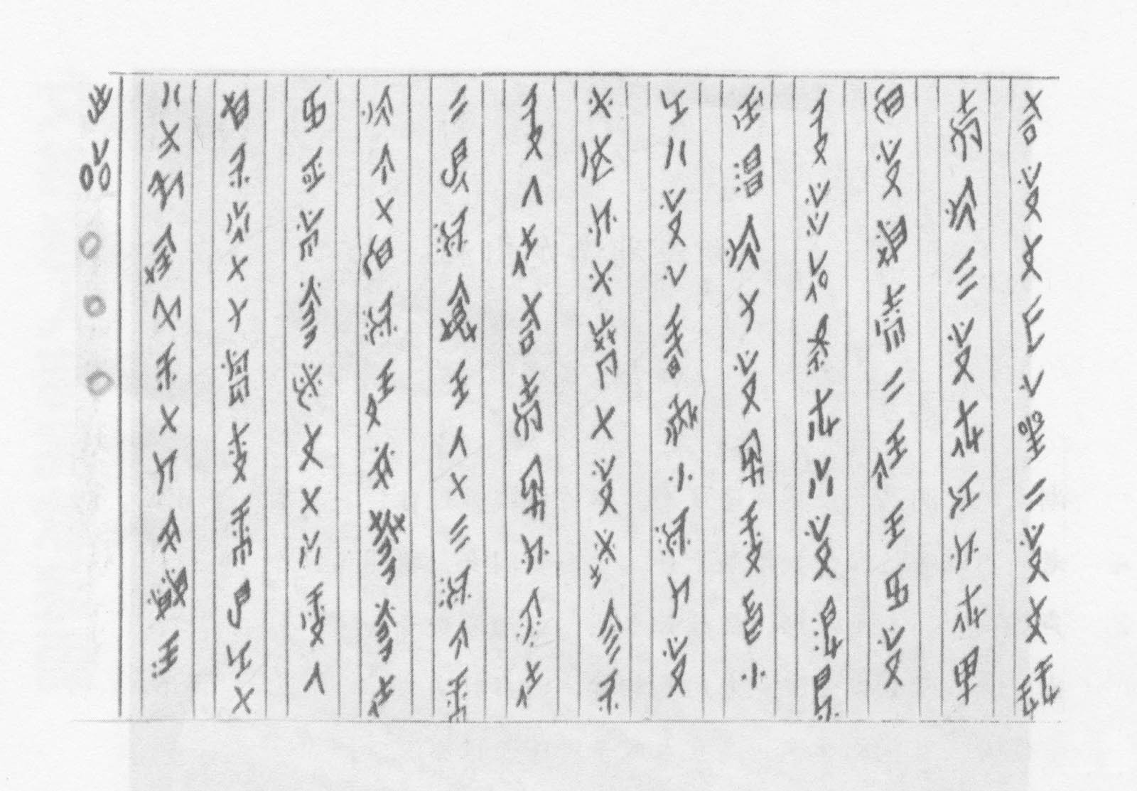
一岁女,手上珠 (One year girl, hands with pearl) by Gao Yinxian 高银仙 (1902–1990)
Reading time: 15min

with Noto Sans Regular in Latin, Chinese and Nüshu
一岁女,手上珠 (One year girl, hands with pearl) by Gao Yinxian 高银仙 (1902–1990)
Reading time: 15min
I pre-ordered Natural Enemies of Books: A Messy History of Women in Printing and Typography immediately when I stumbled upon on the ‘forthcoming titles’ page of publisher Occasional Papers’s website. I knew the the title was a reference to an essay in a book designed and printed by a number of women in 1937—Bookmaking on the Distaff Side. I had recently learned about it in my own research and had only just succeeded in getting my hands on a copy from the edition of 100 after many dead ends. Thank you, interlibrary loan, and thank you, UC Berkeley!
Bookmaking on the Distaff Side was a unique piece of collective work in which women printers were invited by a committee to submit signatures they’d printed to be bound into an edition, which contributor, Kathleen Walkup, refers to as a pot-luck format. This means each submission is printed on unique paper, with varied colors, type, and illustration styles. It’s diminutive size and deckled edges with unique papers (and colors) make it such a treat to hold and leaf through. Content focuses generally on printing and typography, whether it be type theory, history of women and printing, or humorous piss-takes about the famous typographic men of that era. Perhaps my own greatest surprise in reading the book was the shade thrown at male printers and typographers. Though it is often tempered with some clarifying diplomatic statement, it’s clear the women who put this volume together had opinions and knew humor was a clever way to couch their critical opinions.
We have received some encouraging positive feedback on the first online Q&A session for mentors last Wednesday, 15 April 2020. Thank you for joining, it was great! Three current mentors, Sahar Afshar, Pilar Cano, and Petra Cerne-Oven, kindly shared their experiences and tips, and answered several questions by the attending mentors.
We also briefly described how the matching process works now: Once the mentee applies via the application form, we try to find the appropriate mentor, taking into account amongst other things location, mentee’s goals, mentor’s skill set, indicated duration, and conversation language. We also recommended a list of things should be defined with your mentee in the first meeting, including frequency of the meetings, the prevalent medium of communication, definition of the mentee’s goal, a reminder about the duration of the mentorship and that immediate feedback can’t be expected, as well an agreed method to cancel meetings to avoid frustration on both sides.

‘Do you have at hand a list of women type designers?’ ‘can you give me a list of typefaces designed by women?’ ‘Is there a bibliography about works related to women in type?’ We all have received this kind of questions at one point or another, but here in Alphabettes we didn’t have a page or a blog entry listing this kind of material. This is an un-organised list of resources all related to women in type that anyone can use. Continue reading
This is the beginning of a bibliography of women in type. It was initially based in two main works, Julian Moncada’s and Laura Webber’s respective MA theses, but it has grown since then.
The first question when making a bibliography is what is this for? who is it going to help? This list might be useful for anyone researching the history and the roles of women in printing, design and type design. It could also be helpful to understand the contemporary situation of women in type. But also, for anyone who wants to research a particular type design. The list has been organised in three main categories, design, print and type. Continue reading
Each Alphacrit is planned many months in advance. Little did we know then what was in store for our future selves. Would we have continued planning, knowing our psyches would be full of just about everything but type design? In the midst of it all, I’ve found some small comfort in sticking to a few daily routines and exploring areas of interest I couldn’t before. If that resonates, we’re running this Alphacrit for you.
First, what is Alphacrit? It’s a virtual type design critique for four lucky participants picked at random. They’ll receive feedback on their in-progress typefaces by two seasoned type designers — Sara Soskolne of Hoefler & Co and Nicole Dotin of Process Type Foundry. Sol Matas will host the session to keep everything running smoothly.