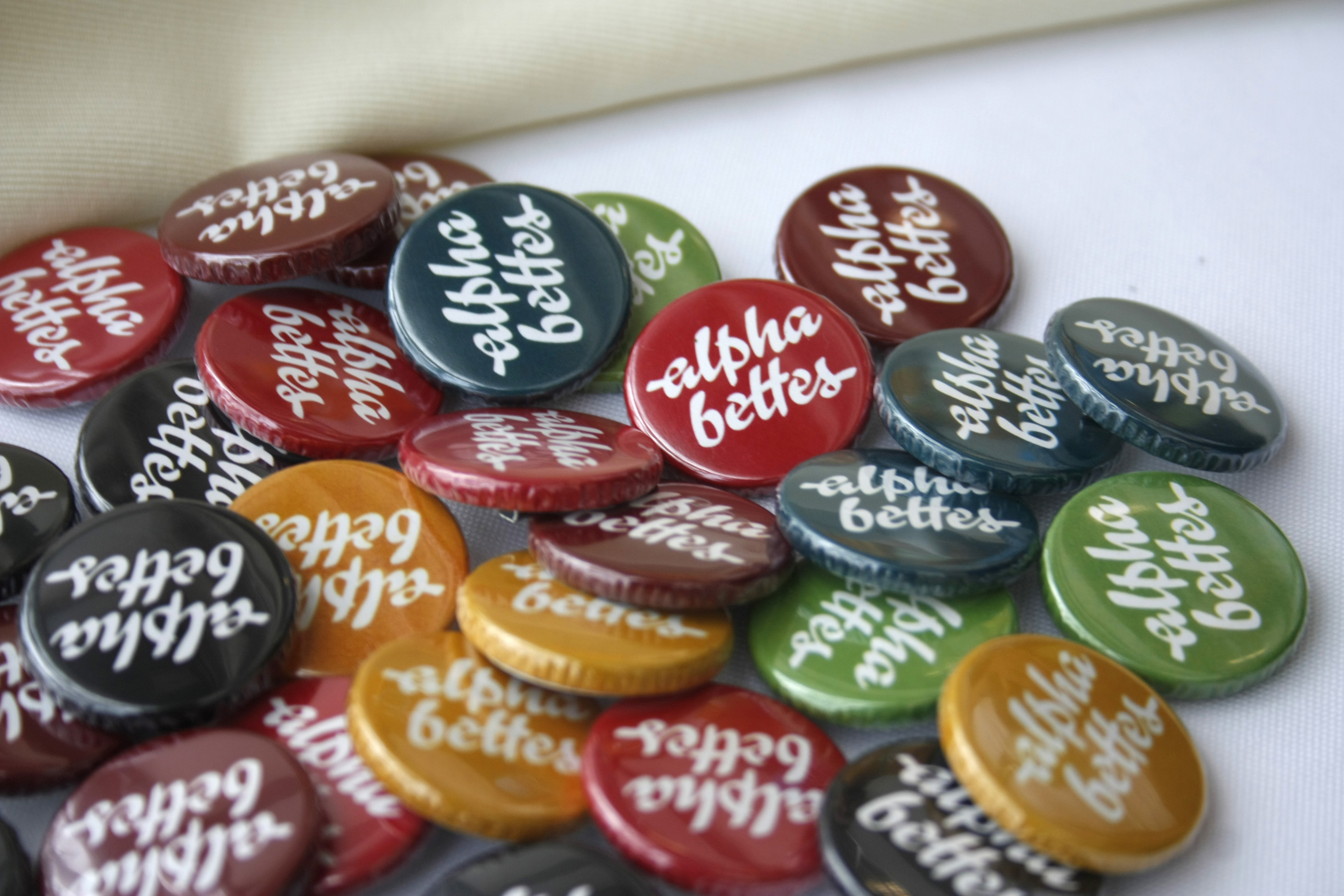
If you’re lucky enough to be at ATypI this week, then you’re lucky enough to snag a sweet Alphabettes pin, with custom lettering by Victoria Rushton and button designs by Veronika Burian. Photo by Elena Veguillas.

If you’re lucky enough to be at ATypI this week, then you’re lucky enough to snag a sweet Alphabettes pin, with custom lettering by Victoria Rushton and button designs by Veronika Burian. Photo by Elena Veguillas.
The typographic twitterverse is aflutter today. The subject? Project Faces, an iPad app by Adobe that allows users to customize the skeleton of a typeface and watch it magically change from flat to fabulous in a matter of seconds. Well, not exactly. At least, that’s not the consensus on Twitter. The application itself, demoed at Adobe Max last week, is perhaps less interesting than the ensuing discussions. Here are a few collected tweets worth sharing. Continue reading
For the second interview in our series, Alice chose Sol Matas to be interviewed. (Beware, personal comment ahead) I was instantly happy – my husband is Argentinian, like Sol, and I have heard so much about Buenos Aires (and can even recommend where to eat without yet being there!) that I was super excited to hear what Sol had to say.
This interview is posted right before ATypI São Paulo, as a small tribute to the type scene in Latin America. So get yourself a nice plate of Argentinian Alfajores or German baked goods, or better yet – both, and enjoy Sol’s thoughts about two places, about type, and life.
Welcome to the first edition of what hopes to be a monthly roundup of women making news in the world of type design, typography and lettering. To not miss any exciting news from the months before September, this time we’re turning the clocks back a little, so sit back and catch up on the amazing things these ladies have been up to this year.
Ruxandra Duru’s report Type Foundries Today goes live on Typographica
Last month, Ruxandra Duru’s census and accompanying analysis of contemporary type foundries based out of Europe, the Americas, Australia, and New Zealand was released by Typographica. This report is a timely first step in understanding the nature of the type business better, and a must-read.
Mary Catherine Pflug wins four CSPA Collegiate Gold Circle Awards
Mary Catherine Pflug has bagged not one, but four, CSPA (Columbia Scholastic Press Association) Collegiate Gold Circle Awards for the campus magazine, The Independent; including one for “General use of typography throughout magazine.”
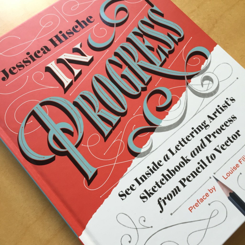
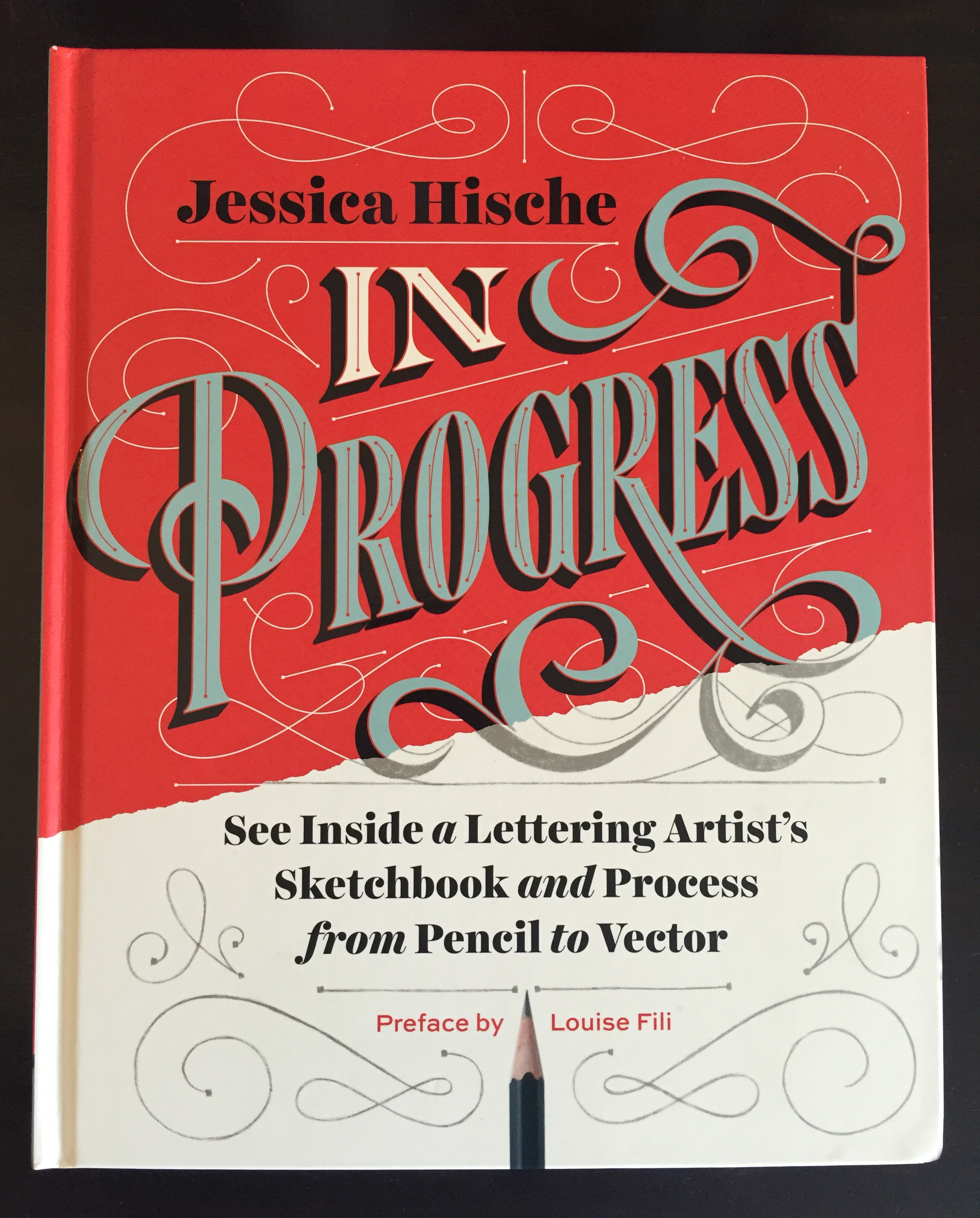
Jessica Hische’s book In Progress is out
If you dig hand lettering, chances are you already know that Jessica Hische’s book In Progress hit the shelves this September. Read more about the book in Shauna Lynn Panczyszyn’s review, or get yourself a copy.
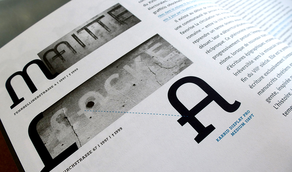
Verena Gerlach is September’s Creative Character…
Read Verena Gerlach’s interview in which she speaks about her work as a typeface and graphic designer, FF Karbid in particular, and about the arts and culture scene in newly-reunited Berlin in the early nineties when she was a student.
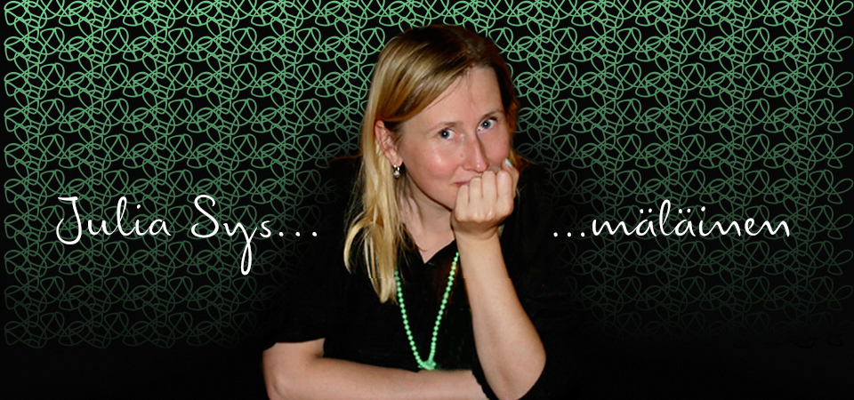
…and Julia Sysmäläinen was May’s
Julia Sysmäläinen, probably best known as the designer of FF Mister K, talks, among other things, about her love for language and how being fluent in more than one language and script has influenced her work in this great Creative Characters interview.
Isabel Urbina Peña’s launches Yes, Equal
Late in August, Isabel Urbina Peña launched Yes, Equal, a directory of sorts of women creatives. Next time you hear a conference organiser bemoaning the very limited number of women they can invite to their event, you know where to point them to.
Nadine Chahine becomes Monotype’s first female director
With her promotion to UK Type Director, Nadine Chahine became the first woman to hold this position at Monotype.
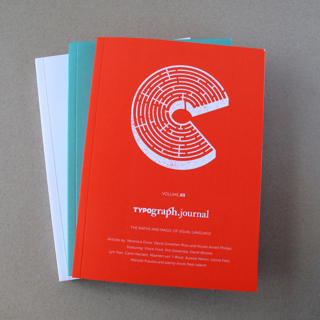
Nicole Arnett Phillips launches the third volume of Typography.Journal
Typography.Journal, a boutique print journal, is the brainchild of Nicole Arnett Phillips, aka Typograph.her. Its third volume, which explores the intersection of maths and magic in visual communication, is now available for purchase.
Rebecca Bartola receives the first TDC Beatrice Warde Scholarship
Rebecca Bartola, who is an American student currently studying at Central St Martins, London became the first recipient of the TDC Beatrice Warde Scholarship this July. Check out her work here.
To those that know Jessica Hische’s work, it will come as no surprise that her new book, In Progress, is an absolute beauty. Honestly, I don’t think we would expect anything less than gorgeous. From the cover to the end papers, to even the ink choices (she used silver ink!), In Progress is an amazingly well-put together book, from beginning to end.
Continue reading
Some very sped-up drawing, for your vector-scrutinizing pleasure. My favorite parts, if you can catch them, are when I realize halfway through that the ascender tops are leaning the wrong way, and when my boyfriend’s iMessage pops up with some solicited feedback that the “a” and “l” are too close together.
Music is Jenny by the bird and the bee.
Check out The Ruq’ah Project by Zeynep Akay, documenting the research and making of a typeface inspired by Ruq’ah, a common style of Arabic handwriting, to be added to the Google Webfont Library. It’s not always easy to allow the world to peek behind the curtain of one’s process but Zeynep is determined to partake in what she is calling “immersion therapy”.
I will open my process, my most unrefined drawings, my kookiest ideas, my most embarrassing failures to the snarkiest, most passive aggressive comments on the internet.
We’ll be right here, watching — and cheering — along.
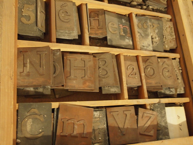
A recent visit to the Gerstenberg type foundry let me finally wrap my head around the different methods of making matrices for foundry type, and how to distinguish them:
Striking a punch into copper
This is the traditional method mostly used in conjunction with hand-cut steel punches, later only used for smaller sizes until ±28pt; larger sizes are hard to strike totally level. Also, the larger the size, the more the copper block gets deformed from the extrusion of the material.
Stamping a matrix with a machine
Often done in conjunction with machine-cut punches, especially for the production of Linotype and Monotype matrices, and for foundry type when the design is supposed to match Lino or Mono typefaces. And for sizes above 28pt. Machine-cutting of punches was also used for very small sizes that were almost impossible to do by hand, e.g. 2pt or 4pt. Stamped matrices can be made of copper, steel, or other alloys.
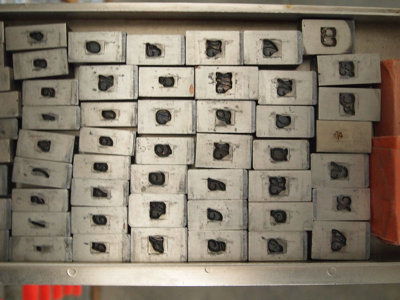
Electrotyping matrices
Widely used in Europe in the 20th century. Usually applied in conjunction with the cutting of patrices (cutting “punches” into soft type metal alloy, called Zeugschnitt in German), mostly done for sizes from ±28pt up. The model gets placed into a galvanic solution for 24–60 hours, or longer, to produce the matrix layer. These forms, cut up, make up the “eye” of the matrix, which is filled out with zinc, tin, or brass, later also steel or other alloys. Material for the matrix-part was copper, nickel, or brass, with copper being less durable for use in the complete caster (also a reason why the traditional method was not much used in the 20th century) but the fastest to grow matrix-layers with.
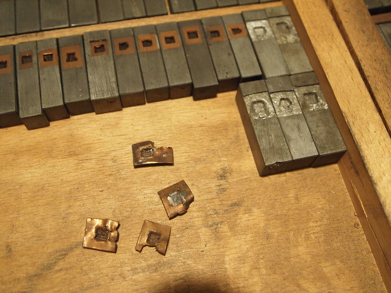
These electrotyped copper matrix-eyes came loose from their “bodies”, presumably a zinc alloy. Copper does not bind well with zinc and has to be tinned at the backside.
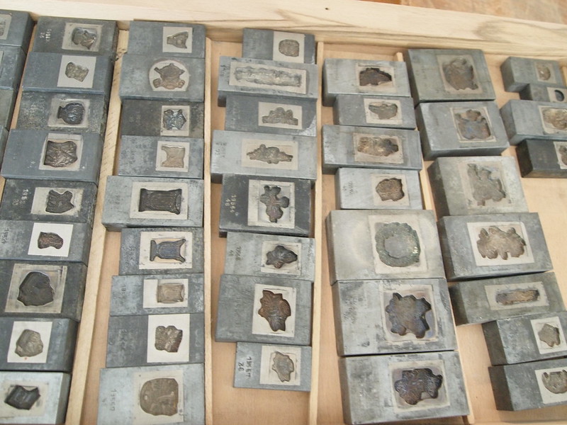
Electrotyped ornament matrices
Cutting matrices for poster type
Type larger than 96pt was usually produced in wood or resin, because metal type gets very heavy and “material-intensive” at large sizes. Still, large-sized matrices can be made via a patrix (type metal or wood) and electrotyping, or by cutting the form out of 3–4 mm thick copper sheets and mounting these on thicker sheets. Alternatively, a cut-out brass form can be pressed into type metal to form a (pretty soft, so not very durable) matrix. Or you could go all old-school and make a sand mold, preferably using beer to moisten the sand, more sticky.
Machine-engraving matrices from patterns
Widely used in Europe in the 20th century. A pantographic milling machine, adjustable for different sizes, engraves the matrix in several step following a pattern. The material used is sometimes bronze, later usually (high speed) steel. Getting an even, plane bottom was hard to achieve in the beginning, so engraving was occasionally combined with galvanic methods, but especially for scripts or other typefaces with large overhangs and kerns because those matrices had to be deeper.
Patterns from Stempel for pantographic matrix engraving
Engraved matrices (above Calipso from Nebiolo, especially for Florian and Isabella 🙂
