
365typo: 365 stories on type, typography and graphic design, published in collaboration with the Association Typographique Internationale (ATypI), is a new annual trade book (loosely in the tradition of the Penrose Annual), featuring a collection of articles about type and typography written by several different contributors from December 2013 to June 2015. The idea is to publish a new book each year, providing a snapshot of the industry for that period.
While many of the articles were not purpose-written and can be found online (such as Typographica’s list of fonts for 2014), it is the curation that makes this publication so relevant: sorting through the seemingly endless supply of typography-related articles and events, the book shows careful selection and intelligent editing. Having the support of the ATypI, the nice hard-cover binding and contributions from many important names in the field (including several Alphabettes) provides a sense of legitimacy and permanence to subject matter that might otherwise be lost in a sea of online content.
The book can be read in a linear order or by skipping through different snippets. In this sense, it feels a bit like a blog or magazine (or even a conference). There is a slight navigation problem, as there is no clear index or table of contents (and researchers of the future might appreciate a clearer path to sort through subjects). But perhaps that is part of the charm… You jump from subject to subject, getting a sense of being in the middle of the myriad discussions that happen in the field. Something akin to that feeling I remember after going to my first ATypI conference: pure awe in the realisation that such a specialised field contains such a wide range of areas of interest.
Subjects covered include short recaps of lectures and conferences, design reviews, projects, essays and interviews, as well as topical current events relevant to the industry (such as the Hoefler and Frere-Jones separation and Je Suis Charlie). They also come from different areas of the globe: I was pleased to see plenty of Latin America in there, and imagine that in upcoming years more voices from less represented parts of the world will be added (there are already some). There is potential for the scope and criteria to be further refined in coming years.
Finally, the design is beautiful, well printed and bound, with well considered typography. The titles look lovely set in Playtype’s Berlingske Serif Black, and TypeTogether’s Capitolium 2 reads wonderfully, set with generous margins and plenty of white space. The articles are numbered in bold deep red (from 1 to 365, of course). Each article has a subject area listed above, and a broad area of interest listed on the top corner of the page (“typography”, “graphic design”, etc), which is nice, but unfortunately not entirely useful since, as mentioned, there is no index list of subjects to be found (the reader can find articles by contributors, or names cited, but cannot read quickly about all the conferences, for instance, or even quickly search articles by title).
Nevertheless, 365typo is a very useful document for catching up on the current state of the industry and to sort through things that were missed. It will be an invaluable tool for future researchers. More importantly, perhaps, it gives a sense of context and captures a bit of the spirit of the previous year in type, and that is very exciting. I eagerly look forward to next year’s edition, and hope this project lives on for a long time.
photo by Elena Veguillas
***
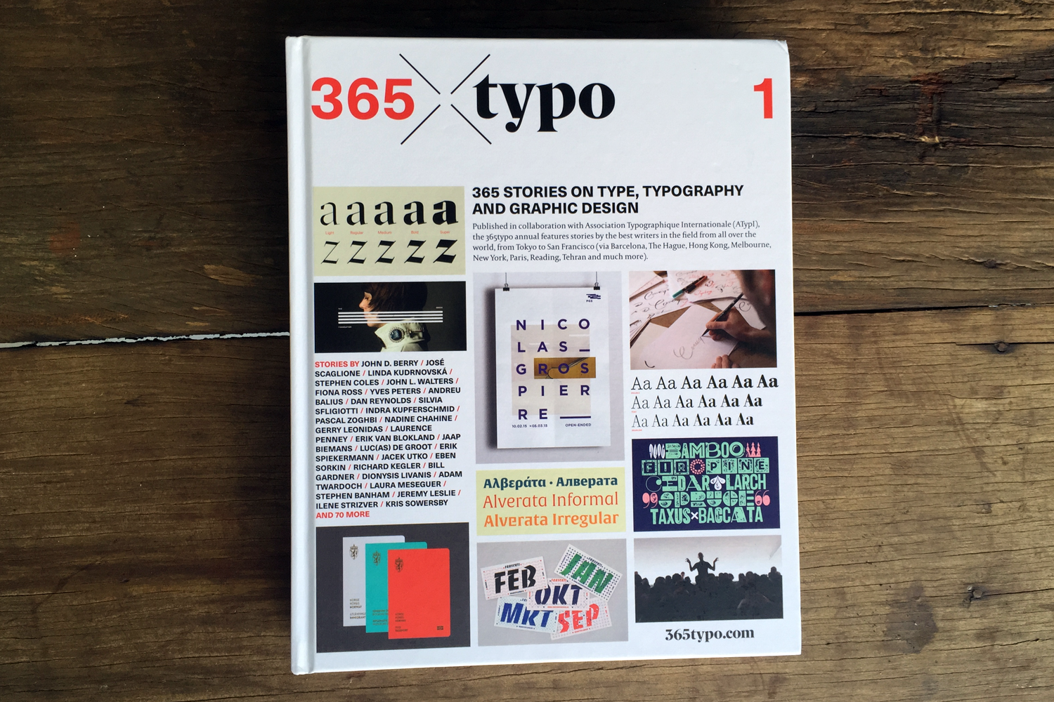
365typo: 365 stories on type, typography and graphic design
Concept by Linda Kudrnovská and Michel Chanaud
Edited by Linda Kudrnovská
Design by Filip Blažek, Designiq
Published by étapes: editions
Printed by D’Auria Printing, Italy