Font Licensing Mess

Este artículo está también disponible en español

Too often, we face the challenge of explaining font licences to students, customers, colleagues, or friends; it proves difficult every time. Back in 2023, we asked ourselves what could we do to improve our understanding of the topic and explain it better? We began collecting information from foundries, tons of data that is not only valuable for us but also for other type users, font makers, and educators. This article is a short introduction to the project and the information available in our website. We also post updates, from time to time, on social media.

Continue reading
Font Licensing Mess

This article is also available in English

Más de una vez nos hemos encontramos con el desafío de explicar qué es y cómo funciona una licencia tipográfica. La respuesta no suele ser fácil. Hace un par de años, en 2023, nos propusimos profundizar en el tema para poder explicarlo mejor. Empezamos recopilando información de fundiciones; un montón de datos que serían útiles, no solo para nosotras, sino también para otras personas que utilizan fuentes, crean tipografías o trabajan en educación. Este artículo presenta un resumen y algunos resultados de este proyecto de investigación, en el que hemos estado trabajando durante casi dos años. Podéis encontrar más información en nuestra página web y recibir actualizaciones en redes sociales.

Continue reading

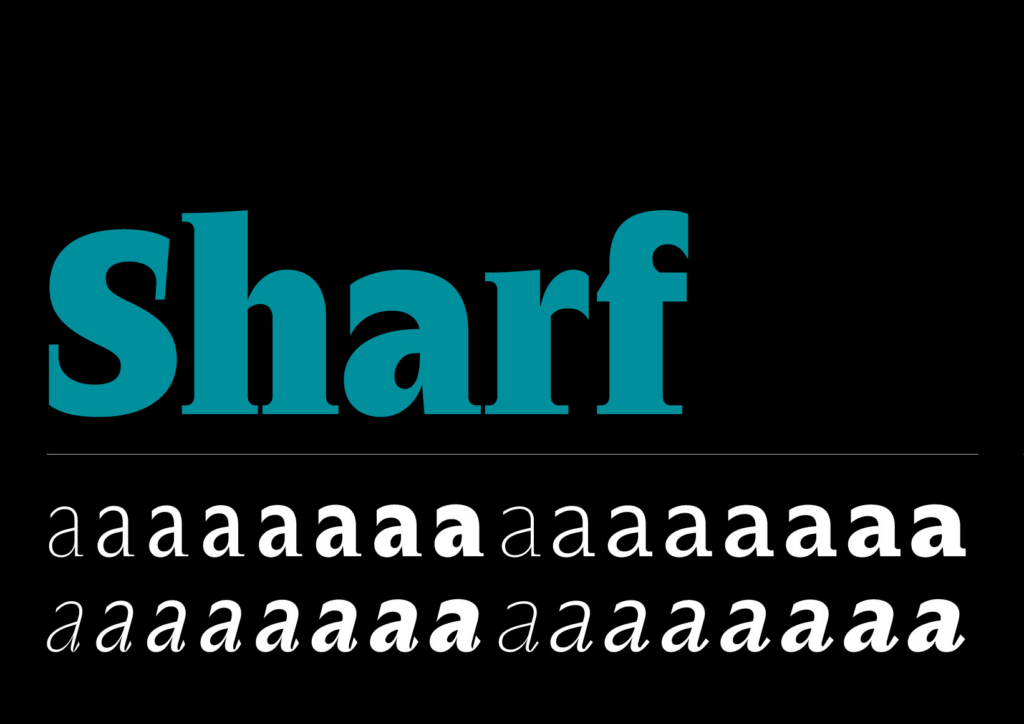
Font Reviews 2024: Sharf

Designed by Barbara Bigosińska
Distributed by Blast
Font family: 8 weights, 2 styles, and 2 sub-families. 32 static fonts + 2 variable fonts

This font review was originally written in Galician, the official language of Galicia, which has been spoken for over 2000 years and is now used by more than 2 million people. English translation below.

Sharf ve a luz en 2021 dende a incubadora de Future Fonts. Aquela versión 0.1 contaba xa con unha fonte variable, que permitía navegar o espazo de deseño entre os distintos pesos da tipografía. Nace con dous tamaños ópticos, cunha clara intencionalidade de uso en deseño editorial.

Continue reading

Font licensing, webfonts and fair trade

A few weeks ago, I had to advise a design studio on licensing fonts. It is a common practice since different foundries and distributors handle licenses in many alternative ways. What may be complex for us, who work in the type industry, can become a nightmare for font users and design studios that acquire licenses for their clients. Some have made an effort in simplifying font licenses but webfonts is still a case worth discussing.

From all the types of use you can make of fonts, the web is probably the format where we find more differences, both in the licensing model and the pricing. Some articles offer information on the topic and compare the different licenses available. I was surprised to note there is little debate or discussion on this.

Continue reading

New borders: the working life of Elizabeth Friedlander

I first heard of Elizabeth Friedländer in an article about early female typeface designers. Using some of the typefaces mentioned in the text I decided to prepare a few images for our Instagram account. That personal exercise opened the door to extra information about the names included in the article. There was an exhibition on Elizabeth’s work at the Ditchling Museum (England), and Katharine Meynell had released the film Elizabeth in 2016. While looking for more information about her I also found the book I am writing about today. This book, letterpress printed and bound by hand, was published as a limited edition of 325 copies. A couple of months ago—coinciding with the launch of Women in type—I finally found it online and was able to read it. The University of Victoria Library scanned the pages and made the book available for all.

The book is full of reproductions of her work, not only finished and published projects but also drawings and documentation of her design process. The author tells us about her life’s path, moving from one country to another, and finding ways to nurture her career as a designer. The text includes insightful quotes from personal documents and imagery from the material she carefully preserved, allowing us to know about her work and career through primary sources.

Rough work in Indian ink for different projects

Continue reading

Visualizing design space in variable fonts

After attending Typolabs a few weeks ago, something kept on rolling around in my mind. Variable fonts—the main topic in type conferences since the announcement at AtypI Warsaw in 2016—was again at the heart of the debate in Berlin. If sliders generated some controversy one year ago, I would say ‘design space’ was one of the most repeated concepts this year. The opening talk by Gerry Leonidas pulled the trigger with a thoughtful presentation: ‘I am now in an environment where the design space is by default way bigger than my ability to imagine it, not just my ability to do something with it’.

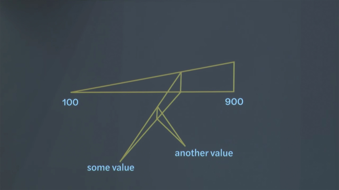
Slide from Gerry’s presentation showing a figure that represents a font with three main axes

This figure, included in the presentation by Gerry Leonidas, is the visual representation of a font with three main axes.

Continue reading