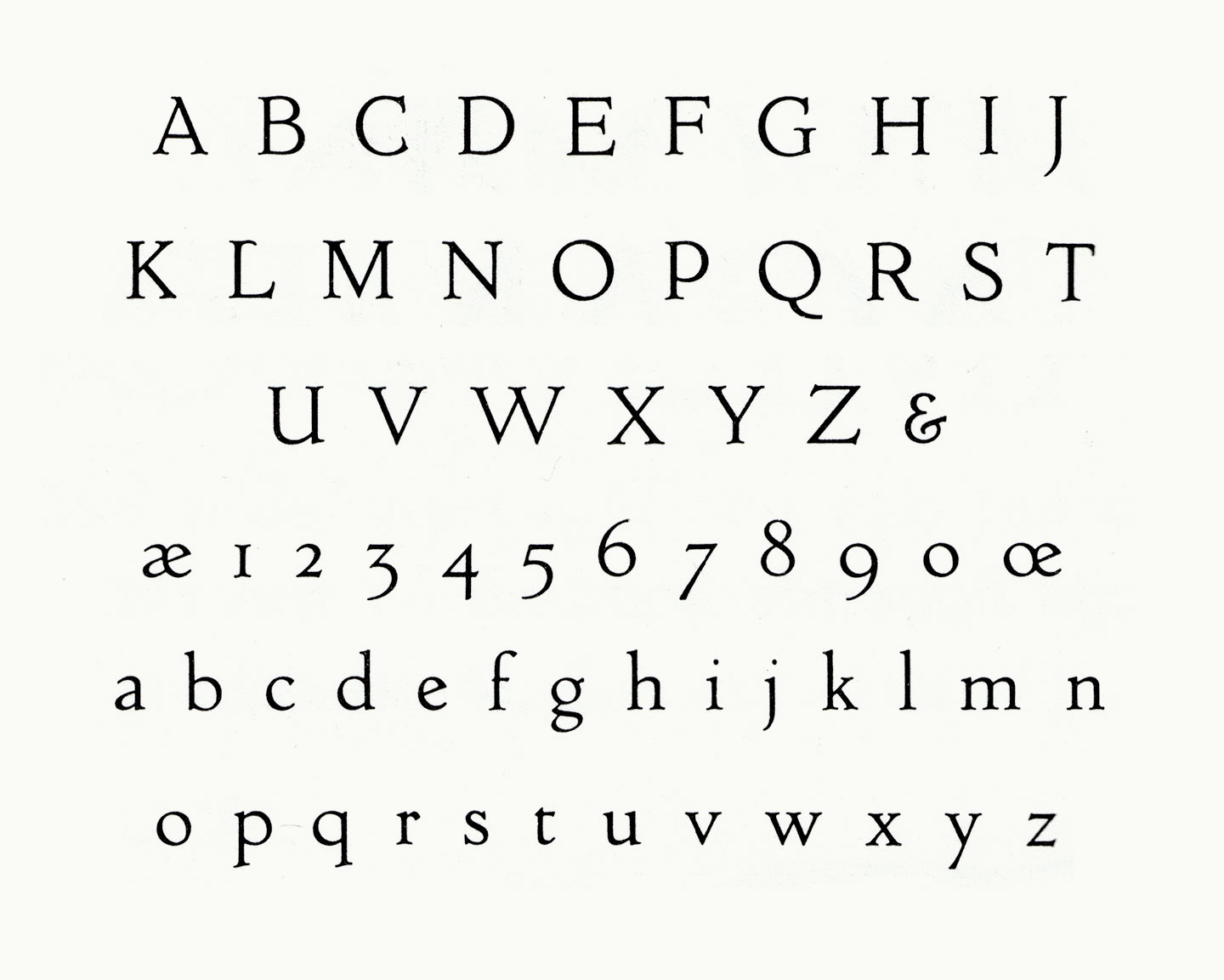
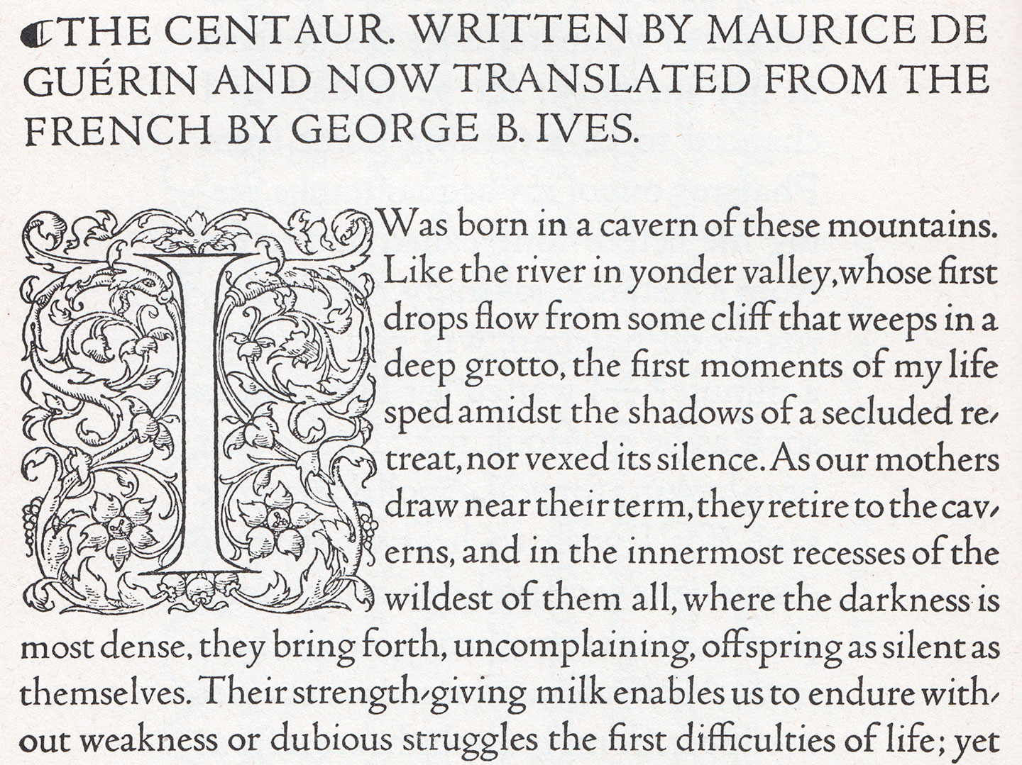
You are surely aware of the titling caps that the great Mr. Bruce Rogers has drawn for the Metropolitan Museum of Art in New York (what is that I hear about a logo? No, these were great). It is fantastic news that he decided to add a lowercase: 1915 saw the expansion of the design into a masterful 14-point text face, which was cut by Robert Wiebking (of Goudy fame) and privately cast by Barnhart Brothers & Spindler. The face was first used by Rogers in his recent edition of Maurice de Guérin’s The Centaur, published in just 135 copies by Carl P. Rollins’ Montague Press. (Get it if or while you can, I’m pretty sure this one’s gonna be popular.)