Corsair and Conductor: a co-showcase

Yesterday was a good day for type releases designed or co-designed by women, so here’s a quick double showcase to commemorate the event.

Project: Corsair
Designer: Ksenya Samarskaya
Foundry: Rosetta Type
Team Members: Azamat Kodzoev, Micha Strukov, James Todd (Drawing); Mathieu Réguer (Post-production)
Published: 2018
Link: Corsair

Project: Conductor
Designers: Tobias Frere-Jones and Nina Stössinger
Foundry: Frere-Jones Type
Team Members: Fred Shallcrass
Published: 2018
Link: Conductor
Continue reading

Conferences 2017

We salute those type conference organisers who decided to use their 2017 chapter as an opportunity to improve their speakers lists towards gender equality and we can’t wait to see this dedication inspire the ones that are still failing to keep pace.

In order of percentage of female speakers:

59% Ultrafett, DE – Bielefeld (c)
56% Typism, AU – Gold Coast (c)
54% (+4%) Typographics, US – New York City (c)
50% (+10%) Encontro de Tipografia Conference, PT – Faro (c+p)

49% (+6%) TypeCon, US – Boston (c+p)
46% (+8%) Rencontres Internationales de Lure, FR – Lurs (c)
44% FEED (Foro de Edición e Deseño), ES – Santiago de Compostela (c)
43% ESAD, Everyday Reading, FR – Amiens (c)
34% (–2%) ATypI, CA – Montréal (c+p)
33% Dia Tipo, BR – Curitiba (c)
33% FURE – Future of Reading, DE – Muenster (c)
32% ISType, TR – Istanbul (c)
31% (–2%) BITS, TH – Bangkok (c)
31% Tipografilia, MX – Ciudad de México (c)
29% (–6%) TYPO Berlin, DE – Berlin (c+p)
29% (+5%) Granshan, AM – Yereven (p)
26% Typo Day, IN – Sri Lanka (p)
25% Face/Interface, US – Stanford (c+p)
25% Typotage, DE – Leipzig (c)
24% AGI Open, FR – Paris (c)
22% Dia Tipo, BR – Rio de Janeiro (c)
22% Letrástica, MX – Guadalajara (c)
21% Dia Tipo, BR – Brasilia (c)
17% Typo Day, DE – Hamburg (c)
17% (+7%) TYPO Labs, DE – Berlin (c+p)
13% (0%) Kerning, IT – Faenza (c)
8% Typetersburg, RU – St. Petersburg (c)

Continue reading

Holiday Shopping with the Alphabettes

Certainly you’ve already gotten twenty dozen emails alerting you that today is CYBER MONDAY and that you MUST SHOP or you’re not doing your duty as a citizen of Planet Earth. If that consumer hypnosis has gotten to you, but you’re wondering how to support some awesome independent women in typography whilst stuffing those stockings this year, check out the shops below!

Left image courtesy Nicole Phillips / right image courtesy Maria Montes

From prints to shirts, greeting cards to enamel pins, these ladies have you covered this holiday season. Please feel free to let us know in the comments what other online stores we may be missing!

Guess what year?

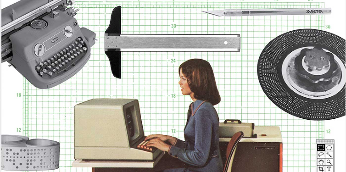
On the way to a depressing union meeting on contract negotiations, I had about 20 minutes to spare so I headed to the library stacks and found a book on women in the printing trades. Here are a few quotes that jumped out:

“[W]e have never obtained a situation that we could not have obtained had we never heard of a union. We refuse to take the men’s situations when they are on strike, and when there is no strike if we ask for work in union offices we are told by union foremen ‘that there are no conveniences for us.’ We are ostracized in many offices because we are members of the union; and although the principle is right, disadvantages are so many that we cannot much longer hold together.”

“She was dressed plainly but neatly in what might be called a cross between a traveling and office suit of brown color. The toughened expression on her face indicated that she was familiar with the tricks of the profession, versed in the study of vulgarity. No tender, trusting female was she, but a hardened, suspicious, masculine woman.”

“This paper is a veritable man-hater; not the slightest mention of a man in any shape or form is to be found in its columns, neither is the genus homo allowed to hawk it!”

“At least let women have a fair opportunity to do something else besides get married. What man is there who would not resent being told that his chief ambition in life should be to be a father? Yet women are told daily that they should devote twenty years of a lifetime in the preparing for motherhood, at least ten years in bearing children, and the rest of their lives in recovering from the effects. If they prefer to think that the world is populated sufficiently, or that to bear a child does not call for the sacrifice of a lifetime, they are snubbed, and especially so when they show any inclination to compete with men in trades.”

Guess what year they’re from? Comments are open!

🚨🚨🚨SPOILER ALERT🚨🚨🚨
The answers are available below. You can also head to the comments first if you’re curious what others guessed.

Continue reading

Type at the New York Art Book Fair at MoMA PS1

Every year, Printed Matter and MoMA choose a sticky weekend in late September to host the New York Art Book Fair at PS1. Between the insane crowds of mostly white people and the heat and the exhaustive, never-ending booths of vendors, everyone leaves traumatized. Which is why it took me six years to go back. But I did, for the love of typography.

I took my intrepid companion, a seven year-old Goth kid who’s really into personal expression, named Francesca. She rides on the back pegs of my bike, and as we came over a small bridge in Queens, we took in the Manhattan skyline and its wavy heat currents. I said, “isn’t living in New York City great?!” … to a native New Yorker, who was like “sure.”

Continue reading

The Pre-Vinylette Society

The PreVinylette Society exhibition

If you happen to be in the Windy City over the next few weeks, you’re going to want to head over to the Chicago Art Department to check out The Pre-Vinylette Society: An International Showcase of Women Sign Painters. Opening on Friday, September 8, the exhibition features the work of over 60 women sign painters from the United States, the UK, Canada, New Zealand, Australia, Scotland, Ireland, and Norway.

Continue reading

Film review: Graphic Means

A detail from the Graphic Means official poster.

If you were a part of this era, but especially if you weren’t, you must see Graphic Means.

These days, it is easier to find information regarding printing in 15th century Europe than graphic design processes in the United States during the 1970s and ’80s. The latter, the focus of Graphic Means, was a major transition for the design and printing industry as centuries old procedures and machinery made way for photographic processes and eventually digital technology. This dramatic shift has not been well-documented, perhaps due to the quick speed of the conversion or that it is still in recent memory.

Continue reading

RIP Margo Chase 1958–2017

I was very sad to hear about the sudden passing of designer Margo Chase. As a teenager in the 90s, it’s hard not to recognize Chase’s impact on the visual language of popular culture in those formative years (Buffy the Vampire Slayer! Dracula! Madonna!). Her lettering, logos, and typefaces are emblematic of an era where forms were being developed and explored that truly expressed digitality. If you’re not familiar with Chase’s work, check out these short interviews on Lynda.com, especially Logos and lettering, which includes some discussion of her early influences and process, and Gothic design where she talks about her cover design for Letter Arts Review, and her typefaces (thanks Typographica for the link). Some nice tributes can be found on Brand New, Graphic Design USA, Art Chantry’s Facebook post, Richard Lipton’s instagram post, The Dieline, among many others.

Margo Chase is an inspiration to all designers. As the founder of her own agency AND an accomplished acrobatics pilot, Alphabettes salutes this pioneering woman who left a mark on our profession.

Exhibition Review: The Calligraphy Revival 1906–2016

Diane von Arx, United States, 2002

The Grolier Club’s exhibition The Calligraphy Revival 1906–2016 (May 17 – July 29, 2017; 10am–5pm Mon–Sat; free admission) is a unique opportunity for anyone interested in applications of western letterforms to experience firsthand the breadth of calligraphy’s beauty as well as its utility. The exhibition, curated by Jerry Kelly, features works by a diverse range of calligraphers. It runs the gamut from art to design to handwriting and often defies categorization.

Continue reading