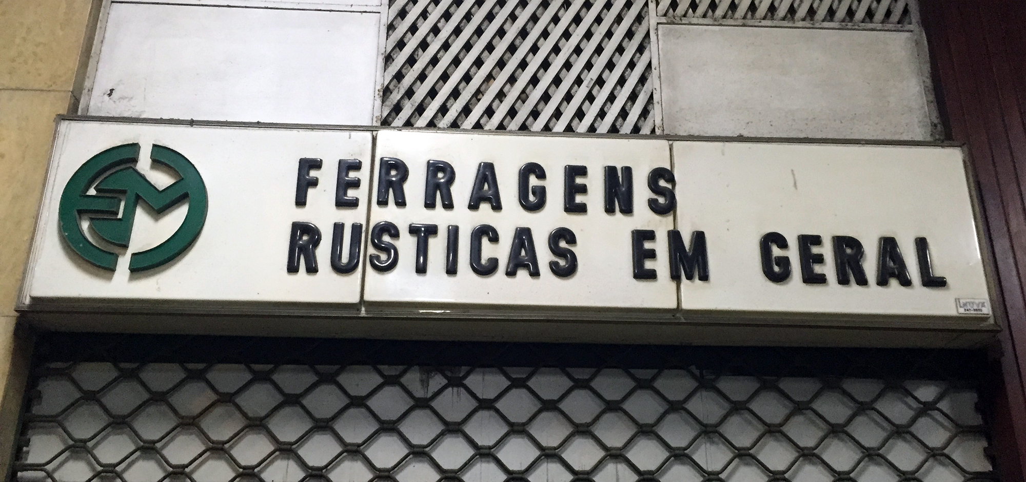
A hardware store in Copacabana.
Love is a strong word, but I’ll admit I have a fondness for them. In truth, I grew up in Rio and I can’t say I ever paid much attention to this kind of acrylic signs. Now, having lived in London for almost a decade, whenever I visit I stay with family in an upper-class neighbourhood where they hardly exist. A few days ago I went to the grittier neighbourhood of Copacabana and had an almost Proustian experience as I found myself surrounded by these old signs; with their cheap plastic appearance and soft edges, they formed the typographic landscape of my childhood. Although I can’t say they are exactly beautiful, I suddenly found them oddly charming. They were the letterforms of local popular commerce in 1980s Rio, the letterforms of hardware stores, florists, barbers and fishmongers, cheap-looking and anonymous, often considered ugly and vulgar. Today they are slowly disappearing, and the city doesn’t mourn the loss.
I decided to write my love letter to them, in spite of all the mixed feelings about their aesthetic value, and tried to find out more. I daydreamed about finding an old factory with stacks of old acrylic letters in different styles, dusty and forgotten…