
During the research for my dissertation, Language-specific type design, I came across some inventive ways to deal with a language’s idiosyncrasies. Excessive use of diacritics and the resulting jaggedness of written language is one of the challenges typeface designers face frequently. This is a small selection of ways designers tried to master it for some of the Slavic languages in the past.
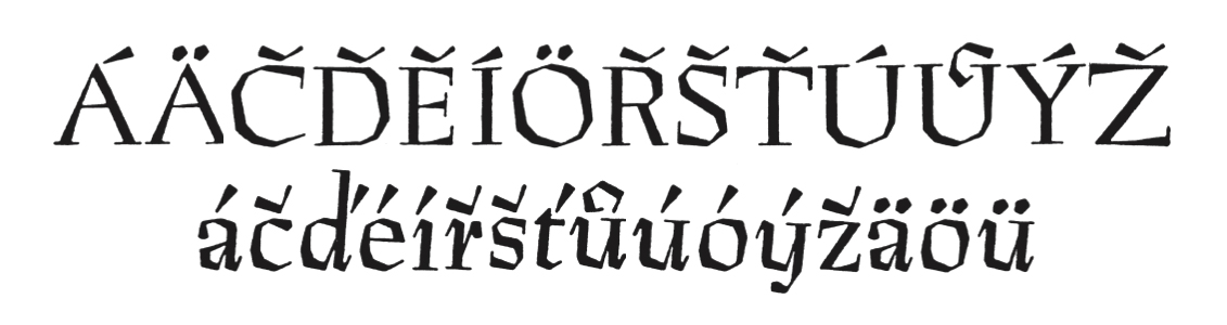
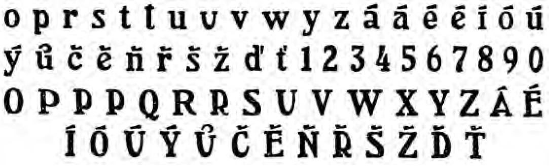
Preissig Antikva, Vojtěch Preissig, 1924
Jožef Poklukar proposed a phonetic universal orthography for all Slavic languages in the 1850s. He announced his ideas in a pamphlet descriptively titled ‘a soon published general Latin-Slavic at the same time German, French, Italian and possibly even universal or world alphabet, with a supplement containing a sample of the Slovene alphabet’. Similar to some German modernists (see Part II) Poklukar suggested that every sound should be represented by an individual letter. While other proposals for a universal alphabet mostly included additional diacritical marks to indicate variations in sound, Poklukar suggested new letterforms with a mathematical basis to attain analogy and regularity. He created seven concepts for alphabets which cover the sounds of Russian, Serbian, Illyrian, Slovene, Czech, Upper Lusatian (Sorbian) and Polish.
In order to harmonise the sounds of the various Slavic languages Poklukar chose Serbian, due to its smooth and melodious nature, as a foundation for his new alphabet. In his opinion, letters should please the eye of the reader through their beauty, which could not be achieved with the Czech alphabet: ‘Points and flourishes, twirls and squiggles only “disturb the purity and evenness of writing and print”. These signs are “not convenient for the eye; the more frequently they occur and the more sensitive the eye is, the more they fatigue it”.’
Poklukar felt that ‘the old, so erroneous, disproportionate and vexatious fashion of writing’ should be abandoned and replaced by an alphabet defined by the sounds of speech. He argued that through the adaption of the Czech alphabet some Slavonic sounds can not be represented. Their ‘alphabet is so awkward and deficient that it cannot possibly become the primary alphabet of the entire Slavic nation’.
Veronika Burian analyses Oldřich Menhart’s work brilliantly in her dissertation, Oldřich Menhart — calligrapher, type designer and craftsman. ‘A Czech typeface should, in Menhart’s view, address, in particular, the syntactic and diacritic peculiarities of the Czech language. In doing so, the richness of Czech culture is then properly demonstrated and national ambience and character are reflected. However, he knew that no letterform expressed ‘Czech-ness’ intrinsically and that every attempt in this direction could lead only to a very superficially decorative and unattractive result. He sought for solutions that would make the printed Czech text more balanced and comprehensive than if printed in other languages. According to him, the designer should take language biased peculiarities, such as the construction of words, reoccurrence of special characters and use of diacritical marks, into account while creating. But he should not intend to invent new letterforms. The skeletal structure of the present classical letters is the result of a long evolution that should be respected. Disregarding the reader’s habits ends up being counterproductive.’
Menhart Antiqua, Oldřich Menhart, 1930
Manuscript Antikva, Oldřich Menhart, 1943
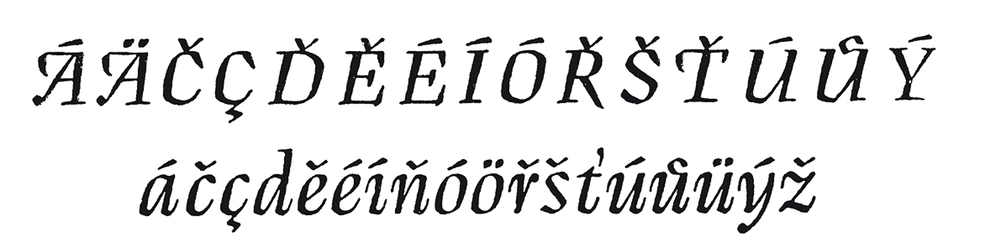
Manuscript Kursiva, Oldřich Menhart, 1946
Burian also touches on the work of VH Brunner and Vojtěch Preissig, predecessors to Menhart, who also saw a challenge in the peculiarities of the Czech language and the problematic effect of diacritics on text setting. At a time of fundamental political and social change after 1918 they attempted to express Czech national identity through their designs.
Brunner’s work shows a good deal of quirkiness and the will to experiment. He created letterforms with connected base letters and diacritical marks resulting in unfamiliar and rather decorative shapes that hindered legibility and were not received with great enthusiasm. His typefaces therefore remained unpublished without further exploration.

Unpublished typeface, VH Brunner, 1919
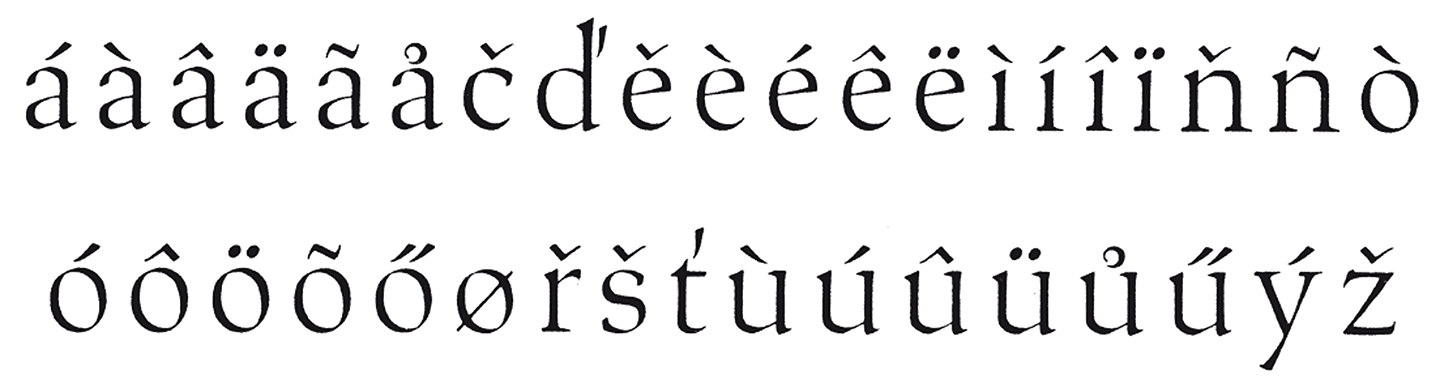
Preissig on the other hand took the issue much to heart and tried to tackle the problem in a different way. He gave the diacritics almost as much importance as their base letters and even went so far as to adjust the design and height of some base letters to accommodate a well-drawn accent. His continuous concern about perfecting proportions and shapes led Preissig to experiment extensively with different forms, positions and angle of the accents. Some critics though point to the overbearing effect of Preissig’s diacritics and indeed his only produced typeface Pressing Antikva oozes such a strong personality that it becomes too difficult to be practical in text setting.
Diacritics and modified letters for the typeface Arlington, Vojtěch Preissig, 1909
Diacritics, the letter g as well as letters with traditionally diagonal strokes like w and y can very frequently be found in written Polish (see Part I). Adam Jerzy Półtawski allowed for these language characteristics to inform his design decisions when working on his typeface Antykwa Półtawskiego which was intended for the use in Polish. I assume the uncommon letterforms for the descending letters were supposed to take the emphasis off the diagonality/verticality of the letterforms and allow for a neater appearance when used in texts for continuous reading. Antykwa Półtawskiego was occasionally referred to as the ‘Polish national typeface’ because its wide use as a book typeface.
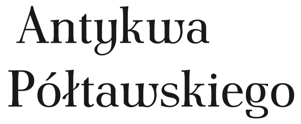
Antykwa Półtawskiego, Adam Jerzy Półtawski, 1923-28
I was asked about the outcome of my investigations after posting the first part of this series. My research was in many ways inconclusive. At the outset I expected to prove that some texts are unsightly because of the language they are set in and I wanted to create guidelines to assist type designers in controlling these oddities. But instead I learned to appreciate the beauty of diversity in the Latin writing system by looking at examples of typefaces designed to suit some of its languages. My advice is to celebrate this variety by giving special consideration to the cultural and social background of language-specific characters and diacritics. I hope these articles can be of use in that regard.
I am extremely grateful to Veronika Burian for her support in reviewing and adding to this post despite her busy schedule.
References
1. Burian, V. (2003). Oldřich Menhart — calligrapher, type designer and craftsman. Unpublished MA thesis, Department of Typography & Graphic Communication, University of Reading
2. Černe Oven, P. (2004). The development of special characters in Slavonic languages with the emphasis on the orthographic reforms in Slovenian and Croatian language. Unpublished PhD dissertation. Department of Typography & Graphic Communication, University of Reading
Further reading
Birkenmajer, A., Kocowski, B., Trzynadlowski, J., (1971). Encyklopedia wiedzy o książce. Wrocław: Ossolineum
Blažek, F. (2010). Diacritics. All you need to design a font with the correct
accents. http://diacritics.typo.cz [consulted on 12.09.2011]
Dyrynk, K. (1925). České původní tipografi cké písmo, Vojtech Preissig. Prague: Spolek Tipografia.
Gaultney, V. (2002). Problems of diacritic design for Latin script text faces.
Unpublished MA thesis, Department of Typography & Graphic
Communication, University of Reading
Muszkowski, J. (1931). Antykwa Polska Adama Półtawskiego. Grafika Nr. 6. Warsaw: Towarzystwo Bibljofilów Polskich
Muzika, F. (1965). Die schöne Schrift in der Entwicklung des lateinischen Alphabets. Hanau am Main: Verlag Werner Dausien.
Hello Miss Berning!
Thank you very much for sharing these posts about your research. I find it particularly valuable because I am really interested in the topic of language as type design criteria, and it is the basis for my final undergrad design project (I have even used a similar methodology to the one you showed on your spreadsheets, just not as in-depth!)
My question is: Is there any place where I can consult and read your whole dissertation? It would be great if I could know more about your findings and ideas.
Freundliche Gruße!
Hi Laura, I just dropped you an email.