My 2¢: Cuba’s 2 Currencies

My 2¢ is less about the design of these two Cuban banknotes than about what they represent.

As a US-dwelling Canadian who has wanted to visit Cuba for many years, I finally made the trip there from Toronto in early 2015 — ironically, just after the announcement of the normalization of relations with the US.

Cuba is a striking and remarkable place in so many ways. But one of the things that struck me most upon arriving there was the discovery that since 1994 Cuba has had two parallel currencies: the Cuban Peso (CUP), which is used for trade among Cubans; and the Convertible Cuban Peso (CUC), which is used by visitors to the country and for international trade, and is pegged to the US dollar. So 1 CUC equals 1 USD — and 1 CUC equals approximately 25 CUP.

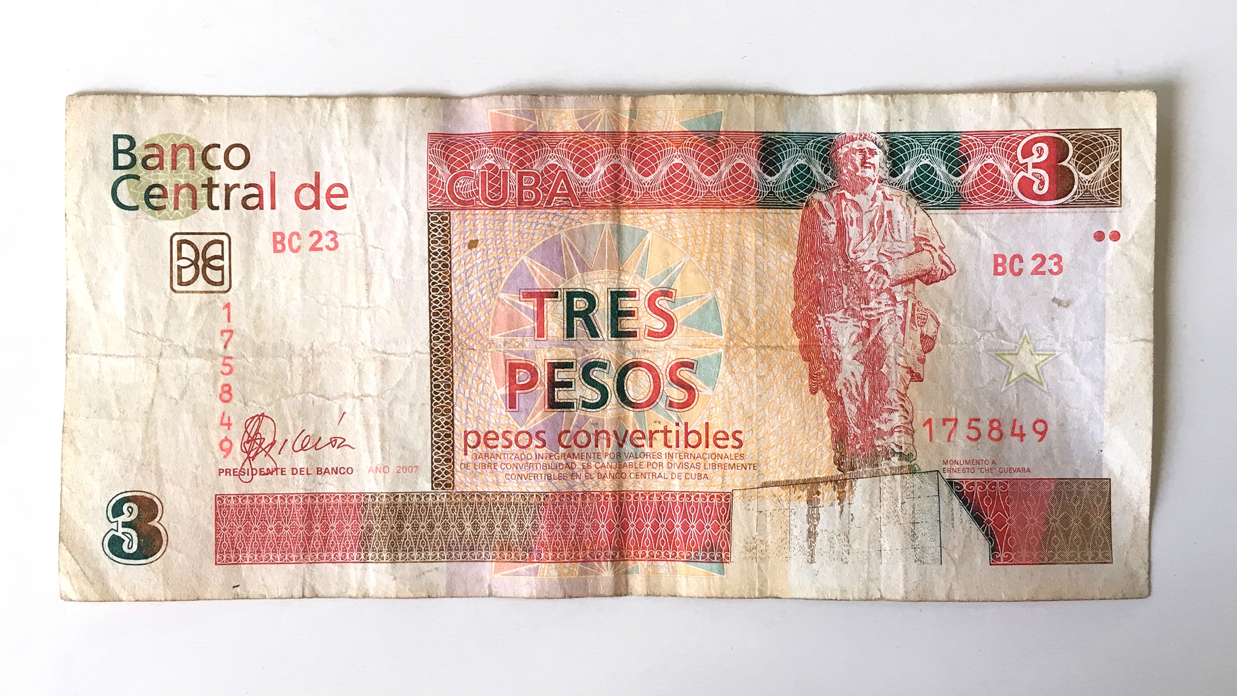
A 3-peso note from the international, convertible Cuban currency, the CUC.

A 10-peso note from the local Cuban currency, the CUP.

Continue reading

My 2¢: Hyderabad State 2 Anna

Although my professional area of focus is Indic type, by which I mean the Brahmi-derived scripts native to India, my favorite coins in my small collection are four 2 Anna coins from the Princely State of Hyderabad, minted in 1946. They are among the last coins minted by the Hyderabad State before its dissolution.

The Hyderabad State, which occupied the Deccan plateau of south-central India, was a semi-autonomous vassal state that existed alongside the British Raj from 1798 until India’s independence in 1947. Ruled by the Asaf Jahi Dynasty, which was Turkic in origin, the Hyderabadi government spread Persian culture in the region. While the British issued currency to be used throughout their South Asian empire, they allowed the Hyderabad State to issue its own set of banknotes and coins.

Hyderabadi_2Anna_1946_o

Obverse of the Hyderabadi 2 Anna coin, 1946. Photo courtesy of Joseph Kunnappally.

Continue reading

My 2¢: The Iranian 250 Rial Coin

To many people, the sentence “here is your change” followed by a clenched hand extending out towards them results in an inner groan. They know that hand is about to offer them coins, an object often perceived as an inconvenience—and in the case of coins with lower value, a nuisance. Coins are frequently taken out of circulation by people who keep them simply because they cannot be bothered to count, calculate, and spend them. I have memories of my parents coming home and discarding loose change on the coffee table, not wanting to carry the jingling weight in a pocket or purse the next day. Yet the same people were the cause of my appreciation for coins. More specifically, Iranian coins.

PersianCoins1

Continue reading

My 2¢: Take a Penny, Leave a Penny

Since the design and lettering of the ‘lowly’ American penny has already been well-documented and researched by honorary Alphabette Tobias Frere-Jones, I’ve settled on an even lowlier topic: the penny tray. If you’re American, or have spent time in the clusterfuck that is currently the United States, then you know what I’m talking about. Found at the cash registers of gas stations, diners, and other small businesses, the object serves as a convenient place for customers and cashiers to dispose of, or acquire, a penny or two (but c’mon deadbeat, don’t even think of taking more than a few).

The basic tray features the phrases “LEAVE-A-PENNY / TAKE-A-PENNY” in subtly extruded shouty-caps that flank the top and bottom of the main bowl. A promotional logo adorns the front of the tray, promoting things like a local newspaper, state lottery, or community bank.

Pretty standard-looking penny tray

Pretty standard-looking penny tray

Continue reading

My 2¢: Empathy Penny

I have a penny that is worth far more than its currency, as it was designed by Marian Bantjes.

Empathy penny, designed by Marian Bantjes

Empathy penny, designed by Marian Bantjes

Several years ago, I taught a Type Camp at the Design Exchange, the Design Museum of Canada in central Toronto. In the lobby is a machine that imprints designs of several artists, one of which is Bantjes, onto pennies. (The irony here is that Canada has ceased production of the penny and is removing them from circulation. Therefore, trying to locate a penny to use in the machine is becoming a bit difficult.)

Continue reading

My 2¢: Canadian $1 Coin

The Canadian dollar coin, introduced in 1987 with a loon featured on the back, is affectionately referred to as a ‘Loonie’. When the two dollar coin was introduced 9 years later, they had a public vote on whether to call it the ‘Twoonie’ or the ‘Doubloon’. They picked the former, which is a shame because if you have an opportunity to name your your money something pirate-themed, then you should totally do it. However, this essay is not about the mundane design of Canadian currency, but rather this particular Loonie, saved from during my recent decade Canada.

shelley_Canada2Dollar_regular

Continue reading

My 2¢: Two Typefaces, Vanished

I do promise there is more than one influential Hebrew type designer, but after a long research process, my mind is filled with stories that were covered in boxes until now.
I am referring to Henri Friedlaender. Last time, I wrote about his design process, and today I wanted to share two typefaces that were simultaneously designed by him for the Bank of Israel in the 70’s: One serif style to be used for banknotes and one (semi-) sans, for coins. Those two were supposed to act as a family, and indeed, Friedlaender based them both on similar skeletal forms.

the banknotes typeface

the banknotes typeface

Continue reading

My 2¢: The Spanish Peseta Coin

I often find myself looking at things that go unnoticed or that people just don’t care about. Coins are invisible design items for most people. We often use size and color to differentiate one from each other, but we rarely look at them closely. I have heard once that the design of a stamp was one of the most challenging and uplifting commissions a graphic designer could get. There are probably many more constraints in the design of a coin, but you would agree with me that it would be a really interesting project for a type designer.

I would like to share with you some thoughts on the design of a particular coin, the extinct Spanish peseta. It was the currency used in Spain from 1868 to 2002, when the euro was introduced. As a side note, it is one of the few examples of a coin with a female name. I was able to collect some historical models of the peseta coins which took me to dark times in our country. The coins became a symbol of political power and the images and text engraved on them were used to reinforce the establishment.

The two sides of 5 historical models of the 1 peseta coin. From right to left, peseta from 1869, 1900, 1947, 1975 and 1986

The two sides of 5 historical models of the 1 peseta coin. From right to left, peseta from 1869, 1900, 1947, 1975 and 1986

Continue reading

Buginese Script

Detail of page 109 of the Lettergieterij “Amsterdam” voorheen N. Tetterode type specimen, 1910.

“Wait! What is this? Is this an alien script or something?”

That was me looking at the book Non-Latin typefaces at St Bride Library, which displayed a page from the Lettergieterij “Amsterdam” specimen with the Buginese script.

“People can read this?! What the…” (5 seconds later…) “That’s it, this is the project for my typeface/dissertation!”

Buginese, also known as Bugi, is the language of the population in the province of South Sulawesi, Indonesia. This language is often written using the Latin script but traditionally, the Buginese script, also know as Lontara, was the common writing system. That was until the 19th century, when the Dutch colonized Indonesia and the Buginese script (amongst others like Javanese and Balinese) was displaced.

Continue reading