Greetings from Santiago

When ‘Santiago’ is mentioned, many will first think of Chile; however, this Santiago is located in northwestern Spain. Santiago de Compostela has an official population of less than 100,000 inhabitants and is known internationally as one of the most important pilgrimage destinations in the world. In 1985 the old town was declared a World Heritage Site and, in 1987, the “Camino” was named the First European Cultural Itinerary by the Council of Europe. There are numerous books written in numerous languages regarding the ‘Camino de Santiago’, so I will refrain from images of the cathedral and other tourist traps.

Signage, an important element of urban landscapes, becomes a particularly interesting topic with regard to environments where the protection of historical buildings is a must. In Santiago, a 2012 sign regulation defines the size, placement, and other features. There is no typographic requirement although it is mentioned that the design must be well-integrated into the historical environment. A better control is needed as many commercial signs infringe the rules and some have just been abandoned. (If we really want to preserve our artistic-historical heritage, we should care a bit more about its maintenance.)
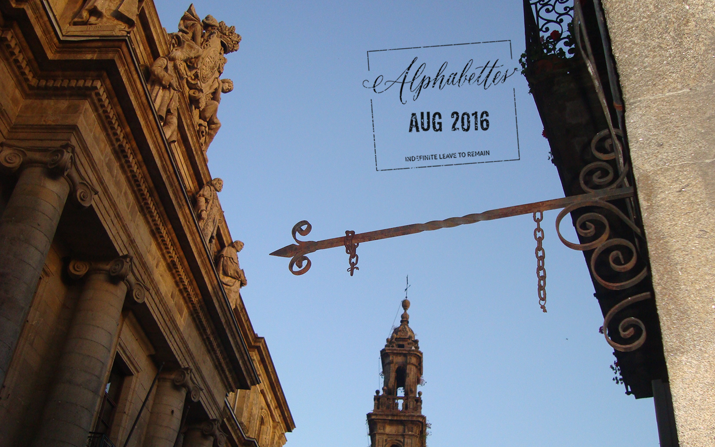
Some old structures for hanging signs in historical builidings stay there even when they don't a function anymore, metal arrows that seem to be leading to nowhere

Some structures, formerly for hanging signs, remain even when they lack a function creating metal arrows that seem to be point nowhere.

Continue reading

Alphabettes News – July 2016

The Alphabettes are taking a small break from their travels to bring you news from July. We hope to back with monthly updates from this month; wish us luck!

Tribute to Rosemary Sassoon during the 7º Congreso Internacional de Tipografía
At 7º Congreso Internacional de Tipografía held in Valencia (Spain), tribute was paid to Rosemary Sassoon, who is best known for designing the Sassoon series of typefaces specifically for children.

Alphabettes at 6th International Conference on Typography & Visual Communication (ICTVC)
At the 6th International Conference on Typography & Visual Communication (ICTVC), which was held in Thessaloniki (Greece), Liron Lavi Turkenich presented a talk on the subject Latinised Hebrew, Radical anecdotes in search for solutions, and also joined Laura Meseguer, Luisa Baeta, Bianca Berning, Alessia Mazzarella for a panel discussion on Collaborative practices in typeface design.

Continue reading

Greetings from Goa

It can be quite the cliché to mention the cultural diversity in a country as large as India, but sometimes, the obvious deserves repeating, especially when it can be supplemented with photographs of beautiful shop signs and house nameplates. In order to demonstrate this, I invite you to join me in Goa, the smallest of India’s twenty-nine states, well-known for its beaches, parties and electronic music festivals.

Unlike the majority of the country, the state of Goa wasn’t a colony of the British. The Portuguese arrived here in the early 1500s and Goa remained under their control till 1961 when it was annexed by India after military action. Interestingly, it was 1556 in Goa that the first printing press from the West arrived in India. Over 450 years of Portuguese rule has left its mark here and it is easy to spot in the architecture and lettering, especially in neighbourhoods like Fontainhas, an old Latin Quarter in the state capital Panjim.

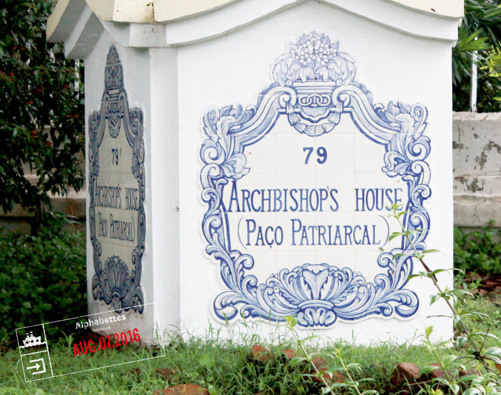
Archbishop’s House Continue reading

Greetings from Haifa

How is it possible that it’s August again??? This summer, we wanted you to travel with us (for free!) around the world and enjoy some typographic curiosities we have around us (check out this map by Indra). Those posts will be scattered throughout the month, marked with a passport stamp on the first image for quicker spotting. This is a perfect excuse for a tomato juice! Here we go:

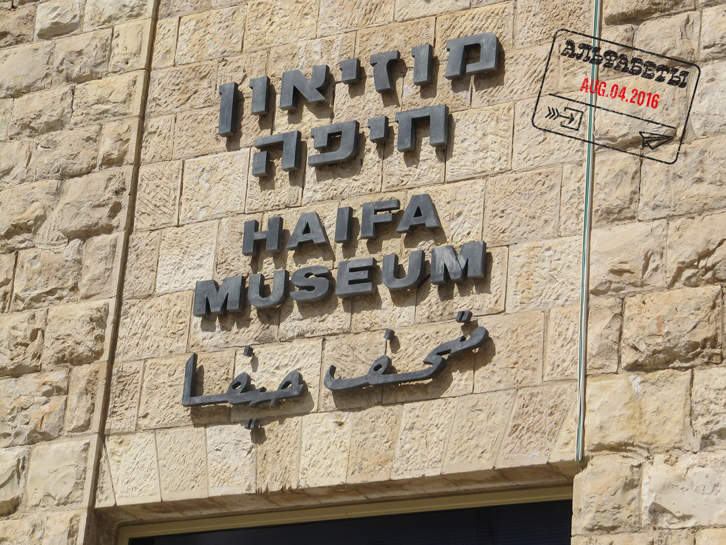
Scripts don’t live in a void. They live together, interlaced, in Israel’s urban environment: Hebrew, Arabic and English. Each script is affected by surrounding scripts, which in turn influences them back, a symbiotic relationship. Examining trilingual signage in Haifa provides an opportunity to discover meaning among the different alphabets; an additional benefit is that it is a good excuse to show some of what surrounds me in my hometown.

haifa10

Continue reading

My 2¢

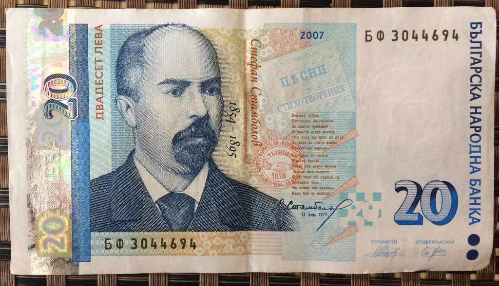
Over the past 10 days, we’ve traveled around the world to learn more about the design of coins, banknotes and money-related artifacts. While we strayed a bit from entirely type-specific content, the series connects visual culture, personal stories and collective experiences in some [hopefully] interesting ways. In case you missed any of the posts, we have conveniently gathered them all here.

Continue reading

My 2¢: From Hendecagonal to Round

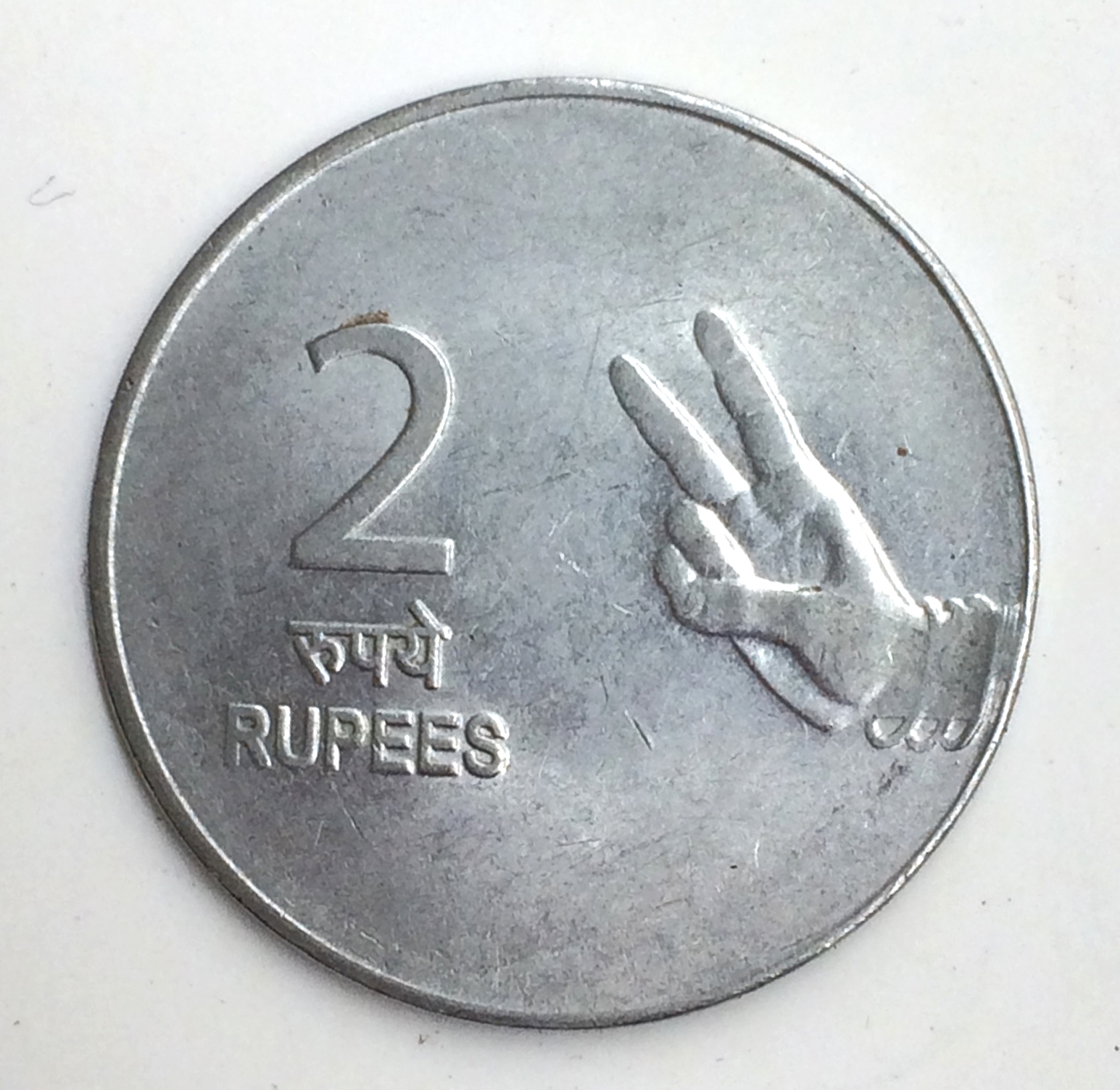
For a brief spell in the 90s, I fancied myself as a coin collector. The interest didn’t last too long, but I did end up with a few old Indian coins that I still like, including a 1945 pice that has a hole punched in the middle. Maybe it had something to do with the fact that I was in primary school, but I was very fond of coins with interesting shapes, like the 1p, 10p and 20p coins. There is little wonder then that my all-time favourite coin was the ₹2 one—it was a hendecagonal (or an 11-sided polygon), and I saw it and used it everyday.

ShapeCoins_small
Coins of denomination 1 pice (1945), 1p (1965), 10p (1986), 20p (1987) and ₹2 (2000)

Continue reading

My 2¢: 1 & 2 Rupee

shelley_2Rupee_coin

Travelling to India changed my relationship with money. When there, I am suddenly in possession of wads of bills in denominations of multiple zeros that I could never hope to ever see, let alone hold. Rupee coins are not as much a part of my experience there, and use them as other Indians do, to give money to people on the street or tips to drivers.

Continue reading

My 2¢: No Pockets in a Shroud?

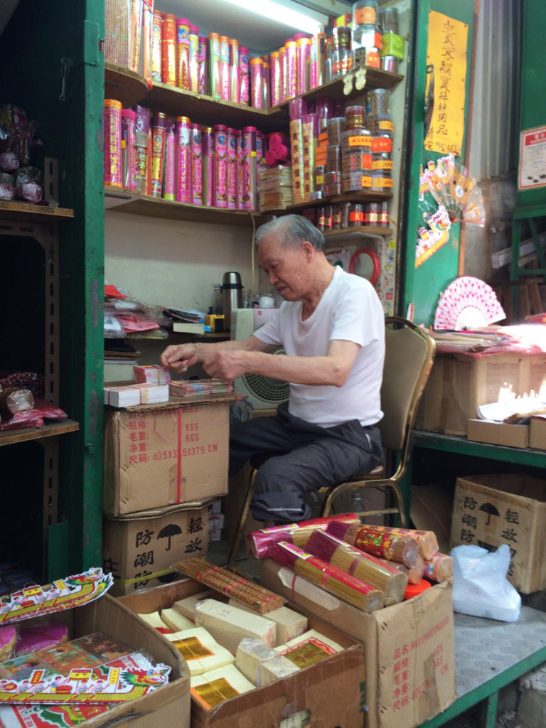
In Hong Kong, I have seen several small stores selling colourful replica of contemporary luxury made by paper, spread all over the mega city. Mimicked handbags of must-have brands, smartphones and even favourite dishes of Hong Kong dining are artfully recreated, and sold to be offered to ancestors by burning the paper artefacts. From time to time, I observed people burning the offerings in metal barrels at the backstreets.

A small store for paper offerings at Sheung Wan, Hong Kong.

A small store for paper offerings at Sheung Wan, Hong Kong.

Continue reading