Thoughts on the 7CIT

Este artículo está también disponible en español

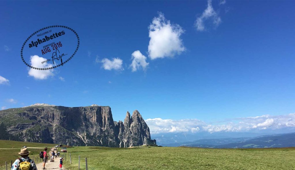
The Congreso Internacional de Tipografía (International Congress of Typography & Type Design) takes place every two years in Spain, in the Eastern city of Valencia. It is a very special conference in our country because, in addition of being the first main event in type, it is the only one that covers typography and type design from three different perspectives: education, research and design. As a result, researchers, educators, students, graphic and type designers meet to exchange their knowledge and share common interests. In this occasion two Alphabettes members, Laura Meseguer and María Ramos, were in Valencia taking notes of every talk and have eagerly reported their experience in an informal conversation. Laura was not only an attendee but she also took part of the TypeCrit session helping novel type designers to develop their skills.

Continue reading

Reflexiones sobre el 7CIT

This article is also available in English

El Congreso Internacional de Tipografía se celebra cada dos años en la ciudad de Valencia (España). Es una conferencia importante, porque además de ser el principal evento sobre tipografía en nuestro país, es el único que cubre la disciplina desde tres perspectivas distintas: la educación, la investigación y el diseño. Con motivo del evento, investigadores, profesores, estudiantes, profesionales del diseño gráfico y de la tipografía se reúnen para intercambiar conocimientos e intereses. En esta ocasión dos miembros de Alphabettes que estuvieron en Valencia, Laura Meseguer y María Ramos, han decidido compartir su experiencia a través de este blog con esta conversación informal. Laura, además de asistir al congreso, también formó parte del programa aconsejando a jóvenes diseñadores en sus proyectos tipográficos en una de las sesiones del TypeCrit.

Continue reading

Greetings from Kolkata

I don’t want to play favorites with Indian scripts, but I have to admit that ever since I became interested in type, I particularly love Bengali letterforms. The Bengali (‘Bangla’) script is the writing system for the Bengali language, the seventh most-used language in the world and is primarily used in the Indian states of West Bengal, Tripura, and South Assam.

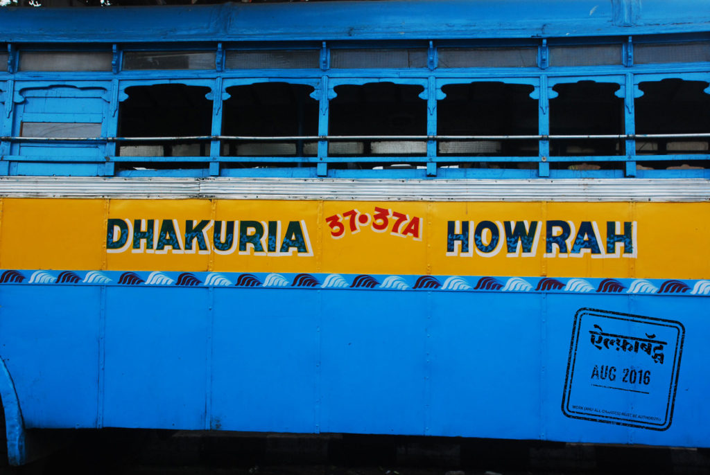
A few years ago, I had an opportunity to visit Kolkata, the capital city of West Bengal, known as ‘Calcutta’ during British colonization. Kolkata is feted for its art and cultural heritage, symbolic of both the bygone British era as well as the Bengali Renaissance. I associate a sense of romanticism with Kolkata, with its trams, the Howrah bridge, and Rabindranath Tagore’s poetry. However, Kolkata in person is simultaneously romantic and chaotic. This duality can be experienced not only in the visual landscape of city life but also through its letterforms. While many examples of elegant Bengali typography exist, the streets are also flooded with bold vernacular lettering on busses.

Kolkata1

Continue reading

Rush & Flow — Talking with Marina Chaccur

Nina, continuing the Den Haag theme (well, not anymore!) chose Marina to be our next interviewee. Honestly, one of the emails with five chosen questions I sent to Marina started with (quote:) “I want to be your friend!” I didn’t even care what she will think of me, proposing friendship out of the blue. In case you are wondering why I am sharing this with you, just read on and you will probably tell her this as well.

She is full of energy. This energy is present in every line Marina wrote, makes it feel like she is talking to us, telling some of the “behind the scenes” stories. She was so engaged in writing the most whole answers, no ego or vanity involved.
Now, I am not sure what I should advise you to drink while reading the interview. As you will see few lines down, Marina offers some flavorful choices. Either way, I know you will enjoy what she has to say.

Continue reading

Greetings from the Pacific Coast Highway

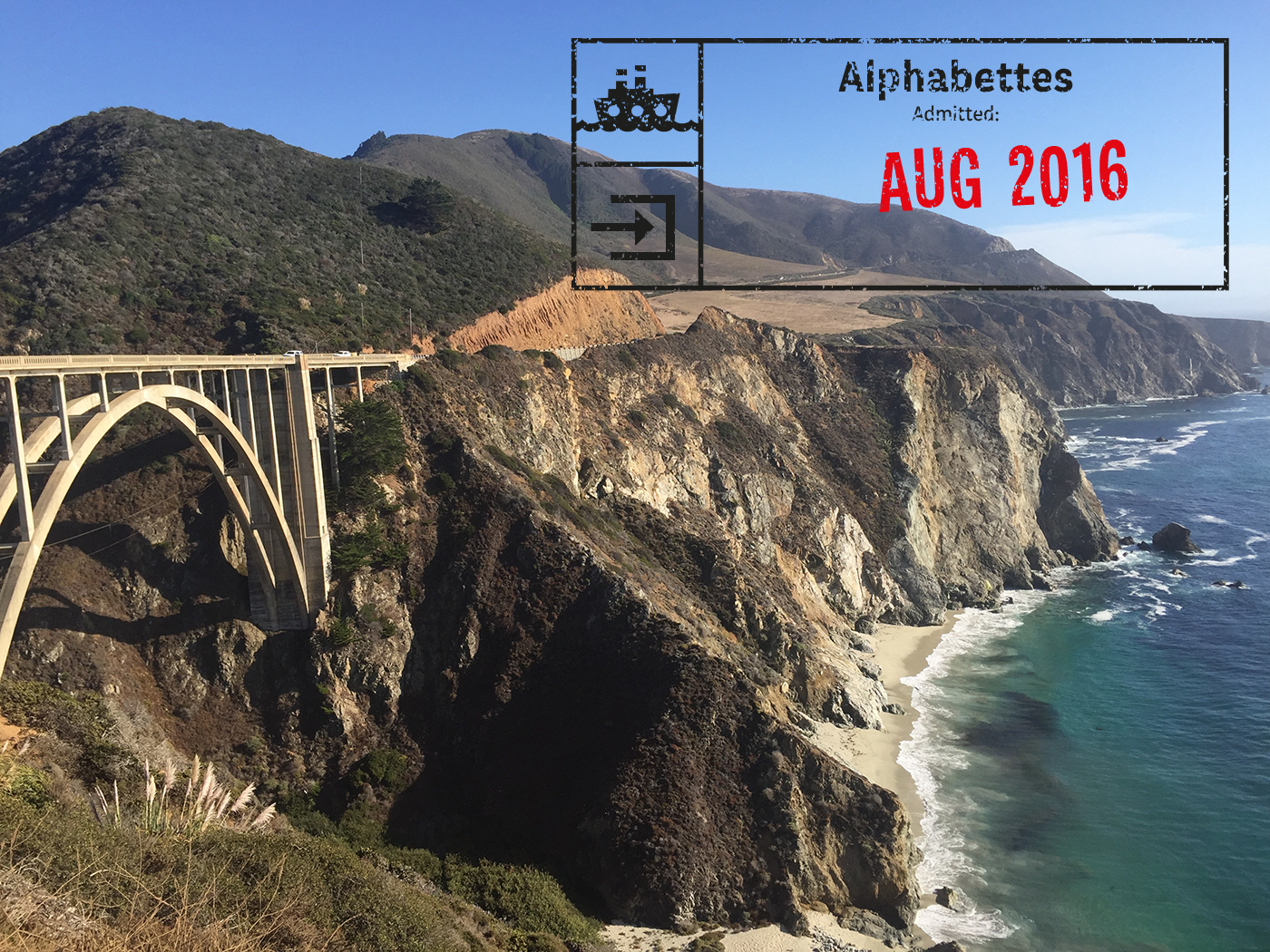
Last September, after getting laid off from my job, I did what every American is programmed to do in times of existential crisis — hit the open road. Unsure of my future, I decided to drive south from my San Francisco home to visit friends in Los Angeles. I had plenty of time before starting my next chapter, so I decided to take the scenic route: California Highway 1, on the stretches known as the Cabrillo Highway and the Pacific Coast Highway.

bigsur_1

For nature, go to Big Sur. For some fantastic vintage signage, keep heading south on the PCH.

Continue reading

Greetings from Newburgh, NY

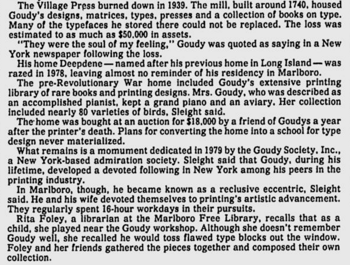
It’s no surprise that we type folk like hanging out in old cemeteries but it’s an extra treat when these cemeteries include the memorials of long-deceased type heroes. I’ve always known that Frederic and Bertha Goudy lived and worked in nearby Marlboro, New York. This excellent silent film on Type Culture shows Fred Goudy at Deepdene, their home and workshop. The Goudys’ workshop, an 18th century mill, burned down in 1939 (along with many of his type designs and fonts) and the home was torn down in the 70s, so there’s not much left to see on the Old Post Road property. However, I recently discovered this blog post from the Marlboro Free Library. Part of the library’s Goudy collection includes a photo of a memorial tablet in Newburgh, a small city on the Hudson river that has seen better times (but is trying hard to make a comeback). Although this probably requires some confirmation, according to this 1986 newspaper article, Fred and Bertha’s “mingled ashes” are buried beneath. Wow!

Here’s a screenshot from the article, with some lovely details about Fred tossing type out the workshop window.

1986 article about the Goudys

Plans for converting the home into a school for type design? *swoon*

Continue reading

Greetings from Poland

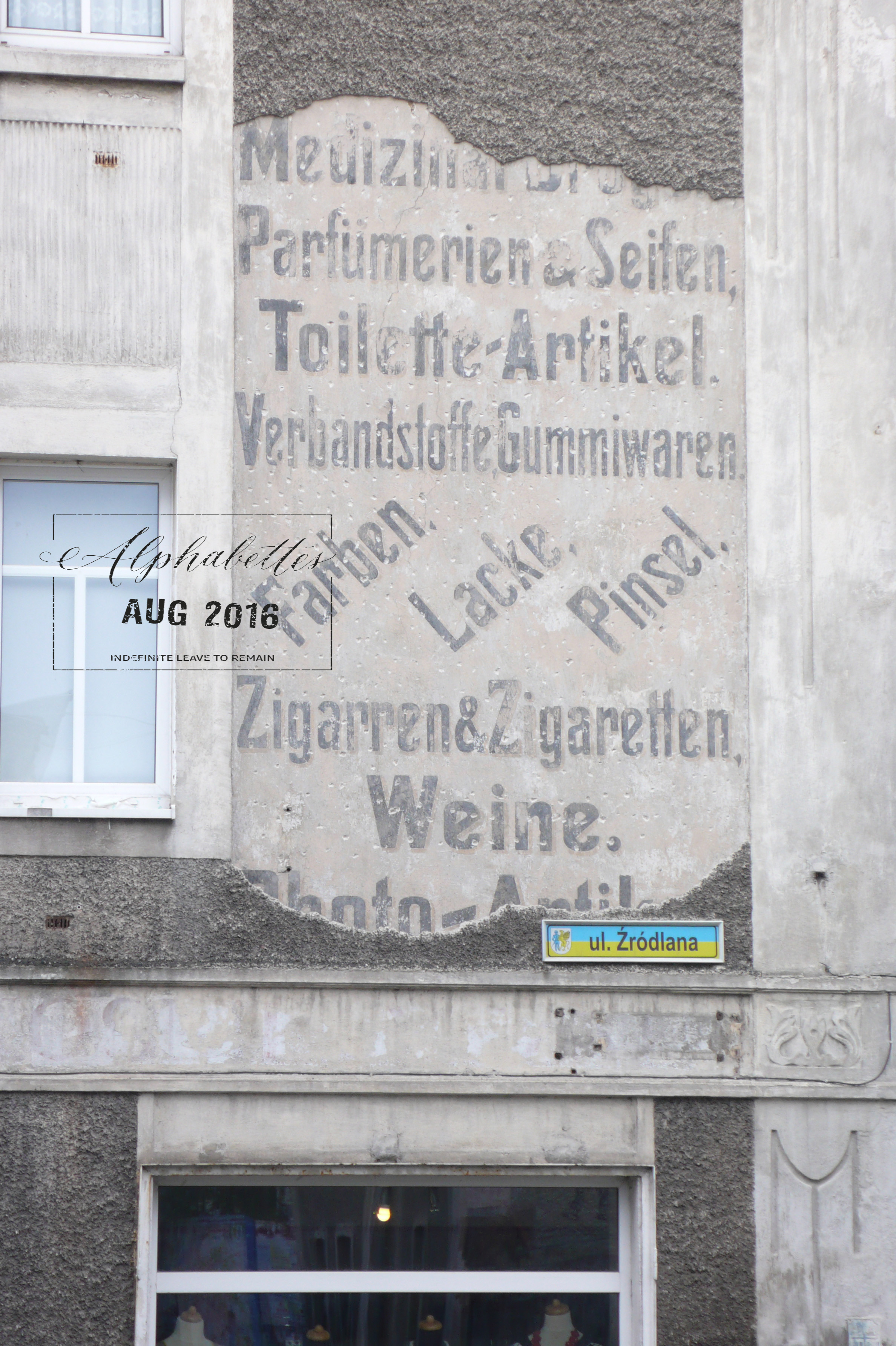
In 2012, I was invited to a wedding of my Polish friends and while there, I very quickly realized two things: the Poles really are experts in singing, dancing, drinking, and eating; and that areas in western Poland were formerly German. I discovered the former with the wedding itself and the latter while walking through the small village »Gryfów Śląski« the next day. There, I stumbled across German ghost signage in combination with a Polish street sign and I was instantly transported back to pre-war times.

L1130045_GFP

Continue reading