
Este artículo está también disponible en español
The Congreso Internacional de Tipografía (International Congress of Typography & Type Design) takes place every two years in Spain, in the Eastern city of Valencia. It is a very special conference in our country because, in addition of being the first main event in type, it is the only one that covers typography and type design from three different perspectives: education, research and design. As a result, researchers, educators, students, graphic and type designers meet to exchange their knowledge and share common interests. In this occasion two Alphabettes members, Laura Meseguer and María Ramos, were in Valencia taking notes of every talk and have eagerly reported their experience in an informal conversation. Laura was not only an attendee but she also took part of the TypeCrit session helping novel type designers to develop their skills.
María Ramos: Although it was the seventh edition of the conference, it has been my first time as an attendee. I have found especially interesting the diversity of the projects that were shown. The term “public”, in the sense of civic and social and related to museums, hospitals, civic spaces, but also to the press and its political influence, was the backbone of all presentations. ‘Global’, ‘social’, ‘inclusive’ and ‘activist’ were words used many times from different speakers. ‘Public typography,’ maybe it should be translated as ‘civic typography’ or ‘social typography’, is an ambiguous and complex topic that covers many angles and that was presented from different perspectives: public/social/civic space, media, education, activism, political communication and socio-cultural integration.
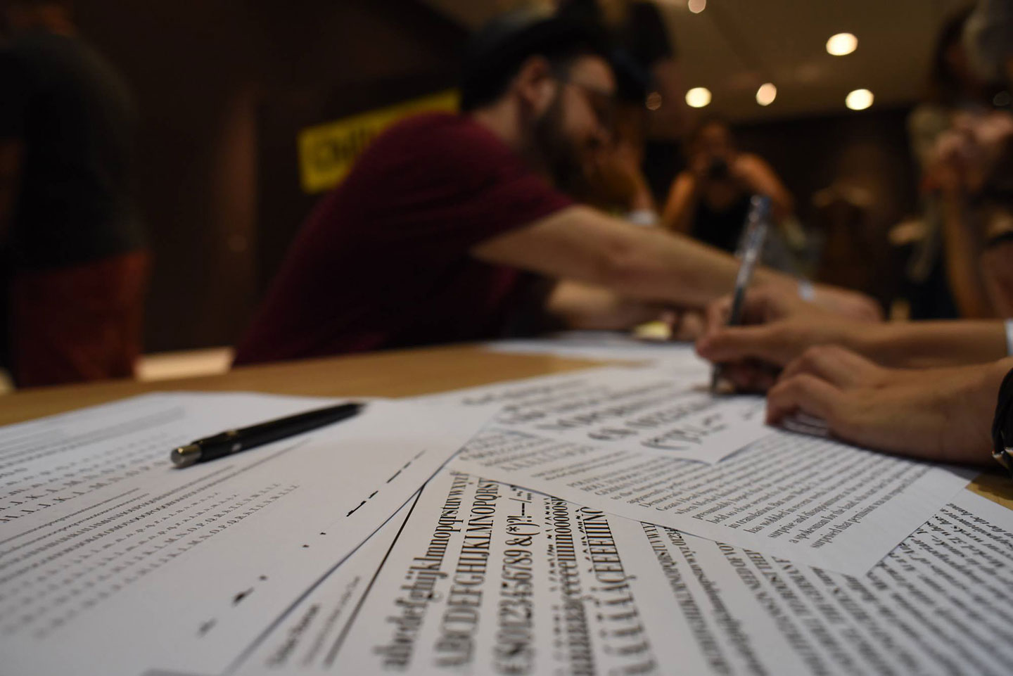
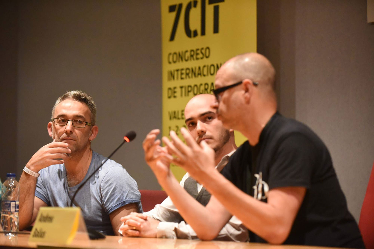
Laura Meseguer: This year, 2016, was the seventh time the conference has taken place. There were some changes to the usual programme that made for a great personal experience. The first of these were two TypeCrit sessions (I participated in one of them, together with Joancarles Casasín and Noe Blanco). The second innovation was the discussion panels, whose purpose was to give voice to those who wanted to share their views on several topics linked to typography. María and I participated in the work group related to commissions on custom type design.
Snapshot from the TypeCrit. Photo: Provi Morillas
LM: The opening talk by the anthropologist Manuel Delgado was one the key presentations for me. He is a specialist in creating collective identities in urban contexts, and in his talk he addressed the meaning of the term “public/civic”. His dialectic was so powerful that made us feel special and lucky of being there.
MR: Unfortunately I missed part of this first talk because I was flying that same day from the opposite corner of the peninsula. What I found when I got there was a full room and a captivated audience by Manuel Delgado’s words. It was definitely a promising first impression!
Manuel Delgado was introduced by Marisa Gallén. Photo: Provi Morillas
LM: The second talk that really impressed me was Ruedi Baur’s one. I was fascinated by the way he integrates the graphic design discipline within the public space, developing the process with and for the user. It is the projects like his that make our profession truly meaningful.
MR: I totally agree with you, the presentation by Ruedi was one of those you get excited about. He reminded us of the social purpose in designing. The beautiful projects he showed were beautiful not just because of their appearance but also because of their meaning. At the end of his talk one of the volunteers asked about the coexistence of commercial and social goals in design, a question that most of us have asked ourselves at some point in our professional careers.
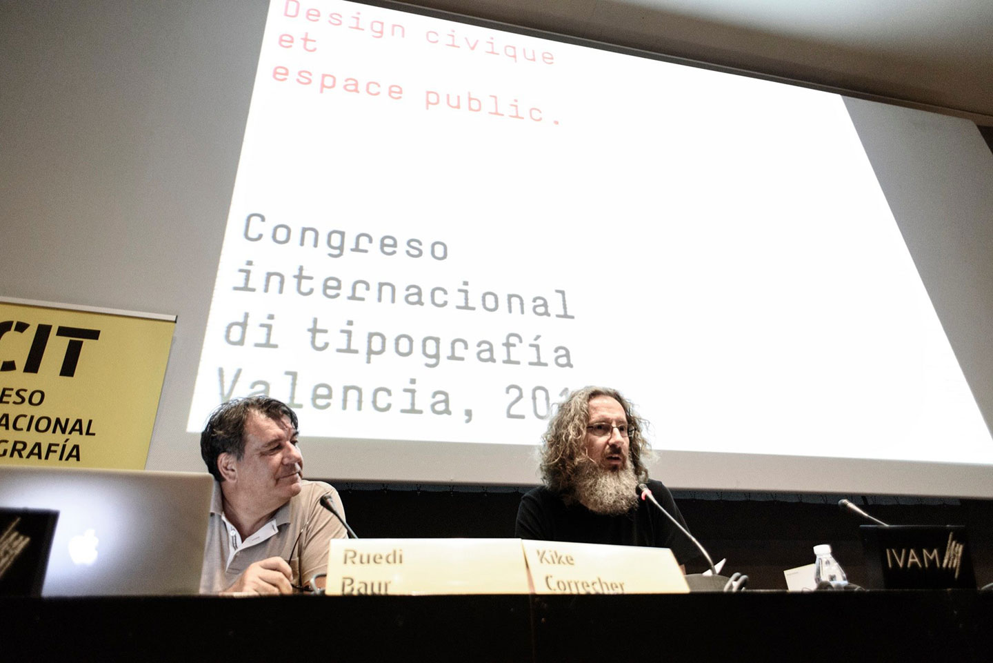
Ruedi Baur was introduced by Kike Correcher. Photo: Provi Morillas
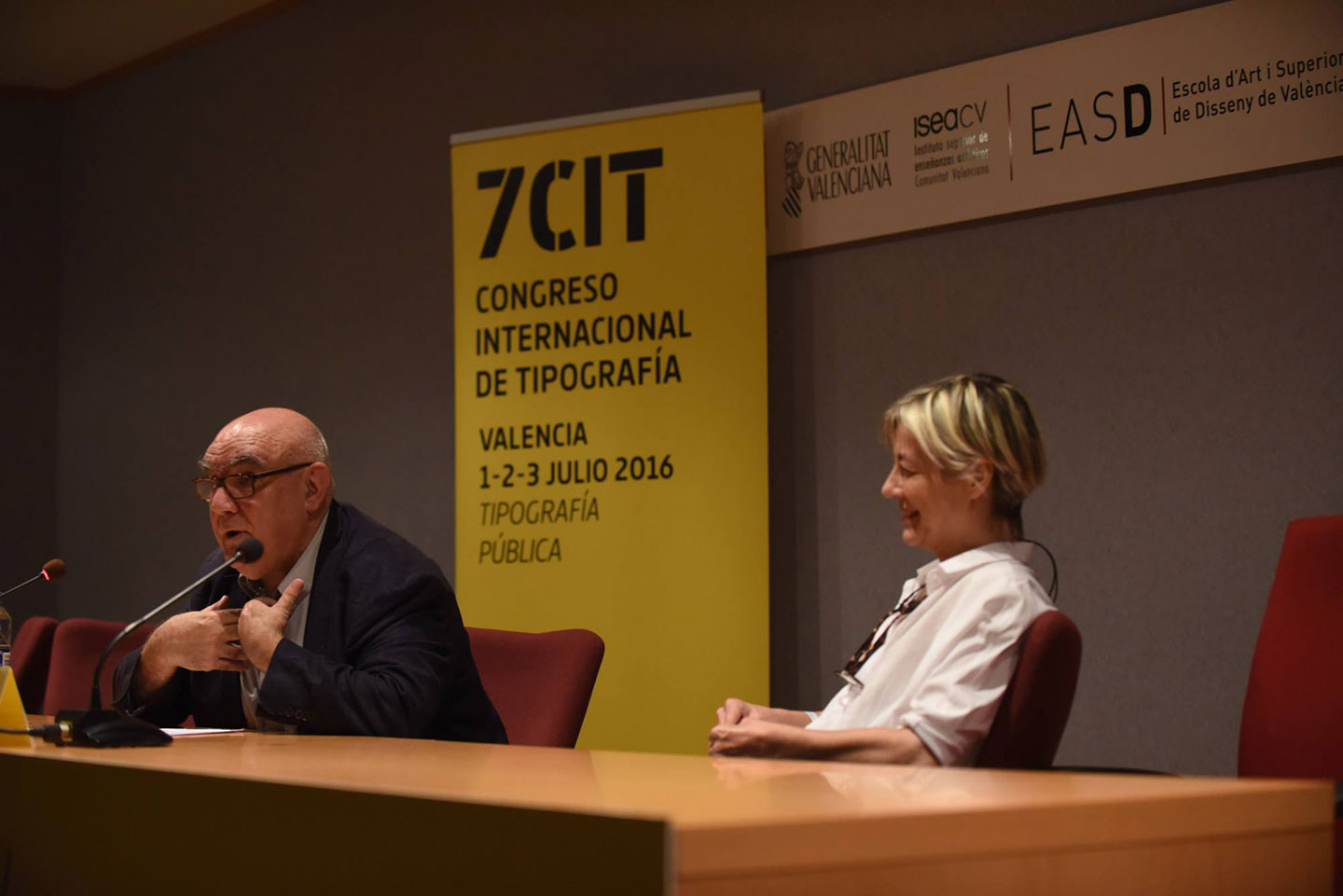
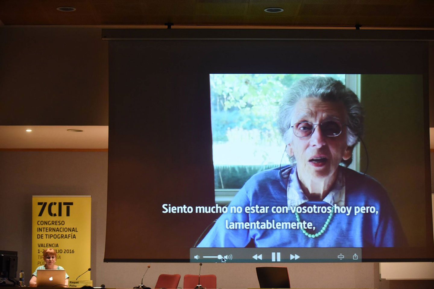
LM: The conference paid homage to Rosemary Sassoon, brilliantly introduced by Raquel Pelta, and it became another peak moment of the event. Although Rosemary could not travel to Valencia, she recorded a video with the help of her granddaughter, in which, very nicely, she addressed the audience of Valencia. She spoke about her life, her professional career and her own wishes from a straightforward and honest perspective.
MR: I believe the conference did a well-deserved homage to these two women, the official one to Rosemary Sassoon, and another one to Raquel who has organized the Congreso Internacional de Tipografía since its very first edition, back in 2004. Her goodbye announcement as an organiser made us all wonder if there will be a next edition.
LM: True, we all hope this is not the end of CIT, in fact I am fully confident that there will be another one. Raquel is handing over her legacy to fresh organizers, who can bring over new perspectives, while she focuses on other projects. Although she will not be leading or organising this conference anymore, I am sure that she will continue to be part of it.
Raquel Pelta in the homage to Rosemary Sassoon. Photo: Provi Morillas
MR: I have just remembered a quote from Adrian Williams that Rosemary Sassoon read, “designers must have the ability to see bridges where others see only barriers”. Several speakers talked exactly about that, building bridges to cultural diversity and social integration, for instance Ruedi Baur or Huda Smitshuijzen AbiFarès, who talked about the work of the Khatt Foundation and the project Typographic Matchmaking in the Maghrib. The multiscript projects shown by Andreu Balius, Juan Luís Blanco and Sergio Trujillo also highlighted that same concern.
LM: The social side of design has always existed. As a matter of fact, some people think design should always have a social function under the motto “design can change the world”. Although there are some projects that pursue social integration through typography, they are quite scarce, probably because of the lack of social awareness of those who could promote and fund those projects.
Juan Luís Blanco, Sergio Trujillo and Andreu Balius during the round of questions. Photo: Provi Morillas
MR: Typographic research was also an important topic during the conference, particularly in some presentations like those by Eloïsa Pérez and Ann Bessemans. Both of them, who have worked with children in their academic projects, emphasised the need to listen to the user and not to be biased by conventions and preconceptions. In the words of Rosemary Sassoon “we may think we know what is best for any particular purpose, but it is often the reader who can give us clues to the real answer”.
LM: No doubt, it is important to listen to the needs of users and to design departing from a clear concept. Designers should offer solutions to real needs, and not just opt for proposals based only on aesthetics.
MR: Even though we were all very tired during the last day, I would like to highlight the talks by the Spanish designers un Mundo Feliz and Uqui Permuy where typography was presented as a tool for social activism. Uqui showed some samples of typographic styles used by feminist movements as a part of their identity. For instance, the handwritten lowercase letters used by the Bolivian group Mujeres Creando [Women making] or the Mexican art collective Polvo de Gallina Negra. They both used letters with a naive appearance to communicate strong messages.
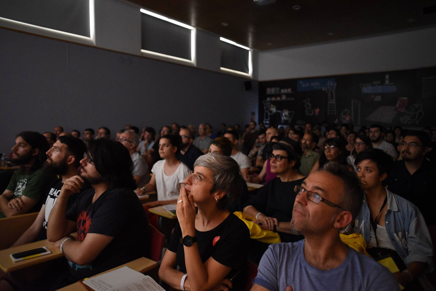
The audience during the presentation of Herminio Fernández. Photo: Provi Morillas
There are many other things that happened during the conference and we have not mentioned here. We discovered some interesting proposals from young people who work in national and international projects. There were also papers particularly focused on design, like those of Manuel Sesma about the always controversial classifications of typefaces, Francisco Gálvez y Rodrigo Ramírez about the typeface they have created for the public transport in Santiago de Chile, or Herminio Fernández about custom type for Spanish newspapers. As usual in academic conferences the entire content of the papers can be read in the conference book. The conclusions from the panel discussions will be published separately in the conference website. If you read Spanish you may find some of the questions there, and hopefully some answers, that you have asked yourself about the current state of typography.
We finished the weekend wanting more!!! Thanks to everyone who made it possible!!! And to Elena Veguillas for helping us with the English translation of this post.