Imaginary Alphabets

I launched a project nearly ten years ago now, when I was just beginning to bridge lettering into my graphic design work. It was called Imaginary Alphabets, and I started with an alphabet I called Lucattini. Lucattini’s is a small Italian restaurant in a laneway in Melbourne, Australia, where I lived at the time.

Lucattini's, Melbourne.

Lucattini’s, Melbourne.

Continue reading

Alphabettes go Typographics

Typographics
 
Next week, the whole (type) world will look and travel to New York City for the incredible Typographics festival. I thought TypoBerlin this year would be impossible to top regarding number of Alphabettes in attendance and in town. But given that no less than ~21 ’bettes are living in NYC*, plus us global trotters who are visiting from abroad, next week’s event will probably be the record breaking meeting of our little club to date.

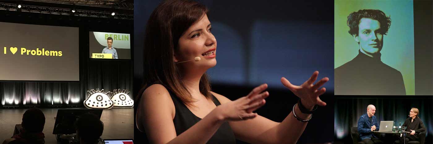
The organizers Cara di Edwardo, Alexander Tochilovsky and Roger Black did a really great job at putting together an interesting diverse line up (the first 50/50 female/male speakers event I know of!). Elizabeth, Nina, Marta, Fiona, Victoria, and I are speaking, Tânia is giving a workshop, Sara can be visited on a studio tour, and at the free Type Lab Isabel is doing a demo, and Amy and Bianca are organizing the Alphabettes Variety Show on Saturday afternoon. Stay tuned for details about that. If you are unable to join us at the lab, you may be in luck …

Check our Twitter and Instagram feeds for live reportage and other nonsense. And if you don’t have a ticket yet and are anywhere close to York Neue, this is your chance to see us in person, so register already. Or for the free Type Lab days. (Oops, I see the two events mentioned above are the only women on the Type Lab program. Girls, get out there!)


* Here is a map of us all I put together back in March for no reason; not totally up to date but giving a rough overview (pins are not showing actual location! No, Lynne is not actually living on the East River.)

For The Love of Unicode

Say the words “character encoding standard” to most people and their brains will congeal into a pile of glazed donuts, like 🍩. See how I embedded a cute little donut directly into that last sentence? You can thank Unicode for that. What is Unicode and how did it become the universal standard for digitally representing the world’s writing systems (yes, including emoji)? Plenty has been written about its history already, but here’s an attempt at a very brief overview.

Continue reading

Please, no more Open Sans for a while

If you are also tired of seeing the ever same fonts and style on the web, and the rich typefaces getting richer, here is a running shortlist of potential body copy typefaces for alphabettes.org I once compiled. I did not test how they look in extended text yet, nor rendering across platforms/browsers. That would be the next step (and we’re also still quite happy with Elido although see that we could use more extensive language support). But maybe you are looking for a fresh, lesser seen typeface and want to check some out anyway. Trying on new clothes is luckily quite easy if you have a website up already, e. g. with tools/bookmarklets that swap out the fonts you currently use, like Webtype’s Font Swapper or FontShop’s Webfonter. Also, most of the typefaces below are available on Fontstand or as trial versions from the foundries, so you can test them locally or in mockups. Let us know if you end up using any at some point.

Continue reading

The Value of Curiosity: TYPO Berlin 2016 in Review

Design conferences are everywhere. Our profession as type designers, typographers and graphic designers is moving fast and we are lucky to have these events where we can get together, learn from each other, gawk at some amazing portfolios and get inspired by the greats.
Perhaps a poignant talk with Jonathan Barnbrook in eggshell-treading-interview format, where intersections between politics and design come to light, together with gloriously great, and now absent, hair?
Or a warmly technical talk about the mechanics of reading and optical sizes with Tobias Frere-Jones, announcing Mallory MicroPlus, which addresses the challenges of small text and screen text simultaneously?
What about Nadine Chahine explaining how the way we read affects our daily life?

typo16_1
Continue reading