Eleni Loves the Handwriting of Greek Notaries

The beautiful handwriting of a notary on an officially stamped paper clearly states it: 1 bed in two colours, 4 cushions, 2 duvets, 12 bed sheets, 1 mosquito net, 2 tablecloths, 12 towels, 1 bedside table, 1 table and 1 sofa was all it took for my great great great grandmother to convince her husband to marry her. What a funny way to declare eternal love! However, contrary to what one might have wished, their love did not last forever. A second letter, written 24 years later, reveals that her late husband made sure to be remembered, leaving her with an exorbitant debt to pay back to the government.

Alas, these family letters were not the most authentic samples of love … but maybe the couple would be happy to know that their great great great grandchild is now in love with every single word that is written in them. I, thus, declare that I am in love with these letters, not because of the content—which I actually find highly entertaining—but because of the unique, elegant and impossible to decipher samples of Greek notaries’ handwriting. Enjoy!

Image 1 and 2: Saturday 2nd of April 1846. Marriage contract of my great great great grandmother. Written in Greek Polytonic.

gamos
gamos

Continue reading

Elena Loves Pigeons

Declaring my love for pigeons is not an easy task. It was not easy to accept it in the first place. But one day I looked back I realised that my friends were right, I have a thing for pigeons. And this thing has a name: Peristerophilia. (With the exception of labeorphilia – love of beer bottle labels, I believe this loveletter-philia to be unique in having a name, whether that is something good or not, well, I really can’t say).

Was this love for pigeons triggered by my grandfather’s love for pigeon keeping? Back in the 60s my grandfather, Bibiano, used to breed pigeons in the attic and participate in competitions that consisted in, basically, many good looking male pigeons (at least if you are a female-pigeon) trying to conquer the female pigeon in dispute, and of course, bring her back. Cachorro, my grandfather’s palomo, was a winner, irresistible for all pigeon-ladies and Bibiano’s reason to be proud.

In my mother’s family archive, an old box full of old pictures, ephemera and other artefacts, there is still a copy of Bibiano’s membership card of the Spanish federation of pigeon keeping (Federación Española de Colombicultura).*

Bibiano

Continue reading

Luisa Loves (Erm… Kind Of) Rio’s Old Acrylic Signs

A hardware store in Copacabana.

A hardware store in Copacabana.

Love is a strong word, but I’ll admit I have a fondness for them. In truth, I grew up in Rio and I can’t say I ever paid much attention to this kind of acrylic signs. Now, having lived in London for almost a decade, whenever I visit I stay with family in an upper-class neighbourhood where they hardly exist. A few days ago I went to the grittier neighbourhood of Copacabana and had an almost Proustian experience as I found myself surrounded by these old signs; with their cheap plastic appearance and soft edges, they formed the typographic landscape of my childhood. Although I can’t say they are exactly beautiful, I suddenly found them oddly charming. They were the letterforms of local popular commerce in 1980s Rio, the letterforms of hardware stores, florists, barbers and fishmongers, cheap-looking and anonymous, often considered ugly and vulgar. Today they are slowly disappearing, and the city doesn’t mourn the loss.

I decided to write my love letter to them, in spite of all the mixed feelings about their aesthetic value, and tried to find out more. I daydreamed about finding an old factory with stacks of old acrylic letters in different styles, dusty and forgotten…

Continue reading

ECS Loves Vintage Italian Fashion

I’ve long loved the vintage femininity of mid-century European fashion. The silhouettes, the careful accessorizing, and most importantly, the thousand-yard glare beaming from a heavily-lined eye have always been an inspiration to me. An old friend of mine peddles these gorgeous pieces most weekends at the Brooklyn Flea, and one weekend, she brought a stack of these Italian Fashion magazines from the 50s. This one, Eva, is from 1951 and features a scripty lettering that perfectly matches the clothing’s aesthetic: custom, curvy, sharp and stabby at just the right points.

eva_cover cover_details

The cover features a few different lettering styles, but what mostly grabbed my attention was the script. It’s used throughout the issue, and creates a nice ‘voice’ for many of the headlines.

Continue reading

Sol Loves Antique Rubber Stamps

I stamped a love letter for you and I can still smell the ink on my fingers.

letter

“I love you more than my own skin and even though you don’t love me the same way, you love me anyways, don’t you? And if you don’t, I’ll always have the hope that you do, and i’m satisfied with that. Love me a little. I adore you.”
― Frida Kahlo

Continue reading

Alessia Loves Pagina

After graduating from the MA in Typeface Design at the University of Reading, I decided to buy myself a present: all the seven issues of Pagina.

Pagina is an international graphic design magazine, published from 1962 until 1966 in Milan by Editoriale Metro S.p.A, with quarterly (but very irregular) releases. Each of the seven issues was published in Italian, French and English, the layout was designed by Heinz Will while the covers were handled by different designers. The articles inside the magazine included authors such as Leo Lionni, Armando Testa, Bruno Munari, Saul Bass and Albe Steiner (just to mention a few).

Pag1 Pag2 Pag3

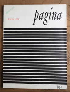
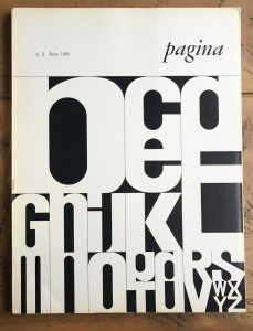
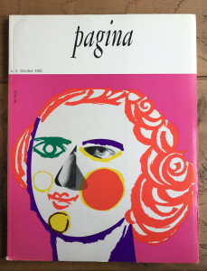
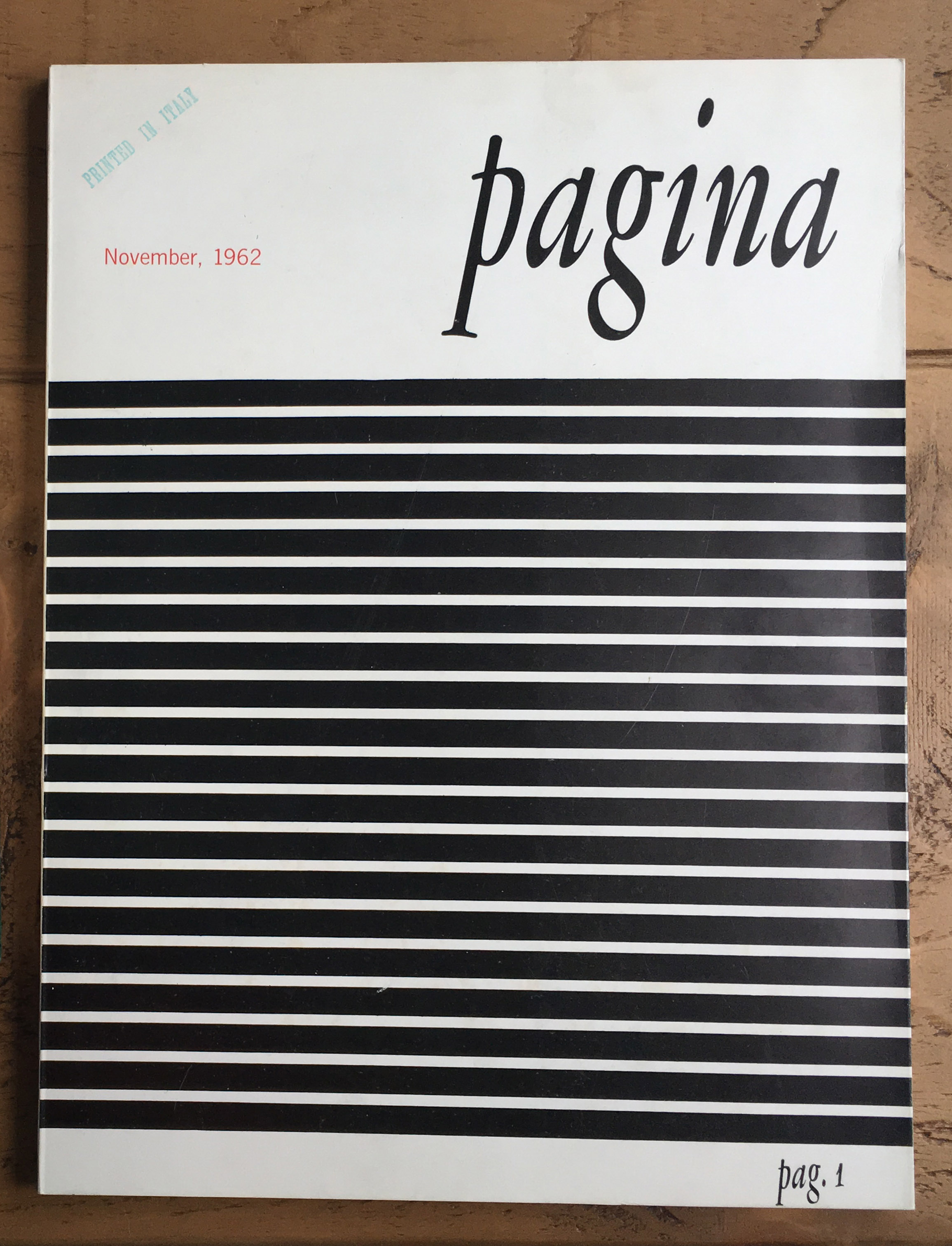
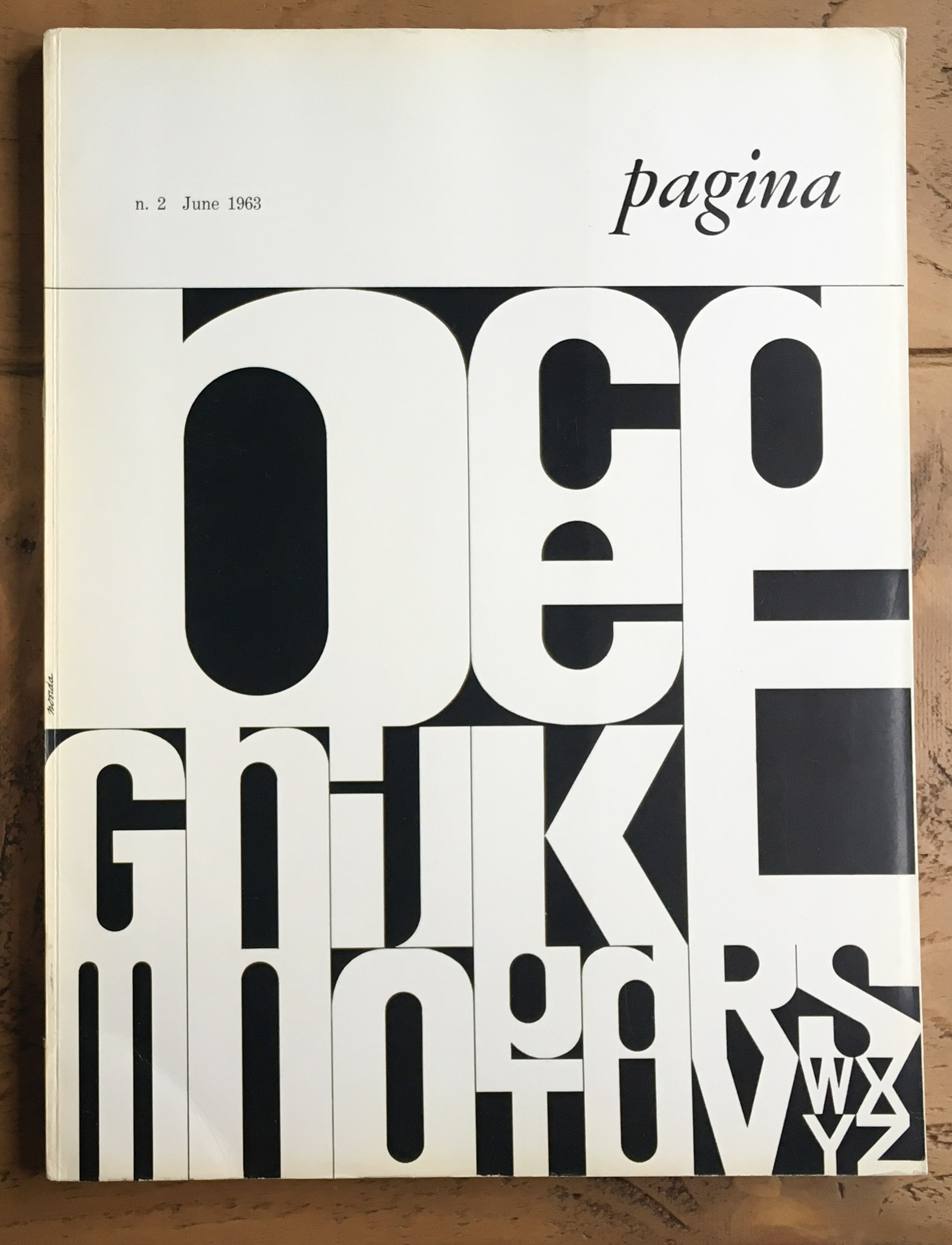
The first three issues of Pagina (November 1962, June 1963, October 1963).
The cover for the second issue was designed by Bob Noorda and for the third issue by Pino Tovaglia.


Pag4 Pag6 Pag7

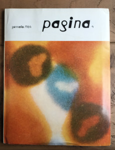
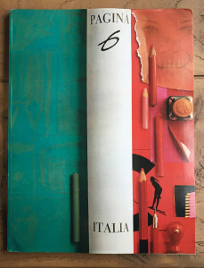
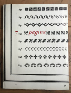
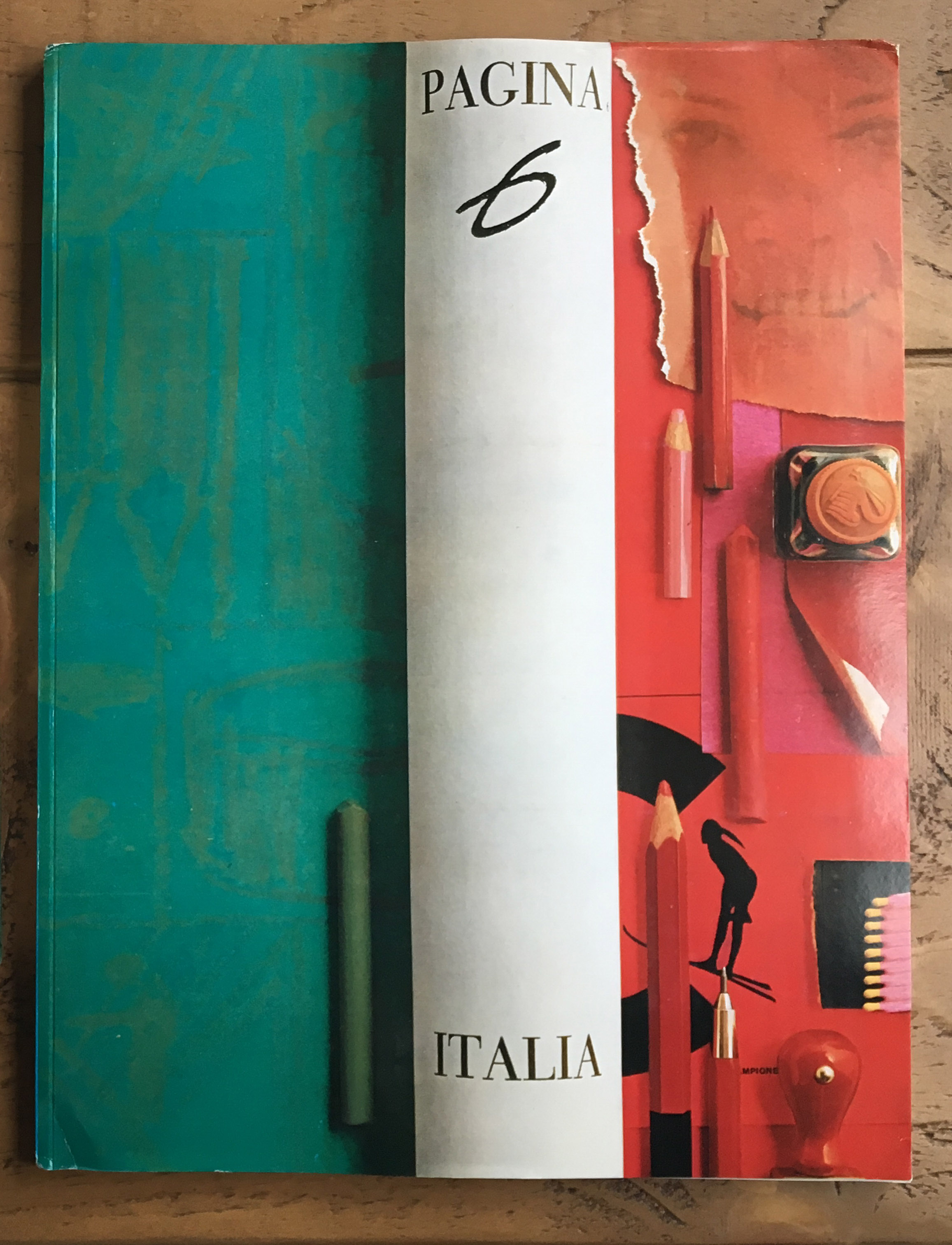
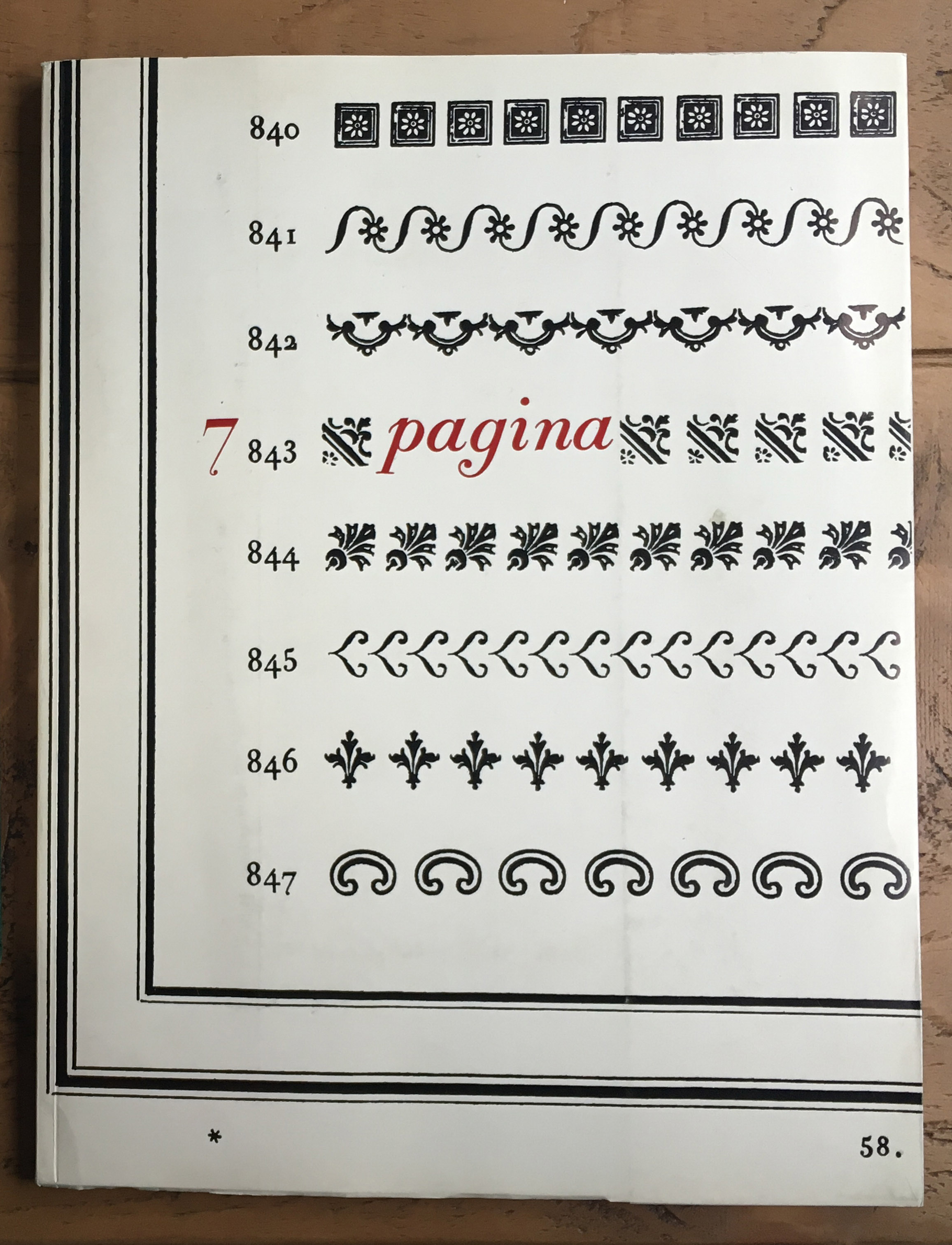
Pagina 4, 6 and 7 (January 1964, January 1965, April 1966). Pagina 6 is a special issue entirely dedicated to Italy. and Pagina 7 is dedicated to Giambattista Bodoni. The covers are respectively by Max Bill, who also designed the typeface on the cover, Giancarlo Iliprandi, and Franco Maria Ricci.

Continue reading

Lynne Loves Vintage Tins

As the renowned Louise Fili has said, “everything looks better on a tin”. Amongst all the little advertising items I collect, little tins are probably one of my favorites. It seems that nearly everything was packaged in these sturdy little boxes at one point, from laxatives to typewriter ribbons.

Advertising Tins

From the left: laxative, moth-deterrent, and two typewriter ribbons

Continue reading