Welcome to the first edition of what hopes to be a monthly roundup of women making news in the world of type design, typography and lettering. To not miss any exciting news from the months before September, this time we’re turning the clocks back a little, so sit back and catch up on the amazing things these ladies have been up to this year.
Ruxandra Duru’s report Type Foundries Today goes live on Typographica
Last month, Ruxandra Duru’s census and accompanying analysis of contemporary type foundries based out of Europe, the Americas, Australia, and New Zealand was released by Typographica. This report is a timely first step in understanding the nature of the type business better, and a must-read.
Mary Catherine Pflug wins four CSPA Collegiate Gold Circle Awards
Mary Catherine Pflug has bagged not one, but four, CSPA (Columbia Scholastic Press Association) Collegiate Gold Circle Awards for the campus magazine, The Independent; including one for “General use of typography throughout magazine.”
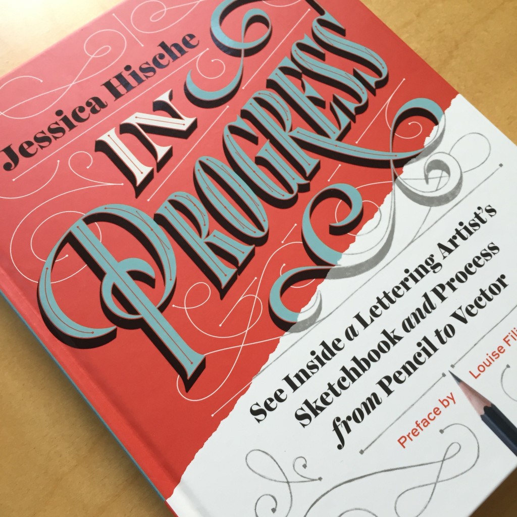
Jessica Hische’s book In Progress is out
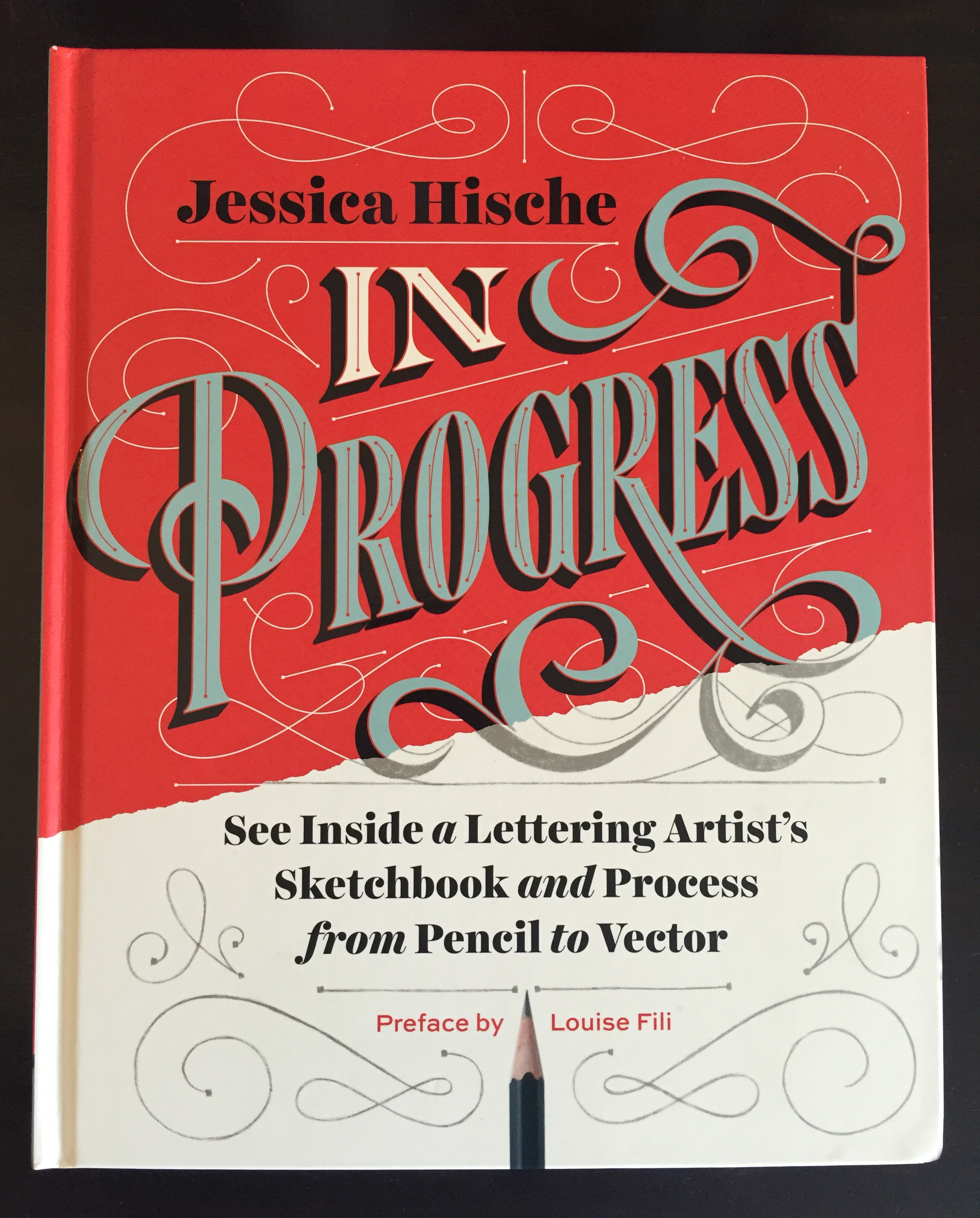
If you dig hand lettering, chances are you already know that Jessica Hische’s book In Progress hit the shelves this September. Read more about the book in Shauna Lynn Panczyszyn’s review, or get yourself a copy.

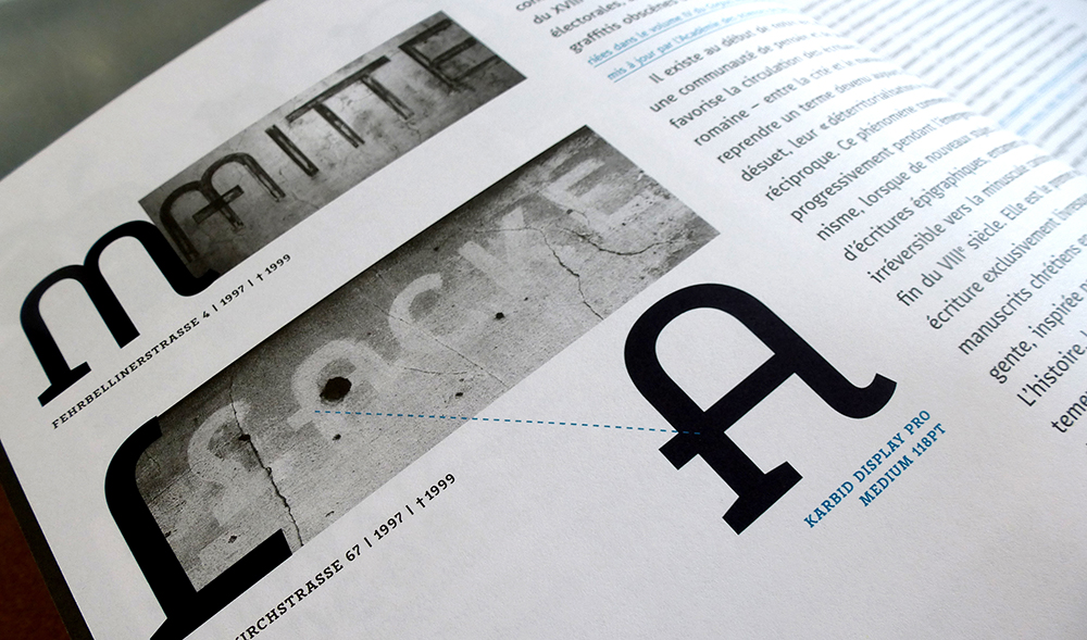
Verena Gerlach is September’s Creative Character…
Read Verena Gerlach’s interview in which she speaks about her work as a typeface and graphic designer, FF Karbid in particular, and about the arts and culture scene in newly-reunited Berlin in the early nineties when she was a student.

…and Julia Sysmäläinen was May’s
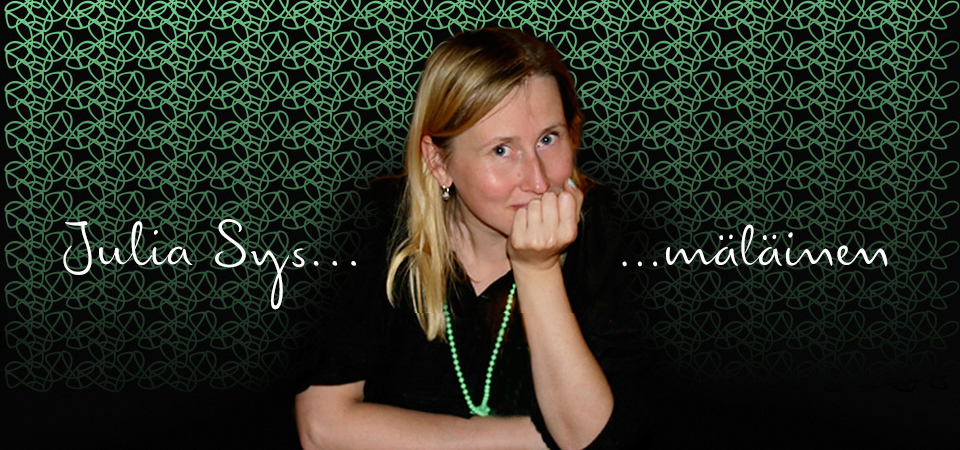
Julia Sysmäläinen, probably best known as the designer of FF Mister K, talks, among other things, about her love for language and how being fluent in more than one language and script has influenced her work in this great Creative Characters interview.

Isabel Urbina Peña’s launches Yes, Equal
Late in August, Isabel Urbina Peña launched Yes, Equal, a directory of sorts of women creatives. Next time you hear a conference organiser bemoaning the very limited number of women they can invite to their event, you know where to point them to.
Nadine Chahine becomes Monotype’s first female director
With her promotion to UK Type Director, Nadine Chahine became the first woman to hold this position at Monotype.
Nicole Arnett Phillips launches the third volume of Typography.Journal
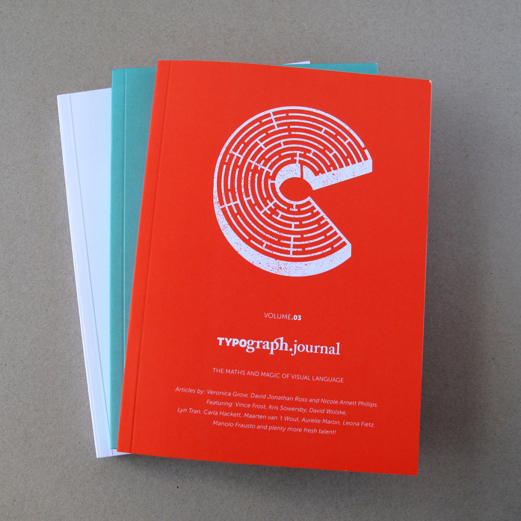
Typography.Journal, a boutique print journal, is the brainchild of Nicole Arnett Phillips, aka Typograph.her. Its third volume, which explores the intersection of maths and magic in visual communication, is now available for purchase.

Rebecca Bartola receives the first TDC Beatrice Warde Scholarship
Rebecca Bartola, who is an American student currently studying at Central St Martins, London became the first recipient of the TDC Beatrice Warde Scholarship this July. Check out her work here.

