The Ruq’ah Project by Zeynep Akay

Check out The Ruq’ah Project by Zeynep Akay, documenting the research and making of a typeface inspired by Ruq’ah, a common style of Arabic handwriting, to be added to the Google Webfont Library. It’s not always easy to allow the world to peek behind the curtain of one’s process but Zeynep is determined to partake in what she is calling “immersion therapy”.

I will open my process, my most unrefined drawings, my kookiest ideas, my most embarrassing failures to the snarkiest, most passive aggressive comments on the internet.

We’ll be right here, watching — and cheering — along.

Making Matrices

A recent visit to the Gerstenberg type foundry let me finally wrap my head around the different methods of making matrices for foundry type, and how to distinguish them:

Striking a punch into copper
This is the traditional method mostly used in conjunction with hand-cut steel punches, later only used for smaller sizes until ±28pt; larger sizes are hard to strike totally level. Also, the larger the size, the more the copper block gets deformed from the extrusion of the material.

Stamping a matrix with a machine
Often done in conjunction with machine-cut punches, especially for the production of Linotype and Monotype matrices, and for foundry type when the design is supposed to match Lino or Mono typefaces. And for sizes above 28pt. Machine-cutting of punches was also used for very small sizes that were almost impossible to do by hand, e.g. 2pt or 4pt. Stamped matrices can be made of copper, steel, or other alloys.

Electrotyping matrices
Widely used in Europe in the 20th century. Usually applied in conjunction with the cutting of patrices (cutting “punches” into soft type metal alloy, called Zeugschnitt in German), mostly done for sizes from ±28pt up. The model gets placed into a galvanic solution for 24–60 hours, or longer, to produce the matrix layer. These forms, cut up, make up the “eye” of the matrix, which is filled out with zinc, tin, or brass, later also steel or other alloys. Material for the matrix-part was copper, nickel, or brass, with copper being less durable for use in the complete caster (also a reason why the traditional method was not much used in the 20th century) but the fastest to grow matrix-layers with.
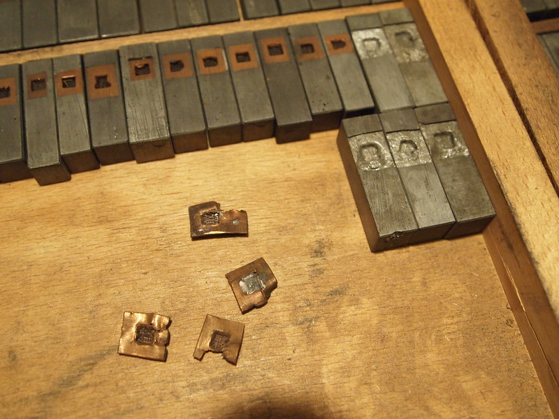
These electrotyped copper matrix-eyes came loose from their “bodies”, presumably a zinc alloy. Copper does not bind well with zinc and has to be tinned at the backside.
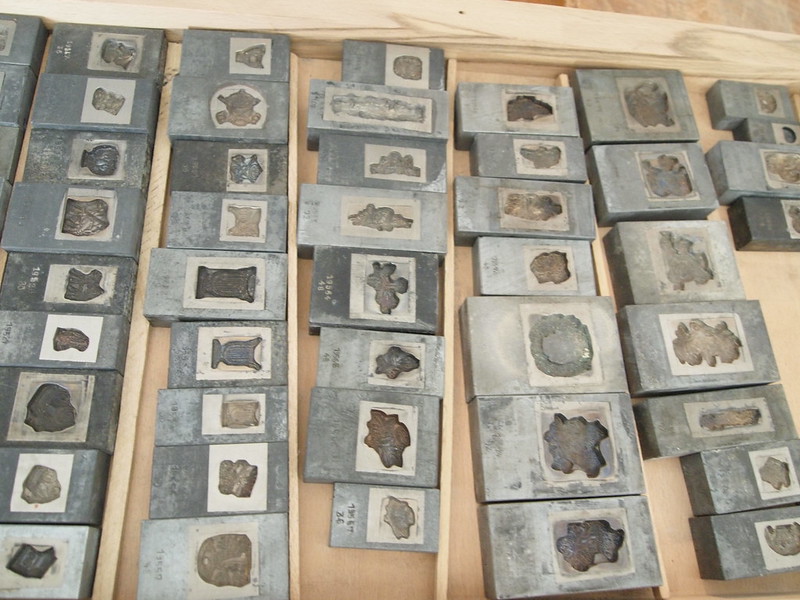
Electrotyped ornament matrices

Cutting matrices for poster type
Type larger than 96pt was usually produced in wood or resin, because metal type gets very heavy and “material-intensive” at large sizes. Still, large-sized matrices can be made via a patrix (type metal or wood) and electrotyping, or by cutting the form out of 3–4 mm thick copper sheets and mounting these on thicker sheets. Alternatively, a cut-out brass form can be pressed into type metal to form a (pretty soft, so not very durable) matrix. Or you could go all old-school and make a sand mold, preferably using beer to moisten the sand, more sticky.

Machine-engraving matrices from patterns
Widely used in Europe in the 20th century. A pantographic milling machine, adjustable for different sizes, engraves the matrix in several step following a pattern. The material used is sometimes bronze, later usually (high speed) steel. Getting an even, plane bottom was hard to achieve in the beginning, so engraving was occasionally combined with galvanic methods, but especially for scripts or other typefaces with large overhangs and kerns because those matrices had to be deeper.
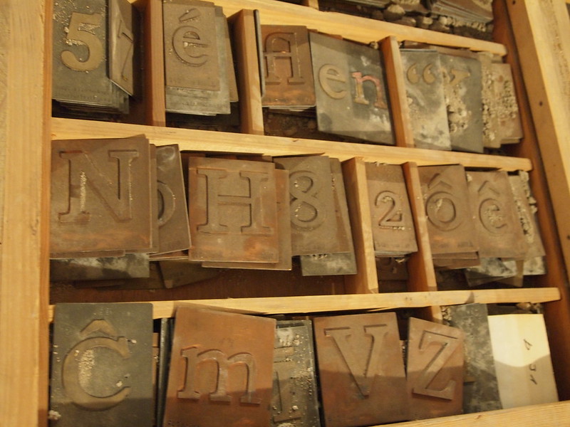
Patterns from Stempel for pantographic matrix engraving
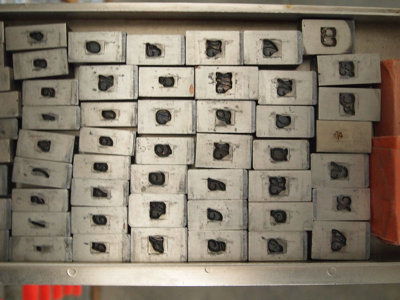
Engraved matrices (above Calipso from Nebiolo, especially for Florian and Isabella 🙂
Goodbye to the Master of the Univers

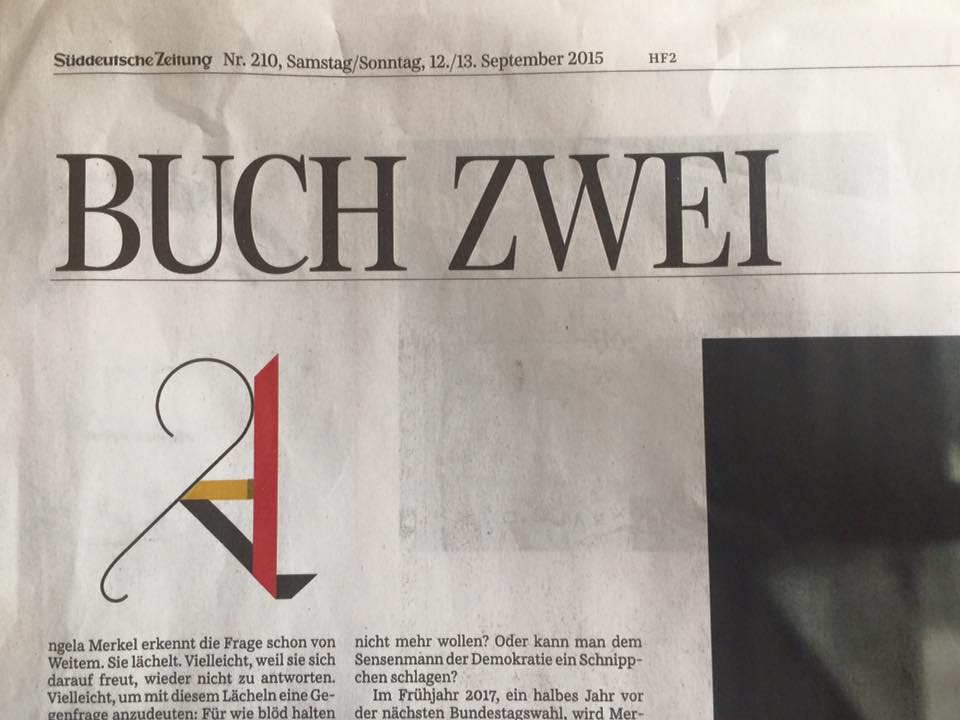
This past week Adrian Frutiger (24.05.1928–10.09.2015) passed away after a life full of passion for typography and type design. This is the second great loss for the type community this year — he followed another type legend, Hermann Zapf, who died in June. In the 1950s, when he designed the famous font family UNIVERS, he could barely imagine that today such ornamental, playful initials would be used in a daily newspaper. He accompanied my life as a designer from the beginning of my studies in the ’80s, and I always loved the rhythm of UNIVERS — even today, and going forward. Farewell and have a good last journey.

Adrian Frutiger - Master of the Univers

Rooibos Tea & Pistachios – Talking with Alice Savoie

I always find it interesting to talk to people. And more than that – to talk to other ladies that are doing similar things like I do, experience the same dilemmas, and most likely share with me some feelings. This series of interviews aims to give us an insight about the lives and work of the Alphabettes.

The structure is simple: Three sections with different length of answers to allow skimming or reading (aren’t we all so busy?). “The warmup” with short questions, “The visual” with photos taken by our interviewee as replies, and “The longer bits” of questions that require some more words to answer to, and probably more thought.

Each interviewee will nominate the next lady to be interviewed, out of our lovely Alphabettes. The last paragraph will also give us a preview of the next interview, with a question passed along for next post.

So grab a coffee or a freshly squeezed orange juice and start reading. Hope you’ll enjoy Alice’s answers just as I did!

Continue reading

A Lovely Night Out with the Ladies

Over the long Labor Day weekend, I had a lovely evening meeting several ladies in type. In some respects, it was one of those moments where you suddenly realize that you’re not quite alone in the world anymore as both a woman and creative individual. Sadly, it’s not often that you meet so many women in the creative field in one place. That being said, there should definitely be more opportunities to make it so.

In my early days after graduating college, I remember how shocked I was upon jumping into the corporate world of Typography and Design. Contrary to the gender-neutral classroom environment, the studios, agencies, and companies I worked for were overwhelmingly male-oriented. Could it be that women didn’t want to work at these places for specific reasons that I wasn’t seeing? If not, where did all these educated women go after they earned their diplomas?

Continue reading