Dissertations and Papers from Type Culture

Mark Jamra’s site Type Culture hosts a couple of very interesting research papers and similar texts, for instance:

Oldrich Menhart: Calligrapher, Type Designer and Craftsman
by Veronika Burian

This extensive dissertation presents the versatile work of the great Czech calligrapher and type designer Oldrich Menhart in his most unique and interesting period between 1930 and 1948.

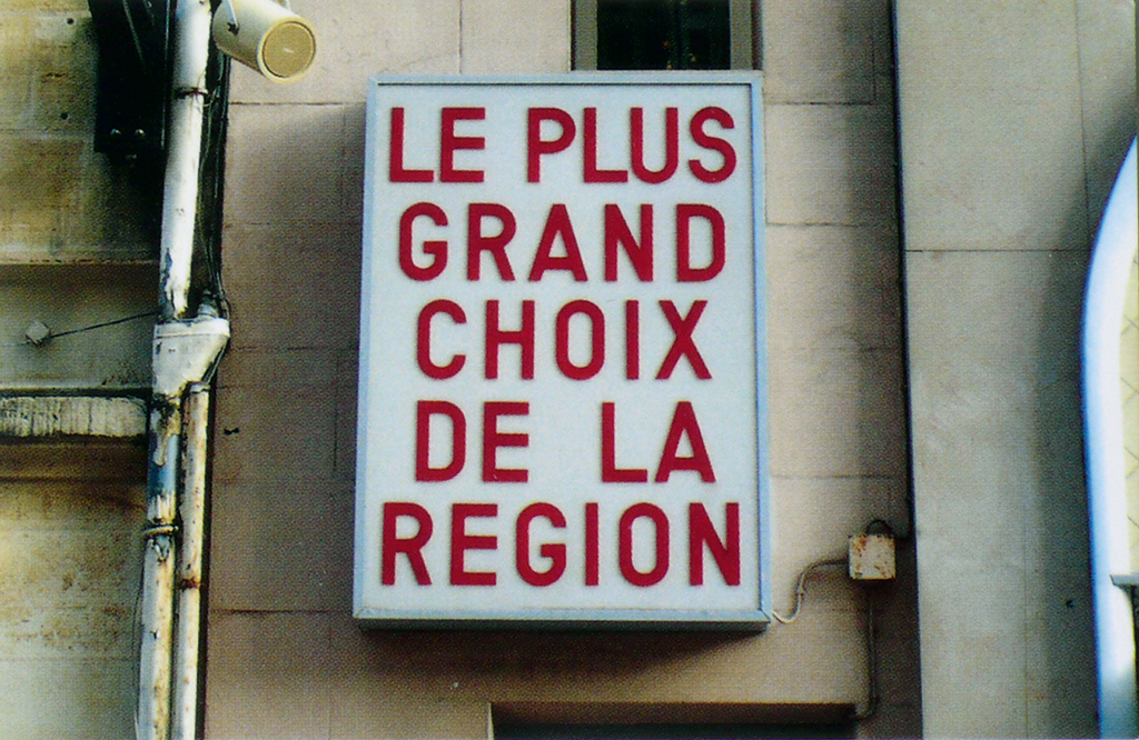
French Type Foundries in the Twentieth Century
by Alice Savoie

The value of this dissertation lies not only in what it imparts to the reader, but also in its rarity, since relatively little information on the recent history of type in France has been written in English. To people who are less than fluent in French, most information about the state of affairs in French type and typography is woefully out of reach. This well-written study focuses on the activity of French foundries, their fateful decisions regarding the adoption of new technologies and the evolution of French type design throughout the last hundred years.

Continue reading

In the Middle of Nowhere

L1040374_wp

In the middle of nowhere – an encounter First published in 2008 at SLANTED

I’m now on my way to Roquefort, after a halfway sleepless thundery night in a tent on the French Atlantic coast. I couldn’t tell if this is the place where the famous French cheese by the same name originates, but I do know that it is the place, central in the southwest of France where I will soon meet the man whose works I have studied, and come to appreciate, for some time now: his name is Jack Usine.

Continue reading

You’re Listening to Typeradio …

If you are interested in peeki…, eh, listening behind the work of some type luminaries, hear personal stories and anecdotes, or just want to know if they are religious (the infamous First Question), head over and immerse yourself in the Typeradio archive. Great interviews with people in type and design related fields since 2004. 🎤 🎶

For instance April Greiman, Kali Nikitas, Morag Myerscough, Irma Boom, Catherine Dixon, Marian Bantjes, Catherine Griffiths, Anette Lenz, and a great many greats more.

The Story of Perpetua

This essay relates the origins of the typeface Perpetua and Felicity italic which were designed by Eric Gill and produced by The Monotype Corporation. Although the type and the collaborators are well known, the story has had to be pieced together from a variety of sources—Gill’s and Morison’s own writings and biographical accounts. There are accounts similar to this, but none could be found that either takes this point of view, or goes into as great detail.

PDF (1.3 MB): The Story of Perpetua

This was originally submitted by Tiffany in partial fulfillment of the requirements for the Master of Arts in Theory and History of Typography and Graphic Communication, at the University of Reading in 2000.

Magasin By Laura Meseguer

magasin1

To say that Magasin is not your average script font is stating the obvious. It is quirky and totally irreverent. It sits stock-straight upright and follows very few rules when it comes to connection between the letter­forms. You get a real sense of Mid-Century Modern and French perfume packaging, along with the echoes of Quirinus/Corvinus and Fluidum in its contrast and terminals.

But don’t confuse Laura Meseguer’s Magasin for some dusty script revival. It is rigorous and modern, por­tray­ing a fierce independence as it easily sets itself apart from all the script fonts being released right now, dancing to its own atonal, syncopated rhythm.

Anyone daring enough to use Magasin will find a useful amount of alternates, ligatures, and swashes that create captivating and playful word shapes. (If anything is missing, I’d say Magasin could use more terminal forms.) I can imagine it deployed large in magazines and small on packaging. Don’t worry about the unorthodox letter shapes; instead, consider them an asset, because they will make people look twice. Additionally, the proud x-height assists, along with the context, in making Magasin legible enough at text sizes.

If you want a taste of what is possible, check out the specimen Meseguer created, along with the article she wrote for I Love Typography. They clearly dem­on­strate the different things that are possible with this idiosyncratic typeface design.

Specimen image made for Typographica where this review appeared previously.

Choosing from Plenty

A Monday morning 7:30 am contemplation about fonts: I think, for the past two or three years, we (finally) see a shift towards choosing a fitting typeface from all offers out there, and not just the fonts we have already licensed previously. The latter was the prevailing situation in analog type days and whenever we had to work with typesetting studios or printers before PDFs. But it was also common in digital desktop publishing for a long time that you would use what you have rather than getting a new typeface for every job (because, amortization, familiarity, etc.).

My stance has changed when I started working more with fonts on the web, or more specifically, renting them from services. No point in licensing those in advance and then using them for everything for years (you can do that with self-hosting webfonts and one-time licenses though). Similar with all the rentable desktop fonts available now. Think what you want about the trend towards renting — incremental licensing vs. one-off licensing — but I’d be happy if we see more variety and more fittingly chosen typefaces this way. Of course, font renting models are not guaranteeing the perfect type decisions, maybe they even promote clumsy choices by people who don’t yet have a good grasp of how-to. But at least they don’t foster the lazy use of much seen staples because of cost, when the cost relates to time, and not just the number of typefaces.

Nouvelle Vague by Elena Albertoni

The typeface Mistral could be considered the default choice for evoking French 1950s lettering. Nouvelle Vague offers a less obvious but still direct reference to the style. The name already gives unmistakable hints at its source of inspiration. Energetic, loose, occasionally edgy, and with quite a soupçon of retro, it is a font du jour with the temperament of mid 20th century advertising.

Although, of course, issued in OpenType format, Nouvelle Vague comes in just one weight with comparably few fancy features. Instead of including the countless ligatures or contextual alternates that fonts today use to emulate hand-lettering, for example MVB Sacre Bleu, Elena Albertoni focused on simple, impactful letters that look lively and natural even when OT features are switched off or can’t be applied (still the case in some applications and browsers, but also when you encounter a lazy user, like — believe it or not — me). Alternatives are provided for letters that frequently recur like ‘i’, ‘l’, ‘n’, ‘r’ but strangely not ‘a’ or ‘e’. Also, a small set of ligatures are included, mostly combinations with ‘f’ and ‘b’ although I don’t see the urgent need for those. The ‘AE’, ‘OE’, ‘&’, and ‘ß’ are particularly nice.

The uppercase characters have a different rhythm and are more expressive. Here, too, a few alternates are provided, e.g. smaller versions of vowels to accommodate accents. The caps in general are quite large. My guess is that they look best as initial letters of single words or in languages which don’t use uppercase letters as frequently as German. But the main field of application for Nouvelle Vague isn’t long continuous text anyway. I see it in all kinds of jobbing work, posters, headlines in print or on the web, packaging or display, and — like where it all started — as a piece of lettering for a French hotel.

Specimen image made for Typographica where this review appeared previously

Oh, Hello There!

Welcome to Alphabettes. We’re just getting started here building a great new type and typography blog. New content will be added regularly, so please stop by and stay awhile.