Liron Loves Henri’s Type Strips

Henri Friedlaender designed the legendary Hadassah Hebrew typeface. While doing extensive research for an exhibition that included his work, I was lucky to get a glimpse of his design process. Until the revealing of his personal archive (donated to the Israel Museum), his design process was only known through an article he wrote with few rather “clean” images of sketches. In the museum’s basement, wearing cotton gloves, we were taking out item by item from large drawers. The Hadassah material was intriguing. So much was said about this typeface, so much guessing on the design process was done. And here we are, seeing traces of Friedlaender’s own way of designing.

hadassah3

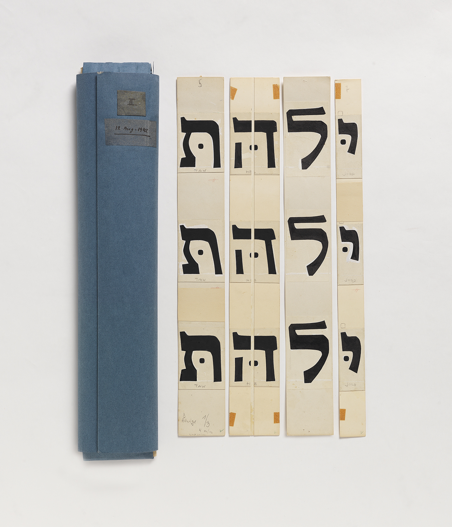
From Friedlaener’s archive. Photo by Eli Pozner, the Israel Museum. This refers for all images in this post

Continue reading

Tiffany Loves Graveyards

For as long as I can remember I’ve enjoyed going to graveyards. Why? Because I’m a romantic at heart. You see, in my view, headstones are the final opportunity for the living to write a love letter to the deceased. Of course, the loved one didn’t carve the actual letters but I like to think that choices were made that allowed the individuals to put their personal stamp of pride and uniqueness on the headstone.

Ferndale Historic Cemetery in Ferndale, California

Ferndale Historic Cemetery in Ferndale, California

Continue reading

Lynne Loves Matchbox Labels

Matchbox labels are the perfect thing for a typographic treasure hunter on a budget — they’re miniature in size, relatively cheap, and their lovely designs are hard to resist.

In the mid–19th to the mid–20th century, these little matchboxes with promotion space were a very important part of the industries. On these tiny panels were advertisements for pretty much everything including (but not limited to) opera companies, fashion companies, public-service announcements as well as political campaigns.

Misc. Matchbox Labels

Variety of matchbox labels, usually about an inch (2.5 cm) high

Continue reading

Amy Loves this 1950s Modess Sanitary Napkin Dispenser… Because

Built in 1953, the aptly named Old Library was the first free-standing library building on the campus where I teach. It eventually housed painting studios and since the late ’80s, has been home to the photography and graphic design programs. I love this space for all its mid-century collegial charm. The stately brick exterior is surrounded by mature honeylocust trees, while inside, built-in bookshelves from its past life flank the sides of computer labs and ample hallways. Soaring windows welcome an abundance of natural light and offer views of the grassy quad where students gather in good weather to play frisbee, sunbathe or strum ukeleles.

But perhaps my most favorite thing about the building is this original Modess sanitary napkin dispenser that lives in the 2nd floor women’s bathroom.

modess1
Continue reading

Pooja Loves Street Lettering in Bangalore

Even though I have lived in three different continents, the place that has felt most alien so far has been in my own country and is the one I live in currently—Bangalore. Before I moved to Bangalore, I had never acknowledged the comfort of being in a city where the all the street signs are in a familiar script, even if I could only half-understand them, or not understand them at all. Five years ago when I first moved here, I began picking up, what are still rudimentary, skills in reading Kannada from the brick-and-mortar yellow signs, like the one below, that announce names of streets and neighbourhoods across the city.

Srinivasalu Layout

And before I knew it, I was sucked into spotting different styles of Kannada lettering that pepper the city.

Continue reading

Taylor Loves Interrobangs. Do You‽

What is the interrobang‽  It’s that weird thing! Wikipedia says it’s a “non-standard punctuation mark” used to “combine the functions of the question mark and the exclamation mark.” The Guardian describes it as “that inappropriate over-sharer we all know.” Brand New calls it “the hipster of punctuation marks.” It’s a lot of things, but most importantly it is a single girl’s bf(f). Join me and claim the interrobang as your bæ this V-day.

Interrobangs from sketchbook. Contributions by Jessica Griscti & Cody Pumper.

Continue reading

Bianca Loves Paperbacks

I grew up in Germany so I know my Reclam books intimately. In German literature class we spent months diligently analysing every sentence of Mann’s or Remarque’s novels. The books were severely worn by the time we were finished with them. Those almost empty covers really just asked to be doodled on, their spines were torn, and the dog-eared pages were covered in ink and chocolate stains. But Reclam’s design withstood all abuse; the format, material and the (now) iconic yellow covers will always reveal their true identity. That is why I love paperbacks.

reclam_new

Continue reading

Indra Loves Buttermann

This is the first in a series of letter love Love Letters where we’re showing a piece of letter-related ephemera we love.

buttermann sw

I love Buttermann (butter man), the logo/mascot of the Dresden Brüder Butter type foundry (later Schriftguss A.-G.) from the 1920s. It is so joyful and affable like no other logo today, at least not in any type related business. Buttermann cheers to you from specimen books, merchandise coins, or hurries through poster type with a spoon of lead in his hand.

Continue reading