Remember December: Tipoteca with Legacy of Letters 2017

The typographic highlight of my year was a July workshop at Tipoteca in Cornuda, Italy. The workshop was the culmination of the 2017 Legacy of Letters tour lead by design historian, writer and educator Paul Shaw and publishing consultant and translator Alta Price. Anyone lucky enough to visit Tipoteca Italiana Fondazione is rewarded with a vibrant and immersive connection to the history of printing and type. For lovers of type, Tipoteca is a bucket list must, for lovers of type and lovers of Italy, Tipoteca, and the Legacy of Letters tours, can become a bit of an addiction.
Continue reading

Remember December: We are being read!

Traveling is one of the best things in life and something I will remember 2017 for (just like my fellow Alphabettes as we have seen in the past December posts so far). Not only do we get to see friends from afar, document funky lettering, foreign scripts, or drink crazy cocktails, we can also exchange PRESENTS!

Let me show you both the best book and most touching gift I got this year:

Elephant, Piggie, Indra and Sahar (plus Marina and a bit of Matthew Carter in the background)


Continue reading

Remember December: Calligraphy Retreat in France

In August, I was fortunate enough to travel to Saint Antoine l’Abbaye (France) for the third time for a six-day Roman Capitals calligraphy course with Keith Adams.

The retreat started with a presentation of the course and student introductions. As usual, there were students from many different countries and the course was run in French, combined with English, Catalan and Spanish.


Continue reading

Remember December: The year of superlatives

After deciding to write for the Remember December series, I began to scroll through my phone’s camera roll to pick an interesting memory to write about. This turned out to be a difficult task because this year has been filled with so much travel and so many beautiful memories – picking just one was extremely hard.

Being in India, it takes a lot of effort, time, money, and a pile of visa paper work before I can plan a trip outside the country. This year however, we (me and my husband Rob Keller) took a personal record number of trips – some were meticulously planned, others quite spontaneous, and we ended up traveling across five countries!

The greatest thing about all these trips to different places has been the sheer diversity of people I met and the wonderful experiences we had together. When I think about the year gone by, I am most reminded of the incredible people that I shared my time with that made these adventures so special.

With this post, I would like to extend my heartfelt gratitude towards all those people for the many enriching memories and for impacting me in some way or the other. Here’s to friends, old and new, and to the power of simple experiences that give hope & inspiration in this often messed up world.

New Years eve at Oakland California

We started the year with one of the most fun New Year’s Eve and stay at Oakland California, with the most wonderful hosts Frank Grießhammer & Tânia Raposo.


Continue reading

Remember December: Making a Typographic Pilgrimage in My Old Backyard

Souvenirs from Up North.

Souvenirs from Up North.

The sun rose over the lake as I stepped outside to get in a run before heading to the morning’s workshop. Subfreezing temperatures were once a familiar part of life to me, but not anymore. My Californian constitution couldn’t handle it and the amount of layers I wore for a 4-mile jog was quite comical.

An hour plus hot shower later, I revved up the heat and the classic rock station in my rental car to head to what is familiar to me now: an international community of type designers – this weekend joining the letterpress and printing community – for the ninth annual Hamilton Wayzgoose at the Hamilton Woodtype and Printing Museum in Two Rivers, Wisconsin.

Continue reading

Remember December: the Pride parade

The Pride Parade has always had a complicated place in my heart. I have long found it incredibly difficult to attend: my own queerness, being both bisexual and transgender, has itself been a difficult truth to live at times. When I am there, I am always consistently and completely overwhelmed: the amount of love, in the eyes of a world that has long threatened many queer people’s existence, is always going to make me cry. But these emotions are mine to deal with, and in that sense the parade helps me.

And Pride works for me. I am served by it; this is how I formed my plan for this year’s pride. I could already walk for myself. I could proudly be out and walk with my friends. But not all of us are so lucky. So I decided to walk for others as well.

Five banners designed for the Oslo Pride parade

I gathered five slogans that I felt would encapsulate issues bigger than myself, issues that deserve year-round attention and awareness. I printed them in dozens of copies and in various sizes, from postcard to A3 on foamcore. With that, I also mobilised friends and friends of friends to carry other people’s messages with them.

Pride is complicated for me. I cry in sorrow at its necessity, and in joy at its plentiful honesty and beauty. I long wondered if it was for me, and when I found it in myself I quickly became attached to it. But I am proud. I’m a very proud and open and, frankly, loud woman. I can speak for myself. So to stand in my strength and pride, on a hot summer’s day, with the world smiling at me, I carried a big-ass Black Lives Matter banner and did my best to speak loudly for others.

Remember December:
The Important Job of the Left Thumb

Let me tell you the story of how I learnt to appreciate my left thumb. In the summer of 2017 I had the privilege of receiving the RIT Cary Graphic Arts Collection summer research fellowship.
This fellowship is offered yearly to scholars so that they can come and use the collection in person. I spent one heavenly month studying the archive of Ismar David, the designer of the first comprehensive Hebrew typeface family.

The Cary Graphic Arts Collection (aka: The Cary) is a rare book library on the history of the graphic arts. The original collection was assembled by Melbert B. Cary, Jr. during the 1920s and 1930s. Cary was the director of the Continental Type Founders Association, a former president of the AIGA and the proprietor of the Woolly Whale Press. He collected printers’ manuals, type specimens, and books on the art of printing. In 1969, his collection of some 2,300 items was presented to the RIT. Today, it houses around 40,000 volumes, manuscripts and correspondence, on bookbinding, paper making, type design, calligraphy and book illustration.

One of the exciting things about The Cary is that although many of the items in the library are rare, access is given to visitors. With the supervision and assistance of the staff, the resources can be examined and studied in the reading room, in very LOW temperatures. So, after making your appointment, be sure to bring a sweater and you can enjoy the rare items and be well preserved with them.

Another thrilling aspect of The Cary is that it is not only a collection of printed matter, it is also a collection of the technology used for its production. The Arthur M. Lowenthal Memorial Pressroom holds some historic printing presses including a 1874 Columbian press, an Albion press that was once owned by Goudy, a Vandercook press from the 60s and a William Morris’ Kelmscott Press. All the presses are functional and regularly maintained. Complementing the presses the collection holds various kinds of metal and wood typefaces.

The Arthur M. Lowenthal Memorial Pressroom
Continue reading

Remember December: Brunch Crumbs & the Emotional Hole of Doom

Lettering

This past weekend, I made the most amazing brunch. I wish you could have seen it. But you didn’t. And you can’t. Well, you could if you looked at my Instagram, but imagine you couldn’t. (No cheating!) And also, imagine me after brunch: Sitting on my bed after my friend left, looking at the table (because, yes, I live in a studio apartment where the place that I sleep and the place that I entertain brunch guests are the same thing), stuffed and sleepy, debating whether to nap before or after the dishes…

I looked at the table with great satisfaction, basking in the glow of my impeccable culinary prowess and Grade A hostess skills. Foods that were once organized in straight lines and circles were now crooked and strewn—half on, half off the plate—mixed together, piles emaciated. Bread crusts pushed to the side of plates, crumbs proudly littered where our mouths had been. Cups coated with half-dried coffee and champagne, some with tiny pools at the bottom of the last sip we didn’t need.

If you had walked into the room and looked at the table without any prior knowledge of what had taken place before, you would have known a delicious brunch had happened there. Without ever having seen a scrap of food, the evidence would have given away that a feast had occurred, an experience, a moment that mattered. People were nourished and felt something and then went on with their lives. This is what the most important typographic memory of my year—Hell, probably of my entire career thus far—is like. Because although I can’t tell you about the project or any of its details, I can show you the table afterwards. I can tell you the story.

Continue reading

Remember December: Standard Type Foundry, New Delhi

December 2009

I am now a graduate in Type Design from Reading University; pleased but somehow empty. After handing in my master thesis on the last day, September 17th (also my birthday), and after celebrating typography in Mexico City at ATypI in October, I was already back in Paris, my hometown, for a month. Not having yet found any job, I registered at the Job Center, aka Pôle Emploi. My experience happened to be quite schizophrenic when I was told my Resume was most likely too sad, too black and white. The Job Center office suggested me thereafter to follow a Resume layout training. I do not think my qualifications were even recognized in this state organization.

The future was not looking that bright for me; I was clueless about what to do next. One evening I met up with a few friends; amongst them was Titus Nemeth. We talked about different things but most importantly … travel to the place where the writing system I have studied in Reading is used. A few weeks later I had tickets to New Delhi in my pocket, ready for a Devanagari overflow!

Preparing the trip, I started learning Hindi; that aim was never really successful, unfortunately. On the other hand, it was encouraging and positive to meet Mayank, my French-Hindi tandem partner. He put me in touch with his dad, who came to meet me at the New Delhi airport with his chauffeur. My Hindi was quite ridiculous and neither Mayank’s dad nor the young chauffeur could articulate words in English. They dropped me off at my hotel.

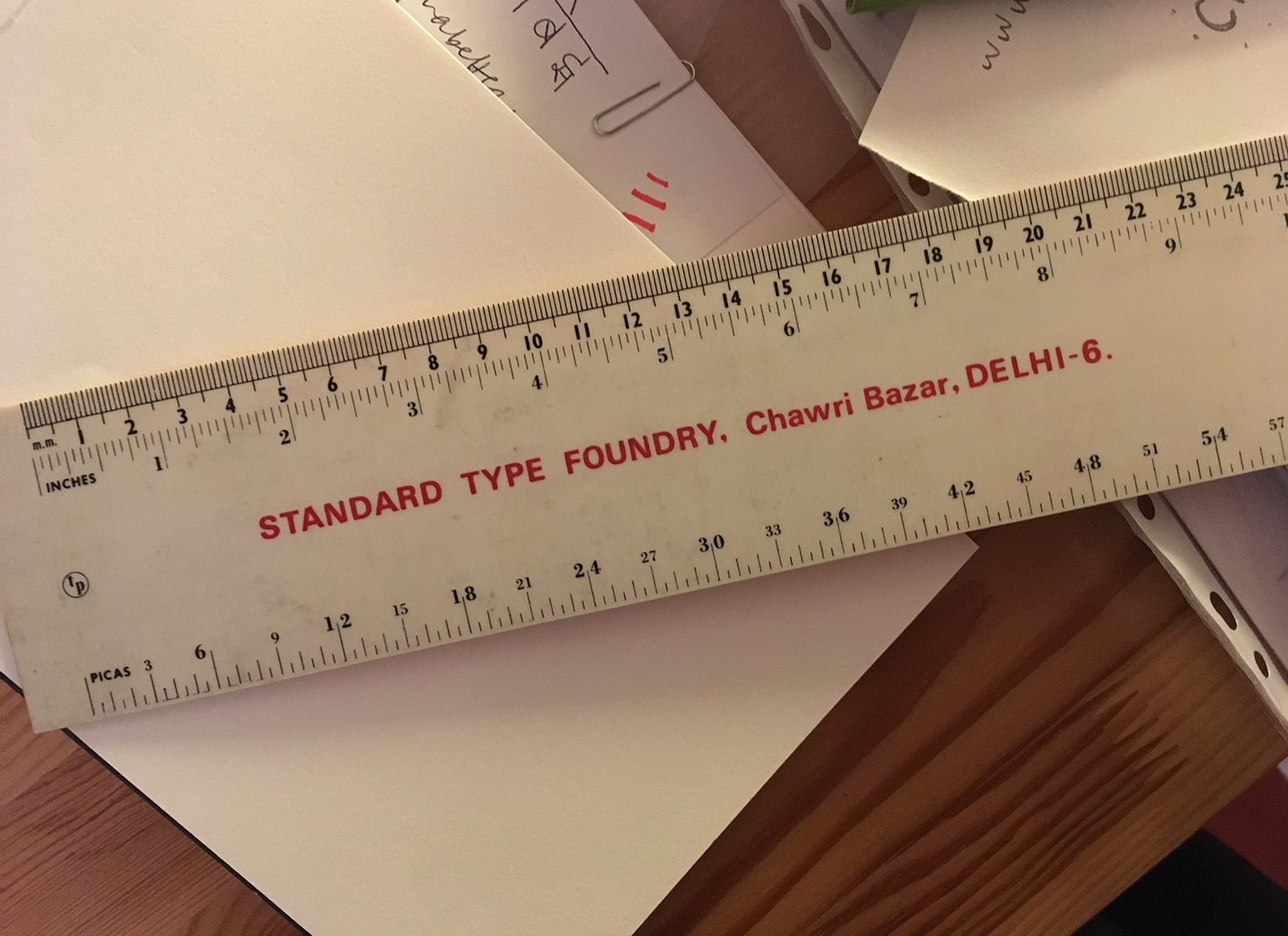
After acclimating to New Delhi – the weather was exceptionally warm for March, around 42°C (108°F) every day – I realized that traveling around the country on my own would be difficult, more likely, impossible. Instead, I decided to focus on researching type in Delhi. First and foremost, I visited the small design studio of Ishan Khosla. There, I was warmly welcomed and Ishan gave me a ruler he got from someone, mentioning that “the foundry may still exist in Old Delhi”. The Standard Type Foundry. That is all I needed at that time: a challenge!

Remember December: Standard Type Foundry – 03/12/17

Remember December: Standard Type Foundry, New Delhi

Continue reading

Remember December: My parents at a type conference

My parents, Manos and Diane. They have slightly parted in this picture to show that Anthony Bourdain is dining behind them.

Shortly after my return from TypeCon Seattle in 2016, my mom had an idea: “You get to go to these conferences in cool cities, next time we should come with you!”. The next conference I was planning to go to was Typographics in New York – a city neither of my parents, despite being world travelers – had ever visited. It was fate.

Continue reading