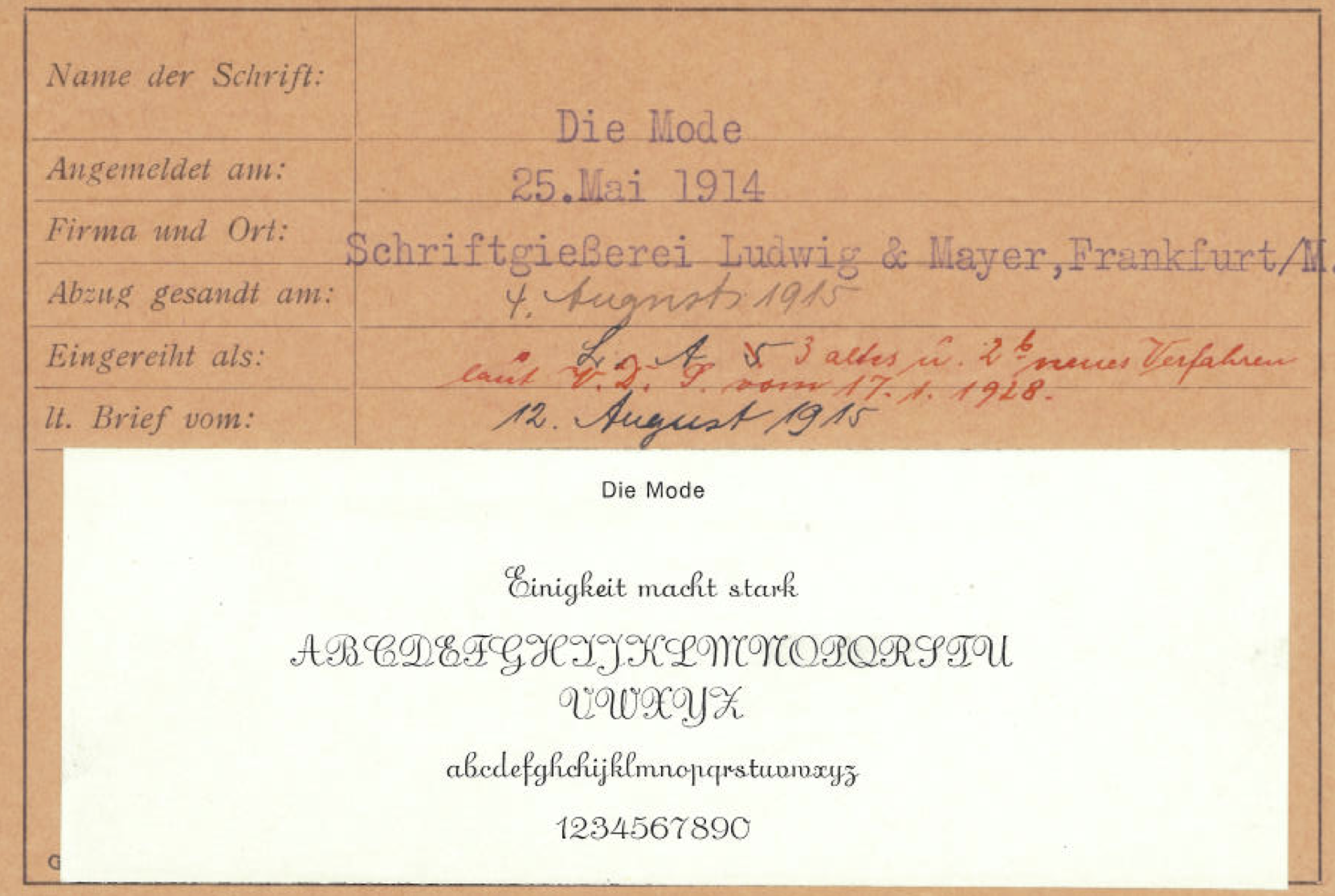
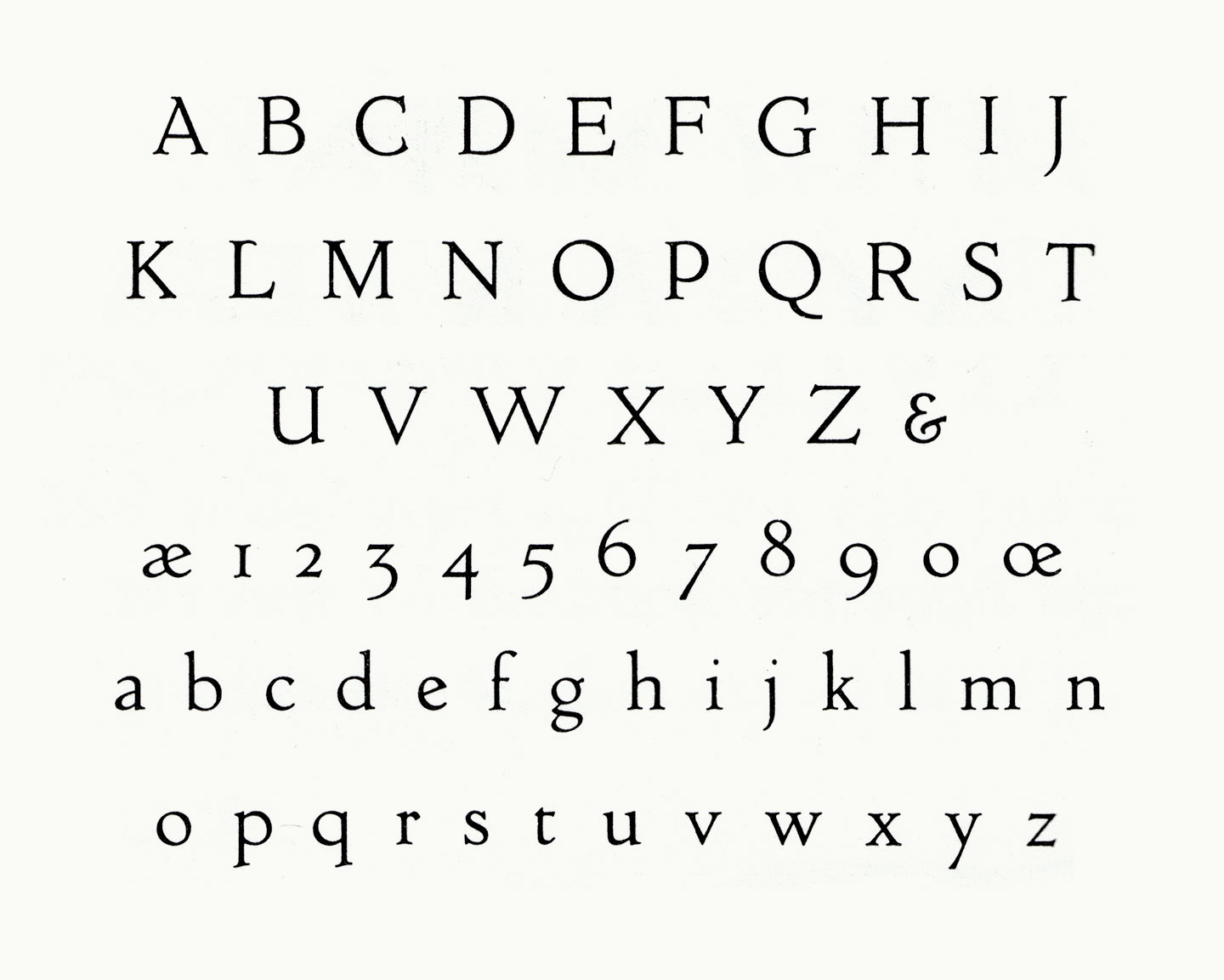
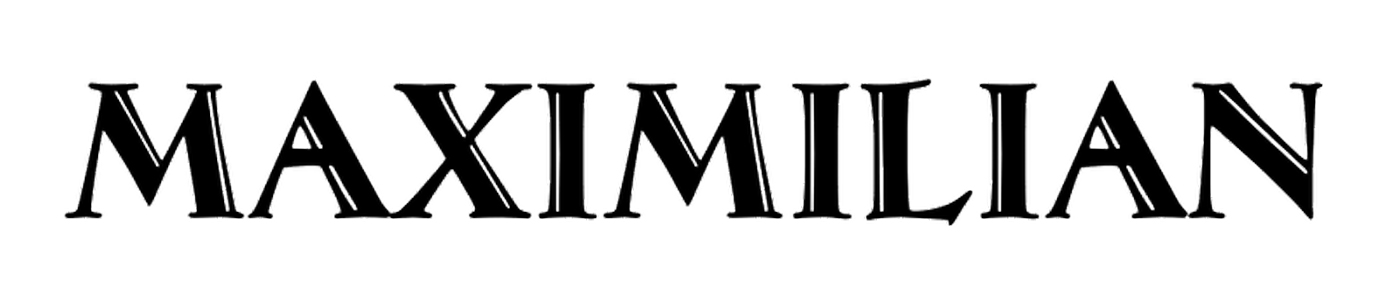
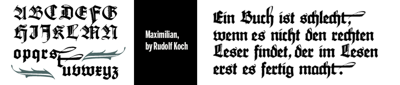
Rudolf Koch began experimenting with pre-Fraktur letterforms he named ‘Maximilian,’ after Emperor Maximilian, an early benefactor of Gutenberg, during the years preceding World War I. Ultimately these experiments in forms — mainly swashes that occupied awkward white space in an otherwise-orderly block of blackletter in the typesetting of prayer books — led to the creation of Koch’s Maximilian Antiqua. Notably, I could find no evidence that Koch explored opportunities using simple .calt features, but more on that later.
Schmalfette Sensation
If you judge its look by the sound of its name, Schmalfette Sensation would be the Humpback anglerfish of typefaces. This name makes images of freakishly deformed bizarre caricatures of letters pop up in your head, even if you are used to the crudeness of spoken German.
Koralle

Koralle by Schelter & Giesecke, Leipzig, is a breath of clear fresh air after the surge of gnarly grots and artsy spawn of recent years. Neither totally geometric nor too hyggelig humanist, it combines simplified letterforms — e. g. its signature lowercase a — with traditional proportions for good readability. (What I used to tag as “trans-sans”?)
Centaur

You are surely aware of the titling caps that the great Mr. Bruce Rogers has drawn for the Metropolitan Museum of Art in New York (what is that I hear about a logo? No, these were great). It is fantastic news that he decided to add a lowercase: 1915 saw the expansion of the design into a masterful 14-point text face, which was cut by Robert Wiebking (of Goudy fame) and privately cast by Barnhart Brothers & Spindler. The face was first used by Rogers in his recent edition of Maurice de Guérin’s The Centaur, published in just 135 copies by Carl P. Rollins’ Montague Press. (Get it if or while you can, I’m pretty sure this one’s gonna be popular.)
Goudy Old Style
Society Section, Forest Hills Gardens Gazette, March 16, 1915, Forest Hills Gardens, New York
About Town with Mrs. H. Puterschein
Frederic Goudy, a local printer and independent designer of typefaces (and a real live-wire!), was recently “discovered” by the powerhouse American Type Founders Company. After gaining recognition for Kennerley Old Style, his classy 1911 custom design for publisher Mitchell Kennerley, Mr. Goudy caught the eye of ATF bigwigs.
Die Mode
If you’re a modern bird with a flair for fashion, look no further than Die Mode: a stylish, upright script face with delightful features. Published by the German foundry Ludwig & Mayer, Die Mode is both elegant and casual, with just enough personality to make those victrola dance party invitations feel fancy and jovial. Need to dress up your Callot Soeurs frock with a typeface that matches your modern style? Die Mode has you covered, way below the knee. Uppercase characters spare no details when it comes to curves that say sophisticated and friendly. Because “Fashion Demands Longer Skirts and Waistlines” Die Mode’s connecting lowercase characters gives it a distinctive, flowing style. If Parisian and Phyllis had an eccentric cousin, she’d be Die Mode. Sure, there might be a World War happening, but Die Mode doesn’t care. Inspired by calligraphic traditions in a hot new feathered hat, Die Mode is a fresh take on a new era in post-Belle Époque script type.
Zilvertype

I was excited to see a new book face designed by Sjoerd Hendrik de Roos of Lettergieterij Amsterdam (aka Tetterode). We’re all, of course, still reeling from the incredible success of his Hollandsche Mediaeval just a few years ago: That text face (the first one designed by a Dutchman since the days of the great Fleischmann!) is quickly shaping up to be near-ubiquitous in books printed here in the Low Countries.
If you like Hollandsche Mediaeval, you may well enjoy this new face too. And if you don’t — maybe because of its cheerful roundness, its Art Nouveau-like detailing, or simply because IT IS EVERYWHERE — you may be relieved to hear that this face will not follow its predecessor as a bestseller; simply because it’s not for sale. De Roos designed it exclusively for the Hague-based private press De Zilverdistel, working closely with his client, Jean François van Royen.
Caslon Openface

It’s talked about everywhere — typefaces are expected to be available in large series these days, not just a handful of fonts. The good folks of ATF-division Barnhart Brothers & Spindlers listened and added an open/inline variant to their popular Caslon Series (as others are doing, too). According to BB & S’s marketing material, it’s “light, airy, dainty [blah…] and decidedly French”. This is a fun stretch as almost all of us would think of Caslon as decidedly English. Compared to Caslon’s Inline, Caslon Openface features many totally different letterforms and has a much smaller x-height.
Hobo Light
The first styles of Hobo were released by ATF in 1910. There are different theories about why Hobo is called Hobo, one being that it was left behind in the drawers of designer Morris Fuller Benton for so long that the typeface was known as “the old Hobo”. Other people think it was inspired by a Russian cigarette poster where the word ново (new) can be seen at the top. But it appears, the inspiration for Hobo’s letterforms came from a different word on the poster — Чудно. (Read the full story here.)
Ella Cursief
The year is 1915 and the typeface is Ella Cursief. While the name might imply that it is intended for the ladies that can’t be true because women do not even have the right to vote yet. Honestly, this is a typeface that simply cannot be pinned down by something so mundane and banal as a stereotype.


