Designed by Sabrina López
Distributed by Typesenses
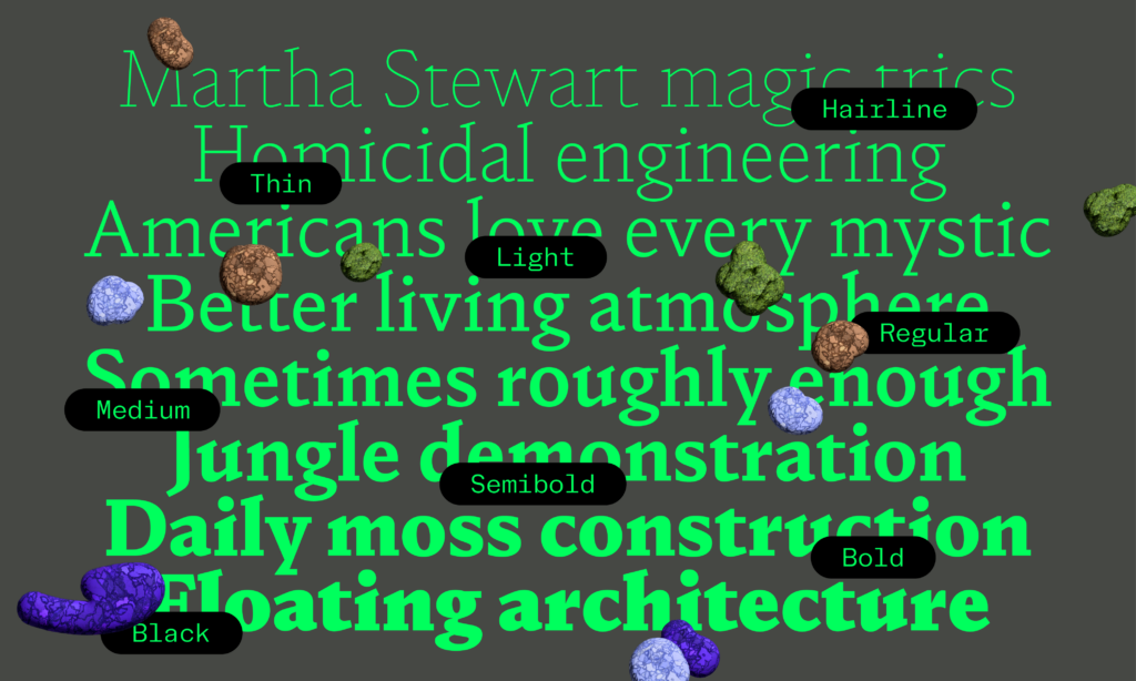
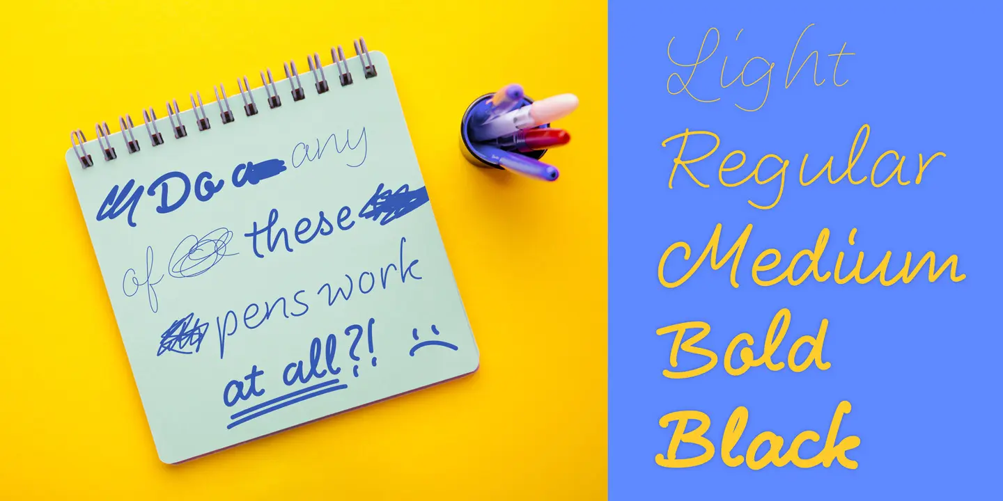
Font family: 6 weights, 2 styles (regular and italic) + variable font
This font review was originally written in Spanish, the colonial language of Argentina. Before colonization, the native people used various languages such as toba, pilagá, mocoví, wichí, nivaclé, chorote, tapiete, quichua, tehuelche, mapudungun, guaraní, vilela, chaná, among others.
English translation of the review below.
Sabrina López es una diseñadora especializada en fuentes display, vive y trabaja en Argentina. Inició Typesenses en 2009.
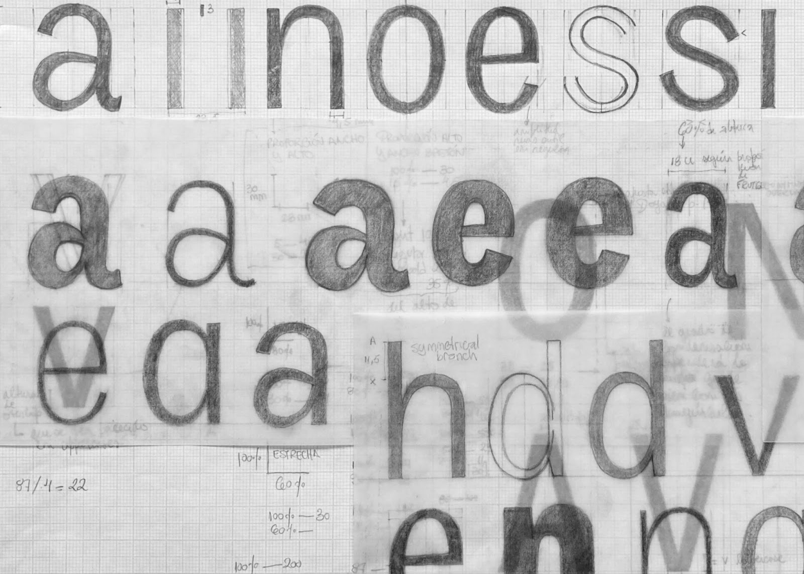
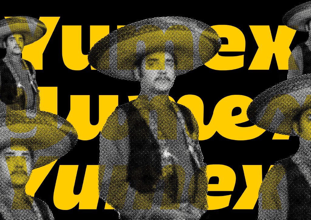
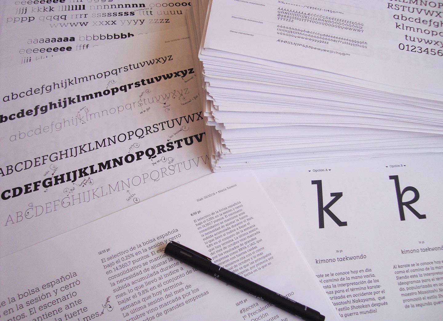
Honesta es una grotesca que se deja seducir por la caligrafía e irrumpe en el catálogo de Typesenses, repleto de tipografías decorativas, display y ligadas. Muestra el rastro de la metodología de trabajo artesanal de Sabrina López, caracterizada por la búsqueda de referentes históricos, el dibujo a mano, mucho papel calco y una gran cantidad de bocetos y borradores a lápiz.