5 years of Alphabettes

"Alphabettes" made out of Wood type

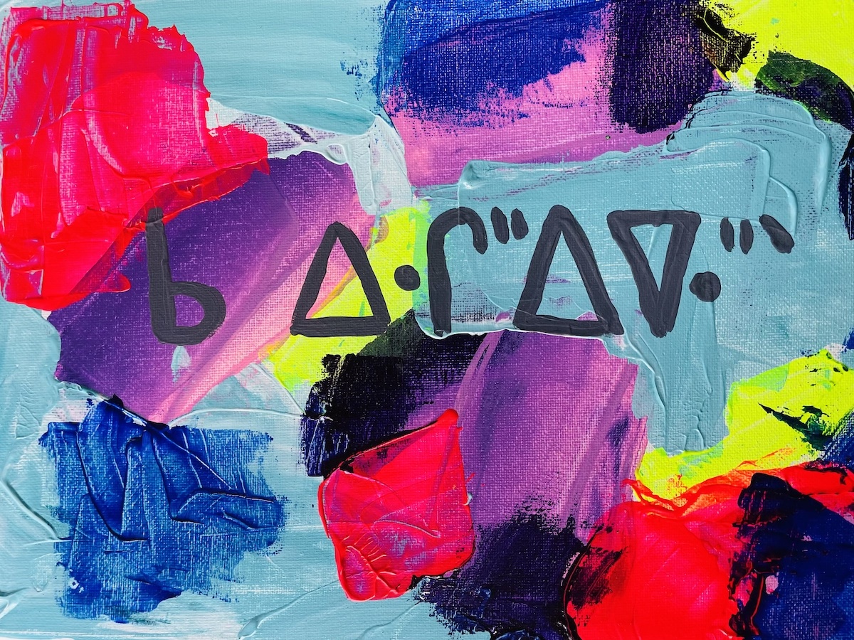
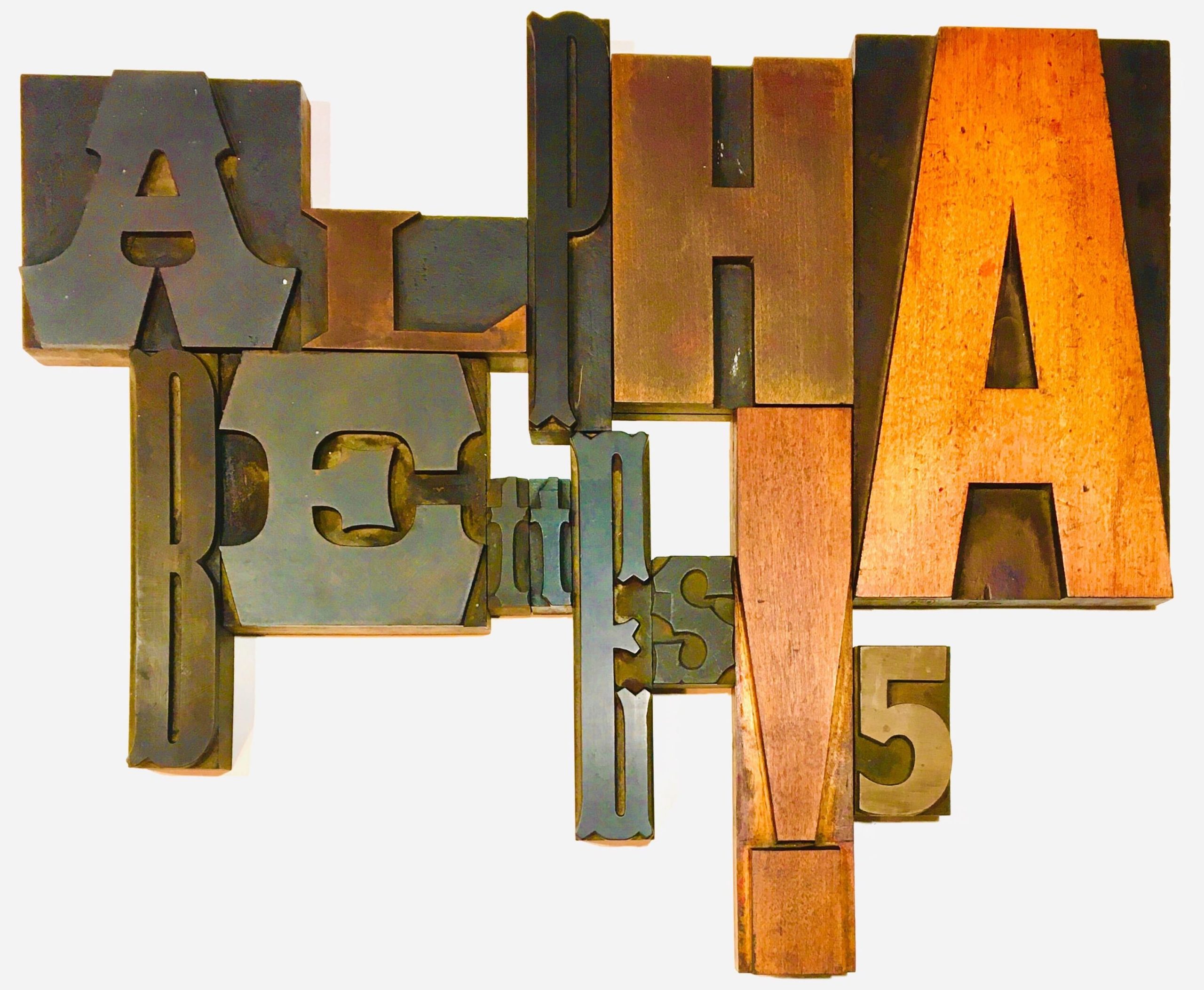
Wood type composition by Grendl Löfkvist

This September, we’re celebrating five years of Alphabettes. Five YEARS?! While the past six months feels like 20 years, it can’t be possible that we’ve been cultivating this tiny plot of the internet for that long, can it? And yet, here we are.

According to reliable sources like Grendl, a 5 year anniversary is celebrated with the gift of wood, to represent the durability of the relationship (psst, you might be seeing some wood type around these parts over the next month). Wood is durable, but it can also show signs of its natural aging process. Kind of like Alphabettes.

What is Alphabettes, anyway? I ask myself that question everyday.

Alphabettes is a disorganized group of (sometimes) loud and (always) opinionated women who share a love of type and lettering. We respect the diverse lived experiences of women in our industry and we can continue to do better to honor and celebrate this. At its roots, Alphabettes supports and promotes the work of all women in type even if everyone doesn’t agree with what we publish or how we (dis)organize ourselves.

Alphabettes is built on the stamina of its contributors. We tend to favor spontaneity over perfection. Sometimes, what we do doesn’t live up to expectations. Sometimes (A LOT of time) we disagree. Some people would like to see us more organized, more transparent, more scholarly, or more conventional. It’s never been perfect but here’s the rub: Alphabettes currently has no sponsors, no membership fees, no budget, no heavy-handed editorial policies, and no hierarchies. There are no profit margins to meet, no board members to appease, and no silent benefactors to placate. Despite this (or perhaps because of this?), a lot of good things have come out of the mix:

• Since 2016, the Alphabettes Mentorship program has helped connect hundreds of professionals with newcomers in the type world. Kudos to Liron Lavi Turkenich, Shani Avni, Eleni Beveratou, Veronika Burian, Katy Mawhood, and everyone else throughout the years (especially Bianca Berning and Isabel Urbina Peña, who started it) has built this amazing initiative.

Alphacrit has offered over 10 sessions in the past two years for newcomers to have in-progress work critiqued by two seasoned professionals. Nicole Dotin steers the formidable boat (shout-out to co-founder emeritus, Luisa Baeta) with a wonderful crew of volunteers including Sol Matas, Tanya Maria George, Vitória Neves, Tamye Riggs, Lila Symons, and Tânia Raposo.

• Since 2015, this fine blog you’re reading has published over 300 articles on type and lettering, industry commentary, research in the field, interviews with experts, quite a few series, and has featured nearly 130 headers by women in the type fields. Phew! It’s impossible to name every person who has written, edited, reviewed, code-tweaked, cheerleaded, or contributed to this effort. Big thanks to Elena Schneider who seamlessly ensures the header updates every other Thursday forever and ever.

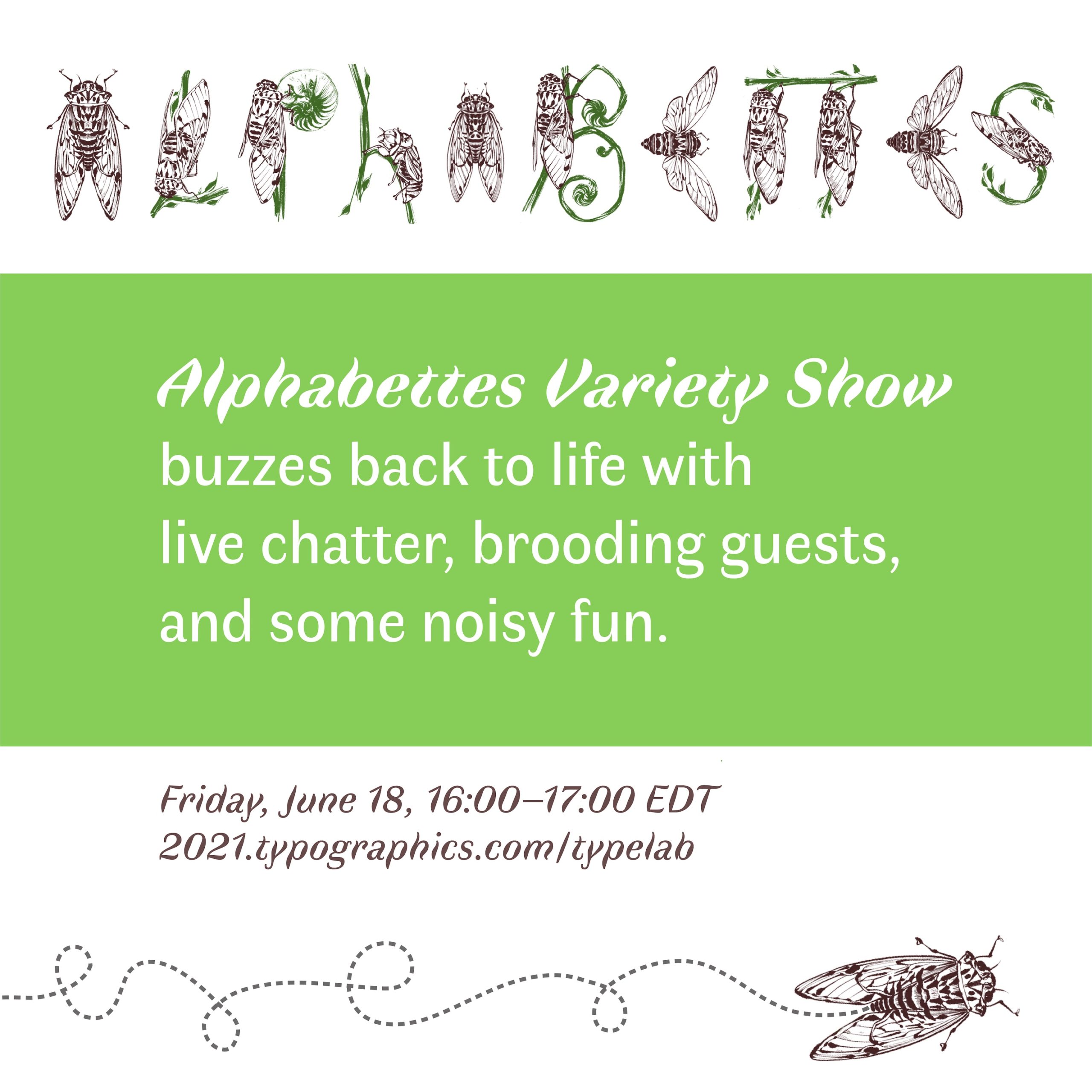
• We’ve hosted several live, quasi-chaotic events through the years, including three editions of the Alphabettes Variety Show at the Typographics conference in NYC and the global 24-hour Hangout.

• Our Instagram feed is taken over each week (or so 😬) by a member of the Alphabettes network, featuring their work, research or things that inspire them.

• Sometimes we get into good trouble on Twitter but hey, what’s Twitter for anyway?

• More women have spoken at type conferences and events in the past five years than ever before. We’ve done our best to respond to every request for speaker recommendations, to circulate calls for speakers within our network, and cheer on those who need the extra push.

• We adopted the 💌.

• Some more things I am probably forgetting because I, probably like you, haven’t slept much in six months.

What’s next for Alphabettes? Good question. The Mentorship Program and Alphacrit are going strong and who knows what other ideas we’ll think up in the future. Do you want to publish an article, submit a header or something else? Please get in touch. It’s hard to know when a labor of love has lost its spark or when to gracefully move on. Spontaneity and disorganization can come at a cost but, for now, this place is still worth it. Here’s to five years, and maybe, if we feel like it, five years more? Knock on wood 😘.

Exhibition Review: Five Hundred Years of Women’s Work

Nestled behind a Romanesque-inspired Methodist Church on 59th St and Park Avenue, entering the Grolier Club conjures a spiritual experience. A private club for the most esteemed bibliophiles, many public exhibitions and lectures are offered in their first and second floor galleries. One day, you might even be granted access to the heavenly third floor, aka the Holy Grail of All Things Bookish: the Grolier Club Library (ok, ok, all you really have to do is ask).

exhibition space with large screen with main exhibition graphic on a large digital screen

Main exhibition hall at the Grolier Club / my preferred house of worship.

Continue reading

One Press Many Hands:
APHA Conference Notes

Not long ago, I had a revelation:

The American Printing History Association (APHA) 2019 conference, “One Press Many Hands: Diversity in the History of American Printing”, held at the University of Maryland, College Park last weekend, proved this theory correct. Just to be clear, I love all sorts of nerds, and identify with many nerd cultures: type nerds, tech nerds, type tech nerds, you get where this is going. But there is something about printing history that’s uniquely wonderful. Any of these nerd groups could show up at the APHA conference, enjoy talks related to their own flavor of nerdy, and learn about a tangentially-related topic. The Venn diagram of printing history includes almost all of the nerd circles I love and why I felt so warmly welcomed, despite butchering the pronunciation of APHA during my talk. (For those not in the know, it’s “AHH-FAH” not “A P H A” 🤦‍♀️ and no one even publicly flogged me for it. AIGA? TDC? It was a reasonable guess!)

cover of conference program features a historical image of a young African American man working at a press

Continue reading

Tooting some horns: new type releases!

Self-promotion can feel somewhat gross but who doesn’t love touting the accomplishments of others? The past several months have seen a bevy of new typeface releases by many talented folks, but perhaps you haven’t heard about all of them yet? In no particular order, let the horn-tooting begin. Drumroll, please!

Pigeonette sample
Pigeonette (Future Fonts)
by Ro Hernández

Pigeonette “combines the sketchiness of handwriting with the open spacing and charmingly awkward proportions of typewriters in a not-quite-monospaced design with a comfortable reading texture.” Started as Hernández’s graduation project, it’s now getting its wings on Future Fonts. Throw it some bread while support for central European languages and Cyrillic is still in the works.

Continue reading

Emojicon Takeaways

Since it’s World Emoji Day and we here at Alphabettes 💚 emoji, I want to share a few things I learned at Emojicon, a day long celebration of all things emoji, in Brooklyn, New York on Saturday, July 14. Emojicon is organized by the fine folks at Emojination, a grassroots effort to help democratize the arcane and cryptic emoji approval process. You can also thank them for the dumpling, the hijab, and the broccoli, among other emoji success stories.

Emojicon logo with o swapped in for tongue sticking out emoji and 2nd o swapped out for a heart with stars emoji

Continue reading

Remember December:
The Dinner Date Question

Despite a daily slog of despondency and rage at the state of the world, there were many personal and professional high points this year: the Alphabettes Variety Show at Typographics (and Indra yelling “Bingo!” during the conference), visiting the Letterform Archive and the San Francisco Zoo with my mom, son, and the wonderful Tânia, and a whirlwind trip to LA for the AIGA design education conference I helped organize. I also got tenure and my daughter is finally potty-trained. Those last two are equally significant.

I was already planning to attend ATypI in Montréal when Liron asked if I would like to interview conference speakers and attendees. Finally, the chance to realize my dream as a typographic talk show host! Boasting almost zero professional on-camera experience, I said yes. With designer, letterer, and ATypI-volunteer-who-happened-to-be-at-the-volunteer-table-when-I-showed-up Luke Norrad as the camera guy, we were ready to roll.

During the conference, Luke and I very professionally wandered around with our very professional gear, asking attendees a very professional question: If you could have dinner with any type person throughout history, who would it be? Some popular answers included Hermann Zapf, Beatrice Warde, William Addison Dwiggins, and Herb Lubalin (I’d totally go to that dinner party, by the way). However, there was one person whose name kept coming up as a favored guest. Luckily, he was in the room and had some ideas of his own.

The official interviews are available on the ATypI YouTube channel.

Guess what year?

On the way to a depressing union meeting on contract negotiations, I had about 20 minutes to spare so I headed to the library stacks and found a book on women in the printing trades. Here are a few quotes that jumped out:

“[W]e have never obtained a situation that we could not have obtained had we never heard of a union. We refuse to take the men’s situations when they are on strike, and when there is no strike if we ask for work in union offices we are told by union foremen ‘that there are no conveniences for us.’ We are ostracized in many offices because we are members of the union; and although the principle is right, disadvantages are so many that we cannot much longer hold together.”

“She was dressed plainly but neatly in what might be called a cross between a traveling and office suit of brown color. The toughened expression on her face indicated that she was familiar with the tricks of the profession, versed in the study of vulgarity. No tender, trusting female was she, but a hardened, suspicious, masculine woman.”

“This paper is a veritable man-hater; not the slightest mention of a man in any shape or form is to be found in its columns, neither is the genus homo allowed to hawk it!”

“At least let women have a fair opportunity to do something else besides get married. What man is there who would not resent being told that his chief ambition in life should be to be a father? Yet women are told daily that they should devote twenty years of a lifetime in the preparing for motherhood, at least ten years in bearing children, and the rest of their lives in recovering from the effects. If they prefer to think that the world is populated sufficiently, or that to bear a child does not call for the sacrifice of a lifetime, they are snubbed, and especially so when they show any inclination to compete with men in trades.”

Guess what year they’re from? Comments are open!

🚨🚨🚨SPOILER ALERT🚨🚨🚨
The answers are available below. You can also head to the comments first if you’re curious what others guessed.

Continue reading

The Pre-Vinylette Society

The PreVinylette Society exhibition

If you happen to be in the Windy City over the next few weeks, you’re going to want to head over to the Chicago Art Department to check out The Pre-Vinylette Society: An International Showcase of Women Sign Painters. Opening on Friday, September 8, the exhibition features the work of over 60 women sign painters from the United States, the UK, Canada, New Zealand, Australia, Scotland, Ireland, and Norway.

Continue reading

Facing Our Fears:
Teaching Type on the Web

This article is based on the presentation, “Web typography is just typography, sort of,” part of the Type@Cooper West Lecture Series at the San Francisco Public Library, on July 18, 2017. Watch a video of the talk or keep reading.

web design and typography exist in parallel

In many design programs, web design and typography courses exist in parallel universes. If 95% of the web is typography, then why aren’t we teaching this?

Continue reading