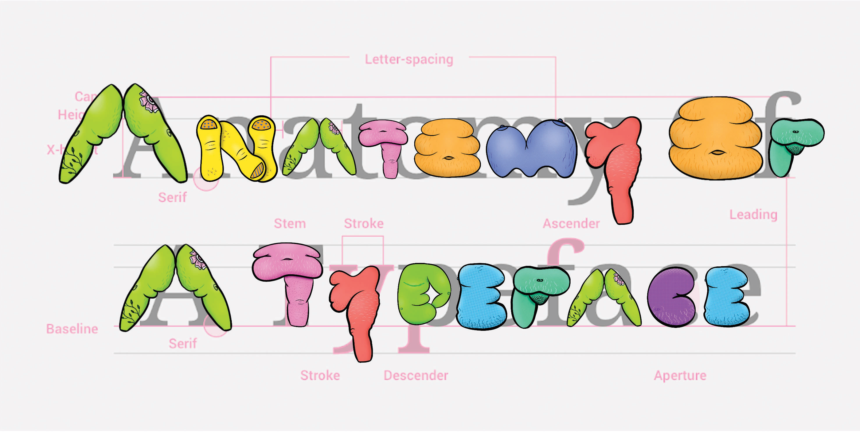
Ukrainian type design heritage in modern context

We have a strong type tradition in Ukraine. Over the past few years, Ukrainian type design has been growing rapidly. I believe that now, during the war, when Russian invaders are destroying not only our nation but also our cultural heritage, it is even more important to highlight Ukraine’s graphic and type tradition.

I enjoy creating letters that are inspired by Ukrainian architecture (for example, my Misto font), works by Ukrainian graphic artists of the last century and vernacular typography. The lettering I did for Alphabettes was inspired by the 1954 book cover created by Mykhailo Dmytrenko. I like to take historical samples as a basis and rethink them more or less in a modern context. In this way, you can build a bridge between the past and the present. Visual communication becomes stronger and makes sense.

Mykhailo Dmytrenko, 1954

Continue reading

Linocut Lettering

When I first started brainstorming header ideas, I knew I wanted to execute it by hand. There is something comforting in the unpredictability and uniqueness of a linocut print. During my time at Starbucks Global Creative, I had the opportunity to explore linocut block printing in quite a bit of my work. What interested me was mixing lettering and linocuts, much like letterpress.

Samples of my work from my time at Starbucks Global Creative.

Continue reading

Gingerbread Advent Calendar

This time four years ago, I was scrambling to finish the semester’s final projects in my senior year of college. In other words, highly suggestible to distractions. I was chatting with my mother on the phone, already a distraction, and she mentioned in passing the idea of making advent calendar numbers out of gingerbread. To which I was like, I will drop everything to complete this task IMMEDIATELY.

I’ve done it again every year, always drawing my own brand new set of numbers and executing them in cookie and icing. For the fifth year, I thought I’d tell you all about my Type A bullshit tips and tricks and secrets for how to do it from start to finish, should you wanna plan to decorate cookies for your roommates or family this year, or have an outing to avoid.

past-calendars

Continue reading

The Perfect Pumpkin Patch Signs

Autumn is serious business around here. During decorative gourd season, signs sit at every intersection directing weekenders and leaf peepers to the best apples, pumpkins and cider donuts in town. Most signs are pretty unremarkable. Except for these. 

2016-10-30-11-49-14-jpg

Hand painted with a distinct lettering style and wacky colors, they’re noticeable and lovely and always brighten my day.

Continue reading

The Chosen Contrast

I recently had a revelation. I’ve been staring at reverse-contrast typefaces for the majority of my life, and the fact that it materialized during my year at CooperType was no coincidence.

As a child/preteen, Saturday mornings were spent at my local reform synagogue in addition to one weeknight at Hebrew School (which I begrudgingly attended). At that point in my life, I had no knowledge of design or typography but developed the skills of reading and writing Hebrew in both classic and cursive form. It never occurred to me that the Hebrew characters looked different from other letterforms, the only contrast (pun intended) apparent to me was the fact that Hebrew is read from right to left as opposed to left to right.

Me reading my Haftorah portion during a Bat-Mitzvah rehearsal with my aunt, uncle and cantor looking on.

Me reading my Haftorah portion during a Bat-Mitzvah rehearsal with my aunt, uncle and cantor looking on.

Continue reading

Knile, a Contemporary Slab

It seems slab serif typefaces are taking over the market. In 1990, PMN Caecilia proved that it was possible create a slab with a more humanistic approach, a style that could work, not only as a display typeface, but for running text as well. In the last decade the diversity in slab designs has grown. The constructed shapes of the serifs adapt to the pixel grid, and they usually work well on screen. We have many different options for slab text typefaces. Some, like Ernestine, include several scripts, while others, like the recently released Equitan, are a part of large families. The rather squarish appearance of classic Egyptians, coexist today with more rounded lettershapes in new slab designs.

Knile is a newborn within the genre. It is a collaborative project with the Spanish design studio Atipo. The original idea was to create a slab counterpart for the existing typeface family Geomanist. Slab serifs are not just sans with added terminals; they have intrinsic design peculiarities. As far as we wanted the typeface to be functional as a text typeface, many changes were necessary and the design evolved into a typeface family with its own personality.

Printing tests made during the design process

Printing tests made during the design process

Continue reading

Design of a Handwritten Devanagari Typeface

Mr. Sharad Deshpande has been a prolific copywriter for 50 years and an intrinsic part of Setu Advertising, Pune. Mr. Deshpande maintained many diaries documenting his writings and what made them extra special was his beautiful, neat handwriting. It was when he suffered a mild paralysis attack, that he lost the ability to write, a couple years back. It was disheartening for a copywriter who was so proud of his writing, to not be able to continue doing what he loved so much. But his sons decided to gift their father something very unique on his 76th birthday – his handwriting. His son, Rugwed saw great potential in converting his fathers handwriting into a font and approached me with this project proposal. This gesture was extremely overwhelming and it’s been a humbling experience to be a part of this project.

scan_handwriting
Scan of the handwriting from Mr. Deshpande’s diary.

Continue reading

Elido by Sibylle Hagmann

… and a bit about type on the web in general.

It’s long overdue that we introduce you to Elido more. I won’t even need that many specimen images because it’s the typeface you are reading right now. When we were discussing the fonts for the Alphabettes blog, we were after something that looks appropriate for very diverse content that we didn’t have yet — potentially long or maybe short, serious, delightful, angry or funny — and that is comfortable to read and rendering well on the web. All demands that many editorial sites share.

elido_specimen

Elido specimen images by Sibylle Hagmann

Continue reading