… and a bit about type on the web in general.
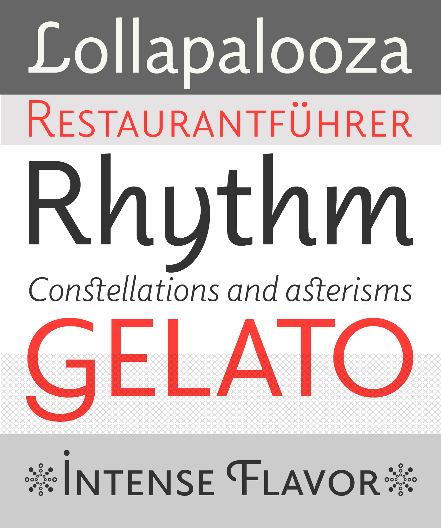
It’s long overdue that we introduce you to Elido more. I won’t even need that many specimen images because it’s the typeface you are reading right now. When we were discussing the fonts for the Alphabettes blog, we were after something that looks appropriate for very diverse content that we didn’t have yet — potentially long or maybe short, serious, delightful, angry or funny — and that is comfortable to read and rendering well on the web. All demands that many editorial sites share.
Elido specimen images by Sibylle Hagmann