If you are also tired of seeing the ever same fonts and style on the web, and the rich typefaces getting richer, here is a running shortlist of potential body copy typefaces for alphabettes.org I once compiled. I did not test how they look in extended text yet, nor rendering across platforms/browsers. That would be the next step (and we’re also still quite happy with Elido although see that we could use more extensive language support). But maybe you are looking for a fresh, lesser seen typeface and want to check some out anyway. Trying on new clothes is luckily quite easy if you have a website up already, e. g. with tools/bookmarklets that swap out the fonts you currently use, like Webtype’s Font Swapper or FontShop’s Webfonter. Also, most of the typefaces below are available on Fontstand or as trial versions from the foundries, so you can test them locally or in mockups. Let us know if you end up using any at some point.
The Value of Curiosity: TYPO Berlin 2016 in Review
Design conferences are everywhere. Our profession as type designers, typographers and graphic designers is moving fast and we are lucky to have these events where we can get together, learn from each other, gawk at some amazing portfolios and get inspired by the greats.
Perhaps a poignant talk with Jonathan Barnbrook in eggshell-treading-interview format, where intersections between politics and design come to light, together with gloriously great, and now absent, hair?
Or a warmly technical talk about the mechanics of reading and optical sizes with Tobias Frere-Jones, announcing Mallory MicroPlus, which addresses the challenges of small text and screen text simultaneously?
What about Nadine Chahine explaining how the way we read affects our daily life?
Congrats, But …
Two little tweets in an ocean of tweets. What harm can they do, especially when their message feels overwhelmingly positive?
Last week, Indian Type Foundry (ITF) sent out the following tweet in reaction to this showcase of type designers who also happen to be women:
Who said there’s no gender equality in type? Out of 30, 14 of our designers are female. @AdobeCreate @shiva__n pic.twitter.com/9NMqGkc7q4
— Indian Type Foundry (@itfoundry) May 4, 2016
Lifelines & Bright Lights — Talking With Nina Stössinger
In our last interview, Sol chose Nina Stössinger to be the next interviewee. The research and work that is done in the background for this series is truly joyful. But, it’s impossible to compress everything I have learned about each interviewee into five questions. I am trying to show a glimpse of the many things each inspiring lady is doing and thinking, and in Nina’s case it was a huge challenge.
The timing of publishing this works perfectly with the week’s events, and Nina herself fits well into conference discussions and talks. When I first met Nina, it was a one-way meeting. I was watching her give a talk at Ampersand conference, and despite the disappointing gender ratio of speakers, I was thrilled to hear another great female speaker. I had much to ask, and her precise answers will surely leave you wanting to read more. So get yourself a sweet or savory treat, preferably of a kind that you can refill your bowl with, and read on:
Continue reading
Language as Design Criteria? Part III
During the research for my dissertation, Language-specific type design, I came across some inventive ways to deal with a language’s idiosyncrasies. Excessive use of diacritics and the resulting jaggedness of written language is one of the challenges typeface designers face frequently. This is a small selection of ways designers tried to master it for some of the Slavic languages in the past.

Preissig Antikva, Vojtěch Preissig, 1924
Knile, a Contemporary Slab
It seems slab serif typefaces are taking over the market. In 1990, PMN Caecilia proved that it was possible create a slab with a more humanistic approach, a style that could work, not only as a display typeface, but for running text as well. In the last decade the diversity in slab designs has grown. The constructed shapes of the serifs adapt to the pixel grid, and they usually work well on screen. We have many different options for slab text typefaces. Some, like Ernestine, include several scripts, while others, like the recently released Equitan, are a part of large families. The rather squarish appearance of classic Egyptians, coexist today with more rounded lettershapes in new slab designs.
Knile is a newborn within the genre. It is a collaborative project with the Spanish design studio Atipo. The original idea was to create a slab counterpart for the existing typeface family Geomanist. Slab serifs are not just sans with added terminals; they have intrinsic design peculiarities. As far as we wanted the typeface to be functional as a text typeface, many changes were necessary and the design evolved into a typeface family with its own personality.

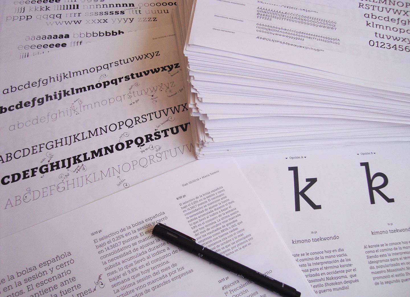
Printing tests made during the design process
Design of a Handwritten Devanagari Typeface
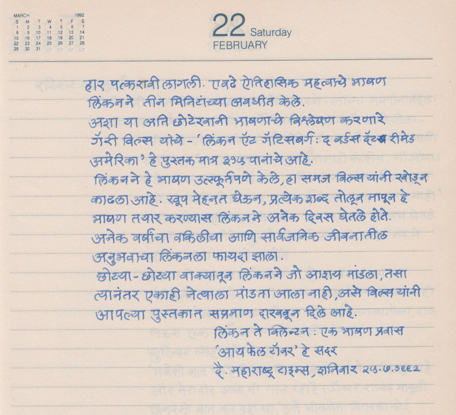
Mr. Sharad Deshpande has been a prolific copywriter for 50 years and an intrinsic part of Setu Advertising, Pune. Mr. Deshpande maintained many diaries documenting his writings and what made them extra special was his beautiful, neat handwriting. It was when he suffered a mild paralysis attack, that he lost the ability to write, a couple years back. It was disheartening for a copywriter who was so proud of his writing, to not be able to continue doing what he loved so much. But his sons decided to gift their father something very unique on his 76th birthday – his handwriting. His son, Rugwed saw great potential in converting his fathers handwriting into a font and approached me with this project proposal. This gesture was extremely overwhelming and it’s been a humbling experience to be a part of this project.
Some Open Thoughts About OpenType
Typeface designers frequently seem to assume the more OT features their fonts have the better. Typeface users, on the other side, don’t always share this delight. They are often stressed by the complexity, don’t get any sense out of them or just ignore the features. Since I am both a designer and a user of typefaces I tend to sway from one position to the other.
In my work, where I am involved with script typeface design, OpenType features and coding play a very big role. I would say that a natural looking contemporary script typeface is not imaginable without an extended OT feature code.


