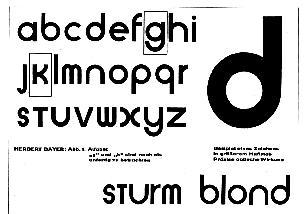
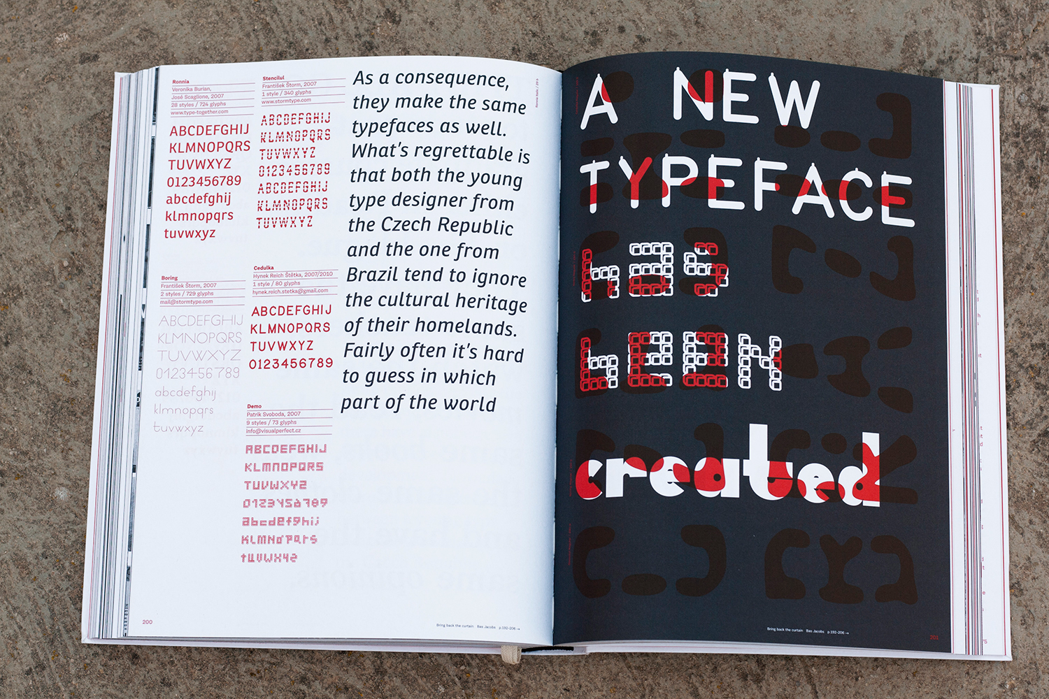
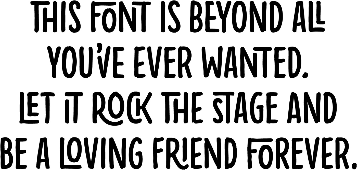
The lack of aesthetic compatibility between Latin uppercase and lowercase letters has long been a topic for discussion among type designers. The mismatch is particularly apparent in written German in which the first letter of all nouns is capitalised (see Part I for more background). In the 1920s and 1930s, experimental proposals to harmonise German were put forward. Attempts ranged from reformations of spelling and grammar, to designs for universal alphabets which tried to connect the various languages of the Latin writing system. This is a very brief introduction to some of those ideas.
Before They Were ’bettes
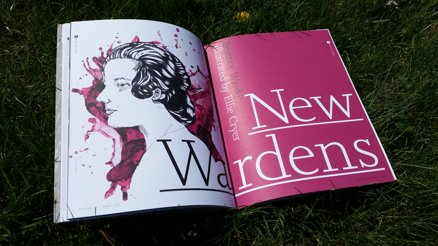
Cover spread of “The New Wardens” in The Recorder #3. Illustration by Ellie Cryer. Additional illustrations by Ping Zhu, Ellie Foreman-Peck, Maya Stepien and Kelsey Dake.
Last spring, I was approached by Emma Tucker, the editor of Monotype’s recently revived magazine The Recorder, to write an article about women’s contributions in type for the upcoming issue. I pitched a series of interviews with women who were championing type and typography à la Beatrice Warde, given her deep connections to the original publication. Besides Shelley Gruendler, I had no prior personal contact with Indra Kupferschmid, Mariko Tagaki or Elizabeth Carey-Smith. Selecting only a handful of modern-day Beatrices was challenging; my list of potential interviewees was quite long. Ultimately, I tried to gather a variety of perspectives that included educators, practicing designers, and those active in contemporary discourse. I could have never imagined, only a few months later, they would all become an integral part of this thing called Alphabettes. Before it sells out, check out The Recorder Issue 3, featuring a host of engaging articles and contributors, as well as my interviews with “The New Wardens”. They’re in great company.
Language as Design Criteria? Part I
A recent conversation on TypeDrawers about cultural preferences in typography threw me right back to 2011 and the months before I submitted my dissertation for the MA in Typeface Design at the University of Reading. Back then I attempted to find out if there are typefaces that suit some languages better than others and whether or not we can draw conclusions from their designs.
I was inspired by Ladislas Mandel who said that the designer ‘needs to analyse the characteristics of his supposed reader socially and culturally and choose shapes accordingly’ in order to achieve high legibility [1]. Richard Southall also touched on the topic in his article ‘A survey of type design techniques before 1978’ [2]. In his opinion, one makes different decisions on the fitting (spacing and kerning) of a typeface depending on the language the test document is set in.
I was left wondering if, for example, condensed typefaces are especially suited to typeset languages with a high frequency of long words. Or, if languages which make heavy use of diacritics require a lowered x-height. Should language be design criteria?
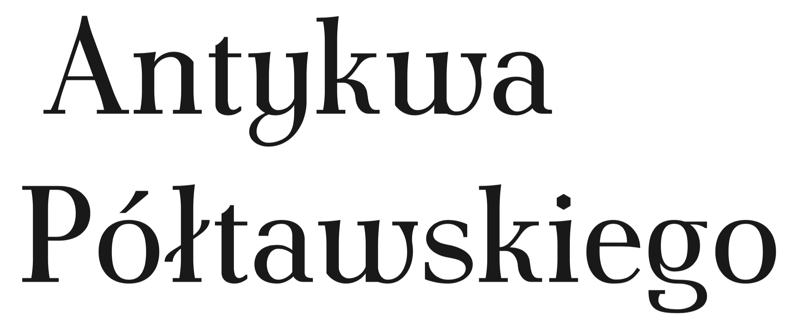
Antykwa Półtawskiego by Adam Jerzy Półtawski was designed for use in Polish
Character Spotlight: Latin lowercase s
Every letter in the alphabet has its own history. They change with time, and it is part of the type designer’s job to give shape to those changes. We set out to celebrate a letter that most designers would agree to be one of the most challenging forms to design in the Latin alphabet, the lowercase s.
The origins of this letter led us to the Phoenicians (1500–300 B.C.), who used three different forms: shin, shade and samekh. The shapes of the letters were simplified drawings of their names, for instance shin means teeth. This letterform is the predecessor of the Greek sigma, which evolved into the Etruscan S, and later on into the Latin form.

Inscriptions of Phoenician shin, Greek sigma, Archaic Etruscan s, and Latin uppercase s
Why Do We Need More Typefaces?
As a type designer, every so often, one is confronted with the question “Do we need more typefaces?”. As somebody who makes a living out of creating typefaces, the obvious answer is yes; however, here are other less subjective reasons in favour of new type designs.
Beyond TYPO Font
Graphic designers who still don’t know what OpenType features can do for them—beware! Artist Steff Stefanidad and I, type designer Ulrike Rausch have spent the past few months in the lab, cooking up a very special typeface for the TYPO Berlin 2016 conference identity:
Elido by Sibylle Hagmann
… and a bit about type on the web in general.
It’s long overdue that we introduce you to Elido more. I won’t even need that many specimen images because it’s the typeface you are reading right now. When we were discussing the fonts for the Alphabettes blog, we were after something that looks appropriate for very diverse content that we didn’t have yet — potentially long or maybe short, serious, delightful, angry or funny — and that is comfortable to read and rendering well on the web. All demands that many editorial sites share.
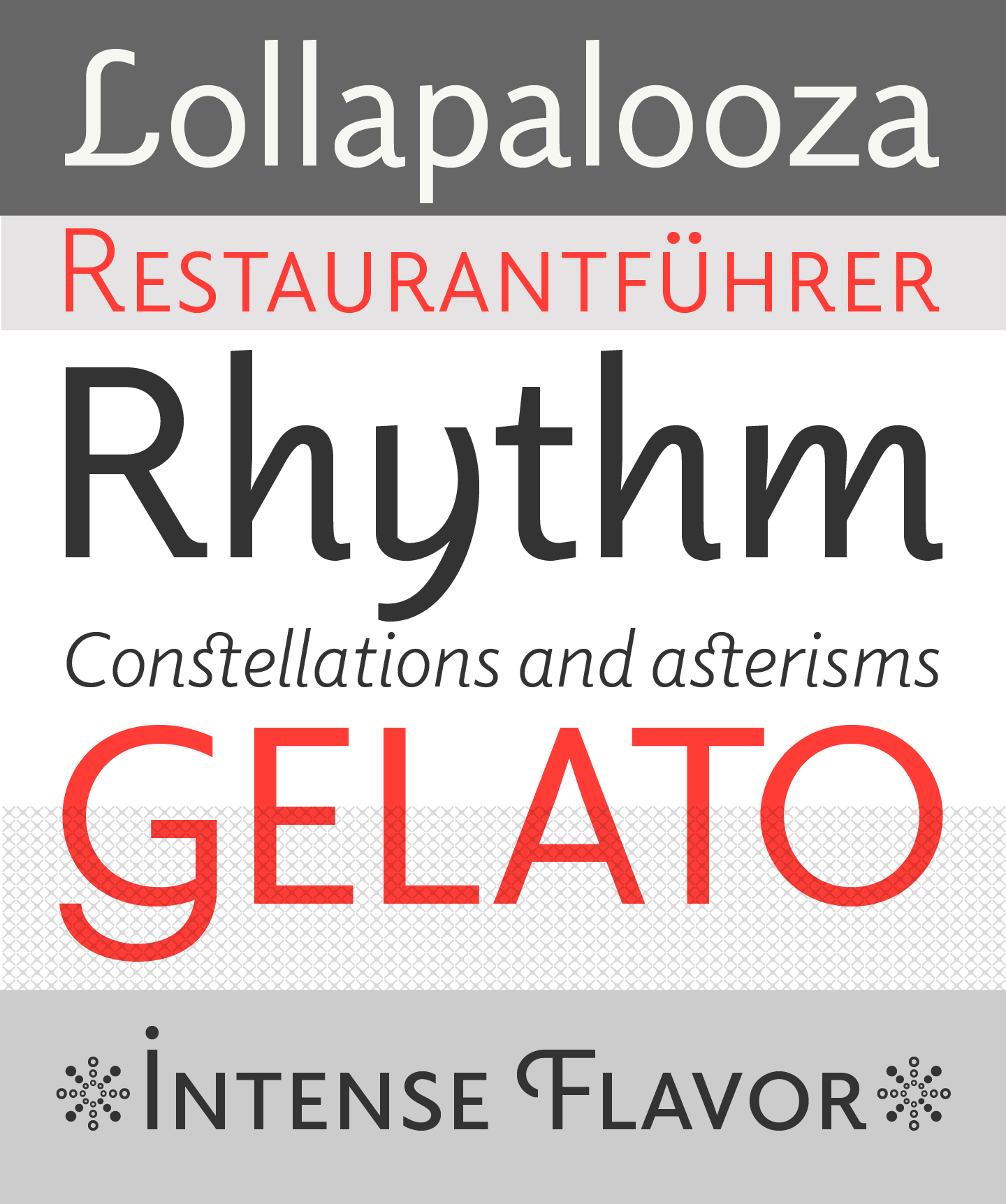
Elido specimen images by Sibylle Hagmann
Mentorship Program
***June 29, 2019 Update***
For the past three months we have been making progress behind the scenes of our new and improved mentorship programme.
This is taking some time because sorting out our online privacy policy is more complicated than we anticipated. We want to make sure we are respecting your personal information. Our legal team is on it and we will be ready to go soon!
The Alphabettes mentorship program team
***March 19, 2019 Update***
After three years of matching mentees with mentors and collecting learning experiences, we realised that we need a short hiatus in order to grease our wheels. We are now in the midst of improving the application process and we will be back soon, with shiny updates.
For the moment, we will not be accepting new applications. For those of you who applied and have not been contacted yet, your requests are safe with us and once we reintroduce the program you will be our top priority.
We believe in the impact and the potential of this program and we are working hard to maximise it. Thank you for your patience!
The Alphabettes mentorship program team
(March 29, 2016)
As the first of hopefully several outreach activities, Alphabettes is happy to announce that we are starting a mentorship program. The aim is to help people, especially students and professional newcomers, to immerse themselves in the industry.
If you are looking for career, industry or educational guidance by professionals in the fields of type, typography, or the lettering arts, please fill in the form and we will try to match you with mentor who can guide you to achieve your goals.
If you are working in this field and want to volunteer as a mentor, please fill in the form and we will get in touch.
FAQ are listed below. If you have any additional questions, drop us an email: mentorship@alphabettes.org
What will you do with my information?
We will keep the information you provide confidential but may share parts of it with potential mentors to find the right match for you. Please be patient, it may take a bit until you receive a reply.
Can I choose my mentor?
We will try to match potential mentees with a mentor who is best suited to their career goals. If applicants already have a specific mentor in mind, they will have the option to state her name in the form but we can’t guarantee she will be available. If the preferred mentor has to decline the request we will try to find equally suitable alternatives.
How often will we meet?
You and your mentor will work out together how frequently, and when, you will connect. It can be anything from a one-off session to quarterly, monthly, or even more frequent meetings.
Where do we meet?
That’s up to you and your mentor as well. Meetings can happen online or in person. Our volunteers are spread across the globe. Some of us are in type-congested areas such as London, Berlin, New York City or the Bay Area where face-to-face meetings can be arranged more easily.
Who is eligible to apply as a mentee?
Although the program is open to everyone in our field, depending on demand, we may give preference to underrepresented groups.
What does it cost?
The organisation of the mentorship is at no cost, but also at no liability.
What’s the difference between a mentor and a consultant?
The idea is to provide guidance by experienced type and lettering professionals. It is not to be confused with free of charge consultancy. If you require more extensive business consulting or expert knowledge, you are welcome to get in touch with individual professionals: http://www.alphabettes.org/about/ or http://yesequal.us/

