Launching the Alphabettes Mentorship Program!

As the first of hopefully several outreach activities, Alphabettes is happy to announce that we are starting a mentorship program. The aim is to help people, especially students and professional newcomers, to immerse themselves in the industry.

If you are looking for career, industry or educational guidance by professionals in the fields of type, typography, or the lettering arts, please fill in the form and we will try to match you with mentor who can guide you to achieve your goals.

If you are working in this field and want to volunteer as a mentor, please fill in the form and we will get in touch.

FAQ are listed below. If you have any additional questions, drop us an email: mentorship@alphabettes.org

What will you do with my information?
We will keep the information you provide confidential but may share parts of it with potential mentors to find the right match for you. Please be patient, it may take a bit until you receive a reply.

Can I choose my mentor?
We will try to match potential mentees with a mentor who is best suited to their career goals. If applicants already have a specific mentor in mind, they will have the option to state her name in the form but we can’t guarantee she will be available. If the preferred mentor has to decline the request we will try to find equally suitable alternatives.

How often will we meet?
You and your mentor will work out together how frequently, and when, you will connect. It can be anything from a one-off session to quarterly, monthly, or even more frequent meetings.

Where do we meet?
That’s up to you and your mentor as well. Meetings can happen online or in person. Our volunteers are spread across the globe. Some of us are in type-congested areas such as London, Berlin, New York City or the Bay Area where face-to-face meetings can be arranged more easily.

Who is eligible to apply as a mentee?
Although the program is open to everyone in our field, depending on demand, we may give preference to underrepresented groups.

What does it cost?
The organisation of the mentorship is at no cost, but also at no liability.

What’s the difference between a mentor and a consultant?
The idea is to provide guidance by experienced type and lettering professionals. It is not to be confused with free of charge consultancy. If you require more extensive business consulting or expert knowledge, you are welcome to get in touch with individual professionals: http://www.alphabettes.org/about/ or http://yesequal.us/

Our Favourite Typefaces of 1915

It’s been an exciting year in type; one that saw many technical innovations, company mergers and restructuring, as well as some delightful new font releases which we will surely encounter in printed matter around the world soon.

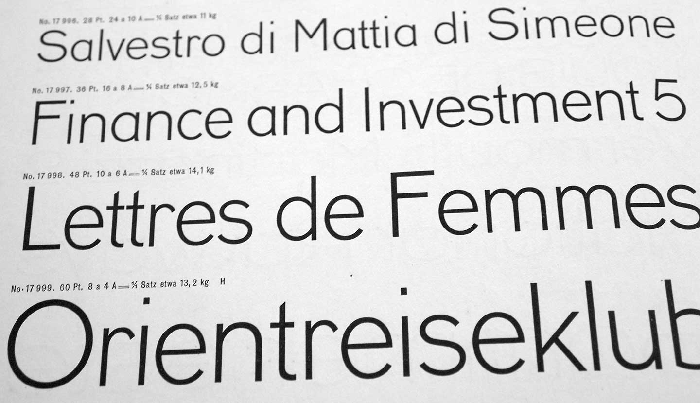
But let’s start with the biggest loss for our industry in 1915: Georges Peignot, type founder in Paris and one of our greatest type designers — of Grasset, Auriol, or Cochin to name a few — died in battle, only 43 years old. Curious to see how long the foundry will be able to remain independent without its head :/ Another substantial loss was the death of Wilhelm Woellmer’s CEO Siegmund Borchardt. His son Fritz (34) suceeded him at the Berlin foundry.

Continue reading

Emperor Maximilian’s New Clothes

maximilian_caps

Rudolf Koch began experimenting with pre-Fraktur letterforms he named ‘Maximilian,’ after Emperor Maximilian, an early benefactor of Gutenberg, during the years preceding World War I. Ultimately these experiments in forms — mainly swashes that occupied awkward white space in an otherwise-orderly block of blackletter in the typesetting of prayer books — led to the creation of Koch’s Maximilian Antiqua. Notably, I could find no evidence that Koch explored opportunities using simple .calt features, but more on that later.

Maximilian

Maximilian

Continue reading

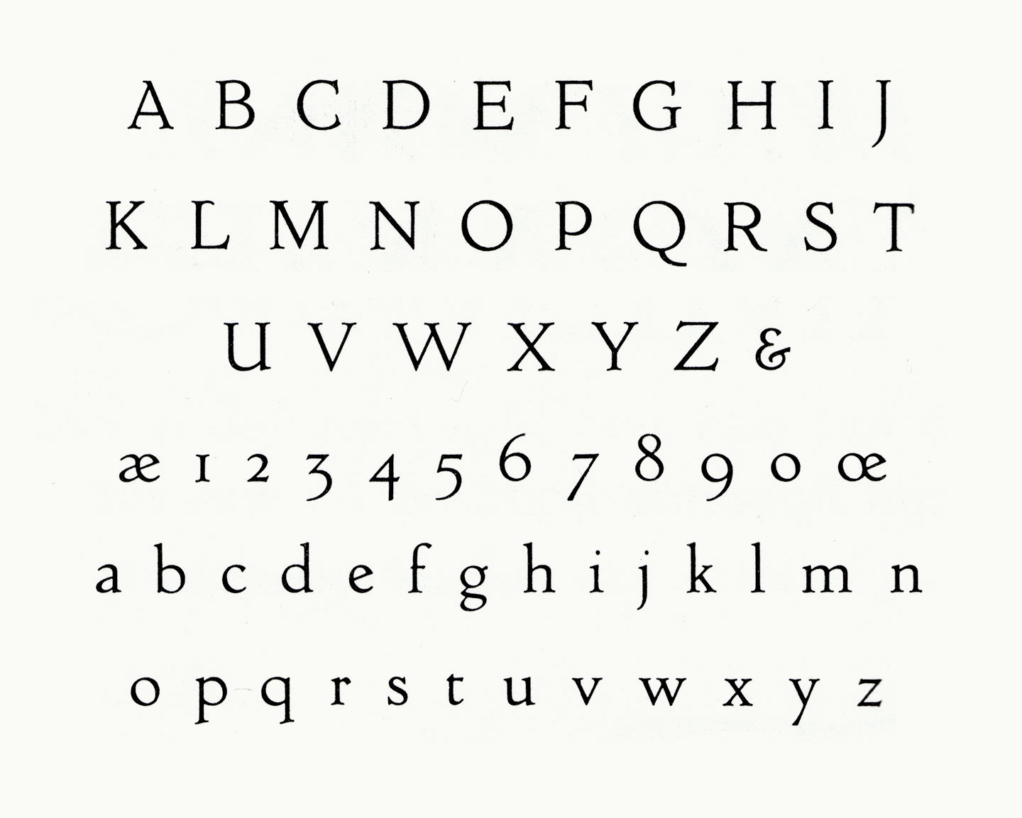
Centaur

centaur1915-1440

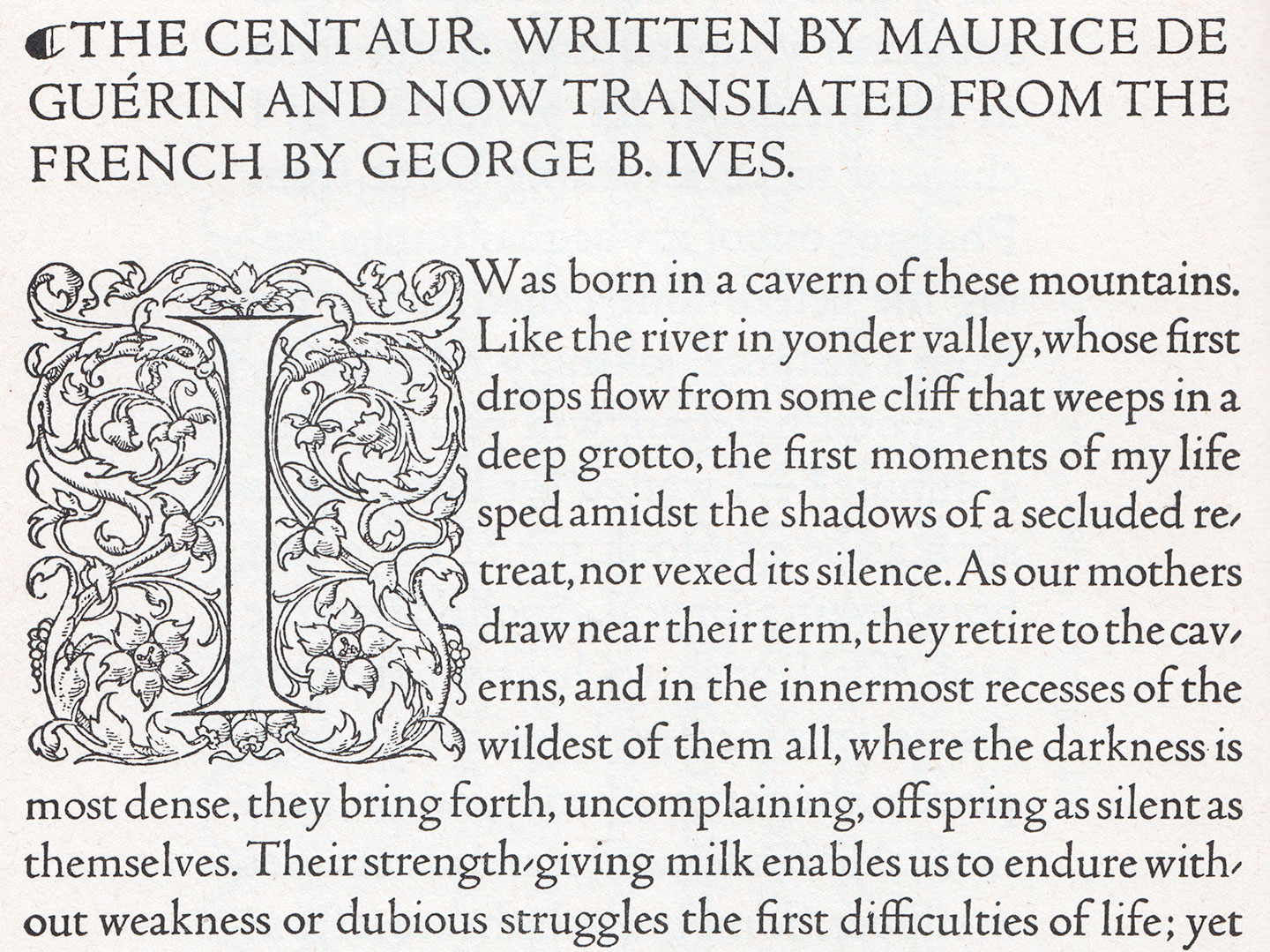
You are surely aware of the titling caps that the great Mr. Bruce Rogers has drawn for the Metropolitan Museum of Art in New York (what is that I hear about a logo? No, these were great). It is fantastic news that he decided to add a lowercase: 1915 saw the expansion of the design into a masterful 14-point text face, which was cut by Robert Wiebking (of Goudy fame) and privately cast by Barnhart Brothers & Spindler. The face was first used by Rogers in his recent edition of Maurice de Guérin’s The Centaur, published in just 135 copies by Carl P. Rollins’ Montague Press. (Get it if or while you can, I’m pretty sure this one’s gonna be popular.)

Continue reading

Goudy Old Style

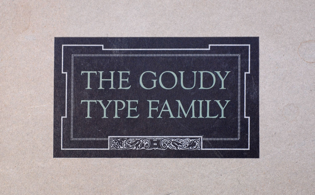
The Goudy Type Family Specimen Cover (1927)

Society Section, Forest Hills Gardens Gazette, March 16, 1915, Forest Hills Gardens, New York

About Town with Mrs. H. Puterschein

Frederic Goudy, a local printer and independent designer of typefaces (and a real live-wire!), was recently “discovered” by the powerhouse American Type Founders Company. After gaining recognition for Kennerley Old Style, his classy 1911 custom design for publisher Mitchell Kennerley, Mr. Goudy caught the eye of ATF bigwigs.

Continue reading

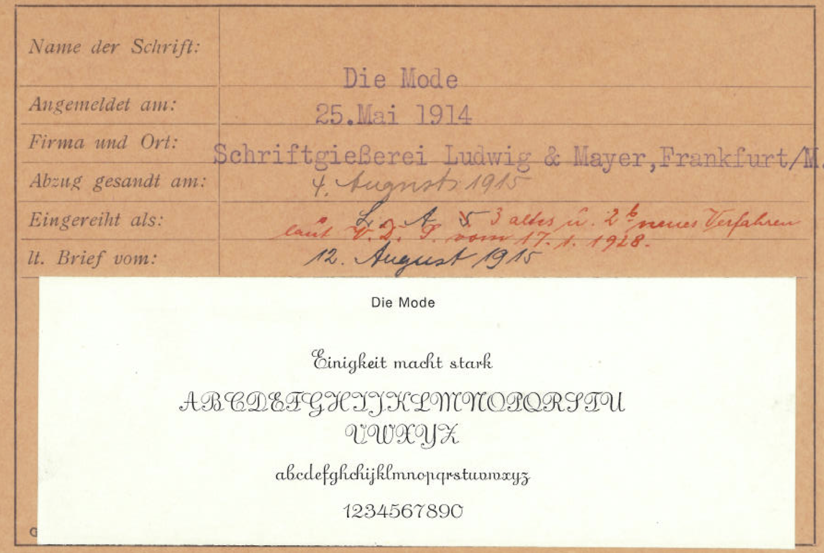
Die Mode

Nothing says fashionable like Die Mode

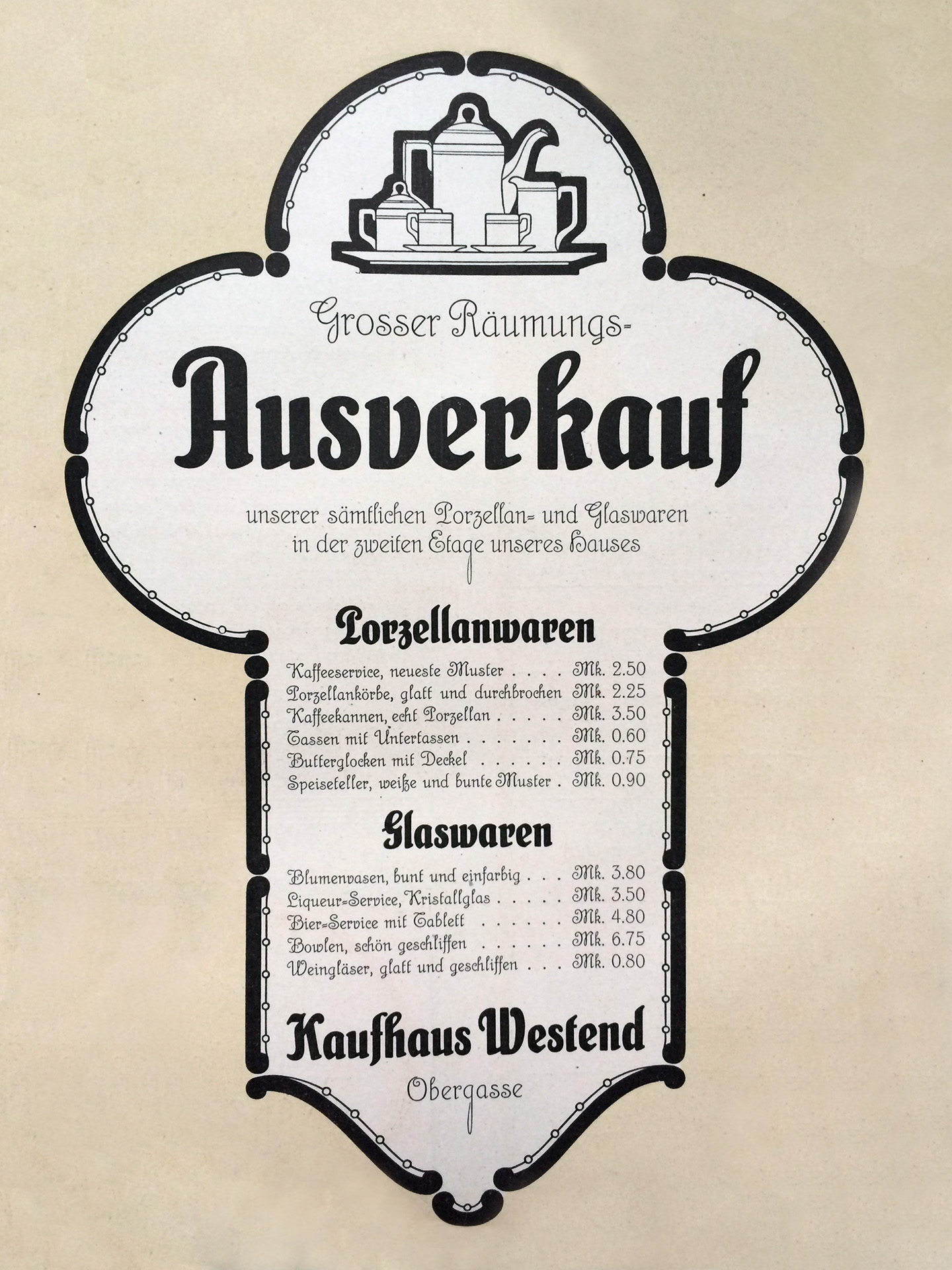
Nothing says “fashionable” like Die Mode!

If you’re a modern bird with a flair for fashion, look no further than Die Mode: a stylish, upright script face with delightful features. Published by the German foundry Ludwig & Mayer, Die Mode is both elegant and casual, with just enough personality to make those victrola dance party invitations feel fancy and jovial. Need to dress up your Callot Soeurs frock with a typeface that matches your modern style? Die Mode has you covered, way below the knee. Uppercase characters spare no details when it comes to curves that say sophisticated and friendly. Because “Fashion Demands Longer Skirts and Waistlines” Die Mode’s connecting lowercase characters gives it a distinctive, flowing style. If Parisian and Phyllis had an eccentric cousin, she’d be Die Mode. Sure, there might be a World War happening, but Die Mode doesn’t care. Inspired by calligraphic traditions in a hot new feathered hat, Die Mode is a fresh take on a new era in post-Belle Époque script type.

Zilvertype

Zilvertype-scan-1440

I was excited to see a new book face designed by Sjoerd Hendrik de Roos of Lettergieterij Amsterdam (aka Tetterode). We’re all, of course, still reeling from the incredible success of his Hollandsche Mediaeval just a few years ago: That text face (the first one designed by a Dutchman since the days of the great Fleischmann!) is quickly shaping up to be near-ubiquitous in books printed here in the Low Countries.
If you like Hollandsche Mediaeval, you may well enjoy this new face too. And if you don’t — maybe because of its cheerful roundness, its Art Nouveau-like detailing, or simply because IT IS EVERYWHERE — you may be relieved to hear that this face will not follow its predecessor as a bestseller; simply because it’s not for sale. De Roos designed it exclusively for the Hague-based private press De Zilverdistel, working closely with his client, Jean François van Royen.

Continue reading

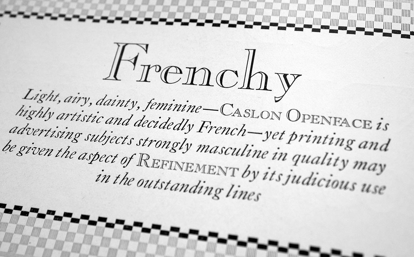
Caslon Openface

Caslon Openface

It’s talked about everywhere — typefaces are expected to be available in large series these days, not just a handful of fonts. The good folks of ATF-division Barnhart Brothers & Spindlers listened and added an open/inline variant to their popular Caslon Series (as others are doing, too). According to BB & S’s marketing material, it’s “light, airy, dainty [blah…] and decidedly French”. This is a fun stretch as almost all of us would think of Caslon as decidedly English. Compared to Caslon’s Inline, Caslon Openface features many totally different letterforms and has a much smaller x-height.

Continue reading